Software
Houzz Logo Print
kimmac2

artwork for dining room

8 years ago
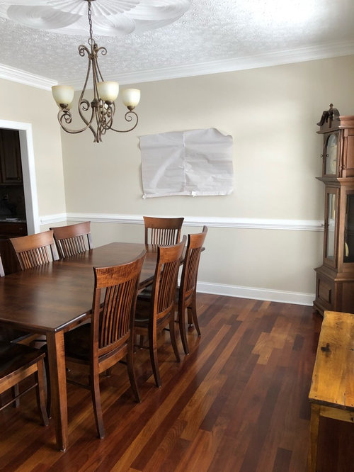
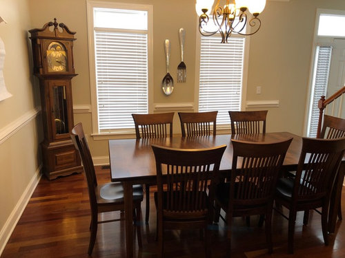
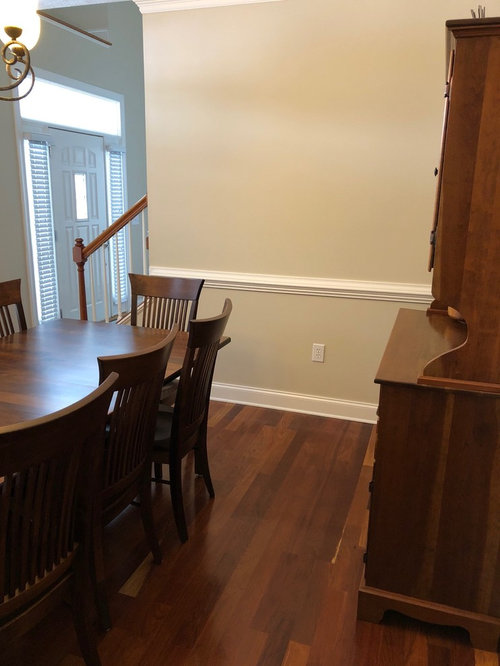
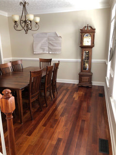
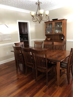
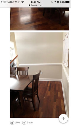
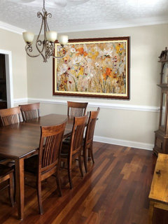
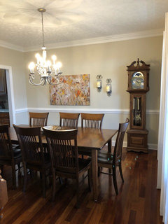
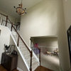
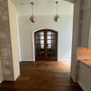
I’m looking for artwork for our dining room and have fallen in love with Jostle by Jill Martin. I’m trying to gauge if the 32x48 canvas is large enough for this wall (where I have the template taped), and I think it may be just a bit small. Opinions, please? Thanks.

Comments (37)

  • PRO
    8 years ago

    It does seem a little small for the large wall. If you framed it with a wider mat it might be large enough to work.

    (Also, consider getting a rug for under your table so there is some contrast between the table and floor)

  • 8 years ago

    I'm afraid the template is too small for the size wall.

    Also, the hanging metal pieces might be a better fit on a wall in another room.

  • 8 years ago
    Thanks to you both. My first instinct was that it was too small, but I REALLY like that print. Back to the drawing board.
  • 8 years ago

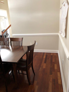
    You could put it on the shorter wall in the last photo.

  • 8 years ago
    Thanks graywings. I may end up doing that, but my first priority is that large wall since it’s the first thing I see when I enter the dining room from either entrance. I looking around to see where else I might hang a smaller version. :)
  • 8 years ago

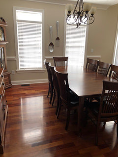
    What about if you turned the clock so it's against the same wall, which will "fill" more of the wall than it is now. Then I think the size would work. I think it's really close, as is, though.

  • 8 years ago
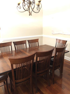
    It helps but now I think the corner looks a little empty. What do you think? Now I’m wondering if I should move the hutch to that long wall and face my table the other direction. Then the 30x48 print might fit on that wall. Hmmmmm.
  • 8 years ago
    last modified: 8 years ago

  • 8 years ago
    What do you guys think of this arrangement instead? Then maybe move the clock to the wall opposite the hutch?
  • 8 years ago
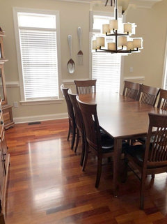
    From a different angle
  • 8 years ago

    You need to remove the grandfather clock from the dining room. Find another place for it. And then you need to remove that hutch. It's too dated. Get yourself a sideboard and put it on the large blank wall. With that below it, you could probably get away with hanging that picture above it with two lamps on either end. Remove the fork and spoon hanging. Get yourself an area rug and some drapery panels.

  • 8 years ago
    Ilikefriday thank you so much! I love it. I really wanted some color on that wall since you see that wall when you come through the front door. While the furniture rearranging I just did makes it more spacious, it’s just a sea of brown when you look in.
  • 8 years ago

    That print is availabile as a 54 x 36 on Art.com. Perhaps that would fill your space better.

  • 8 years ago
    Cpaul1 thanks for your comments. Drapery panels are next after I choose the art. As for the hutch, my father in law made it for us when we got married 30 years ago, so it is definitely staying whether people consider it dated or not.
  • 8 years ago

    Nothing is “dated” ( I hate that word ) if you love it.

  • 8 years ago
    last modified: 8 years ago

    I like the new arrangement, but can't comment on placement of the clock, but try it and see what YOU think!

  • 8 years ago
    last modified: 8 years ago

    That hutch is wonderful, and it works in your room. I loved it even before i saw that it was made for you. I also despise, very strongly, the dated term, DATED. I also like the fork and spoon.

  • 8 years ago
    last modified: 8 years ago

    I love your hutch and I love your clock. If I ruled the world I would ban the word "dated" from decor vocabulary especially when used to disparage someone else's style or choices. Grrr. (You are more gracious than I would have been.) I think it's great that you tried moving your furniture around and it sounds like you prefer your original furniture placement the best. Have you tried templating the larger sized art that is available to see if it will work at 54"x36"?

    Kim Mac thanked dragonflywings42
  • 8 years ago

    Perhaps put up sconces on either side of the picture to visually fill in the space better.


  • 8 years ago

    I was also going to suggest sconces, and give the clock some space. Corners are supposed to be empty-you will get used to it, especially with a rug and the drapes and your lovely art. Centered here?

    With properly hung drapes I don't think you'll have space for your fork and spoon, maybe more of a kitchen item anyway.

  • PRO
    8 years ago
    last modified: 8 years ago

    The canvas is available in 60x40. They usually offer a 50% off coupon with your first purchase.

    https://www.greatbigcanvas.com/view/jostle,1056579/?s=1VYMvVMl4PswYLpRLXc6zaQPPUWtKDKW2RmUzO14po9b7anOqfzAz73QByeWYvo1

    I think the art would look best if framed without glass, but with a linen liner to bring out the best in the image

    No fork and spoon in a dining room.

  • PRO
    8 years ago
    last modified: 8 years ago

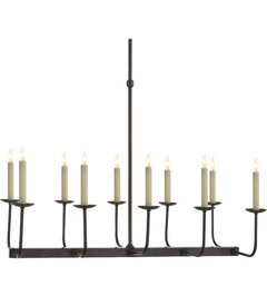
    Your chandelier should be mounted about 30" above the table.


  • 8 years ago

    Thanks again, everyone. I moved the hutch back over to one of the shorter walls in the dining room so it isn't the sea of brown when you look into the dining room from the front door. I left our table the new direction I moved it yesterday and moved the clock out of the corner like Olychick suggested, to fill more of the space on that wall.

    BeverlyFLADeziner, you are one of my favorite professionals on Houzz. I really like your style and the way you made the print with the linen colored mat.

    For everyone who suggested the larger print, it is 5 times the price of the 32x48 canvas, and that's out of my price range. I found the 32x48 for $96! I signed up for an account I'm am waiting to see if I get a 50% off coupon for the larger print.

    I may still order the 32x48 and try to find something else to go with it. Sconces would be pretty, but would require an electrician, as there is only one outlet on that wall that could be used to run a switch for a sconce.

    So at this point I'm still trying to decide what to do.

    If I stick with this print, anyone have suggestions for curtains? I was thinking white to brighten the room and pull out the daisies in the art, but also really like the orange and green in the print. I won't be getting a rug for a while.

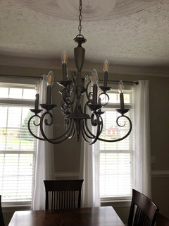
    Oh, and the light above the table was here when we moved in. It will eventually be changed out for something sparkly. :)

  • PRO
    8 years ago

    If you select a candle sconce you can use the Flickering Faux Candles that are available from a variety of retailers. Pottery Barn, QVC, etc. I'm sure someone has knocked it off by now at a lower price. Also, the flameless candles can be controlled by remote control.


    Kim Mac thanked BeverlyFLADeziner
  • PRO
    8 years ago

    What about using the "wall peel" version of the print and applying it to a locally purchased framed canvas and then adding a frame?

    https://www.greatbigcanvas.com/view/jostle,1056579/?s=1VYMvVMl4PswYLpRLXc6zaQPPUWtKDKW2RmUzO14po9b7anOqfzAz73QByeWYvo1

  • 8 years ago

    MIND BLOWN! I have two of those lovely flickering candles and even though a few people recommended wall sconces, in my mind, I was always thinking electrical. Wow. I'm going to order the 32*48 canvas and will start looking for sconces for the luminara lights. THANK YOU EVERYONE! Next stop, curtains!!

  • 8 years ago

    Poonam Choudhary Artist Thanks for your link, but I just ordered the print I fell in love with originally. I'm all set on art for now.

  • PRO
    8 years ago

    Np ... enjoy decor :)

  • 8 years ago
    Room complete. Just what I hoped for! Thanks everyone!
  • 8 years ago

    Very Pretty!!!

  • 8 years ago

    I think the smaller version is fine, but it needs to be hung just a little bit higher. It's too close to the chair rail.

  • 8 years ago
    Thanks, Jamie!

    JerezeeGirl, my husband was afraid I (or someone here) would say that. Hahaha.
  • 8 years ago
    Looks good. I think a rug with colours from your new art work would really finish it nicely.
  • 8 years ago

    I love this room because it is filled with all things selected by you and your family and is therefore. unique! Well done and very beautiful....as for curtains, you could do a heavy warm white or whet linen type and add contrast tape i orange green and teal or the colors any of the prominent colors in the print; then they print colors and curtains would relate to each other and complement the strait lines on your lovely chair backs.....just a suggestion but otherwise looking good.

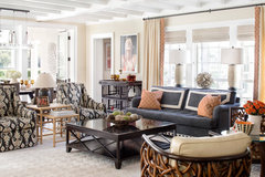
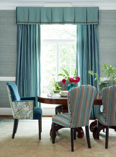
    Examples of edged trims.....

    Traditional Family Room · More Info

    Bay Street · More Info

    Mill Valley Gourmet · More Info
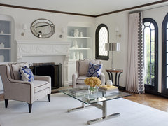
    Like this trim done onto the curtain the width of the trim from the edge.....nice neat contrast.
    Traditional Dining Room · More Info

  • 8 years ago
    Thanks Pamela. I agree a rug would look nice, but we keep two toddler grandkids who eat in that room, so I won’t be able to get a rug for a while. It’s easier to clean up the bare floor for now.
  • 8 years ago
    Aww, thanks for the compliment and suggestions, Susan. I really am happy with everything in there! My husband put the light on a dimmer and moved the pic up a little more from the chair rail. Instead of adding color to the edge of the curtains, I’d like to tie in the colors of the pic another way. Maybe a different centerpiece on the table (or something colorful in the bowl on the table??) I also have a hutch on the other wall that I could put something colorful on.
Sponsored
Kuhns Contracting, Inc.
Average rating: 5 out of 5 stars26 Reviews
Central Ohio's Trusted Home Remodeler Specializing in Kitchens & Baths