Software
Houzz Logo Print
arisha_choudhary

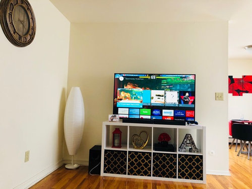
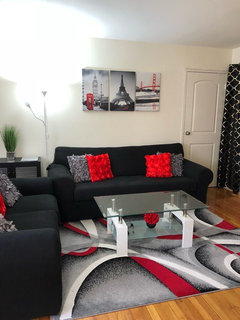
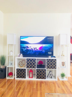
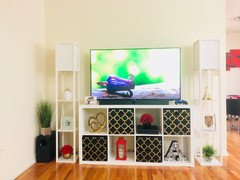
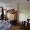
which looks better..please suggest..

8 years ago
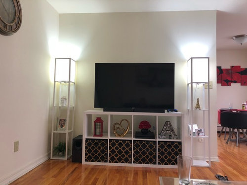
If choosing 2nd option anything can be hang or done on walls behind..its rented apt so painting is not an option..

Comments (35)

  • 8 years ago
    Monique: 1st option here is with shelf lamp on both sides..you liked that better..am i right..??
  • 8 years ago

    Yes Arisha, you're right. I like the symmerty those lamps give

  • 8 years ago
    Symmetry, of course :)
  • 8 years ago

    I like #2 and would add a tall plant to the left, put the lamp on the right.

    Too many shelves in #1.

  • 8 years ago

    I like option #1...it's very balanced and draws the eyes up!

  • 8 years ago

    Do you need a lamp and shelves around your tv? Is there other lighting in the room? Sorry, photo 1 looks too cluttered to me, and photo 2 looks like something from outer space is going to emerge from it. However, if you love it, anything goes. I don’t think you need anything else on the wall with the tv. If you post a photo of what’s going on in the rest of the room you will get more ideas.

  • 8 years ago

    If I have to choose, I like the one with the curved lamp. But both arrangements have weaknesses.

    The tv and tv stand are rectangles. And the stand has squares inside it. Combining all those 90 degree angles and partitions with a pair more squares and rectangles feels hard and busy to me. Add in the knickknacks on both the shelves and the tv stand and (for me) the busy-ness gets overwhelming.

    The curved lamp is a good foil for the rectangles. And it's big enough to help balance them. But I'd bring it out of its corner a bit. It looks a little crowded there. And I'd move the large clock to the same wall as the tv, with the 6 o'clock centred on the right edge of the television. Those 2 curved shapes will balance and soften all the rectangles. And the asymmetry will keep it from being boring.

  • 8 years ago
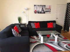
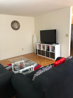
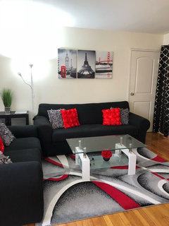
    @saypoint: these are pics of living area..pls suggest some ideas..
  • PRO
    8 years ago

    I like the first option.

  • 8 years ago
    Jennifer k: i didnt understand about moving clock to right edge centre..i can move the clock on that wall..but not sure what right edge centre means exactly..can you explain or show any pic??
  • 8 years ago

    The tv looks like it’s too close to the corner. Is it hard to watch comfortably on that angle? Can you put it on the long wall to the left of where it is currently? Also your artwork is hanging a bit too high above the sofa.

  • 8 years ago
    Saypoint: we generally use 3 seater sofa so watching tv is no problem..all cable point are behind tv unit..shifting tv to other wall would expose all wires and modem etc..kids usually come over and jump on sofa thts y wallart little high..
  • 8 years ago

    Got it. So if it’s 1 or 2, I’d say 2.

  • 8 years ago
    Saypoint: i feel something is missing with that small lamp..i liked its shape but couldnt find taller one.. wall behind is so boring..and because of tv m not sure adding some wall decor to it..can you suggest some decor tips for the wall behind tv?
  • 8 years ago
    Option one with the lamp. Option two adds clutter.
  • 8 years ago
    last modified: 8 years ago

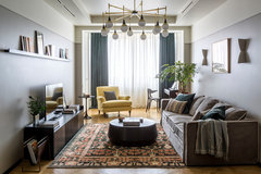
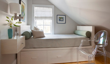
    Love the shape of the lamp in #2 with the tv area but I think the scale is off for that spot. It is too small. I might try something like this photo- a long shelf above. I might also try pulling the tv stand over to the left and play with putting something decorative to the right. Or I wonder if you added a shelf if the oblong light might then work on the right side of the tv?

    Квартира в Москве 140 м2 для семьи с тремя детьми · More Info

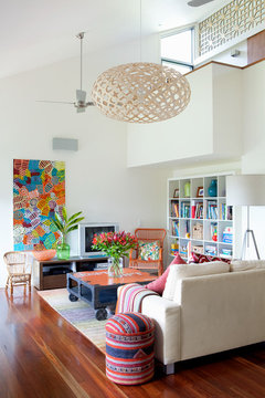
    Here's another idea, a large vertical poster off set to one side of your tv, really low. You could even set it partly behind the tv. Or you could try hanging the three pieces you have now over the sofa vertically, one above the other, in the tv area. I can't tell if they'd be large enough.)

    Pullenvale Contemporary · More Info

    If you leave them over the sofa, I'd suggest you lower and separate them.

    I'd also take that piece ( mirror? Clock?) off the wall to the left of the tv. It looks lonely and a different style.

  • 8 years ago

    when I was talking about the clock, I meant that you should line up the horizontal centre of the clock with the right edge of the tv. i.e. if you pretend to draw a vertical line upwards from the right side of the tv, it would bisect the clock. Make sense?

  • 8 years ago

    I agree that having shelves on each sides makes it looks too cluttered. If you can, use a wider and lower tv stand. Good luck!

  • 8 years ago

    I'm not a fan of either choice. The first looks too cluttery, the second doesn't add anything to the space. Is there a reason why you need lamps there?

    Have you considered angling the tv stand in the corner facing the sofa? Would you still be able to hide the wires?

    Another option would be to paint the tv stand black to give it more visual weight and have it relate better to the rest of the room.

  • 8 years ago

    Just the television & stand. Nothing on either side would be my choice.

  • 8 years ago

    My cable company charges about $40 to install a new cable hookup in a different spot. Not a big deal if it’s something you want to consider.

  • 8 years ago

    I like second option better. The frst is too 'matchy-matchy'. Nature itself is often 'random', 'uneven' and 'odd' so to me decor and furniture placement usually looks much better when grouped in odd numbers, not even ones.

  • 8 years ago

    Can you put the same containers in the top shelves of your TV stand? A big plant in the corner is enough. TV is your focal point. The idea of putting your TV unit across the corner is good also.

  • 8 years ago
    No offense to anyone..but seems here most ppl likes asymmetrical pattern..bt i personally find symmetrical patterns more pleasing and appealing to eyes..assymmetric pattern is painful and chaotic to eyes sometimes..anyways thanks for your suggestions..i wanted to do some patterns on wall..but got no suggestions on that:(
  • 8 years ago
    Saypoint: may be in pic it seems that other wall is big..but i just measured it..both are same size..its a rented apartment..so i dont think its worth doing such efforts..i only wanted some idea for wall decor on tv wall if i am choosing option 2..because that lamp is small and wall seems empty plain and boring to me..
  • 8 years ago
    Erinsean: no dear i cant push tv to corner because the parallel wall has closet door..and sofa lies next to door..not a big space here..
  • 8 years ago
    Barncartz: i didnt liked either of the designs and choice of color combinations..everything looks messy there..
  • 8 years ago
    last modified: 8 years ago

    Arisha, to be fair to the people that took the time to help you, there may be a language issue because the question about pattern or art wasn't clear in your post. The title of your post is "Which looks better". That is the question that people answered.

    You won't be able to add art or pattern to make choice number 2 look more finished. You don't have any room on that wall. You can't put art above the TV.

    The reason that many people didn't like choice one was not because of the symmetry, it is because it makes the wall look cluttered.

    Of the two choices, the asymmetrical choice is better but neither choice looks great.

  • PRO
    8 years ago

    The first option but I love the floor lamp in the second pic! Definitely save that to put elsewhere.

  • 8 years ago

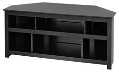
    If you had a corner tv stand like this:

    Vasari Corner TV Console in Black · More Info
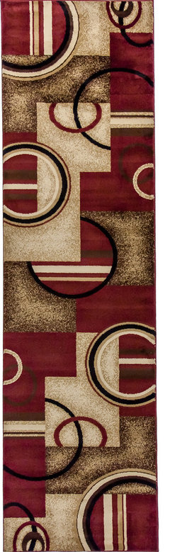
    then the tv could be angled. You could move the curved lamp onto the short wall where the tv currently is and hang a large vertical poster or rug behind it.


    Well Woven Barclay Arcs & Shapes Rug, Red, 2'7''x9'6'' Runner · More Info
    (colour is not quite right, but the design echos your floor rug)

    Then use your current tv stand as a credenza on the wall where the clock currently is. Take down the clock and replace it with a large art piece that almost spans the width of the credenza and reaches the same height as the top of the tv.


  • 8 years ago
    Carolina kitchen and bath : thanks for your comment..and yes i love that oval lamp too..will definately use that elsewhere..
  • 8 years ago

    Arisha, since the closet is there, I like the #2 best. I like your red accents...I have red in my family room also....

  • 8 years ago
    Thank you so much to each one of you who took your time to suggest me ideas..i personally liked this and sticking with this right now because i feel it makes wall look complete..might change accent pieces on shelves to match better..hope you like it..
  • 8 years ago

    I'm glad you like your result. For me it would be too match-matchy but it's not mine!