Software
Houzz Logo Print
sawdonkey

Where do I stop my backsplash?

8 years ago
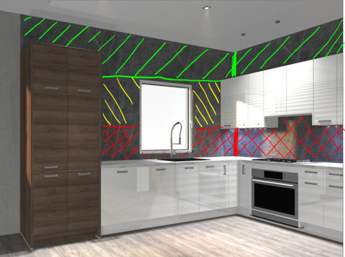
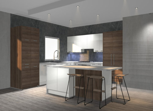
We're completely redoing our condo down to the studs after a fire in our building. We're approaching the end of the project and I need your opinions on where to stop my backsplash. There isn't an obvious stopping point.


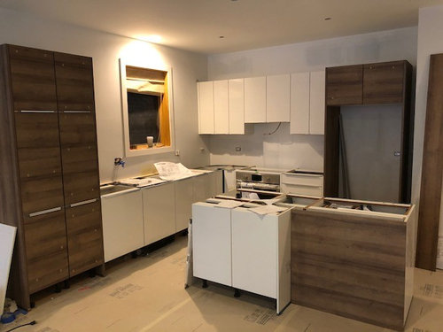
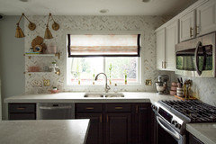
First, in the rendering, the window is shown too low. It actually goes higher than the top of the upper cabinets. See the WIP photo at the end.


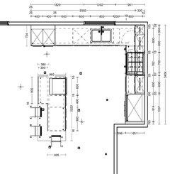
I will definitely tile all areas in red. Do I stop there? Do I go all the way to the top of the uppers? Do I go all the way to the ceiling? We're doing small white rhombus tile with white grout.


I'd love to hear your thoughts!


Comments (20)

  • 8 years ago
    I would go to red zone or all the way to ceiling.
    sawdonkey thanked noisycats
  • 8 years ago

    I've also seen it done in many different ways. In your case, I'd also lean toward just the red area. No right or wrong IMO. However, I'm not a pro.

  • 8 years ago
    Thanks everyone. You’ve more or less confirmed what I was thinking. I think I’ll just go with the area in red. This will be white tile in a white painted wall, so the contrast won’t be huge.

    I may put a couple of shelves on the left side of the window, the lower one at the divide between tile/paint, to help delineate where the backsplash should stop.

    Should I use Schluter strip to divide the materials?
  • 8 years ago

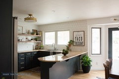
    you have a modern kitchen w/modern tile. I'd do all the walls to the ceiling. It's a small area so I think it would make sense rather than cutting it in half.

    It is a personal choice, no right way. I just like it better w/tile.

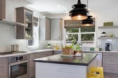
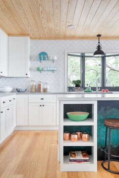
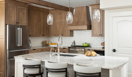
    this one would have looked so much better if they did the tile all the way up.

  • 8 years ago

    All the way up! It will be a nice impact!

  • 8 years ago
    If you do decide for the red option I offer a slight tweak....take the line on the window wall up slightly so that it aligns with the bottom of the hood. It’s just a way to settle the eye on one line rather than multiple lines. I personally like the look all the way to the top or to red with the tweak I suggested. To the top of the cabinets looks awkward IMO and like you couldn’t commit :) I like the look you are going for cabinetry wise.
  • PRO
    8 years ago

    All the way to the ceiling.

  • PRO
    8 years ago

    Taking it to the ceiling creates an awkward edge of tile above the refrigerator, as shown in your rendering.

  • 8 years ago
    Great points everyone. Really appreciate the the help thinking through this. I like the tweak of moving the line to the hood height, but do think the full wall tile would look very intentional and like we’re not settling.

    Do you all think that if I go to the ceiling, that I need to do above the cabinets on the right too?

    I’m trying to achieve a contemporary Scandinavian look. Under the floor paper, there is new brushed and oiled wide plank larch flooring from Mafi.

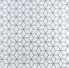
    Here is the tile we’re doing for the backsplash/kitchen walls (using white or a barely gray grout):
  • 8 years ago

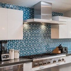
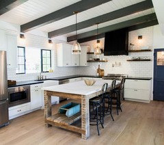
    I've seen it both ways. for sure do the the entire sink wall, to the ceiling, above the fridge. you can stop it there, or, it's such a small area, do the wall to the right as well.

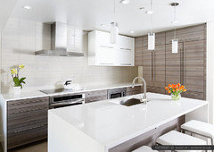
    this one, they stopped on the window wall and didn't do above the cabs to the right. personal choice.

  • 8 years ago
    Kristin, it’s hard to tell from the rendering, but that’s actually a wall, not a transition. This may help:
  • 8 years ago

    I'd like to piggyback on this question. I am installing a glass tile backsplash in a similar distribution to the area in red. Do I need Schluter at the top edge on either side of the window? Or is it ok to leave it as a raw edge - as long as the grouting is meticulous?

  • 8 years ago
    last modified: 8 years ago

    Seriously consider one 4" row of solid color tile (chosen from your countertop colors) as your backsplash giving you a lot more options for how to use the painted wall space ...

    ... beginning with either a shelf or, preferably, a row of small cabinets with top hinges all around that corner of the room above window height for storing (and/or, with glass doors, for displaying) items (without needing to constantly dust them) such as your favorite vases and candy dishes and candle holders and serving dishes (and even seasonal items) when they're not in use for their intended purposes.

  • PRO
    8 years ago

    I'm sorry...I meant the pantry cabinet to the left of the sink. At first glance, I thought it was an integrated refrigerator. Ending tiling without an intentional barrier looks unresolved.

  • 8 years ago

    Elizabeth,,it depends how thick it is, what the edge of the tile looks like and how meticulous they are. you could always use a thin glass pencil liner in the same color. The tiles don't come in a bullnose edging?

  • PRO
    8 years ago
    All areas should be tiled: red green and yellow
  • 8 years ago
    Kristin,

    After I posted I thought you might have thought the pantry was the refrigerator. Your point is actually a worry of mine too. I could probably live with it, but I agree it would look half-baked.
  • PRO
    8 years ago

    I'll be odd man out - so to speak.

    I'm voting for just doing the red area. I don't believe in tiling for the sake of tiling. I also see the current tile design trend as something that is passé. Tile to the ceiling can look great, it can also look overly done. I like the idea of spending money on nice tile and a pencil liner, from there you can paint and place shelving on one side, perhaps a picture on the other.

  • 8 years ago
    Tile to red or green zone (all the way up). Going to top of cabinets will not look good. All the best with your project