Software
Houzz Logo Print
nb1126

Exterior Character?

8 years ago
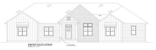
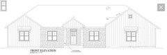
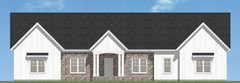
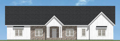
We’re so close with finalizing our new build. What do you think of the exterior? Would you make any changes? I’m all ears!!

Comments (29)

  • 8 years ago
    last modified: 8 years ago

    I'm sorry but that's just way too much. All you need is one material for the siding, not 3. With one material your focal point, the front door, will become the star. Right now everything is competing for attention.

    Add to that the transom over the door that doesn't match the door style, and the transom windows to the right of the door that don't match any other windows. And lastly the single square window over the front center gable. It's just a mess of materials.

    And then you have that roof over two of the windows?

    Let me guess. A draftsman designed this for you.

    N Alm thanked cpartist
  • PRO
    8 years ago

    What do you think?


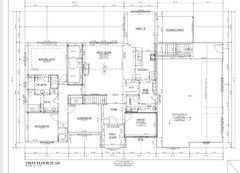
    Could you post the floor plan so we better understand what we are looking at?

    N Alm thanked PPF.
  • PRO
    8 years ago
    last modified: 8 years ago

    When posting the floor plan(s) post the other three elevations also. A lot of people forget there is more to little boxes made of ticky tacky.

  • 8 years ago

    Barely a year ago the trend was mixing brick, stone and siding ... now with the Gaines effect, we see a mix of board-and-batten, stone and siding.

    The only positive with this elevation is that there is one roof type... scratch that ... I just noticed the obligatory metal roof element is included over the door and two windows.

    Just too much stuff ...

  • 8 years ago
    last modified: 8 years ago

    Too much, too busy...vertical siding, horizontal siding, stone should be simplified. Can you do all stone or brick...since siding in front usually looks cheap compared to stone or brick? Or at least stone in the center as a focal point with the columns, generally columns look better against stone than siding. And ditch the windows above the door + roof directly over window.

    Also on the side, why is that window smaller than the rest, it looks awkward with every window being same size except that one.

    N Alm thanked A W
  • 8 years ago

    I think a double front door would look nice given the length.

    N Alm thanked Elle
  • 8 years ago

    Just brick the whole front. To much going on . It looks like a salvage house with all those different textures.

  • 8 years ago

    I do like that fact that, unlike many U.S. houses, it does not have garage doors dominating half of the front of the house.

    N Alm thanked kudzu9
  • 8 years ago
    A simpler effect. Perhaps dismiss the bricks
    N Alm thanked Irene Morresey
  • 8 years ago

    "A simpler effect."


    In my opinion that is awful but to each there own......................

  • 8 years ago
    last modified: 8 years ago

    Agree with the consensus above...too many materials. It actually makes the front of your proposed home look chaotic and messy. It looks like a series of townhomes stuck together because of all of the gables. I'm sure that is not the look you were seeking. Design is a real skill. I have seen mixed materials done well, but rarely. Yes, your home has character, but not in a good way. Sorry. Start over.

  • PRO
    8 years ago

    What type of character do you want your house to express?

  • PRO
    8 years ago

    N Alm thanked BeverlyFLADeziner
  • PRO
    8 years ago

    Elevations are always deceiving, since it's impossible to visually tell which planes recede, which project and which are actually on the same plane.

    That said, comments above are on the mark. For a simple residential shape, there's just two many wall and roof materials; the windows have no rhythm or priority; the windows are inconsistent types; the front door is insignificant and lost among the other façade elements...

    Simplification will make a strong improvement.

    N Alm thanked Virgil Carter Fine Art
  • 8 years ago
    Thank you all for your comments.
    -The plan was for the siding and board and batten to be the same color, so it wouldn’t be as overwhelming- but I’ll have to rethink that.
    -Stone is required in the neighborhood and we cannot afford to do the entire front.
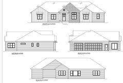
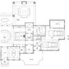
    -Attached are the elevations and the floor plan. I know everyone has been very critical of the exterior and I appreciate the feedback- but just want to throw it out there that we are very happy with our builder and this is exactly what we asked for.
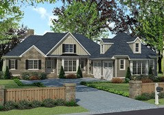
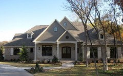
    -Suggestions on realistic ways to simplify are appreciated. And I love the pictures of the houses above.

    Thank you!!
  • PRO
    8 years ago

    Put as much thought into the rear elevation, right elevation, and left elevation as you do the front elevation. Have the designer come up with an alternative front elevation that puts all the front walls in the same plane and look good.

  • 8 years ago

    I would also ask the designer to look at making the windows more consistent. Right now you have many different types with no obvious organizing scheme among them.

  • 8 years ago

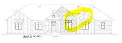
    Looks to me like you're setting yourself up for needing an excellent roofer to not have issues with leaks in the highlighted circle area. That is a lot of water that will be running into that shared valley.

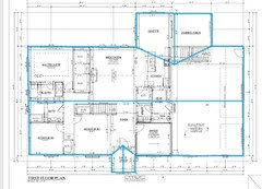
    I agree with the above that the design appears to be all over the place. I think you have too many gables as well. How about removing the one in the middle and just have the entry gable and then change the garage side to be a single gable. It should be a wash construction wise and may even save you some money. Do the middle part in stone and the other parts in the same siding materials. Then those wings (gables) will have more the appearance of being a natural add-on to a house that originally was stone.

    N Alm thanked lyfia
  • 8 years ago
    last modified: 8 years ago

    Without commenting on the floorplan, which affects the various perimeter elements of the house (because I know this is what almost everyone builds, now), (but yes, you could easily flatten the front façade of this house without any detriment to the plan, possibly some improvement to it, and improvement of the façade and roof):

    This house would be fine if it was clad in one material with stone added at the bottom to mimic the foundation to meet the stone requirement. You may be able to do the entire perimeter if it's just a foot or so all around.

    The rear elevation looks awfully blank, there are not enough windows. The garage entry would look better with some sort of detail to give it a sense of entry like a small porch.

  • 8 years ago

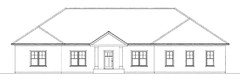
    You could start here:

  • 8 years ago
    last modified: 8 years ago

    If you need stone, put stone all the way around the house on the bottom up to the first floor line. Then it will look like it was the foundation. That will look classy.

    Do yourself a huge favor and get a copy of the book What Not to Build. I found it so helpful when I was working on my house.

    N Alm thanked cpartist
  • 8 years ago

    Just a poorly done illustration, but I think you have options to make it less busy and attractive too.

    N Alm thanked lyfia
  • PRO
    8 years ago
    last modified: 8 years ago

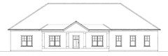
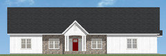
    Some somewhat simplified versions.


    N Alm thanked PPF.
  • 8 years ago

    I like cpartist suggestion too, but in many areas that doesn't qualify and your elevations doesn't look like you even have a foot of the foundation showing.

    N Alm thanked lyfia
  • 8 years ago

    I like cpartist suggestion too, but in many areas that doesn't qualify and your elevations doesn't look like you even have a foot of the foundation showing.

    That's a possibility too but if so, even done to the bottom edge of the windows with the windows done more like your version would be better.

    Actually your rendering looks a heck of a lot better than the throw everything but the kitchen sink look the OP had. I like it.

  • PRO
    8 years ago

    Yesterday, I took a bunch of lily of the valley to DD and was then drove around her neighborhood a bit. It's only 2 miles from my house but there has been a lot of MAJOR remodeling going on the past year or so. Most of the houses were built in the late 60's/early 70's and were all custom - it's not a subdivision. Many are single story or 1 1/2 story. Hers is a Cape.

    I was so disappointed to see that two houses at the top of her street now look like subdivision houses, with multiple building materials being used - batten, brick, stone, - you name it, it's on there somewhere. None of the other houses in the neighborhood have more than 1 material, most being brick. These newly remodeled house just cheapen her entire neighborhood and it's NOT a cheap neighborhood at all. Such a huge mistake.

  • PRO
    8 years ago

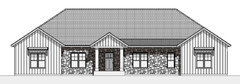
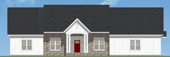
    More ideas.


    N Alm thanked PPF.
  • 8 years ago

    I like these, but I think the center mass with the stone needs to look more separate or purposeful:

    N Alm thanked palimpsest