Software
Houzz Logo Print
martybdye

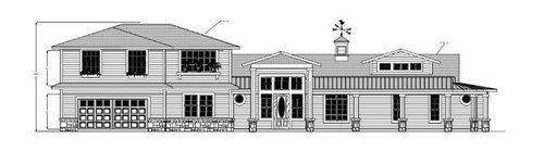
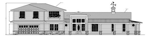
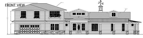
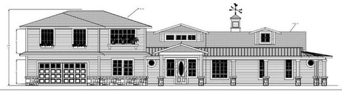
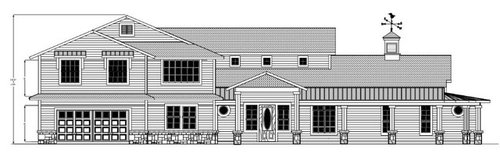
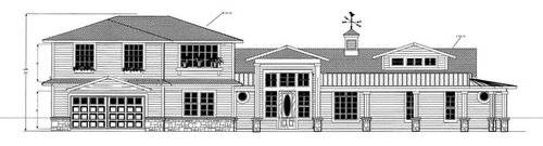
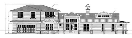
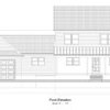
Which front elevation do you prefer?

8 years ago
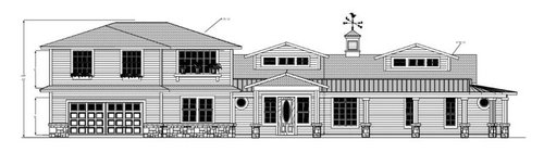
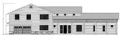
We are building a new house and our draftsman has presented several front elevation choices. The space over the garage will be a rental unit. The first floor will be our living space.


Which of these elevations do you like and why?

Option 1 - Matching dormers - one in center provides light, one on left is false

Option 2 - Center height provides dramatic interior entrance, dormer on left is false

Option 3 - Center height provides dramatic interior entrance. Cupola helps balance height?

Option 4 - Center dormer provides light into music room. Right small dormer is false.

Option 5 - Oops duplicate of option 4

Option 6 - Center clear story is cosmetic only

Option 7 - Does gable over garage door help tie together 2-story to 1-story?

Option 8 - Does gable over 1st story window (shop area) help tie together 2-story to 1-story?

Comments (23)

  • 8 years ago

    3 or maybe 8, but I don't like the oval window shape in the front door. It seems out of place. I would use a rectangular shape that matches the windows.

  • 8 years ago
    last modified: 8 years ago

    None. They are all too busy and all the elements have no relationship to one another.

    Good house design is not putting together the interior and then pasting gee gaws on the exterior. A person of talent would design the exterior at the same time as they design the interior.

    Also a person of design talent doesn't stick on things like fake dormers.

  • 8 years ago

    Why is there a railing on the second floor? Is there a porch there?

  • 8 years ago
    I agree the oval window is out.
  • 8 years ago
    There is no railing on 2nd floor. The roof over the porch is metal. Perhaps is looks like a railing.
  • 8 years ago
    last modified: 8 years ago

    Can you provide a rendering that removes all fake dormers, cupola's, gets rid of the stone, and makes the round windows square? If I was only given this choice, my preference would be for a very plain version with the taller entry.

    You really need to start over. I'm sorry but it's a bit of a mess. The proportions and center mass are all way off. No amount of adding stuff will save the basic design. What part of less is more does your designer not seem to understand?

    I don't like the round glass front door, either. Square would be better. I don't mean to be unkind, but you've got to simplify this.

  • 8 years ago

    Why wouldn't you exploit the clerestory from the interior if you put something like that on the house?

    Unless you were designing a Regency pavilion style house in the style of John Elgin Woolf, the large entryways on a number of options are exaggeratedly overscaled.

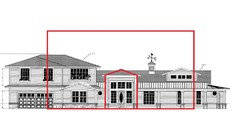
    The facade for an entry of that size is more like this:

    These are all really much too elaborate, and the idea of adding fake structure to this extent (I am not always against it) --this just means you realize that there is something wrong with the essential massing of the house.

  • PRO
    8 years ago

    Well...as has been said...there isn't a "favorite". Sorry!

    All of the elevation studies are fragmented, and appear to be simply different versions with different mascara and lipstick applied to the outside.

    The over all proportions and scale are not good to start with--a large bulky shape on the left, and a long, extended smaller shape on the right. The two shapes simply don't work well together as is. No amount of exterior decoration is going to change that.

    Ask your drafter for perspectives, so you can better see what's going on. Elevations are very difficult to read in three dimensions.

    To improve the exterior, there's going to have to be changes to the floor plan, since floor plan and exterior are inextricably linked. They cannot be designed and designed well sequentially.

  • 8 years ago
    last modified: 8 years ago

    Start back here somewhere:

    I flattened out the facade on the left a bit and raised the portch roof. I would still sort out the column spacing and the windows to the lower right.

  • 8 years ago
    last modified: 8 years ago

    OT

    John Elgin Woolf

    Thanks to palimpset for introducing another in the line of the over-the-top Hollywood "Starchitects" . (The latest, Richard Landry, has Canadian roots.) And, of course, Toronto's Eph Goldberg has long moved onto international eminence as Frank Gehry.

  • 8 years ago
    Thanks to everyone for your comments. We love our floorplan but not the elevations. We don't see any options that don't have 2-story on left and 1-story on right (long story). Looking for fresh ideas to help a front elevation look good.
  • PRO
    8 years ago

    I think I mentioned in one of your other threads that the exterior massing would be improved if the 2-story element and the 1-story element were separated and connected with what would appear from the exterior to be a exterior or interior breezeway. In so doing the 2-story mass could stand alone and the 1-story mass could stand alone. Each could be developed in a way to be sympathetic to the other.

    Connected as they are, each mass fights with the other in terms of mass, proportion, scale and importance.

    Only a constructive suggestion.

    As I mentioned earlier, there can be no substantive change to the exterior without making plan changes.

    Good luck!

  • 8 years ago

    Have you considered starting over with an architect instead of continuing with the draftsman?

  • 8 years ago

    Thanks, we started with an architect who designed a house that could not be built on the lot. By now and after many $$ we are feeling discouraged. If we don't find an acceptable elevation then perhaps we are back to a new floorplan.

  • 8 years ago

    We need to find Carol an architect. Somebody step forward. Please, she's trying so hard. I give her an "A" for effort. She deserves better than this.

  • PRO
    8 years ago

    I nominate ArchitectRunnerGuy.

  • 8 years ago

    I second architectrunnerguy.

    Carol get in touch withDoug.

    He'll work remotely with you. He's done quite a few designs for members here.

  • PRO
    8 years ago

    Look out for his clouds.

  • 8 years ago

    If we don't find an acceptable elevation then perhaps we are back to a new floorplan.

    Well, yes - just because the two are inextricably linked. Every time we tweaked our floor plan, the elevations changed in kind. Not always just to accommodate the change physically - sometimes things need to change visually. Roof over the main living area went up - roof on front porch goes from gable to hip, in order for balance to be maintained. When I asked, Mark said, "Every line has a reason." So now, when I see change I just ask, "What is the reason for that?" And I learn something, and the design stays balanced.

    Therefore, in order to get an elevation you are happy with, the floorplan will need to change. What you'll need to keep in mind is that the simple shapes of the elevation are what you need to get right. That's the cake. The styling can then be laid over top - frosting. Then whatever little detail touches *cough* Swedish window trim, if you're me *cough* - think of that (or your cupola) as the "sprinkles."

    Cake, THEN frosting, THEN sprinkles. But you make the inside of the cake and the outside of the cake at the same time. And you can't fix a bad cake with more frosting. (Go cue up "Nailed It!" on Netflix for visual evidence of this).

  • 8 years ago

    I like you cake/frosting/sprinkles analogy!

  • 8 years ago

    I can't entirely take the credit for that one - it came from an architect who was working on a friend's project. She kept getting hung up on the styling while he was still trying to get the structure right. But it does help those of us non-pros think about just how much is involved in making a house look pretty. ;-)

  • 8 years ago

    Am I the only one now cackling with glee and rubbing hands together to see what Doug comes up with this time?