Software
Houzz Logo Print
lbernardbuchan

Dining Room Recommendation

8 years ago

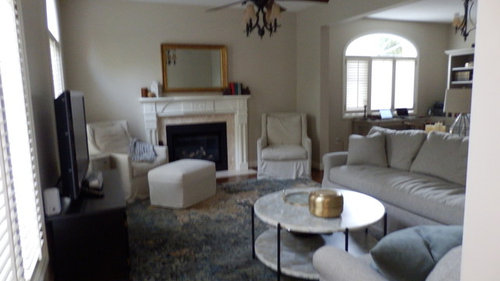
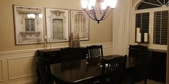
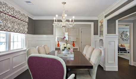
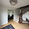
We bought this house approximately one year ago. We purchased the dining room furniture from the people that sold the house to us. Once we were here I was disappointed with myself that I did that. Now I am finding it very dark and heavy. I had been looking at furniture at Restoration Hardware and had an order ready to go. The sellers were selling some furniture because they were going overseas and we got a better deal buying from the sellers so we went with it. Now I am quite unhappy with my dining room. Too traditional, but the quality of the furniture is very good The room has lovely wainscotting and it has textured wallpaper (which I DID love at the time), but now I don't care for this anymore. I would like to go a bit more modern. However I cannot go out and buy new furniture. My thought is to paint the walls a shade of white and paint the 2 hutches; what colour I don't know, maybe a shade of grey or some shade of taupe. I am planning to remove the top part of the hutch. My understanding is that it is not good to paint the top of the table so I thought I could leave this dark. I can also change the material on the seating of the chairs which are just cream right now. Can I get any recommendations on this? I have included a picture of our family room so you can see what I want to do. I am so stuck. I really need help. I just don't know what do do in the dining room to up date it. The carpet is also on the stairs going to the 2nd floor. I attached a picture. I would prefer not to have to replace now. The walls are not quite so gold as this picture shows but very textured in that old fashioned wallpaper. I looked it up, and it is called: Anaglypta Supaglypta Spencer Wallpaper. Pictures were part of what was left and I will happily take down. ANY HELP WOULD BE SO APPRECIATE!


Comments (61)

  • 8 years ago

    Thank you so much for many suggestions!

    Our family room is painted in BM ClayBeige so as recommended I am going to carry the same colour throughout. I am also going to do the hall way in the same colour. In the dining room I am going to begin by removing the wall paper above the wainscotting and then paint above the wainscotting in the Clay Beige as recommended by 'Fairway'. The white we used in the family room for all trim and the fireplace is BM OC 29 - Floral White. We used that particular white because we have shutters throughout the house and they are not quite white. Slightly creamy white. If the trim was too white it made the shutters look a bit dirty.

    My big news is that I had the top portion of the china cabinet removed yesterday and it is not marked up at all on top surface. It is amazing how much it has opened up the room. I had considered painting both cabinets because the room seems so dark, but the change in the room is amazing. The room seems so much larger and it really was not too too small to begin with. Current pictures are coming down and leaving the house! I will upload more pictures once the wall paper has been removed and all is newly painted. Thanks for the many suggestions! I cannot wait to get started on this! :)

  • 8 years ago

    It's nice to see how much it opened things up just by removing the top to the china cabinet. I don't think you'll even need to paint the furniture once you remove the wallpaper and repaint the walls. Fresher artwork, new upholstery on the chairs and some updated accessories will make a world of difference!

  • 8 years ago

    Thanks katinparadise! I agree. It has been so great to get advice. It has been very helpful.


  • 8 years ago

    You're welcome. I'm looking forward to seeing your changes!

  • 8 years ago

    I missed your comment, wanted to say thank you! The wallpaper is being removed and the walls are being painted Clay Beige - just got my quote and the painting will begin next week hopefully. I will send pictures!


  • 8 years ago

    Can't wait to see how they turn out!

  • 8 years ago
    last modified: 8 years ago

    Hello again, I am not certain that I am in the correct place to pick up and continue on my decorating that I started 6 weeks ago. (this pictures are not supposed to be right below this writing) I couldn't delete. please ignore for now.

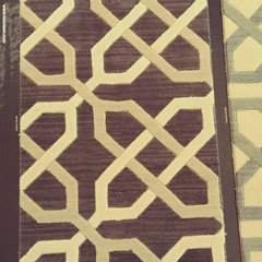
    • I have been working in my dining room over the last month. We have removed the wallpaper and painted the room BM - Clay Beige and removed the hutch portion of the buffet as I talked about back in May. Now for the carpet. I had no idea it would be so difficult to find something that we really liked at lot. However finally I have found it, but I am really looking for opinions on this carpet. It is by Nourison, Manhattan Collection - Uptown, colour is Shale - it is a dark grey with cream and beige design going through it. I want something with some POP to it. I have not been able to find a room online with this carpet so I am really working with a 2' x 1.5' piece of a sample. The size of the dining room is 12' x 15'.
    • I have ordered white linen sheers for either side of the window with a 2" rod in champagne that is at the ceiling height. The ceilings are 9' high.
    • 'Fairway Style Living' suggested that I do a light neutral (not too light for stain-hiding), maybe a grey to balance the warmer wall tone, with a slight woven pattern suggestion. This carpet is a beautiful grey with cream links (so to speak).
    • I found some artwork that is 43" x 43". It is totally textural with a second frame within it. It is much nicer in person than what it appears to be in the photo.
    • Thanks so much for any suggestions and / or opinions. So much appreciated!!


  • 8 years ago

    The new wall color looks fantastic. So much brighter and fresher. I really love the carpet and artwork. Excellent progress!

  • 8 years ago

    Thank you! I love the carpet too!

  • 8 years ago

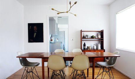
    I have a feeling that a chandelier with a more modern, angular look without any dark tones would really lift this space into something more exciting and current. I would also look for more artwork, modern and without a frame or glass or only a minimal silver metal frame. The framed art besides the window ages the room and I would remove it.

  • 8 years ago

    Hi Ingrid, the framed art beside the window is gone. That was the original back in May from when I moved in. Just above this is the new carpet and the new art work that I have now. have a look :)


  • 8 years ago

    Hi Ingrid, I should have also mentioned that for now I am painting the chandelier in a light cream. If it doesn't work I will purchase something else, but I thought I would try that first. I agree with you, I am trying to lighten the room. Did you see my new carpet (Manhattan) that I am getting and the art work?


  • PRO
    8 years ago

    Go Linda! Progress is looking great.

    Linda thanked Fairway Style Living
  • 8 years ago

    We chandelier cheap and easy! Just have an electrician come and hang. Easy update!

  • 8 years ago

    Thank you Fairway Style Living! I have been waiting for you to see what I am doing!! :)


  • 8 years ago
    Did you consider painting out the wainscotting in the same colour as your new walls but with a bit of sheen? If you want a less formal feel, remove the pair of doors.
    Really nice update! I’ve seen designers repurpose a hutch in a master bedroom or walk-in closet for storage of purses, shoes, sweaters etc.
  • 8 years ago

    I had not thought to paint the wainscotting the same colour as the new walls. However it is an interesting idea. It has just been all freshly painted now though but a thought for the future. I also never thought to take off the doors! Another great idea. I am lucky, my husband can basically do anything so that will be a piece of cake for him if we decide to go that route. I am going to mention it to him.

    I currently have the hutch for sale and I have showed how you can re-purpose it. One of them in particular is really lovely. I do have a nice big walk in closet however the clothes go right around the room except for where the door entry is. Honestly, once you gave me that idea I was thinking 'Can I do that"? but I would really lose too much space. Thank you though for the idea.

  • 8 years ago

    Hello again, thanks so much for all of your comments. I am having a very hard time making up mind between 2 carpets.

    The first carpet is: Nourison, Manhattan Collection - Uptown, colour is Shale - it is a dark grey with cream and beige design going through it. I want something with some POP to it. I have not been able to find a room online with this carpet so I am really working with a 2' x 1.5' piece of a sample. The size of the dining room is 12' x 15'. This carpet is really out there in design and pop and it is exactly what I was looking for. However I wonder is it too much?

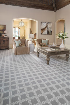
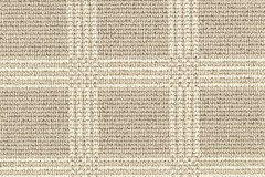
    Next is Karastan _ Woolston Plaid - colour shoreline - it is not really a plaid at all. It is boxes. It is much more subdued but I think it totally has 'pop' to it. I am showing below in a room (blue_not what I am looking at). I really like the monochromatic look. I am attaching the artwork again. I like the fact that the art work is textural squares and that the Woolston Plaid is square. HELP PLEASE. I am really having a problem. The Manhattan is much harder to bring up to Canada (no relationship with vendor) so the guy I am dealing with started showing me other carpets. Both are New Zealand Wool. Both are slightly impractical, but I would like one of them for sure. I really appreciate any views on these two carpet. Thanks! Linda

  • 8 years ago

    So you want your carpet to go with your art as in both squares and the same color?

  • 8 years ago

    Hi Danielle, Well I think it is something that pulls it together... It wasn't what I set out to do, but once i got the art I saw the relation to the Manhattan carpet and now i see it to the woolston plaid. Your thoughts?


  • 8 years ago

    It makes sense you like similar shapes and colors

  • 8 years ago

    I like the Norison> Plaid

  • 8 years ago

    Its really helps to have the opinions. thank you!


  • 8 years ago

    The plaid is certainly pretty as well. It may also give you more options for curtain colors and patterns.

  • 8 years ago
    I like the plaid. The blue makes it difficult to visualize in your room though. Here it is in beige.
    Living Room Inspiration · More Info
  • 8 years ago
    To be clear though.. are you looking at the plaid in Shoreline or River Sand?
  • 8 years ago

    Thanks for the additional picture. I am looking at Shoreline. Riversand in person has a slight bit of gold in it. The one that you sent me looks very grey when I open it. I have the sample here in Shoreline. It is much taupier. I have already ordered my curtains - white sheers with a beautiful champagne rod up at the ceiling. (Drapes are coming in 3 weeks :) Thanks!

  • 8 years ago

    You have done a wonderful job!

  • 8 years ago

    Hello again! The new carpet has been installed today - Karastan - Wooston Plaid. I have uploaded the pictures just to update. My new curtains for either side of the window are coming next week. I did not put back the buffet lamps because I am getting something new (with a drum style shade), in cream I think. All comments are very appreciated.

  • 8 years ago

    Very pretty! Do you like it?

  • 8 years ago

    Yes I do like it for sure. It was so busy before. But now I feel it is really missing something. I need to get new buffet lamps, probably a new centre piece for table. Previously the top was on the buffet on the one wall (now removed), so I have to also get something for that. I am not certain how to co-ordinate the two buffets in the same room. :) I was absolutely positive that I loved the art work with the carpet, but now that I have the carpet I wonder if I might need something with a bit more POW on the wall. I have some other art work in the house, so I am going bring it in to the dining room so that I can get an idea. I also have a mirror that was in there, but now I am thinking I don't like it either in that room. Thanks for any comments!

  • 8 years ago

    Adding curtains will help. As will a centerpiece, as you mentioned. I agree that artwork with a bit more color and movement is probably a better choice. How long is the buffet that has the artwork above it?

  • PRO
    8 years ago

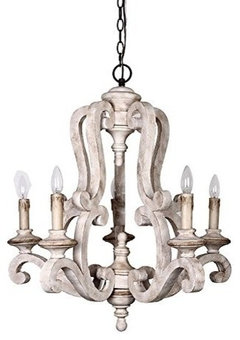
    Linda, this carpet looks gorgeous. Crisp and elegant - I think the linear nature enhances the architectural touches in the room. I think you're right on the money with a touch of drapery in the space (maybe even just sheers, hung at the height of the base of your fanlight), but wouldn't forget about a lighter chandelier option. The carved, white wood item upthread could be particularly striking in there. Nice work!

  • 8 years ago

    'Fairway' Thank you so much for your comments! They brought the sheers (white) on Thursday however they brought the wrong hardware. I had ordered in the hardware in the colour of champagne 1.5" rod and they brought silver. No real finials, the rod will go just about to the wall on each side with a very flat finial.. Plus the drapes were off by a few inches because there was a mistake when measuring so everything unfortunately went back.. I had the drapery made so that the rod would be right below the crown molding on both sides of the window. Do you think that is too high?

    What did it mean when you said "The carved, white wood item upthread could be particularly striking in there." Did you mean this item below? Thanks again.

  • 8 years ago

    'Fairway' I have one more question. I have ordered a rod that goes straight across the wall. However I have been wondering if I should have ordered two separate rods that just go on either side of the window. Could I please get your opinion on that? Because that the original rod has gone back now is the time for me to make a change if necessary. I just wasn't certain which way to go on this.


  • 8 years ago

    'KatinParadise', sorry I hadn't realized you had asked me how long the buffet was with the artwork over it. It is 54" wide. :)

  • 8 years ago

    I think with your carpet I’d go more upscale

    L

    Linda thanked Danielle Black
  • 8 years ago


    Linda thanked Danielle Black
  • 8 years ago

    I like them for sure, they are just not my style. Thank you though!!


  • 8 years ago

    What type of art do you like? More traditional like landscapes or abstract?

  • PRO
    8 years ago

    Hi, Linda--

    You mentioned that you'd previously gone with a single, long rod. I think this is the way to go here, as the normal illusion of drapery, should be that it has a functional purpose. Operationally, you may leave it open 99% of the time, but the usual function of curtains (even sheers) is that they can close over the window opening they frame. I'd recommend this approach here, too, so I think you're on the right track. However, I do think that hanging it right under your crown, as you might normally do, would be too high for this particular window. With your window plan, I'd bisect it horizontally where the fanlight meets the main, larger windowpanes, to further highlight the architecture.

    Also, do you not think hardware in a silver/nickel finish might be right in your dining room versus a champagne finish? Unless your table flatware is also golden bronze, I usually like to stick to cooler metallics in a dining space to blend with (sometimes time-honored, antique or heirloom) tableware when it's in use.

    And, you're right about the chandelier item you referenced in your post - I think it would be a great touch in here.

  • 8 years ago

    Hi Fairway Style Living,

    Thank you again for taking the time to help me! If I use the full width rod right across the window what happens is that it will have to be slightly higher than the actual shutters, otherwise I will not be able to open them (I don't open them much, but need to do for window cleaning, etc.). Part of what you see is the 2.5" frame of the shutter. Won't having it right across the shutter cut into the look of the architecture by having the darker colour go right through it?

    That is a very good point regarding the colour of the rod. I was going with the champagne so that it would go with the bookshelf that is in the room directly across (my office) from the dining room. There is a point where you can see into each of them at the same time so I thought I had to coordinate :). The hardware on the unit is champagne.

    I am meeting with the drapery person this week to pick another rod, so I can absolutely go with our suggestion and not change it. (That will make her very happy). However I would like to see what you say about the rod going directly across the white shutters and up slightly therefore it will go across the actual window part. I like the idea very much of the height of the drapes being at the base of the fanlight. I am not sure about the rod cutting through the shutters though?? Can you just confirm your thoughts on that part for me.


  • PRO
    8 years ago

    Hi, Linda--

    Sorry I'm having a hard time seeing the detail of the hardware on your office unit; from this picture it looks like it's satin nickel. If it isn't that, those handles and knobs could easily be swapped for a few dollars and a walk down the hardware aisle at the home center, and they'd then match drapery hardware in the DR, and if you ever needed to update your light in the office space, you'd have the option to coordinate, too.

    Also, since your shutters need to open for cleaning purposes, the rod must clear them. I would center it on the casing above the framed opening , but still below the glass panes in the fanlight (if there's clearance to do so), since the rod shouldn't interfere with the shutter operation - eventually that window will need a cleaning!

    If it doesn't seem there's enough vertical space to accommodate the rod above the shutter panel but below the fanlight, then I'd revert to placing it close to the crown as you'd previously thought. Cheers!

  • 8 years ago

    Hi Fairway Style Living!

    Thank you for such a quick response. I attached photos of the hardware. They probably don't seem like much but I got them from a store specific to selling cabinet hardware. I had shopped around so much but just could not find what I wanted in style and colour. I brought home (and ordered on line from US and Canada) so many different pieces. At one point I was getting confused as to what went in what box :). The hardware ended up being expensive really, for what it is. I will go with what you say with regards to not matching. My husband won't be too happy if I want to change the hardware.

    I will hold up a rod where the shutters are to see how it looks. I think it will have to be over the glass which would not be great.

    I have attached a picture of the frame at the top of the shutters so that you can see it. It is only 3/4" and the rod is 1.5". Even if I went smaller to 1 3/8" it will still be over the window. But we will check it out and just hold up a rod we have.

    I will check it all out and be back :)

  • PRO
    8 years ago

    Thanks for the extra info, Linda. Even in your most recent shots, your cabinet hardware reads as a brushed nickel to me (it could totally be my monitor, however).

    Linda thanked Fairway Style Living
  • 8 years ago

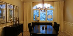
    Hello! I had my drapery installed yesterday and just wanted to update my photo. Now I am working on my artwork and what I will put on the buffets. One lamp on each? 2 on one? and other items on the other. Height of items, etc. I am also pretty much leaning towards the attached chandelier. 'Fairway' and 'Danielle Black' had a recommendation to something similar however that one is not available any longer and this is the closest I could get. I think I prefer this to a glittery chandelier. I love the glittery for someone else, just not for me. Again any comments are really appreciated. (Chairs in corners will be recovered at a later date, but will be definitely done in something creamy).


  • PRO
    8 years ago
    last modified: 8 years ago

    Hi, Linda--

    Here's the one I meant (looks like it's still available - and on sale), versus something more glittery. I don't feel that something sparkly would fit the textures you're working with here.


    Parrotuncle Antique Wooden Candle Chandelier With White Finish · More Info

    I do think that a white silk cord cover would be a great touch, though. I use them almost always in formal dining rooms - chandy chain just isn't a statement that fits in. Cheers!

  • 8 years ago

    Thank you so much! It appears that they don't ship to Canada so a rep from Houzz is checking for me! Last time I had checked about a month ago, the items was unavailable. I was a bit sad because I did love it. Thanks for your comments again.


  • 7 years ago

    Hello again, It's been a long time but I thought I would do an update re our dining room and show you the latest updates. Just a heads up the art work that I chose is definitely not everyone's style. I definitely know that. However for me I LOVE IT. I love old doors and old windows, so I was able to have this and still update the dining room. I still am not 100% finished. I need to still change my lighting and I am definitely going with suggestion from Fairway and Danielle Black. However they do not ship to Canada. I am currently in the US but flying back, cannot bring back in a car. Next time I am here possibly will drive. I also want to get a champagne framed mirror for opposite wall to art work. I welcome any comments 100%. I just added in the original photo at the end.


  • 7 years ago
    Wall color and carpet immensely improved!! Looking good!
    Linda thanked Danielle Black
Sponsored
AIS Renovations
Average rating: 4.5 out of 5 stars15 Reviews
Custom Craftsmanship & Construction Solutions in Franklin County, Ohio