

Help! Gallery Wall input
8 years ago
last modified: 8 years ago
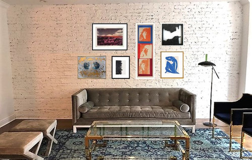
Yes, go with this gallery wall!
I don't think this works
Featured Answer
Sort by:Oldest
Comments (17)
Related Professionals
Eugene Interior Designers & Decorators · Auburn Furniture & Accessories · Binghamton Furniture & Accessories · Beckley Interior Designers & Decorators · Watertown Interior Designers & Decorators · Harrisburg Interior Designers & Decorators · Magog Architects & Building Designers · Willmar Kitchen & Bathroom Designers · Mansfield Kitchen & Bathroom Designers · Eugene Kitchen & Bathroom Designers · Amherstburg Kitchen & Bathroom Designers · Rocky Mount Design-Build Firms · St. Louis Flooring Contractors · Chula Vista Flooring Contractors · Toronto Flooring Contractors 8 years agolast modified: 8 years ago
 8 years ago
- 8 years ago
 8 years ago
- 8 years ago
- 8 years ago
- 8 years ago
- 8 years ago
 8 years ago
 8 years ago
- 8 years ago



Related Stories
COLOR9 Great Colors for Your Gallery Wall
Boost the power of your art collection with paint that brings out its color and detail
Full Story
ARTHow to Display Lots of Photos Without a Perfect Gallery Wall
You can skip the matching frames and careful arrangement and hang your photos using one or more of these fun ideas
Full Story
ARTAn Insider’s Guide to Creating the Perfect Gallery Wall
Bring your room to life with these expert tips for grouping artwork and photographs
Full Story
ARTA Gallery Wall for Every Personality
Eclectic, ambitious, inspired, dreamer? Which art-wall type are you?
Full Story
BUDGET DECORATINGBudget Decorator: A Most Affordable Gallery Wall
Need to fill a wall on the cheap? See how to make use of something pretty cool you may already have
Full Story
REMODELING GUIDES11 Reasons to Love Wall-to-Wall Carpeting Again
Is it time to kick the hard stuff? Your feet, wallet and downstairs neighbors may be nodding
Full Story
LANDSCAPE DESIGNGarden Walls: Dry-Stacked Stone Walls Keep Their Place in the Garden
See an ancient building technique that’s held stone walls together without mortar for centuries
Full Story
WALL TREATMENTSA Dozen Creative Ideas for Decorating Blank Walls
When you want to fill a lot of wall space in one fell swoop, these ideas will help you do it with aplomb
Full Story
GREAT HOME PROJECTSHow to Design a Family Photo Wall
New project for a new year: Display your favorite images of loved ones for the most personal gallery wall of all
Full Story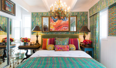
FEEL-GOOD HOME50 Out-of-the-Box Ideas for Bedroom Accent Walls
Neon signs, gallery walls, wood and dramatic paint add personality and budget-friendly flair to these bedrooms
Full Story

Gwen