Software
Houzz Logo Print
dmpsd

Feedback on tile choices for master bath please

8 years ago

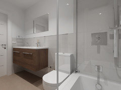
We are redoing the master bath in our transitional style home. The bathroom is ~15.5 x 12 with two vanities, a toilet room, a corner shower, and a freestanding tub.

I am looking for a calm, clutter free bathroom, but I worry my choices might be too plain. I would appreciate your feedback.

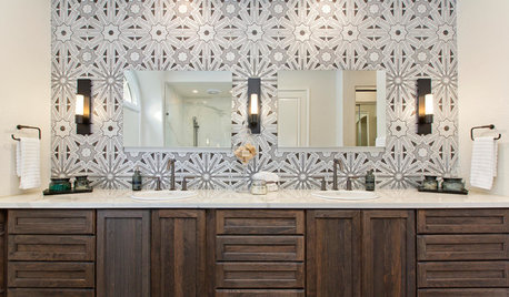
Wall tile is porcelanosa brunei blanco. On my computer screen, it looks a little dingy. In real life, the background is a pretty bright white. Cabinets are a stained walnut (again, in real life, you can see movement in the cabinets, though not in this picture), floor tile is pretty basic beige. Shower floor will be the floor tile cut into little pieces. I haven't settled on the countertop, but thinking a white-ish quartz.


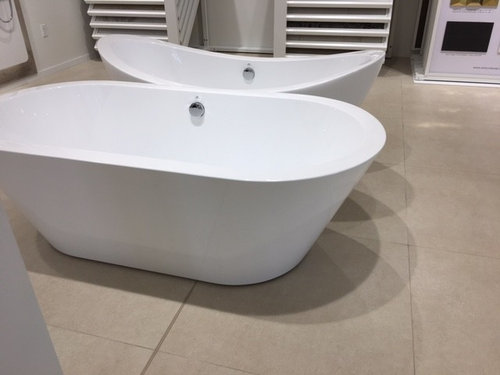
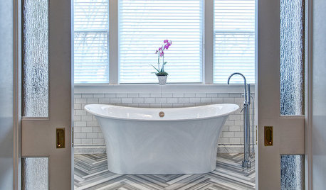
The front picture is the tub I am leaning towards.

What do you think? Too boring? Thanks!

Comments (27)

  • 8 years ago
    Love that tub! I tend to pick boring colors too, I know your pain of thinking it might be TOO plain. Do you have any inspiration picture you’re working off or just winging it?
    dmpsd thanked K R
  • 8 years ago

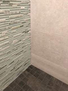
    I like calm colors in the bathroom also, but I wanted some color/interest somewhere, I just wasn't sure where. There was a soft mixed linear mosaic I really liked, and wanted to use it somehow. I don't like "strips" of mosaic in showers or as a backsplash, so I kept thinking about it and finally we decided to install a full wall of the mosaic on the back wall of the shower which is prominently visible when walking into the bathroom. There is color, but it's soft and subtle, so it didn't mess with the goal of creating a calm color palette. All of the rest of the materials are neutral/calm, such as floor, field tile in shower, counter tops, paint, which provide a nice backdrop for the feature mosaic. We also repeated the mosaic in the niches (on field tile walls), but they are only visible when you are in the shower. It was expensive though bc mosaics just are. This particular mosaic is Emser Lucente Lazzaro, which is a very soft green mixed with marble.

    All your foundation choices are neutral and will provide a nice backdrop for anything more colorful you decide to introduce. It could be a whole wall like we did, or the tile you place in a niche, accessories, a pretty pot with an orchid, a stained glass window, or the framing for mirrors. Since you chose stained wood for the vanity, you are already introducing a warm element which is nice with the cool tones of the other materials. If you have a favorite color, you can pick a very soft subtle shade of it to introduce somewhere.

    dmpsd thanked AJCN
  • PRO
    8 years ago
    I love the mood board you have created... nothing wrong with a neutral background and walnut being the pop. The fact that the cabinets have movement in real Life is amazing.

    You can bring some warmth by selecting brass fixtures and pulls if not done already...

    Power on!!!
    dmpsd thanked DesignbyRuchi
  • 8 years ago

    You mentioned clutter free, so you might want to post a layout so that people on here can help you with clutter-free storage strategies.

    Our remodeled master bathroom is 15' x 10' with WC room, tub, 4' x 6' shower, 8' double vanity, and 4' storage cabinet, so it is similar in size to yours. We changed it from separate vanities to one double vanity because for us that was the way to get a larger shower and fit in the large storage cabinet with lots of lingerie drawers and built-in laundry pullout. If your bathroom is 15 x 12, you should be able to create your clutter free goal because you will have plenty of room for storage.

  • 8 years ago

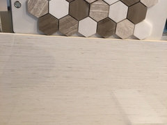
    Originally our decorator had recommended using this mosaic on the floor/shower niches to add a little pop. I rejected it on the floor because it is marble/limestone, and I just don't want to worry about things like my shower floor getting ruined at this point in my life. We were still considering using it as an accent somewhere (maybe shower niches and backsplash), but I am not sure it really works with the wall tile we are leaning towards. But I do love the mosaic. I looked for a long time to find something in porcelain that had the same pop and was not successful.


  • 8 years ago

    I like all your other choices, but not that mosaic. It doesn't say "calm" to me.

  • 8 years ago

    We ended up using a 3" x 3" charcoal gray porcelain tile with matching grout on our shower floor. It's the only dark tile in the room. I prefer the shower floor to be all one color so it is not a feature, it just fades into the background. But, that's just a personal preference. I like the darker warm brown color in your mosaic sample. Maybe you could find porcelain tile in that tone without the white and lighter colors and use that on the shower floor.

    dmpsd thanked AJCN
  • 8 years ago

    It's not plain, it's "serene".


    dmpsd thanked gracie01 zone5 SW of Chicago
  • 8 years ago


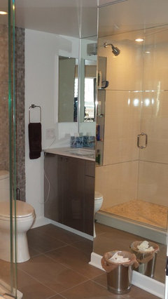
    990 Lake Shore Drive · More Info
    I know this photo is a little hard to decipher, but what do you think of the thin metal strips they have in this tile? (Shower tile is the same as the one I am considering.)

  • 8 years ago

    @ssdarb - Do you think a dark shower floor would be better than a light shower floor? I have never had a dark shower floor.

    Also, can you post any photos of hour bathroom?

    I will try and post a floorplan later tonight when I am home.

  • 8 years ago

    I'm not a designer, but we just winged it and liked the dark floor. I think a monochromatic floor or any tone would have appealed to me. I was not attracted to any floor tiles that were busy. That's why we settled on the charcoal grey, all one color.

  • 8 years ago

    dmpsd thanked AJCN
  • 8 years ago

    The field tile is a porcelain concrete-ish color ( Emser Uptown "Sugar Hill"), the wall is that greenish Emser mosaic and the floor is porcelain charcoal (gotta look that up). But I think a lighter color would look nice also, especially since you are choosing the stained cabinet. I just didn't care for a multi-colored floor tile. I think I could have chosen a light color and been totally happy with it as long as it was uniform/monochromatic.

  • 8 years ago

    Looking at that photo, a medium-to-light shower floor in the brown/beige color family would look really pretty, and let the cabinet stain be the deep, dark, special tone in the room. I wouldn't put pattern on the shower floor though. It's a personal preference, but a patterned shower floor tile really bugs me for some reason. The shower should be a steamy, calm place, and when I look down, I don't want to look at a busy pattern on the floor.

  • 8 years ago

    I don't prefer those shiny strips between the field tiles because it isn't calm and serene which is what you want. The shiny strips take the eye away from the beautiful field tile. If you really like your field tile, you want your eye to settle on that when you're in the shower. I know people do contrasting grout or sometimes tiny strips of mosaic between field tiles, but I prefer color-matched grout for a more seamless look. Again, it's a personal preference, but "calm and serene" would get broken up by those strips.

  • 8 years ago

    My DS recently installed copper-colored hardware on her cabinetry that looks really beautiful because the rest of her room is in light warm tones. Instead of chrome/silver finishes you might want to do something warm/brown and for the metal finishes. Her hardware was from Jeffery Alexander, and it looked like a copper tone, but I don't remember the exact finish name.

  • 8 years ago

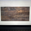
    @blondelle - Do you like this floor better? Originally I loved it because it reminded me of sand, but then I got scared that I would get tired of the lines after a while. (Although the tile looks wavy, it really is flat.)

  • 8 years ago
    That's much more stylish and modern. Looks much better. If it's a small bath you can use the same tile on walls and floor. Love the striated tile by Emser call Motion in the Cue color. Also look at Crossville Moonstruck in one of the lighter colors.
  • 8 years ago

    Off-topic and please forgive....but a designer - not you OP! - posting to the world a photo of a Chicago Lake Shore Drive (ergo, super-pricey) residence with a cruddy filled wastebasket front and center?? Twice - thanks to the mirror. What were they thinking?? Sure not a good advertisement for their business.

    To the topic at hand, I think the swirling sand effect is very different and pleasing. And the thing about a neutral or serene effect in a bath is how easy to change the look with colored linens, a few accents, etc.

  • 8 years ago
    I love the wavy tile! I’ve seen that in a lot of model homes and it is so pretty!
  • PRO
    8 years ago

    The wavy tile looks best, the first mood board although it is "calmy" personally is too boring. Adding brass hardware to the cabinets will give you the POP you need.

  • 8 years ago

    You're basically copying this photo of Brunei Blanco from Porcelanosa's website.

  • 8 years ago

    I like the wavy pattern in the tile. What is it?

  • 8 years ago

    Does anyone know the source for the tile?

  • 8 years ago
    @ssarb. I believe the wavy tile is by Emil and is called Solar White. Here is the number. PG220PRO986ZOR
    Interestingly, I like the tile with the wavy lines in the large 24 x 48" size, but I don't like it in the 12 x 24" size. Can't really figure out why.
  • 8 years ago

    @mayflowers - Thanks for posting that photo. The photo looks a little boring to me. I am trying to envision it with a framed mirror over the vanity, a bit of color on the wall, and a nice colorful painting above the tub.