

Help with white kitchen selections
8 years ago
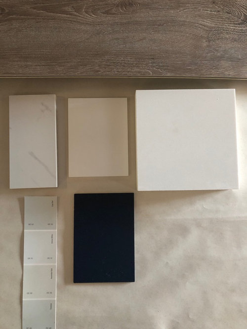
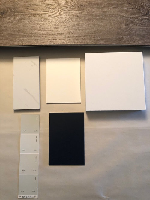
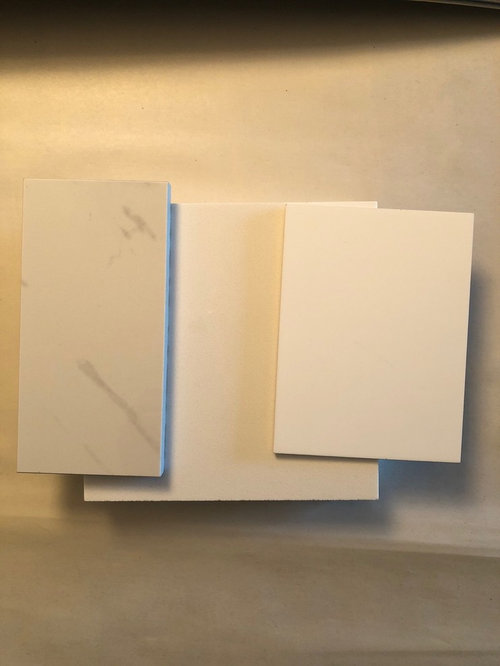
Featured Answer
Sort by:Oldest
Comments (13)
 8 years ago
Related Professionals
Fort Smith Kitchen & Bathroom Designers · Palm Bay Kitchen & Bathroom Designers · Athens Kitchen & Bathroom Designers · Dayton Kitchen & Bathroom Designers · Florence Kitchen Remodelers · Baltimore Kitchen Remodelers · Abilene Kitchen Remodelers · Davenport Kitchen Remodelers · Ottawa Kitchen Remodelers · Crestview Custom Countertops · Sebring Custom Countertops · Charlotte Custom Countertops · Athens Custom Countertops · New York City Custom Countertops · Lake Havasu City Custom Countertops- 8 years ago
- 8 years ago
- 8 years ago
- 8 years ago
- 8 years ago
- 8 years ago
- 8 years ago
 8 years ago
- 8 years ago
- PRO8 years agolast modified: 8 years ago
- 8 years ago

Related Stories
KITCHEN DESIGNHow to Keep Your White Kitchen White
Sure, white kitchens are beautiful — when they’re sparkling clean. Here’s how to keep them that way
Full Story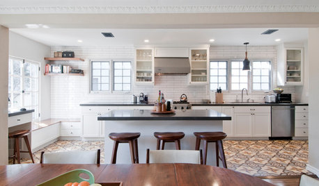
KITCHEN OF THE WEEKKitchen of the Week: Graphic Floor Tiles Accent a White Kitchen
Walls come down to open up the room and create better traffic flow
Full Story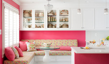
KITCHEN OF THE WEEKKitchen of the Week: A Punch of Pink for a White Kitchen
A homeowner shows her love of pink in bold walls that impart a cheerful vibe
Full Story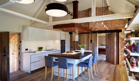
KITCHEN DESIGNKitchen of the Week: Crisp White Kitchen in a Rustic Barn Setting
This beautiful barn conversion walks the line between rustic style and contemporary edge
Full Story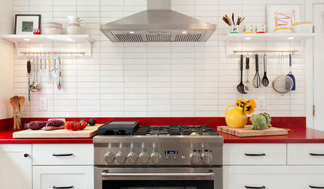
KITCHEN DESIGNKitchen of the Week: Red Energizes a Functional White Kitchen
A client’s roots in the Netherlands and desire for red countertops drive a unique design
Full Story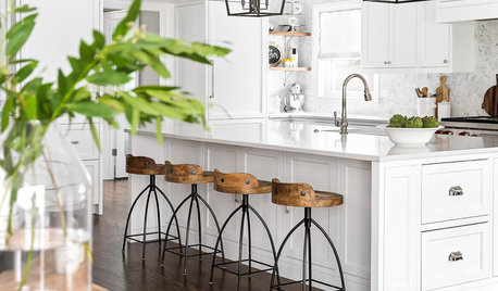
KITCHEN DESIGNKitchen of the Week: White Cabinets With a Big Island, Please!
Designers help a growing Chicago-area family put together a simple, clean and high-functioning space
Full Story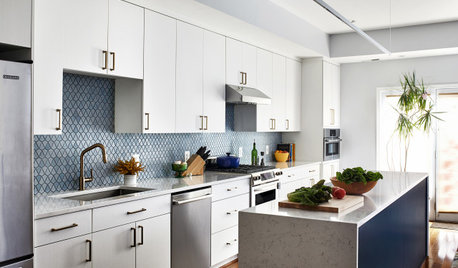
KITCHEN DESIGNKitchen of the Week: A Galley With White-and-Blue Style
A designer helps a D.C. couple create a bigger and brighter family kitchen with a new island and a fresh palette
Full Story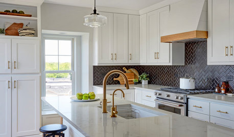
KITCHEN DESIGNWhite Kitchen Cabinets and an Open Layout
A designer helps a couple create an updated condo kitchen that takes advantage of the unit’s sunny top-floor location
Full Story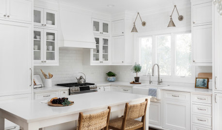
BEFORE AND AFTERSKitchen of the Week: Classic White Space With Layered Style
A designer helps an Illinois couple create a bright, fresh kitchen with subtle texture, custom details and a new layout
Full Story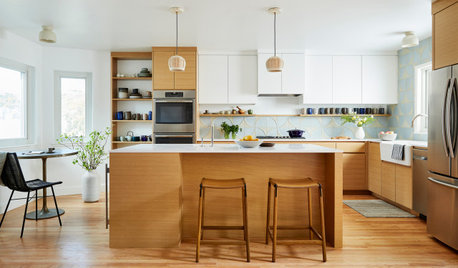
KITCHEN MAKEOVERSKitchen of the Week: A Modern Mix of White, Wood and Blue
A designer helps a San Francisco couple create a calm and clean-lined space with a touch of textured geometric pattern
Full StorySponsored

Columbus Design-Build, Kitchen & Bath Remodeling, Historic Renovations
User