Software
Houzz Logo Print

Comments (72)

  • 8 years ago

    Isn’t eggshell and satin pretty much the same?

  • 8 years ago

    eggshell has the texture of an egg, satin has a shiny sheen.

  • 8 years ago

    Kilim Beige is my favorite neutral. It works with everything and is so much warmer than gray.

  • PRO
    8 years ago
    If your walls don’t have imperfections use eggshell. If they do use matte finish. Use a good quality paint and they are very washable. Shine on walls can look cheap and every defect shows up. Kilem is good beige, but trend is toward lighter, brighter colors. Need to know what furniture is going into this space before you can get right color?
  • 8 years ago
    last modified: 8 years ago

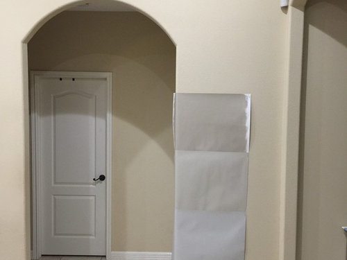
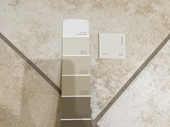
    I got a sample of Kilim Beige and out of all of the ones I’ve tried so far it’s the one that matches the floors the most but still not happy with the color. How would Softer Tan and Manchester Tan compare to Kilim Beige? Urban Putty seems like it can work with the floors, in the pic of the swatches it looks different than seeing it in person. Has more of a taupe tone to it that the pic does not show. Local SW store only has samples in satin from what they told me.

    Right now the furniture is basically brown but we will soon be shopping for new furniture and willing to change it up so any recommendations would be great.

  • 8 years ago

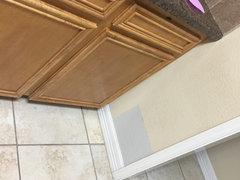
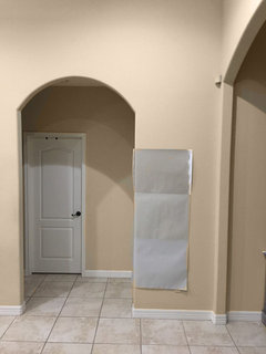
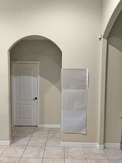
    Here is a swatch I did of Accessible Beige in my kitchen. I really like the color but just doesn’t seem like it works with the colors I already have in the house. Going to BM store today to look at more samples.

  • 8 years ago

  • 8 years ago
    I like the middle one best. Also consider Shiitake or Realist Beige.
  • PRO
    8 years ago
    Mike. Yes almost all “sample” products are satin finish. With your flooring you would be best going lighter. More to the green so before you go buy a bunch more samples let me give you some alternative suggestions. Bbl
    Mike Garcia thanked Flo Mangan
  • 8 years ago

    I’d love to use something like worldly gray but the lightest gray colors I’ve tried look too gray for the floors. What type of sample boards do you recommend using?

  • PRO
    8 years ago

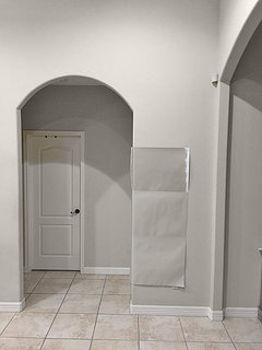
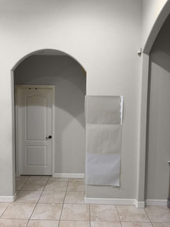
    Here is the top color

    here is color that is in the middle

  • PRO
    8 years ago

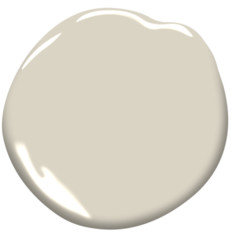
    Kilim beige by SW

  • 8 years ago

    After seeing those pics I do not like Kilim Beige. Realist Beige looks nice. How would Edgecomb Gray work with the color of the floors? I don’t have much natural light coming in but my lighting is pretty well lit when they are all on.

  • 8 years ago
    Realist beige looks good with the floors.
  • 8 years ago

    Realist beige looks pretty good. I think that's on the right track.

  • PRO
    8 years ago
    last modified: 8 years ago

    I like edgecomb gray, but it would look a little greenish in spots with luck of light.

    Edgecomb Gray

    When you try sample, try dark and light spots in room. Look at it in day time and night time.

  • 8 years ago

    I like realist beige in the pictures. Still best way to tell is boards and move them around in your light. There is no substitute for seeing them in person at different times of the day.

  • PRO
    8 years ago

    Try some of them in reality, they look different on computer screens and on picture.

    Mike Garcia thanked Celery. Visualization, Rendering images
  • 8 years ago

    Realist Beige looks great in the pic. I’ll get a sample of it and see how it looks around the house. Is it possible to lighten it if it looks too dark on the walls and if so will it totally change the color?

  • PRO
    8 years ago
    last modified: 8 years ago

    You can go 30% or 50% or so lighter.

  • PRO
    8 years ago

    I also vote for an off white which will update your look nicely :)

  • PRO
    8 years ago

    So sorry Mike I haven't been on line. We have had a major power outage in our area and I haven't had enough battery power to post or power to my desktop. I have a photoshoot here at 2, but after that I will take a look at other options. One that I wanted to scan with my Color Muse is SW Natural Choice. Might want to look at that. It is off white with beige tone. Grays are out and the new "gray" is off whites. So if you want more current look, go toward lighter, whiter look and that would work with your tile as well.

    Mike Garcia thanked Flo Mangan
  • 8 years ago

    Flo as usual, you are ultra helpful.

  • 8 years ago

    2nd chip is Realist Beige


  • 8 years ago

    2nd chip is Softer Tan and chip next to it is BM Manchester Tan


  • 8 years ago

    What about the top chip?

  • PRO
    8 years ago

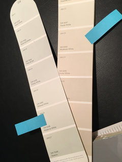
    Mike - I have taken a look at the color above "Moderate White" 6240 and also another to consider is "Moderne White" SW 6168. Moderate White has an LRV of 74 which puts it towards the lighter end of the lightness scale (0- darkest - 100 lightest). It is from the color family of yellow and a Hue angle of 89. That is almost smack dab in the center of the Yellow hue family and on the warm side. Moderne White has an LRV of 74 as well, but it has a Hue angle of 111, so that takes it toward the warm side of the Green/Yellow and gives it a bit more green overtone. That would provide a change from all beiges to a slightly different look for your space. I notice that your grout appears very dark taupe. Is that correct? If you are going to try for changing from brown furniture, I would test Moderne White to move slightly away from the Beige, but it would still be warm. Of course, you have to test in your light conditions.

    Mike Garcia thanked Flo Mangan
  • PRO
    8 years ago


    paint colors · More Info
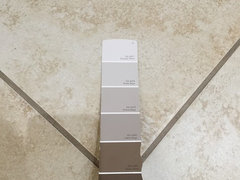
    Here are the two strips from my SW fan deck.

  • PRO
    8 years ago

    I haven't analyzed the BM Manchester Tan, but it has an LRV of 64.41 which means it is significantly darker. It is a pretty color but not sure you want that much color. I know it doesn't look like it on the paint chip but with that delta in LRV it would be noticeable. I will do a Color Muse scan tomorrow. Can't get to my BM fan deck until then. Keep thinking because I know this is a difficult decision and requires careful consideration without knowing the other colors you will have in the space. Large blocks of color such as trim color, rugs, sofas/sectionals, ceiling colors, etc., all influence how the eye sees the ultimate color along with natural and artificial light. The reason this is difficult is because it is complicated! But we can get there.

    Mike Garcia thanked Flo Mangan
  • PRO
    8 years ago

    I just did the analysis on BM Manchester Tan. It has the LRV of 64.41. So not as light as other choices, as I recalled. It has a hue angle of 88.4 which puts it in the center of the yellow hue family and on the warm side. It is a warm, tone with a good bit of Chroma at 10.7 I fear it might look muddy in your space depending on the other features I mentioned earlier. I would go lighter.

    Mike Garcia thanked Flo Mangan
  • 8 years ago

    I’ll definitely look at the colors you mentioned. How about getting Manchester Tan lightened? Would that help or just a waste of time?

  • PRO
    8 years ago
    Technically you cannot count on lightening colors because the formula actually changes. Many try this and think it is ok but it is not best method. I think you may want to try other choices first.
    Mike Garcia thanked Flo Mangan
  • PRO
    8 years ago
    Any more samples?
  • 8 years ago

    With tile and grout like that,try BM Seapearl.

  • 8 years ago

    Not at the moment. Had to take a little break from samples. Was getting a little overwhelmed with all the colors. I’ll be back at the paint store tomorrow for more samples though. This sure isn’t as easy as I thought it would.

  • 8 years ago

    @Mike Garcia Yeah,take a break,including a break from overthinking. Also, I highly recommend https://shop.samplize.com/

  • 7 years ago
    Well I’m back at it again. Haven’t really been back to the paint store but planning on it tomorrow. I found a paint chip that I had laying around that looks pretty good. It’s BM Natural Linen. Anyone have any experience with it? My wife thinks that a really light greige will go well enough with the floors but I just can’t visualize it considering all the samples I’ve tried. So back to the drawing board. We do plan on buying new furniture soon as well.
  • 7 years ago
    Guess I might be the first to try BM Natural Linen. We will be visiting a couple of paint stores today to look at other colors. I need to pick something soon. I plan to start painting in a couple of weeks.
  • PRO
    7 years ago

    Hi Mike - I just looked up BM Natural Linen for you and it is pretty light absorbing at an LRV of 60. It has a lot of chroma at 11. If you want a nice light beige color, try SW 7011-Natural Choice. It has an LRV of 73, so a lot more reflective than Natural Linen; it has a chroma of 1.0 which means it does not have a lot of intensity; and a Hue Family of Yellow on the cool segment at 97 degrees on the Color Strategist Color Wheel. You can get a sample from samplize.com that hollybar mentioned. That saves buying paint samples, doing sample boards, and ultimately disposing of the paint samples left overs, so really good to get excellent idea of true color.

  • 7 years ago

    Your floor tile looks to be a pink beige. That’s why the yellow colors look wrong along side it. The Realist Beige seems a match, but do you want to live in a pink beige cloud? That will not match your orange wood kitchen cabinets either.

    Solution: listen to Flo the Pro and go with Moderne White, which is more of a neutral white than a beige/ grey with strong undertones. But check it with your existing white trim and kitchen - it may not work.

  • 7 years ago

    Thanks. I will take a look at these colors as well. I really like light grays and greiges but I just can't seem to find one that will blend in with the floors. The pics of the floor look a little different in person compared to what they look like on the screen.

  • 7 years ago
    Wife and I went to the local paint stores and she only grabbed a few different paint chips while I grabbed a lot of different ones including all that are mentioned here. After going through all of them and trying to match something with our floors the three that seem to look the best in our opinion are SW Wool Skein, SW Urban Putty and BM Natural Linen.

    I have samples already for the SW colors from months ago when we were trying to pick a color so plan on grabbing a sample of the BM color. It’s actually looks pretty close to Urban Putty though on the chip. I wish I could get better pics of the colors on the wall and color of the flooring because the pics posted look different from seeing it in person.
  • PRO
    7 years ago

    I just looked up the notations for each of the colors you posted. Mike! These are all so similar and so 90s! Sorry, don't mean to be mean. Just struck me as funny. They are all in the same Hue Family - Yellow. They all have LRVs of 56-63 so they absorb a lot of light over 50%; and they have a lot of Chroma which means they move toward deeper tones. So if you want a lighter look, none of these will achieve that goal. Do you want a lighter color? These are colors I used in the 90s. I realize the tile is an issue, but if you go much lighter, the room will be much lighter and brighter. So, if you want lighter, we need a whole different set of colors.

  • 7 years ago
    Well I definitely can’t have a color of the 90’s. Haha. I’m open to more suggestions. My wife thought that the off white colors were too white. I myself wouldn’t mind getting a sample of one and trying it out and comparing it to the 90’s colors. All the nice homes I’ve been in locally all have some sort of color on the walls if that makes sense. I’ve never seen a new home locally with off white walls so maybe that is what is steering me away. I guess every time I’ve seen a house I like the wall colors are usually some sort of a gray or greige. My house will become a rental home within the next 2 years so want a good all around color that appeals to many people but most importantly my wife and myself.
  • 7 years ago
    Flo, I laid the Moderne White chip down on my floors and with my lighting it looked really gray. Kind of like a bright light gray. Is that what it’s suppose to look like with my flooring? Tried snapping pics of it but it just wouldn’t appear as in seeing it in person.
  • PRO
    7 years ago
    Try SW Natural Choice. I suspect your lighting is a big part of your problem. Also, you will have rugs and furnishings that will blend and help to bring a cohesive look to your place. I recently recommended SW Natural Choice to a person who was updating a condo to rent. They used this color to great success. The grays and greiges you may have seen in model homes was a trend but has run its course. So up to you but the new trend is to light walls.
  • 7 years ago
    Thanks. I’ll give it a try later today. By the end of this I’m going to end up with around 100 different color chips. Haha
  • PRO
    7 years ago

    I suggest you get a sample of that and perhaps SW Accessible Beige from samplize.com In the long run, it is a less expensive way and the samples are really good. Cheaper than buying sample cans, foam boards, putting 2 coats on the sample boards, and then disposing of the excess paint in a environmentally safe manner. Check that out.

  • 7 years ago
    I picked up a paint chip of SW Natural Choice yesterday and although my wife didn’t care for it she’s ok with getting a sample of it to try out. In certain parts of the house it almost looked exactly like the color of the trim. I already have a sample of SW Accessible Beige and tried it on a sample board but it looked too gray. There is a pic posted in the above post of when I tried it a few months back. Was really hoping that it would have worked.