Software
Houzz Logo Print
katie_nealbasura

Need GROUT advice ASAP

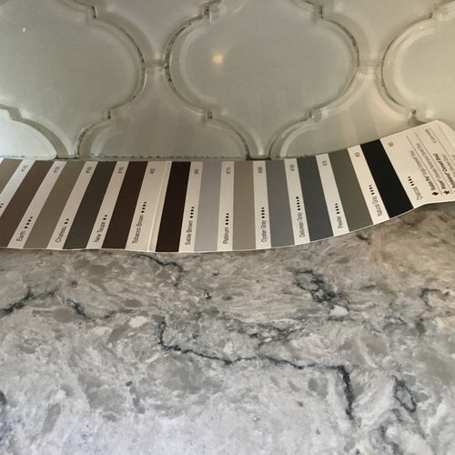
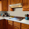
My glass backsplash was installed today. My decorator went home and I can’t contact her. I don’t know if I should have white, off-white or gray grout. The countertops look like blue cheese, cabinets are going to be dark NAVY blue and white uppers. The spacing is close, so maybe it doesn’t matter?
Please help, they need an answer in the morning.
Thank you.

Comments (15)

  • 8 years ago

    I like #2 from the left.

  • 8 years ago
    #2
  • 8 years ago
    last modified: 8 years ago

    Katie, at this point you don't want a grout color that creates any more pattern. You already have a lot of pattern/movement in the counters. On my screen your backsplash looks green-ish in comparison to the counter...? Could just be the lighting...see what the pros here suggest.

  • PRO
    8 years ago

    Hi Katie! Great question. Taking in the style, materials and what you are looking to achieve, I would highly recommend a white. Going for a brighter white vs off white or gray will really allow the beautiful pattern to pop and stand out nicely with the countertops and the navy and white cabinets. Would love to see the finished pic! :)

  • 8 years ago
    There is a clear grout available at Lowe’s that works with glass tile. It picks up the color(s) of the glass and doesn’t distract. Sorry, I don’t remember the name.
  • 8 years ago

    I would go with the lightest grout on that sample swatch. I think #2 will turn out looking darker than the tile (although it looks like a match), and then the grout is what will stand out, not the tile. What is your pretty countertop?

  • 8 years ago

    No contrast color. But why does the backsplash look like it completely doesn’t go with countertop? Hoping it’s just my monitor.

  • 8 years ago

    I’m leaning towards the white too. Thank you all for such quick responses. Countertop is Silestone Pietra. The backsplash looks more blue/gray when it’s up against the navy blue cabinet (to be painted). Also the lighting is wonky in my kitchen.

  • 8 years ago
    last modified: 8 years ago

    I love that Silestone Pietra. I think you should go very subtle for the grout. There is a model home here with that counter and dark blue-ish grey cabinets. The tile is not glass but similarily is a bit busy due to shape (a polished hex marble look tile); the white grout keeps them from being too visually busy.

  • 8 years ago
    last modified: 8 years ago

    Be subtle with the grout. If the grout has too much contrast with the tile, it will show every tiny flaw in the installation (misalignment of tiles, variations in grout width, etc.). If you want contrast, your installer has to be a real artist.

    The larger question, though, is: Why wasn't this decided weeks ago?

    The secondary question is: Why are you relying on the opinion of strangers on the internet--none of whom have a calibrated monitor--to assess the color choices? (ignoring also that your photo has no calibration)

  • PRO
    8 years ago
    I would try Platium. But very hard to judge on phone type photos. With the action in your countertop i would select a color close to backsplash tones. White is first color the eye sees so white is risky. If possible, test a couple and let dry because these look different when dry. Have tiler do a couple sample boards. They can’t put grout on right away so you have some time.
  • 8 years ago
    last modified: 8 years ago

    maybe the soft white or the palest of grays.

    what color is the glass tile? did you get white? we always caution people about white glass tile because once on the wall it takes on a greenish tone. just like yours. Does it look like that in person or is it just the photo?

    Honestly, the way it looks in the picture, it does not go w/the countertop at all.

  • 8 years ago
    last modified: 8 years ago

    Yes the much bigger question is why you the client was left with this decision at the last minute. Your decorator / designer is NOT doing her job. Need an answer by this morning? Tell them NO grout at all.

    Want to give them something they CAN do this morning? Got extra tile? Have them tile and make up a proper sample board for you. Spaced just like the splash. On hardiboard or similar if there is some extra around. 12" x 12" or 18" preferably. And exactly the same material and color like they did on your splash. (No different thinset materials or white mastic or something). Then after it dries, you will have a clean sample board to test several grouts so later you can arrange to SEE what it will look like.

    You could also tell them to contact your decorator this morning to ask what grout she specified, (if any) that was discussed and approved by you for the look you wanted. If she doesn't have an answer for them, you'll be all set with making a sample board to test grouts so you will have an answer later. For another day. NOT this morning.

    Did she actually discuss the grout color with you? And how different grout colors will have different effects? Don't feel rushed by someone else's schedule. This is not ready.

    We are all seeing these photos on various screens and not in person. The countertop to me does appear to be have a prominently grey with a pinky undertone while the splash appears more of a taupe green yellow undertone. And the cabinets are appearing more cream than white with soft grey cream walls. And yes I agree that possibly these tiles may not be the best solution for your countertop and cabinets. But it's hard to tell. Do you have undercounter lighting? What type and color temperature? LED? Cool white or warm white? Halogen? Fluorescent? Room lighting different than undercounter lighting? Lighting changes colors. (although these pics look like natural daylight, artificial lighting needs to be considered).

    The right grout could blend the backsplash glass tiles and contertop colors together. The lightness or darkness of grout for little to more contrast can be your choice of subtle or strong, but those undertones are important. You really need someone there in person with an eye for colors. I would not think a stark white or strong contrasts would work at all because it would only highlight the difference in the existing colors instead of blending the two and fixing the perceived problem. A pale color with a correcting neutral undertone.

    Did you work with your designer on colors with separate loose backsplash tiles with your countertop, cabinets and wall paint already in place? Or something else? Was the tile's green cast intentional? Is this open concept and you're pulling different colors together from another area?

    Did the installers use white or grey thinset under that glass tile? If grey, it will darken and change the actual finished colors. And yes if they are 'white glass', it will read as a greenish cast, so you might have several changes to your loose sample.

    Here is where that sample board would come into play to show different finished tile and grouts selections so you're expectations are the same. I've had several done myself especially in areas that have multiple colors and undertones going on. I've had up to four grouts per sample and I would not have chosen the best looking without it.

    Don't let the tile guys rush you and 'try' something and see if you like it. Living with something that is 'just ok' or bad, is not what you want. (and scraping out the wrong grout is a waste of time and labor and they can also scratch your glass tiles doing that.)

    Your designer, should have been helping you with the finalized colors (including the right color of thinset and grout), so you know what to expect and you have agreed with everything. In Advance. There should be no last minute decisions. And especially not on YOUR shoulders like this. Actually a full service designer would be coordinating this directly and you would NOT be stuck in the middle. Things like this really drive me crazy. I hate feeling left 'high and dry' and incomplete by "professionals" who should know better.

    Please wait and do it right. Take your time, which I know is hard even on a tight schedule. And especially if you're on a tight budget. It's very wasteful and frustrating to have to redo anything. Also if that even means that this is not the right backsplash tile, and have to reselect and it has to be torn out. Think long term. You have some classic materials there and it should be lovely and joyful every time you see it.

  • 8 years ago
    I called off the tile guy and was able to talk to my decorator. She and I originally discussed grout colors on our second meeting but decided to wait. I found the tile at a better price and good install price. I jumped the gun and had it installed without talking to her. This morning she advised we do the white grout which has some gray undertones. This with the dark blue cabinets with help the gray tiles pick up more blue instead of the green. The tile is actually called mist, it’s gray and looks like fog. Funny that it picked up so much green. Thanks everyone for such great advice.