Software
Houzz Logo Print
piefairy

Please help! Kitchen backsplash conundrum, take 2

8 years ago
last modified: 8 years ago
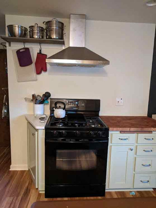
The backsplash is the last piece of our DIY kitchen redo, and we're indecisive. Would love to hear some thoughts. Warning, janky photoshoppery -- and far too many words, pictures, and overthinking -- lie ahead...

First, I suppose I should set the scene? The house is a 1976 PNWonderland rambler, on a .3 acre urban[ish] almost-homestead. We the residents are a young and growing (read: two under age 4) family with a casual, function-above-all-else-but-loving-fun-and-thoughtful-details tendency toward our home who expect to be here for four more years, and then will sell and move far, far away. The kitchen is in the front of the south-facing house, heavily shaded by trees and porch overhang.


(1)

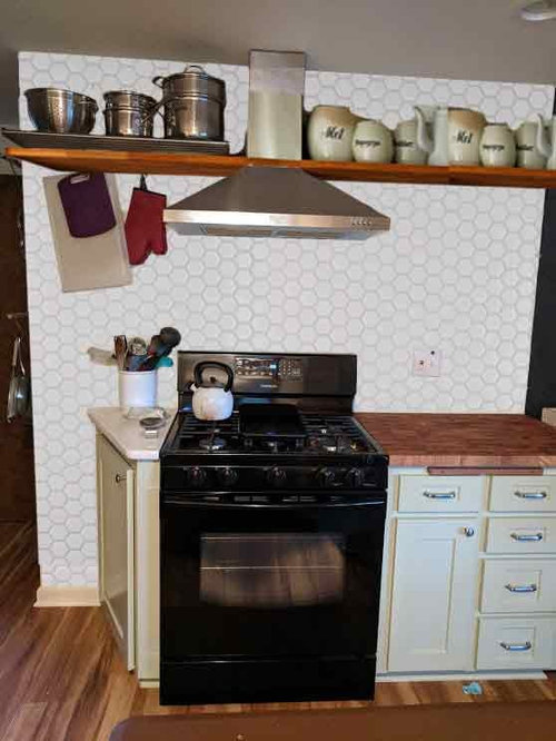
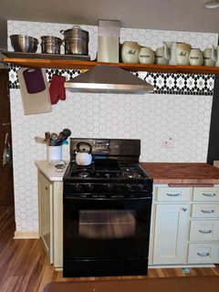
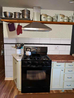
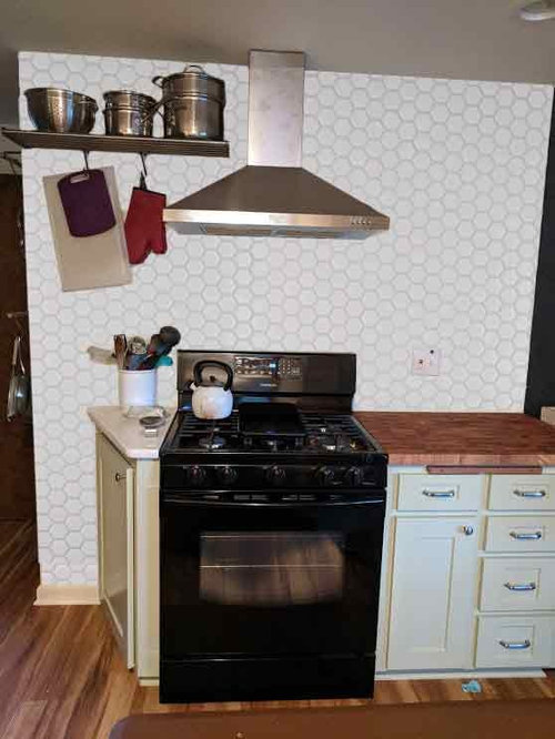
Here is our workspace as it currently is. The other part of the kitchen that will get a backsplash is directly behind the photographer, including a large wall with an approximately-centered window and sink -- counter is the same white quartz as on the small triangle cabinet to left of the stove -- it's nothing remarkable and is not imposing any design constraints, which is why I'm focusing on the stove wall. Nothing you see there is changing -- that is our stove, our hood, our cabinets (tiny one has to be tiny to allow enough space in front of the just-out-of-frame fridge enclosure to pass into the adjacent, barely visible hallway), our counters (quartz and a GORGEOUS custom end-grain butcher block). Pots have to be stored there.


(2)

After [my previous post[(https://www.houzz.com/discussions/kitchen-backsplash-height-conundrum-dsvw-vd~5021011), this is nominally what I was planning to do. I like the idea of bringing the backsplash all the way to the ceiling, but the asymmetries were giving me headaches until a recent revelation that, if extended all the way to the corner of the wall, the hood & range were *close enough* to being centered that it didn't drive me nuts.


(3)

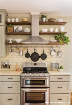
But you know what? That pot rack is problematic. It needs to be mounted into studs, but its braces don't match the stud spacing, so we have it mounted onto a kind of ledger board and *that* is attached to studs (see first two pictures). And while supremely functional (and I'm weirdly sentimental about it), I wouldn't mind something more attractive. Also, still not entirely thrilled about the asymmetry. But I've seen pictures I like of shelves wrapping the chimney of a hood...


(4)

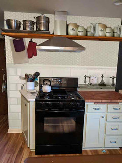
(Pretend the metal pot rack isn't there anymore, I just couldn't convincingly edit it out, pots would sit on the shelf.) I like this. This might be a winner. But I also fell in love with a tile border that we think we maybe want to incorporate...


(5)

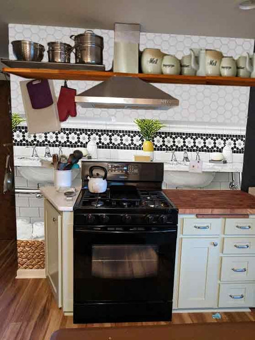
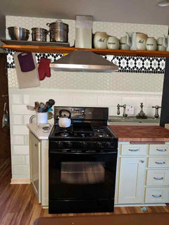
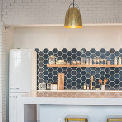
Yeah, here's where the photoshoppery gets really weird. But if you squint and ignore the (really lovely, actually) sink, what about the subway tile up to the border, and our 4" hex tiles above?

But a lot of that hex tile gets covered by the stuff on the shelf, and I'm far more interested in the hex tiles than the subway...would it be weird to have the hex tiles below, and subway above?


(6)

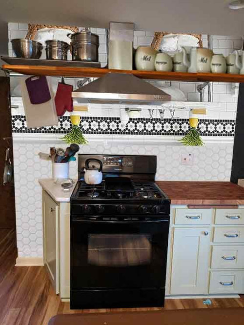
I don't know on this one. Seems like the scale is a little off, that with a 3x6 or 4x8 subway tile, since it's bigger in at least one dimension it ought go below the accent mosaic, with the smaller 4" hexes going above. I don't know.

And what if this is just too many different tiles?


(7)

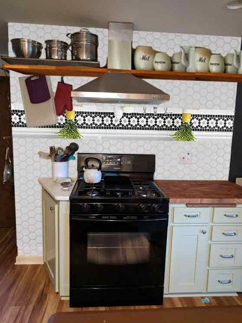
What if we just do hex tile, top to bottom, with the accent running through the middle?

If you've stuck with me this far, thank you! Please give me your thoughts. It's been fun playing paper dolls with all of these options, but I think I'm in analysis paralysis.

TL;DR -- barring the photo-editing atrocities, which picture do you like better?

1
2
3
4
5
6
7

Comments (17)

  • 8 years ago

    Agree. Keep it simple.

    K T thanked flopsycat1
  • 8 years ago
    Center the stove on the wall and add wood shelves on both sides
    K T thanked marylut
  • 8 years ago
    @ptreckel -- the pot rack came into our lives waaaaaay back 9 years ago when we first got married and moved into a tiny apartment together. It was an "Aha!" moment that solved a lot of space issues, and every place we've lived since hasn't felt like home until we put it up. Hence the sentimentality. But this is the first home that we own, rather than rent, and we're totally up for swapping the rack for something that makes for a more cohesive whole. I think the wooden shelf spanning both sides is a given at this point.

    @marylut -- I've always loved that image, that's definitely been one of our inspirations! At this point, moving fixtures or furniture is off the table, given the space constraints. If we nudge to the left, we don't have enough clearance to turn the corner into the hallway; if we nudge to the right, we don't have enough space for that butcher block cabinet, which is the primary work space.
  • 8 years ago

    Your post made me laugh out loud, janky photoshop and all!

    I voted for #4 (hex tile all the way up, no subway or border, shelf all the way across). I think your border idea is pretty, but when it goes all the way across, it seems like the small space is broken into too many horizontal stripes (the cabinets, the horizontal stripe above the cabinets but below the border, the border itself, the horizontal stripe above the border but below the shelf, the shelf, and the horizontal stripe above the shelf).

    If you want to do a tiny bit more photoshop wizardry, how would it look if you had hex tiles all the way up, but placed the border tile right below the shelf, going all the way across underneath the shelf? That at least wouldn't be adding an extra horizontal stripe to the small space (since it would be visually combined with the line of the shelf). It might still be too busy, but maybe worth a look in Photoshop.

    K T thanked lynnstrider
  • 8 years ago

    @lynnstrider -- ooh, good idea! I made the border a little taller to line up with the line at edge of the hood, too. I like it...not sure if it's still too busy...and it reminds me of the shelf-and-wallpaper-accent in my parents' kitchen growing up. (Haven't decided if that's a good or bad reminder.)

    (8)

    I also made a few more paper dolls featuring a smaller hex tile that is similar in color to the painted walls in the kitchen (a light yellowy green, Behr's "Baby Artichoke").

    (9)

    (10)

    (11)

    I think #9 may be my favorite overall?


  • PRO
    8 years ago
    last modified: 8 years ago
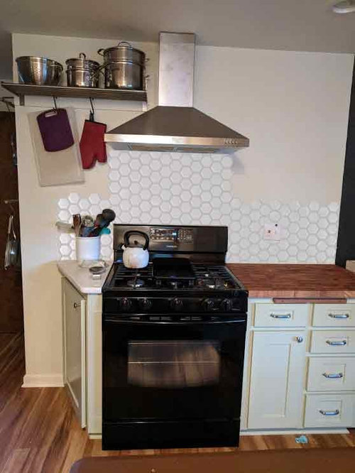
    Consider also the function of the backsplash - make it high enough to keep splatters from cooking off the exposed wall. Using the hexagonal tile gives you a natural edge to end the design without having to add a boarder or bullnose.

    Wit & Delight's City Studio · More Info

  • 8 years ago

    I like hex on the entire wall. I would definitely nix the current pot rack and if you like the shelves, go for those.

  • 8 years ago

    Center the stove on the wall and add wood shelves on both sides

    Agree. What you have now is hazardous if anything is put on the left side. There was no reason not to center the stove.

  • 8 years ago
    You are overthinking this. Go for a hike and see how nature keeps things simple. Then go with something simple and purposeful.
    K T thanked Steve
  • 8 years ago
    last modified: 8 years ago
    If you tile all the way up just take out some of the drywall, put in blocking, patch it, put the pot rack wherever you want it.

    Or take out some drywall, replace it with plywood, don't patch it and tile right over it.

    Don't let the tail wag the dog.

  • 8 years ago

    I vote one simple tile over the whole thing.

    K T thanked Nothing Left to Say
  • 8 years ago

    Of the new ones you made, I like 9 the best. But overall I think I still like 4. Or maybe the smaller hex over the whole space.

    K T thanked lynnstrider
  • 8 years ago

    I like either of the hex tiles over the whole thing. (and the shelf too)

    I like your janky photoshopping skillz and your anxiety-that's maybe not something one wants to hear but seeing as how I too am of a similar vein, I commiserate.

    K T thanked Midwest (4b IA)
  • 8 years ago
    Have you checked your local building codes for safe kitchen appliance placement? With preschoolers running around, it is unsafe to have the oven door open so it blocks a path into another room. Also, for safety reasons our local building code requires a 15” min counter on each side of the stove as adequate landing space for hot pots, baking sheets, pans, so they don’t tip off the counter.
  • 8 years ago
    @marylut - Code and function was our top priority (what can we say, a household of engineers), hence the aesthetic considerations getting left to the end. ;) You must be somewhere with a luxury of space, to have required a foot+ either side of the stove! I think only one of the places I've been in the past 12 years of urban living had offered that.

    @Missi - Thank you? ;) I know what you mean. Over-thinking has definitely drawn out this process, but also given us something we're really happy with.
  • 8 years ago

    Code forces folks to get 2 15” cabs instead of more practical 30” cab.