Software
Houzz Logo Print
mrj80

please help with sign placement

8 years ago
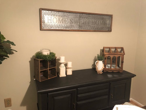
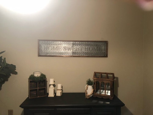
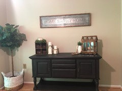
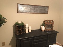
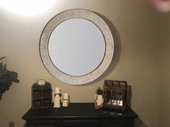
I’m a little bit lost on if I hung this sign correctly. My husband said it is at a good height but I feel it needs to be lower. Any advice? The galvanized tin looks discolored in the second photo but does not generally loom that way

Comments (23)

  • 8 years ago
    last modified: 8 years ago

    Signs or pictures should be around eye level. It is hard for us to tell from your picture if that is the case. For most of us, that would bring it around 5' from the floor, more or less unless you are very tall or very height challenged. If that is where it is hanging already, then maybe what you need are some pieces in your grouping on the table below to be taller. That might help with the scale a bit. Do you have some decor items you could switch in there and see if that helps you feel better about placement? Maybe a tall vase on one side and a grouping on the other? Things tend to look nice in odd numbers, so three tall pieces, of differing heights maybe? See if that helps you feel better about the look of it.

  • 8 years ago
    Just in case this helps!
  • 8 years ago

    I agree. I think the height is fine, but you need something tall to one side, and a grouping of three on the other. perhaps replace the wooden item on the right with a taller item and introduce a bit of color with it and you will have a lovely wall. This will work with the tall plant I see to the left and balance out the wall. Perhaps not what you were thinking of, but I would love a Tiffany type lamp which would be fabulous there, and a great way to introduce color.

  • 8 years ago
    “The center of your picture should hang 58-62″ from the floor when it’s the only item on that vertical wall space or when it’s above an item that is shorter than 32″ tall”.

    “When hanging a picture above a piece of furniture that is 32″h+, there should be approx. 3″-8″ from the top of your furniture piece and the bottom of your picture.”
  • 8 years ago
    I agree with Sophie. I understand that you like it, but it has a country affect which doesn't seem to match your furnishings. If you want to keep it, maybe it would work in the laundry room.
  • 8 years ago
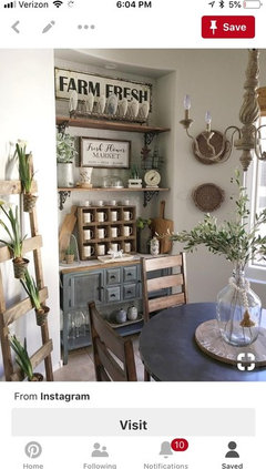
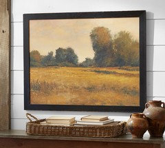
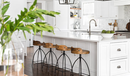
    This is a similar look to what I desire
  • 8 years ago

    Do you have a lamp you could try there....with an outlet? LOL How about a stack of books to put under the display on one side to lift it up a bit and fill in some of the blank space.....that is what might be throwing you off.


  • 8 years ago

    Michelle, I do think it's too high but you can probably just fill in with some items, such as abbyjean mentioned. One caution is to not have too much going on there. I know people whose country style is actually clutter style. Keeping it simple will be a much nicer, calmer look.


    Any chance you could lower it just a bit? I think it would look better maybe 2-3 inches max above the item (terrarium?) on the far right. That might make it easier to fill in the space...just not with too much.

  • 8 years ago

    Too much stuff on the table. Agree about "feelings" plaques. No "home" which is evident. No "family" which is also evident. It would look better to add a cute country print.

  • PRO
    8 years ago
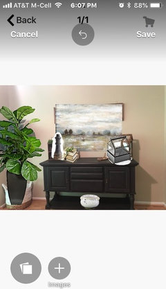
    A variety of sizes and scale will help you when doing accessorizing. Art above buffet would be better scale than your ling narrow piece. That shape fits better over doorway. Your plant needs to have more foliage to balance space. I did this mock up for you to demonstrate these concepts. Also, if you want whites they should be less white. More antiqued up for farmhouse look. I put bowl on lower shelf that is crackled off white.
  • 8 years ago

    You need something to connect the sign to the table. It also looks like it's crooked. Get some of those little sticky pads that go in the corners to hold pictures to the wall.


  • 8 years ago
    I think it would be to either change the pieces on the table to taller items or to lower the sign.
  • 8 years ago

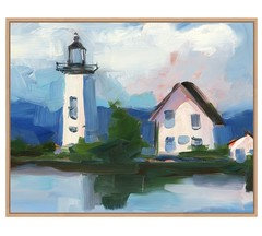
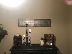
    Maybe a better option:


  • 8 years ago
    Following
  • 8 years ago

    Lower the sign...much too high. It should relate to the table, not just "float" on that big wall. It's not difficult at all to lower a piece of art and fill the holes. I have to agree with Sophie's comments, even though they were probably hard to hear. Your home should tell a story, your story and you can do that by creating vignettes of interesting objects that mean something to you, as Sophie suggested. You've received some excellent advice; I can't wait to see what you do!

  • 8 years ago

    I I like your sign and obviously you like it, so keep it but lower it. Try a lamp or some other taller objects for balance. Your home is a very refreshing change for what we see way too often on here. I would add some vintage items to your vignette, too. I much prefer older things. Thank you for sharing.

  • 8 years ago
    It looks crooked ..but anyhow it all looks depressing , brown on brown and then the sign ...I would hang it in the garage , laundry room or guess groom ....and put a lovely bright painting or large mirror ...put some flowers on the table and take the brown accessories off ....it's all too dark and well, depressing to look at in my view .
  • 8 years ago
    I think if it’s at eye level then it’s at the correct height. If this is in say, a dining room where you’ll be seated most of the time, then it could be lowered. Having said that, I think the main reason it feels too high is that it may be too small for that spot. A larger, and more square piece may go better there, IMHO.
  • 8 years ago
    Do you have several large books ( coffee table variety) ? Place the wooden object on the right on them to elevate it. Leave just 3 on the left.
  • 8 years ago
    Also, bring all objects towards the center a bit....
    Much more pleasing to the eye.
  • 8 years ago

    Another vote for "get rid of the word art entirely." A mirror, or a nice piece of artwork that can bring a little lightness and color to the space. Especially if you can find something you like at a local arts and crafts event.

    Consider avoiding armloads of general "stuff" from the Joanna Gaines Collection and spend some time acquiring items that mean something to you, personally. What do you love? Grab a friend and go hit the flea market world to see what you can find that would really be unique and "you." (I'm still annoyed about having missed out on a wooden milk crate from my hometown at the last flea I went to. I even hovered, hoping that the guy who'd found it first would put it back down. ;-) )

    Some of the differences between what you have and your inspiration photo are that the inspiration photo has lighter colored elements, and uses verticality to create an airy feeling that you may have trouble capturing with just the buffet.

  • 8 years ago

    Are you planning to add shelves as in your inspiration photo? If so I'd wait to change the placement of the tin until you have your shelves in place. You have a good start in getting that farmhouse feel. Don't be discouraged. We're all there when putting together something new. If you are like me, you'll know when it's done. I till "tell" you.