

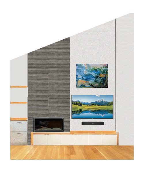
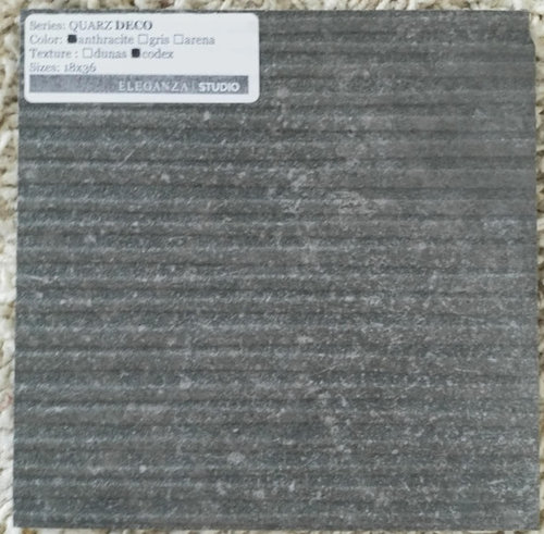
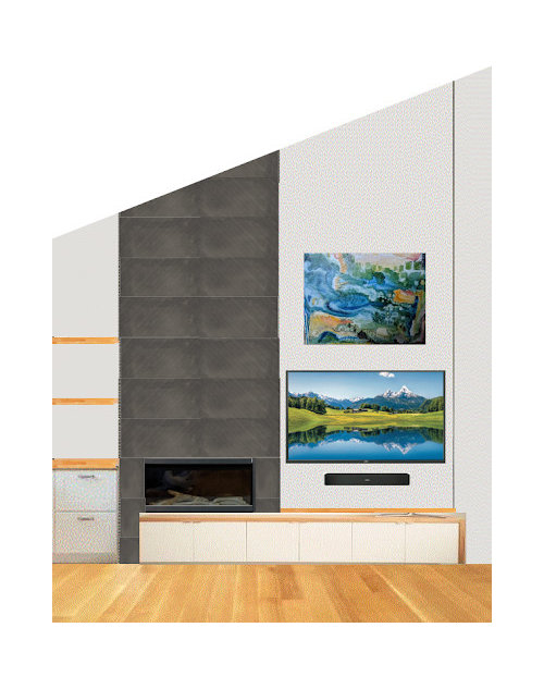
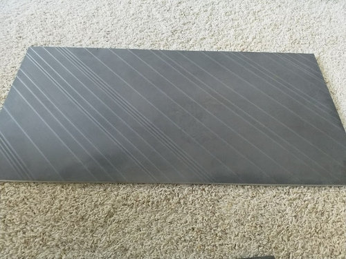
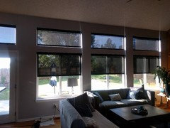
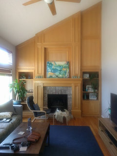
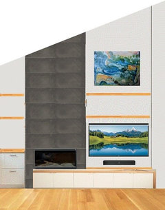
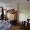
Fireplace tile dilemma
8 years ago
last modified: 8 years ago
Featured Answer
Sort by:Oldest
Comments (11)
 8 years ago
- 8 years agolast modified: 8 years ago
Related Professionals
Frederick Interior Designers & Decorators · Chambersburg Kitchen & Bathroom Designers · Johnson City Kitchen & Bathroom Designers · Cody Kitchen & Bathroom Designers · Aberdeen Design-Build Firms · Bridgeport Design-Build Firms · Jamestown General Contractors · San Luis Obispo General Contractors · Topeka Flooring Contractors · Brattleboro Flooring Contractors · Magog Flooring Contractors · Taunton Interior Designers & Decorators · Coos Bay Interior Designers & Decorators · Dayton Tile and Stone Contractors · Victoria Interior Designers & Decorators- 8 years ago
 PRO8 years ago
- 8 years ago
- 8 years ago
 8 years ago
 8 years agolast modified: 8 years ago
 PRO8 years ago
- 8 years ago

Related Stories

TRIMHow to Fix a Mirror-Above-the-Mantel Dilemma
Got an unmovable mirror over your fireplace? Use trim to turn it into a feature that will turn heads
Full Story
Design Dilemmas: 4 Questions for Houzzers
Brick Fireplaces, Historic Homes, and Tropical Living Room Decor, Oh My!
Full Story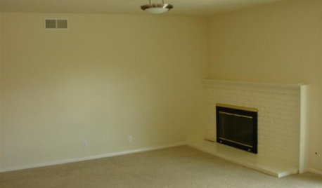
FIREPLACESDesign Dilemma: Difficult Corner Fireplace
Where to Put the TV? Help a Houzz Reader Set Up His New Living Room
Full Story
REMODELING GUIDESHouzzers to the Rescue: Users Solve Design Dilemmas
The proof is in the painting — and the pond. As Houzz users hit 100,000 discussions, see some of the results of their advice and ideas
Full Story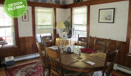
Design Dilemma: Keep or Nix Knotty Pine?
Help a Houzz User Choose a Paint Color for a Cohesive Design
Full Story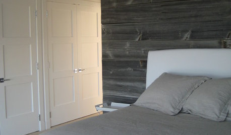
REMODELING GUIDESDesign Dilemma: How Do I Modernize My Cedar Walls?
8 Ways to Give Wood Walls a More Contemporary Look
Full Story
DECORATING GUIDESDesign Dilemma: I Need Lake House Decor Ideas!
How to Update a Lake House With Wood, Views, and Just Enough Accessories
Full Story
REMODELING GUIDESHave a Design Dilemma? Talk Amongst Yourselves
Solve challenges by getting feedback from Houzz’s community of design lovers and professionals. Here’s how
Full Story
DECORATING GUIDES7 Common Design Dilemmas Solved!
Here’s how to transform the awkward areas of your home into some of its best features
Full Story
Design Dilemma: How to Fix Up My Front Yard?
4 Questions From the Houzz Community. How Many Can You Answer?
Full Story



daisiesandbutterflies