Software
Houzz Logo Print
katy_carter5393090

Another Gray Paint question!!! Please

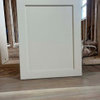
Hi I am having trouble choosing between Repose Gray and Worldly Gray for my kitchen and family room... my floor is dark hand scraped wide plank wood...I have white satin kitchen cabinets, my island is called Elephant Ear and my Quartz is Quartz Master Calacatta Borghini….The worldly grey is more beige and I think slightly warmer? Im just not sure what to do I would appreciate any advice. Thank You

Comments (30)

  • 8 years ago
    I’ve looked at a LOT of greys the last year. These are some of my favorite comparisons, but of course lighting plays a huge difference for each shade in every space.
  • PRO
    8 years ago

    Can you post some pictures of the space? Some overall pictures as well as close ups of flooring, cabinetry, hardware, etc... that will give us a better idea of how to tie the room together! And although pictures are the best to get an accurate color depiction, it will give everyone a better idea of the colors under your specific lighting

    Katy Carter Holycross thanked Avoree Ferreira-Dunlap
  • 8 years ago

    Pick a real COLOR. Gray is over. Not a bunch of clashing neutrals. Colors from Nature are a much better choice as well as what is taking over from gray.

  • 8 years ago

    so what do you suggest?


  • 8 years ago

    I just heard on a Real Estate show, this topic and the statement was made that the MOST PURCHASED PAINT color in this huge metropolitan area was: Agreeable Gray. You are probably looking at the wrong shades. Try that one. Another one that seems to work when ALLLL is decided unfitting is Balboa Mist. There are many many grays and it is just easier to pick a cream color than a Gray color, because Gray can be dreary, dark, and depressing in rooms with not enough natural lighting and especially if you have a major dark surface already, as you say your floors are. It takes a LOT more light in a gray room with a dark floor to feel perky/happy personality, especially with the winter months coming upon us in some areas.https://www.diydecormom.com/benjamin-moore-balboa-mist/ This link features the Balboa and the Classic Gray. Classic might be the lightest of all of them and what you need??


    If none of the grays are right, try some shades of white, and see if you don't find a fit quite a bit sooner. There is a reason.....

    Katy Carter Holycross thanked redsilver
  • 8 years ago

    It’s best to go buy giant cardboards at the dollar store. Paint them with your paint choices and tape them to every wall.

    The color will be different based on light in your room. It’s the only way to be sure.

    It took me 17 paint samples to find the exact blue I wanted.

    Katy Carter Holycross thanked beachem
  • 8 years ago

    Yes I did that

  • 8 years ago

    You can also order poster board size vinyl , I guess...stickers of the paint colors as I think cardboard(brown)will not give you a really true value of the paint, unless you prime it, if your vision is sharp enough...maybe pieces of white poster board(simulating white primed sheetrock) would be more effective than brown cardboard. But a larger surface is generally going to be more accurate, to be sure, so just paint the wall with some of those smaller 5 oz containers of paint where the natural light and the room light exposure is possible..??? It's just hard after your eyes have squinted, like trying to find the right perfume after the nose has gone thru more than 4 samples... LOL

    Katy Carter Holycross thanked redsilver
  • 8 years ago

    We did mindful gray in living room and kitchen, sorry not the best pictures but hopefully it shows the color.


    & we actually did bathrooms and laundry room a little lighter repose gray... you literally can't tell the difference.


    Katy Carter Holycross thanked Karie Sprague
  • PRO
    8 years ago
    last modified: 8 years ago

    IMO black and white will always be classic but grays are hard to choose and there is no way we can tell you what will work in your place . Mybest suggestion is the gray from the counter 0r even the gray from the island cut to get the shade you want instead of trying to make another gray work.

    Katy Carter Holycross thanked Patricia Colwell Consulting
  • 8 years ago

    I know that gray has been popular for a good while now. When we were doing the large cardboard sample tests, we found that true grays looked really bad with any warm wood. They looked like cool and warm were fighting each other. They looked great with white kitchens, but if wood floors in the room were warm at all (ours are engineered cherry), suddenly, everything looked askew.


    We ended up going with a light blue that has notes of green and gray in it. Ironically, it's cooler than the gray, but something about the fact that the blue sky and trees coexisting in nature made it look just right.


    Most grays have an undertone, and if you look at the darkest shade on the strip, you can see the undertone easier. If you look for a color that is muted with gray (gray undertone instead of gray with something else undertone), somehow we found the color helped the wall color "fit" with the wood.

    Katy Carter Holycross thanked allie
  • 8 years ago

    ok that makes sense....I was set on Repose gray but started to think it may be too cool with all my other things so now I was going to buy a sample of Agreeable Gray and put that up net to the Worldly and Repose

  • 8 years ago
    last modified: 8 years ago


    all of my trim will be white....this is my floor...bottom pic is one plank and kinda dusty


  • 8 years ago
    last modified: 8 years ago

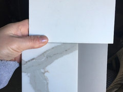
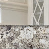
    my counters and island

  • 8 years ago

    Home Interiors with Ease can I have your opinion on weather i should choose Worldly Gray, Repose or Agreeable gray for my kitchen and family room...thank you

  • 8 years ago


    my light fixtures

  • 8 years ago

    Avoree Ferreira-Dunlap I posted some of my pics and will take a picture of the space when I get home....Im trying to decide between Repose, Worldly, and Agreeable gray

  • 8 years ago
    last modified: 8 years ago

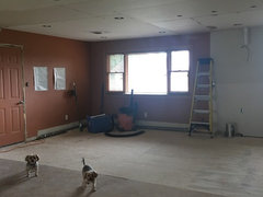
    Facing North into dining area and kitchen

  • 8 years ago
    last modified: 8 years ago

    Facing south family room

  • 8 years ago

    Kitchen

  • 8 years ago

    Island base and cabinets

  • 8 years ago

  • 8 years ago

    Way too much depressing gray already. Color is what you need.

    Katy Carter Holycross thanked User
  • PRO
    8 years ago
    last modified: 8 years ago

    Hi Katy, thanks for posting pictures!

    Repose Gray can read on the warmer side of a cool gray, if that makes any sense. I have always been a fan of the color in general, but it can be a bit bland. Worldly Gray can have a green undertone, from what I have seen of it - this might be a good or bad thing depending on what you were going for; personally I wouldn't pair it with what you have going. Agreeable Gray is probably the "warmest" of the 3 you are looking at, if I had to describe AG, I would say it is like gray and beige had a baby - it is a top selling color for a reason! Of those three options, I would go with AG, it is a nice balance between your cabinets & counter (which are both more on the cool side) and the flooring (which has some more warmer tones to it)

    With all of that in mind, I do not disagree with Sophie, a color would be very fun and uplifting, it really brings some life into what some people see as drabby or dreary. I personally don't see gray that way - so I understand completely if the color aspect is a bit too bold of a choice for you.

    Good luck with your project, I love the stuff that you have picked out so far! I would love to see the after pictures once you have finished the remodel!

    Katy Carter Holycross thanked Avoree Ferreira-Dunlap
  • 8 years ago

    Thank you both so much for your input...I am only doing one color as this is a ranch that is on the small side with only 8 ft ceilings...the color will also be going down the hallway. I love color but I'm scared of it lol and I have no idea what color I would even use for kitchen/family room/hallway to go with all my stuff that is already in the works.

  • 8 years ago

    Ally's Earring, perhaps???? https://www.thespruce.com/gray-paint-colors-797962

    Ally's Earring by Benjamin Moore is a stylish alternative to off-white or pale beige. This is a creamy pale gray with warm undertones. If you love the light look of white walls but want a warmer color, Ally's earring gives you that light glow of white paint but with a touch of color to warm up your space. OR, Irish Mist? perhaps....https://www.thespruce.com/gray-paint-colors-797962

    Katy Carter Holycross thanked redsilver
  • 8 years ago

    We own a condo we had to rebuild after Hurricane Harvey flood. Our daughter Rents from us. We chose agreeable gray walls with alabaster cabinets and extra white trim.


    Katy Carter Holycross thanked Becky H
  • 8 years ago
    last modified: 8 years ago

    I am so sorry you had to deal with Harvey. I know now of 3 households in the Michael affected eye/ area. Devastating, is one word.

  • 8 years ago

    Thank you Becky H looks great!!