Software
Houzz Logo Print
gthigpen

Time to pick a backsplash

7 years ago
I see the question of what backsplash to pick asked all the time. I think I read every one trying to gain insight on things to do and not do. I tend to play it safe and stick to traditional things. My family wants to go bold. Here is what I have...... an open floor plan with adjacent dining area and family room. Kitchen gets decent light but isn’t super bright because of a covered porch outside window. Adjoining family room is very bright.

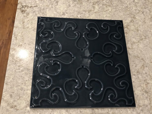
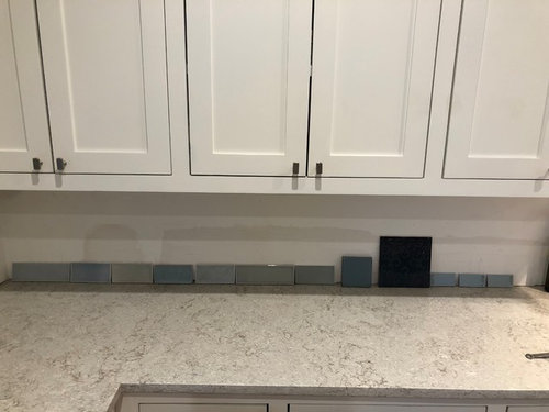
Favorite color is blue and I know i want a blue tile. Cabinets are custom painted white dove on perimeter, island is painted a blue now that I’m planning on changing to either white or a darker blue (currently Jamestown blue but I hate it), island top is oiled walnut and perimeter is MSI quartz gray lagoon. I would say it’s a gray quartz that can go cool or warm but leans warmer. I’ve received a bunch of samples from Walker Zanger, The Tile Shop, Fireclay, Cle, Complete Tile, Tilebar, and Floor and Decor. I’ve already weeded out the ones that were not a favorite. Attaching a bunch of pics of the space and the tiles but specifically my question is around the largest dark blue tile. My family loves it. I’m a chicken and dark blue wasn’t what I was envisioning but it is growing on me. Can I go in this direction?

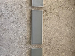
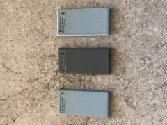
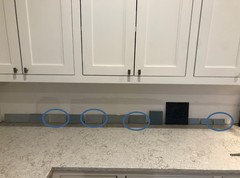
Samples all lined up .

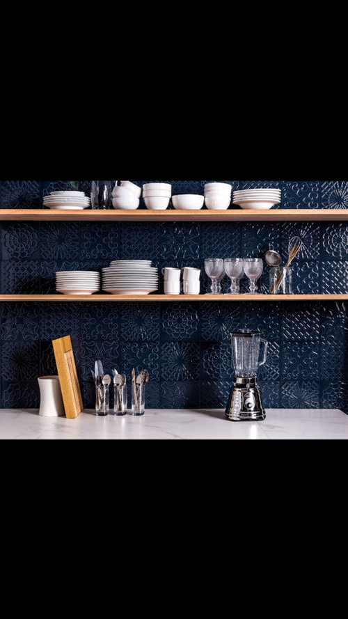
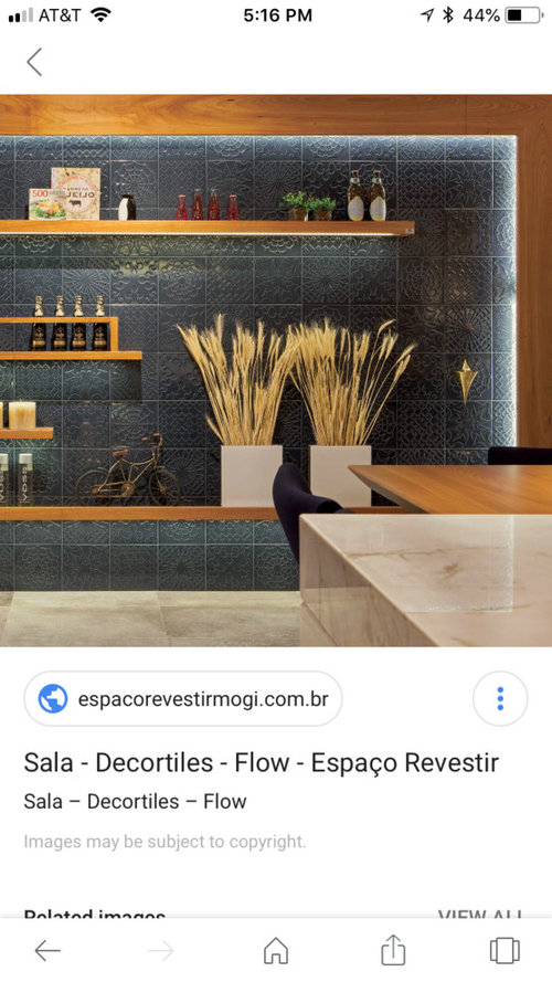
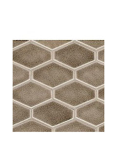
Closeup of the Flow Smoky Blue Tile. It comes in 4 different patterns that we could mix.


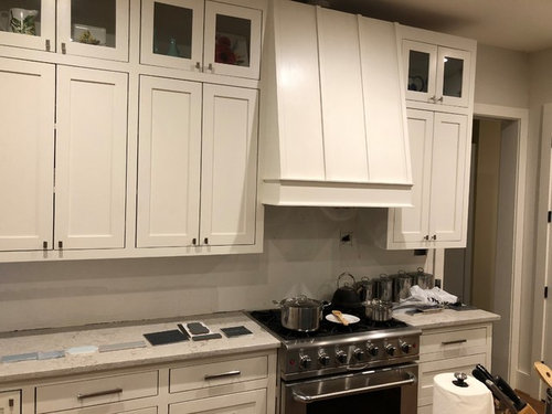
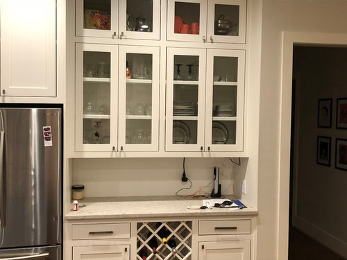
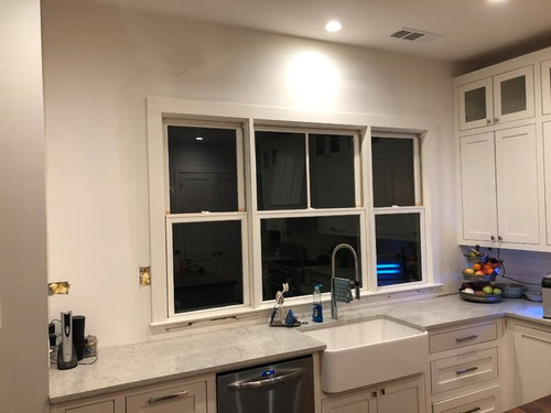
Walls where the tile would go. Molding is still missing from the top


Tile would go all the way to the ceiling

Couple of google search images of the dark blue tile installed


Comments (23)

  • 7 years ago
    last modified: 7 years ago

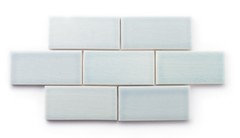
    The large dark blue tile reads black and its detail is hidden in the photos. It may look better with under cabinet lighting on... I like the tile, but like you said, you don't have a bright kitchen so it might not show the color. I love the idea of blue back splash, just worried that your glass in the uppers will look like dark squares (and I like them), and then you will have dark stripe with that tile.


    Prairie Hills Walkout Ranch · More Info


    gthigpen thanked lucky998877
  • 7 years ago

    Navy blue can indeed read black so be aware unless of course you want this black look. I think you can go bold without going super dark Navy. And if you dont have lots of light the blue will read black.


    Of your samples, I like the 3rd one counting left to right. I also like any of the soft blue tiles.


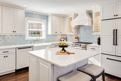
    bold but not Navy note there is lots of light


    Palm Beach Georgian Estate · More Info


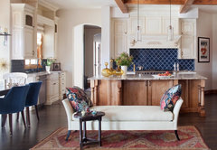
    Navy with walnut really looks great

    Kitchens - Traditional · More Info


    Hobbs Kitchen Makeover · More Info


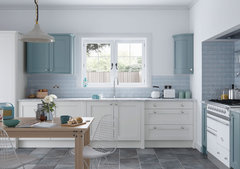
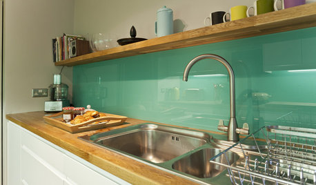
    Farringdon Shaker smooth painted kitchen in Porcelain and Winter Teal · More Info


    gthigpen thanked Boxerpal
  • 7 years ago
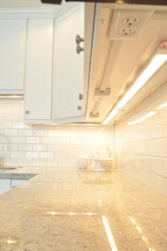
    Love it if you don't feel that you'd tire of it. Your kitchen is open enough to go with a dark backsplash. With under cabinet lighting you should be fine. Yes!

    gthigpen thanked leelee
  • 7 years ago

    It is really pretty, but it will make dark spaces darker. Only you can decide if that will be okay.

    I would really like a mix of tiles 2,3,4, 5 and 7. Those shades go so nicely together.

    gthigpen thanked raee_gw zone 5b-6a Ohio
  • 7 years ago


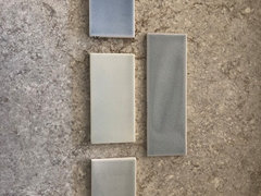
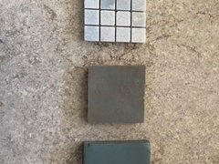
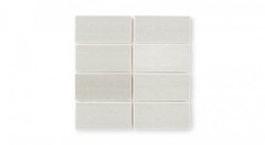
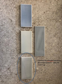
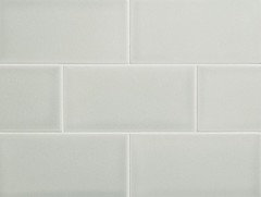
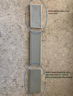
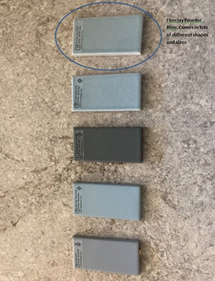
    These are some of the lighter tile options. I think I pulled a few more out after taking these pics to further narrow it down. My favorites are the Powder Blue by Fireclay (top tile, last pic). Dark Ocean Breeze by Vermeere Complete Tile (bottom tile, top pic) or Nabi Arctic Blue from Tilebar (top tile middle pic). I can do better job of numbering them to keep them straight. I was just trying to get a feel if this dark tile was worth pursuing. I think I’ll buy a navy vinyl table cloth and tape it up to see how it looks.


    Also, intrigued by this clay tile by Walker Zanger. Bottom tile. Not sure that a clay tile fits the style of the kitchen but it’s really pretty. On the darker side though.


  • 7 years ago

    Oh wow, that's a lot to pick from! That would so be me!

    As much as I like a darker blue, I agree, it does read almost black and I don't think it blends well in your lovely space. I much prefer the more muted shades that pull from your countertop colors. From your first photo, I think I like 3, 5, and 7. The last photo of the clay tile, I really like that middle one.

    gthigpen thanked kmg11
  • PRO
    7 years ago
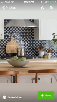
    Nice kitchen and your backsplash will make a statement. Blues i see are cool and your countertops and cabinets look warm? But can’t trust Internet photos. You have a lot of tile and if you want contrast i would do a shaped neutral tile (fish scale) with dark blue grout. That would give you some color but not dominant the whole kitchen.
  • PRO
    7 years ago
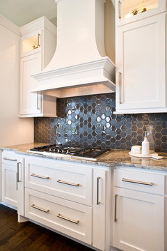
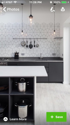
    Alternatively, make the shape work for you. Here are some examples.
    gthigpen thanked Flo Mangan
  • 7 years ago

    Kmg11 - that middle tile in that last pic is a zellige tile by Cle. The one sample we got is a muddy color with the faintest blue over it. Here is a google image of a full install. I really liked it but my DH doesn’t think it fits the style of the kitchen or house


    Flo- thank you for the images. Yes, I think counters are more warm. The lighter blues I’m liking the most are the warmer ones.

  • 7 years ago

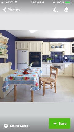
    Not your same colors but a mix can work.


  • 7 years ago

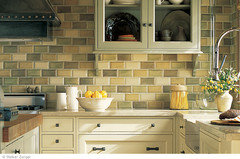
    Several of the Walker Zanger tiles already have subtle variations even within the same colors.

    You see it but you don't.


    Same with FireClay


    gthigpen thanked leelee
  • 7 years ago

    Leelee - yes, that’s what I originally wanted. Subtle variation. Here is my favorite inspiration pic.


    San Jose Res 2 · More Info


  • 7 years ago
    last modified: 7 years ago

    Highly textured tile is hard to clean. In a place like kitchen, if there is a lot of cooking taking place, it may become quite a chore to scrub the grooves and crevices.

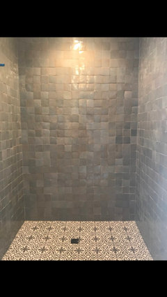
    Walker Zanger has a line of tile that is handmade or mimics handmade with a lot of irregularities and variations. If I recall right, they have quite a color palate to choose from. Also check out Winchester tile - they have quite a stunning selection of hand made tiles. Based on your inspiration picture you may find something that will suit your taste AND have some subtly daring motifs - like this Artisan range. There are quite a few greys and blues there that will read solid (do a squint test) from afar, but will present delightful pattern upclose.

  • 7 years ago

    That darkest one reads black on my screen, and i'm guessing it will read black in your kitchen if it is not bright (as you say). Like someone else above noted, i'd also be concerned that the black one, along with the glass cabinets, will start looking like black voids.... which i don't think is the look you are going for. I think most any of the other tiles you choose are lovely and not boring at all. I would pick one of those, but in one of the interesting shapes that fireclay and other vendors offer (instead of subway). If you do an interesting shape in one of those lighter blues, i think the end result will be a lot more "bold" than the dark navy tile (which, i don't think will end up looking "bold" so much as it will just look dark and unflattering).

  • 7 years ago

    The zellig tile looks really different in the last photo, seems to have lots of variation.

    Since your countertop has movement in it, I like more of a subtle contrast, one color look, so they're not competing. Picking up on the warmness/muddiness of the taupes/grays, to my eye, looks to be more cohesive. With an open floor plan, all your rooms have to play nice with each other. I would just make sure your choice is something you'll love for a long time and is easily worked with if you want to change colors or fabrics in your other rooms.

    I also think going too dark might work against the space if needing more light. You mentioned the island is walnut so that's more of a darker surface as well.

    Can't wait to see the wall done by your windows!

  • 7 years ago
    last modified: 7 years ago

    Ok, sounds like most think the dark is too dark and reads black. That's pretty accurate in the space also....unless the sun is hitting it or the under cabinet lights are on, it looks mostly black. Back to focusing on the lighter options.....

    I had looked at the Winchester Tiles but wrote them off as I didn't think I could get samples since they were in the UK. I just sent them an email to inquire on a couple of samples. They look beautiful!

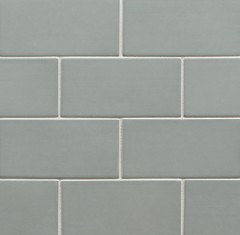
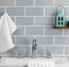
    Of the samples that I had already collected, here are my top choices with other images from the websites or Google. These are all tiles that read warmer but are still blue. With the exception of the WZ Robert AM Stern one...that one is mostly taupe. That one also has no variation in color in the gloss finish. Some of the colors come in different glazes, but not sure about the Cape Cod color. Lots of shapes though.

    From the original picture.

    Vermeere Dark Ocean Breeze Gloss pic from their website. Comes in rectangle and squares.

    WZ Cape Cod from their website in Gloss. I don't see much variation in color.

    Nabi Artic Blue from their website

    Fireclay Powder Blue from their website

  • 7 years ago
    They have dealers in the US. I have their tiles. They arrived promptly. Shopping from the UK has been comparable to Amazon!
    gthigpen thanked Natalie H.
  • 7 years ago

    Hi. Just wanted to pop in. You might want to test the tile differently - like it was paint. The counter is horizontal and the wall vertical. The light hits things differently (like you can paint a ceiling the same color as the walls but it looks darker. That space next to your fridge seems to have lots of shadow which will effect how you perceive). Also the current unfinished wall can influence the color perception - you should test paint on top of pure white (so place your large paint sample over a larger piece of poster board).

    I like it when you can go home with one of those sample boards of a tile layout and lean against the wall. The board itself tends to be pure white. Good luck!

    gthigpen thanked Mid America Mom
  • 7 years ago

    All those tones look really nice!! I agree about wanting to see them as a sample board, instead of just one tile to get a better visual, especially ones with variation. Will they also work with your other elements in your dining and family room?

    gthigpen thanked kmg11
  • 7 years ago

    Hey gthigpen,

    Before you begin the tiling here are some electrical changes that you might want to think about.


    Charging station in a dedicated drawer


    Electrical outlets moved up and under the cabinets. No more beautiful backsplash punctuated with ugly plug-ins.


  • 7 years ago

    leelee - already done! We have strip outlets under our cabinets and none on our backsplash. Any holes you currently see are still leftovers from trying to feed wires through the walls. They will be patched and tiled over.

  • 7 years ago

    Great! That will look fantastic with whatever tile you choose.