Software
Houzz Logo Print
hzdeleted_22590553

Bedding/bath – Does this all work together?

7 years ago
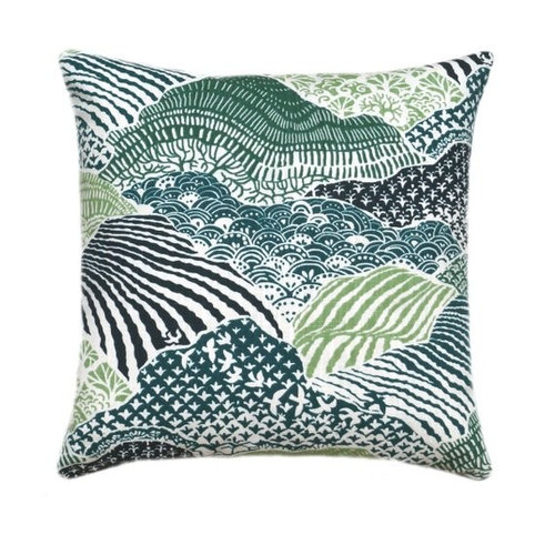
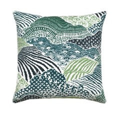
It did in my head. (I like a mix of color and pattern.) This (blue/green) fabric was the starting point but the colors are a tad cleaner and scale a little larger of both fabric and rug than I hoped. Fresh eyes please.


Comments (33)

  • 7 years ago
    last modified: 7 years ago

    Bedroom walls are BM Feather Down and not photographing well.

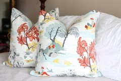
    • Two 26” euro shams in blue/green fabric
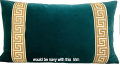
    • One TBD size navy cotton velvet lumbar with this greek key trim.
    • PB navy striped duvet
    • white bedskirt
    • white coverlet (Don’t have yet - I’m second guessing if maybe I should get navy)
    • white curtains with roman shades (now also considering navy)
    • Wanted to use a few majolica plates around mirror.
    • I like this art and think it ties everything together and adds red (which I love) but I don’t want the room to feel ‘beachy’.
    • These 27” lamps.

    Use imagination. :) (white things on fabric samples are stickers I failed to remove)

    [deleted]

    • majolica around this mirror (over long dresser)

    [deleted]

    Close up of art.

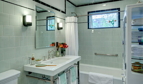
    Bathroom: Original Opt A

    • Bought this rug
    • Botanical art repeats the duvet stripe
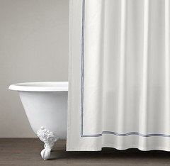
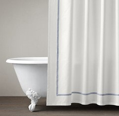
    • RH white shower curtain with navy embroidered stripe.
    • TBP - Wooden roman shade (considered blue/green fabric but think the scale is too close
      and think they will fight for attention)
    • BM Hale Navy walls
    • paint vanity and trim off-white like BM Cloud White.
    • white towels

    *concerned white
    cabinets will look disjointed

    [deleted]

    The ivory color in the rug works with bedroom carpet.

    Small watercolor maybe on small wall to right when walk in.

    [deleted]

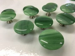
    Possible knobs. I'll figure out last, but they're pretty.

    Opt B

    • same rug & botanical art
    • paint walls a light neutral
    • paint vanity BM Hale Navy

    *Floor is a green gray. My house is mostly beige I’m not into gray. Feel like if
    I’m going to use a neutral in here too it should be the same as the bedroom, BM Feather Down, and I’m not convinced it looks great in here.

    Opt 3

    • Strip and stain vanity. (FWIW, it’s oak and honestly I don’t know if I have the
      time or desire to do this.)

    Thoughts? Thank you!

    Old pics of room. Pillows fell over, ha. (Yes I know those lamps are way too small.)

    [deleted]

  • 7 years ago

    I really like the pillow but I'm not sure what your query is. You want to use it in the bedroom?

    User thanked tartanmeup
  • 7 years ago

    I'm confused too.

    The backlight from the windows is washing out the colors of the room. I see what looks like a red, gold, white and black color scheme?

    User thanked carolb_w_fl_coastal_9/10
  • 7 years ago

    I don’t think the pillow goes with your other linenS. The print seems summery to me.

    User thanked chickadee2_gw
  • 7 years ago
    last modified: 7 years ago
    Oh sorry. I was bouncing my ideas for both rooms and was asking if things coordinated.

    I'm looking to use the blue/green fabric as euro shams with the stripe duvet and a navy velvet with greek key trim lumbar pillow. I tried to list everything out and show photos for visuals.

    The dark color in the pillow fabric and duvet are dark navy and IRL read blue.

    So blues and greens but alone feels cold to me and I like red so that's where the rug came in. I then wanted to repeat the colors and found the art, which I do actually like and didn't just pick for colors. I was hoping it helped along to bridge everything together.

    The colors would be repeated through the rooms:

    • Green repeat with majolica, beach and botanical art, & rug.
    • Blue repeat in duvet, velvet lumbar, beach & botanical art, possible bathroom wall paint, rug.
    • Yellow/gold repeat in greek key trim, flower painting, beach & botanical art, and rug.
    • Red in beach art and rug.

    I know it's all a lot of info.

    ETA - IRL the fabric has an inky navy, green blue, celery green, and hunter green.

    I felt like I had a solid plan for weeks now and I'm not sure if the fabric is giving me pause or if it's just because once I place an order I'm unable to return it so I'm hesitating.


  • 7 years ago
    There’s way too much going on. Worry less about coordinating separate rooms and more about completing one with things you like.
    User thanked Rachel Lee
  • PRO
    7 years ago
    Are you redoing both bedroom and bath? If so, use no more than 3 colors. You are starting on the wrong end of design. Start with bedding such as duvet or bedspread. Then look for pillows and accessories. Multi paneled drapery is fine if you have some wall separating panels of windows. Start with bedroom and extend your color palette into bathroom. If you stick with those pillows pick your favorite single color from the pillow and keep most all other fabric choices plain. Add texture for more interest.
    User thanked Flo Mangan
  • PRO
    7 years ago
    Here is our bedroom window wall with panels either side of window sections. Easier to manage and i like the look.
    User thanked Flo Mangan
  • PRO
    7 years ago
    To mix patterns the trick is to keep the scale of the patterns different. A unifying color in each pattern is best. Possibly black with the pillows you selected. Notice in your inspiration photo one pattern has black dots , one has black in stripe. That is what helps pull off a multi print scheme. I would not add ted into this color palette. A black velvet small accent pillow would be a lovely addition of texture and help ground the color palette.
    User thanked Flo Mangan
  • PRO
    7 years ago
    Consider a deep blue/green wall color once you settle on bedding look.
    User thanked Flo Mangan
  • 7 years ago
    last modified: 7 years ago

    Rachel - As far as too much going on, I don't like quiet all white bedrooms or rooms in general. All these things in the room I do like. That part is taken care of. None of these items were picked for the reason of coordinating.

    Flo - There's no black. There's no black dots on her bedding either. The fabric is from the same collection and it's two shades of green.

    I just painted the room and wanted a lighter look from the dark gold it was.

    Pattern mixing, I do understand the rules though can't always achieve it. That's why I said I thought the blue/green fabric competed and was too similar to the rug scale of the rug pattern. The same color of my duvet stripes is the same as the dark navy in the blue/green fabric.

    To clarify again. This is my bed. This is my navy stripe duvet. Those euro shams would be covered in the blue/green fabric. Lumbar would be navy velvet with gold greek key trim. That's the potential art and lamp.

    [deleted]

    I have too much going on trying to explain in this thread. It should have been multiple posts but it was easier for me to do it all as one. I'll remind myself not to do that.

  • 7 years ago
    I like the Euro sham with the striped duvet and the lamp. To me, velvet lumbar pillow looks heavy compared to your new airy feel. I don’t think the bath and bedrooms feel cohesive, but maybe it’s just a matter of changing the curtains in the bath which to me, feels much more formal.
    User thanked Molly
  • 7 years ago
    last modified: 7 years ago
    Molly I wondered that about the lumbar. When you say the bath being more formal do you mean the photo with the floral valance? To clarify all that stuff will go.

    Was thinking the white shower curtain (navy trim) and wood roman shade I posted above. Then the rug, botanical art and what to do with wall color and cabinets.

  • 7 years ago

    Are there pictures, posts missing in this thread? I thought I saw more pics last night (like of your art and other accessories) but now they are gone?

    User thanked Olychick
  • 7 years ago
    I was referring to the floral balance. I think a white and navy bath will be pretty. Is the art for the bedroom or bath?
    User thanked Molly
  • 7 years ago
    last modified: 7 years ago
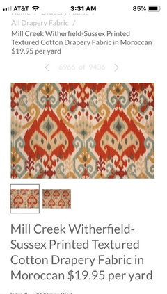
    Oly- Really ? I didn’t delete anything. ...hmm

    I can see all of them still.

    Molly The beach art for bedroom and the botanical for bath.

    I’m concerned the off white vanity will look disjointed with the bedroom.

    I was just in looking at samples again of the bedroom paint for bathroom and hale navy on the vanity. The red walls are making it very difficult to test.

    View of my bathroom as is. Was just showing this for size and relation to bedroom.

    [deleted]

    Have the rug, using this botanical art.

    Opt 1. navy walls, white vanity.

    Opt 2 is light neutral walls, navy vanity.


    This is the fabric that was to go cover my euro pillows. The stripe pillows are showing my duvet in the bedroom. Majolica around mirror in bedroom.


    Again showing the bathroom art, Opt. 1 wall color etc. etc.


    shower curtain

    Is this stuff missing above?

  • PRO
    7 years ago
    I didn’t see art either. Been a bit confusing.
    User thanked Flo Mangan
  • 7 years ago

    I'm also confused. Shee, is there another topic you did about the room? I rarely go to the decor side.

    I agree with Flo, do the bedding first and extend it from there. The problem with inspiration pictures is we buy something similar and realize it won't work because we don't have the exact flooring, wall color, and bedding.

    Are you doing a beach decor?

    User thanked Oakley
  • 7 years ago
    last modified: 7 years ago
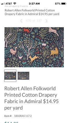
    Oh wow. So half the stuff is missing. Nice. Someone on the conversation said again how their stuff wasn't showing up.

    Can you see the above photos I just posted above the bathroom?

    Oakley - Not lately. Sounds like a lot is missing from this post.

    I have the duvet. Ok. I'll try again to post the bedding info. and stuff.

    Old pic of room. This stuff will go.

    [deleted]

    This is my room/bed shown below with my navy blue stripe PB duvet. I wanted to use the blue/green fabric on the euros and possibly a navy (pillow shown on left is more teal I know) lumber with gold/yellow greek key trim. (want a long lumbar no other pillows besides these three decorative) beach art was what i was looking for above bed. I'm not going for beachy theme though. I liked these lamps.

    [deleted]

    Close up of art.

    Wanted to use majolica plates around this mirror over my long dresser.

    [deleted]

    So I was asking thoughts on my whole idea of everything, lol. I'm sorry this has been confusing. It was never meant to be!

  • 7 years ago

    A navy long pillow seems too dark and out of place, the green actually looks more coordinated to me. Not sure about the yellow on it, though...?

    User thanked carolb_w_fl_coastal_9/10
  • 7 years ago

    That teal pillow with the yellow Greek key trim shown above was just to show a similar pillow if I were to do it in navy with gold Greek key.

    Hmmm there’s a hunter green and celery in the fabric. I like hunter green but that might be just as dark looking as the navy. I’d prefer not to use the celery color. Hmmmm


  • PRO
    7 years ago
    I don’t see that rug working with your color palette. Nothing relates to it. You need to put a primer on the red walls so do that. It will help you visualize your combos. The Hale navy might be too saturated for your tones in art (finally just see those photos). I will try to put some things together for you. Bbl.
    User thanked Flo Mangan
  • 7 years ago
    last modified: 7 years ago
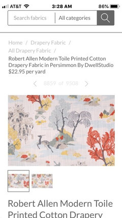
    Flo- I am looking for honest feedback but I don’t understand what you mean by nothing related to the rug. The colors are used throughout the other options I have an am mentioning. ? Do you mean style?

    I plan to keep the rug and the striped duvet (and have matching stripe euro shams). I‘d nix the blue green fabric. (and beach art).

    I’d like to keep the bed pillows to two euros and a lumbar.

    eta- fwiw the rug colors are red, navy,sage green, ivory, gray, brown gold, tan, and tiny bit of dark brown.

  • PRO
    7 years ago
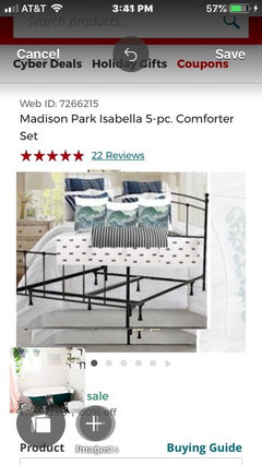
    As i read through things, i was under the impression you wanted the multi color pillow shams as your inspiration for color. Hence, i was focused on that color palette. I put this mock up together using your inspiration photo to inform decisions. I put a iron bed in as well as bathroom picture to keep both rooms tied together. While your rug has many colors, the net impression is red. So now i just read you are dropping the initial shams? I am just trying to help but without clear information it is pretty hard to figure out what you are doing?
    User thanked Flo Mangan
  • 7 years ago
    last modified: 7 years ago
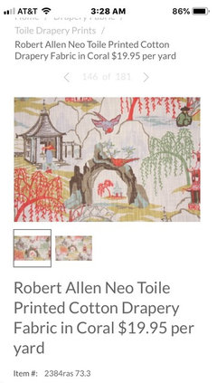
    Thanks Flo. I don’t own the blue green fabric shams yet. The shams were my original leaping point/the inspiration to brainstorm a new room but I like red and warm colors and a mix of colors in a room. I couldn’t just do a room with blue an green and white. That’s when I went searching for a bathroom rug that had those as well as warm colors. I was trying to make it all work. Did you ever like a fabric that in the end maybe wasn’t really ‘you’. ? :). I’ve also been wanting to use a ticking type stripe for a long time but that alone didn’t work for me.

    I have the rug and navy stripe duvet. I want to use them. They can be the main build around things. I really only want three pillows on the bed these days.

    ETA -I'll note I was also trying to branch out from my norm and go for a fresher look. Ex. I love botanicals and audubon prints and my knee jerk reaction was to use two bird prints above the bed. I do really like the beach art (again, will to find something else) and have many fun memories of beach trips so it wasn't just a random piece I found trying to make colors work. I think a mix of different styles looks good but I don't think it's always easy to pull off and can be debatable.

  • 7 years ago
    The rug feels tribal to me and that’s why I think it doesn’t work well. I do love all of your other elements.
    User thanked Molly
  • 7 years ago

    I finally saw the art which I love! IMO, it will shine in a light bathroom with no navy walls or cabinets. White walls and white cabinets, and navy accessories.

    The rug is pretty but the southwestern style and colors would clash.

    About 15 years ago I was in a navy mode and I hung beautiful navy wallpaper with a tiny pink print in the bathroom. I regretted it immediately because it was just too dark. I like dark bathrooms that only have a sink and toilet with no window. Not sure if that makes sense.

    Have you thought about wallpaper?

    User thanked Oakley
  • 7 years ago

    Oakley- Do you mean the beach art? I was going to use that above the bed. The botanical print I was going to use in the bathroom.

    You don't think white cabinets (I would do an off-white) would look disjointed from the bedroom? Tonight I was leaning for lighter walls in there and navy cabinets.

    I know what you mean about dark rooms with no window. I like them too.

    I do like wallpaper and did briefly start looking at some possible for the main bathroom but that proved to be as difficult of finding something I liked as finding fabrics. :)

  • PRO
    7 years ago
    Ok. Now the picture is getting clearer. Since your red seems to be favored, get pillows or fabric to make your pillows that pull that red in. If you only want 3 pillows you can get a great fabric and work your other fabrics in. I would download cardinal Audubon photos from one of the museums that offer this and frame them for over your headboard/bed. For your bathroom, i think all light but off white would be fresh, bright and you can use your red rug and add pictures with red flowers if you wish in there. In a small bath fewer colors help keep a space more open feeling. I will look for some pillows that might work or fabrics. Bbl
    User thanked Flo Mangan
  • PRO
    7 years ago
    Some ideas for your 3 pillows.
    User thanked Flo Mangan
  • 7 years ago
    last modified: 7 years ago
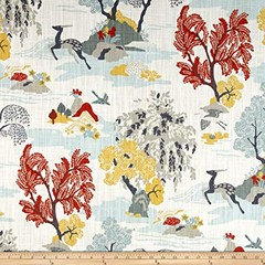
    Hi Flo. Thanks for the feedback and searching for potential fabrics. It's funny, I've looked at all those fabrics before during my great fabric search of 2018 and like all of them but dismissed for not enough navy or green or whatever. I'll admit I'm not a fan of light blues (always favor navys) and grays but fact is my bathroom floor is gray and there's gray in the rug (which I was happy about since it's in the floor). I do tend to like a variety of colors in fabrics/room. I have bosporus toile pillows in my living room and used another one in here when the red bedding look I had for years. I love colors. My favorite one is this one and I'm going to order a sample. Some photos it looked like there was some sage green in there and others not.

    I do very much love that beach picture but that's not going to look right above the bed. I like the idea of cardinal Audubon prints but was trying to branch out with slightly different art. We'll see. :)

    If you have some time, do you know of a fabric that includes a similar shade of green like this? Also found in the daffodil painting.

    [deleted]

    Looking again, I see the folk ones does but I think I'd like something lighter. The last one also does but I like those japanese/chinese fabrics but not necessarily for my own home.

  • PRO
    7 years ago
    It is largely a personal choice, and my choice in a bedroom/ensuite is peace and tranquillity. Red is high energy color and great in small doses in general areas. For me, the navy and white and cream and art that creates soothing feelings is good for bedrooms. So stick with navy and less saturated colors for a inviting and calming look.
    User thanked Flo Mangan