Software
Houzz Logo Print
esther_parra

layout - please critique

7 years ago
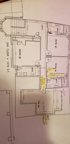
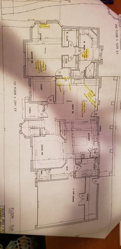
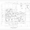
Here is the layout of our home. The only concern we have is the fireplace won't be centered under the tray ceiling. Any comments?

Comments (12)

  • 7 years ago

    Here are the layouts.

  • 7 years ago
    Which ceilings do you recommend?
  • 7 years ago

    You have two threads on here about this very issue. The other can be found HERE.

    I'd like to hear Anglophilia's opinion on coffered ceilings as I'm contemplating one myself.


  • PRO
    7 years ago

    What tray ceiling?


  • PRO
    7 years ago

    A flat ceiling will go well with the right and left elevation which have no or very few windows.

  • 7 years ago

    People in both threads have told you to forget the tray ceiling idea. You should listen. Tray ceilings were popular in the 1990's. They serve little purpose. In your application, it just creates a problem. Forget the idea. Spend your money on a better fireplace and better crown moulding.

  • 7 years ago

    no tray ceiling, a flat one with crown molding

  • 7 years ago

    HI -- How old is this house plan ? It looks very segmented and very 80's to me . I agree with others to not have tray ceilings . Maybe re-look for a better house plan if possible .

  • 7 years ago
    last modified: 7 years ago

    Here is the layout of our home. The only concern we have is the fireplace won't be centered under the tray ceiling. Any comments?

    - Because this room opens into the kitchen, a tray ceiling would look quite odd. I agree with the above posters that tray ceilings are a mistake ... not because they're "dated" but because they were always a weird and awkward choice. I see no reason not to use a simple, flat ceiling in this space.

    - Will you be able to bring furniture into the master bedroom? Imagine bringing a large dresser though that 90 degree angle door.

    - Do you need the sitting area AND the study right next to the master? I'd be tempted to lose the sitting area and insert double French doors between the master and the study. This would also allow for a more natural placement of the bed; that is, you could arrange the bed so you'd see the pretty headboard upon entering the room ... as it must be placed now, you'd enter and see the foot of the bed.

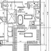
    - The master bathroom is grossly overdone ... it really does look like a "worst of the 80s" bathroom ... and badly done: note that the designer has split the entrance so you'll come in and have a view of the tub ... but the door is off-centered. Simplify and downsize, and you'll have a comfortable and attractive space.

    - The great room looks nice and the fireplace /built-ins are nice ... but it won't be large once you allow walking aisles on two sides.

    - The kitchen is a mess. Three big issues: 1) A "U" shaped kitchen's greatest asset is that it's highly functional for a single cook, who can turn and have everything at his or her fingertips ... but when you cram that middle space with an island, you remove the function. 2) The kitchen is laid out for looks instead of function ... for example, the refrigerator is literally across a hallway /too far to work well with the other major players. 3) As presented here, the corner pantry divides your workspace further. You have a nice-sized space here, and you can have a much nicer kitchen.

    - The utility room looks great ... but since this door will stay open 90% of the time, I'd go with a pocket door.

    - The mudroom also looks good, though I sorta want to suggest another pocket door so this messy area can be closed off when it suits you ... but I say "sorta" because this is the space through which guests must pass to use the half bath.

    - In the garage, remove the wall for storage ... just place storage against that wall. My uncle had such a storage room, and I always hated when he asked me to go into that room to retrieve something from the freezer ... why create a narrow, difficult-to-navigate room, when you could just have storage against the wall and walk straight up to it?

    - Three upstairs baths? What a lot of work. Think of the installation cost, the constant hassle of keeping 4 1/2 bathrooms stocked with toilet paper and soap, and -- worst of all -- think of cleaning 4 1/2 bathrooms each week. Even if you're paying someone to clean, you're paying more than is necessary. No thanks. I'd rather have ONE well-done bathroom open to the hallway.

    - Note that, as drawn, people in the upstairs playroom cannot access a bathroom without going through a bedroom.

    - Ignoring the above comment: The two side-by-side bedrooms are poorly designed ... it'd make so much more sense to place the bathrooms and closets together so that they'd form an acoustical barrier between the two bedrooms. Also, that might allow for more windows in these two bedrooms ... at the moment, these bedrooms have only one small window each, which will make them rather dark.

    - Where will you place a bed in Bedroom #2? No natural spot seems to exist.

  • 7 years ago

    Stop with the double postings!!!!

  • PRO
    7 years ago

    I avoid:

    Designs that do not relate to the site.

    Jack & Jill bathrooms.

    Bathrooms with two doors.

    Pocket doors to bathrooms.

    Closets where hanging clothes turn corners.

    Windowless walk-in closets.

    Walk-in closets the are less than five feet wide for a single loaded closet, seven feet wide for a double loaded closet.

    Jumbled room arrangements.

    No coat closet at exterior entrances.

    Kitchens with overly large work triangle.

    Corner pantries.

    Hallways less than four feet wide.

    Stairs less than 3'-6" wide.

    Less than three feet of width at a watercloset.

    Door swings that impede into laundry room work space.

    Doors that swing in front of other doors.

    Different ceilings in an open space that do not transition well.

    insufficient space beside a door for the light switch.

    to name a few.