Software
Houzz Logo Print
soleil72

Need help with paint color for Spanish Home

7 years ago
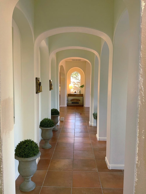


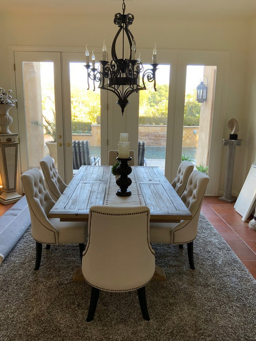
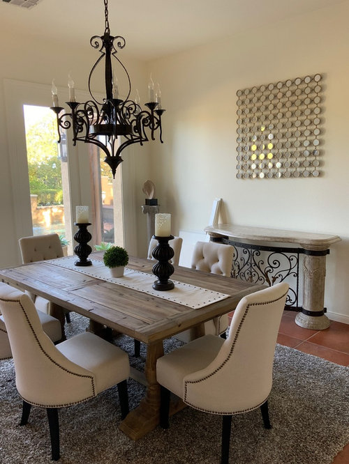
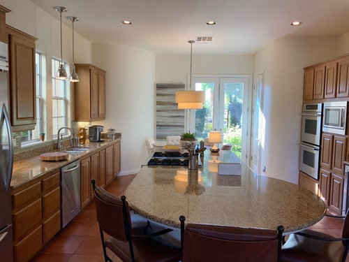
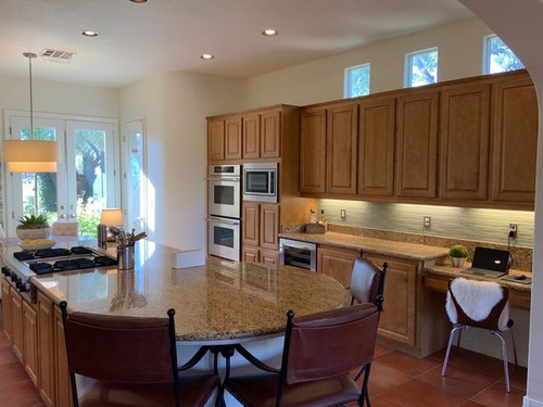
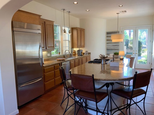
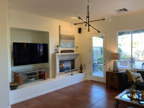
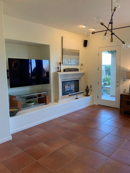
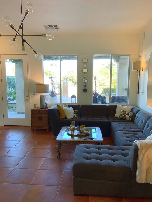
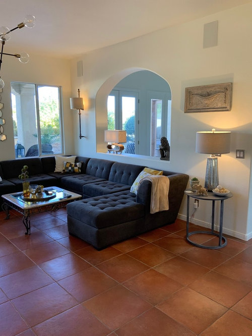
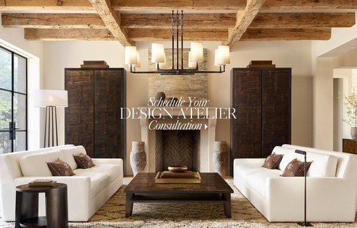
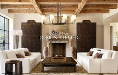
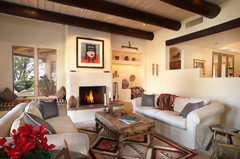
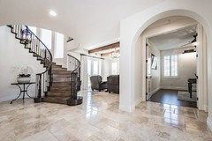
We have purchased a 17 year old Spanish home in Las Vegas with Italian Terracotta porcelain floors that is currently painted in BM White Chocolate OC-127. The walls and ceilings are in BM Regal Select Matte, the trim in Regal Select Semi-Gloss. All the same color - BM White Chocolate OC-127. The existing color is lovely, but not warm enough for the space as the rooms receive A LOT of light during the day and turn these walls sterile/clinical/cold. The light is predominately from the North with additional windows from South, West and East. The lighting sources have created quite the paint challenge for us while testing different colors. Our goal is to find a paint that has a similar "feel" to the RH picture we attached to this post. We know that's RH picture has probably been photo shopped but nevertheless like the "feel" of the color and the warmth of the space. We like the White Look w/the Terracotta to embrace the Spanish architecture, but need to warm things up a bit.


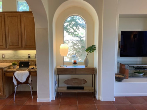
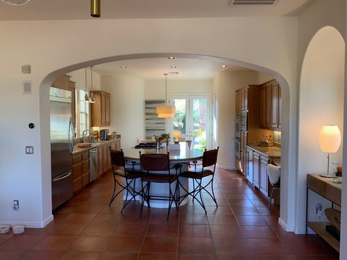
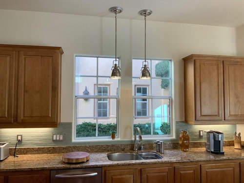
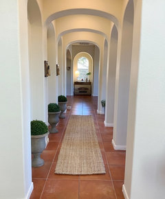
Attached are photos of the hallway, DR, LR and kitchen as they all open up to each other.


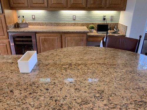
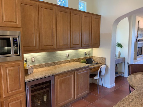
We are open to painting the cabinets in the kitchen if need be, but they are very high quality maple cabinets in a harvest stain. The glass on the wall is Walker Zanger Roku Glass but also have contemplated swapping that out for some of the small 3D matte off-white square tiles (something simple + neutral, but with some texture).


We sampled quite a few colors on boards. The ones that have a little grey in them either turn blue or lavender in our space, most likely due to the lighting, reflection from the pool outside, and the flooring.


As we are not paint experts and not familiar with colors and how they would read in our space, we would like to put our dilemma out for advise/discussion.


Any help would be appreciated. This really is a beautiful home - we just need to get that darn paint color right so we can tie everything together.


Comments (78)

  • 7 years ago
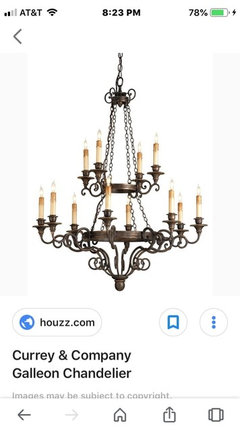
    last modified: 7 years ago


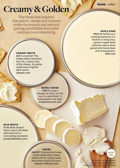
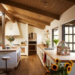
    this is marble white on the walls in this pic. looks like a warm tone. however, it does have a yellow/green undertone , as they've shown here: (click on shades to see the tones)

    https://www.benjaminmoore.com/en-us/color-overview/find-your-color/color/942/marble-white?color=942

    Since OP said her room gets Northern light, the light will look more blue/gray than if it was a southern exposure. Therefore, Marble White, on OP's wall w/a northern exposure, will NOT have a warm, creamy look to it. It will have more blue/green hues.

    Soleil:

    Cloud White is a soft warm white. It has a creamy base that is tapped down a bit by a neutral undertone so that it isn’t overly ‘yellow’. Cloud White will NOT act like white. It is softer and warmer.

    soleil72 thanked Beth H. :
  • PRO
    7 years ago
    I will do a color analysis for you on Marble White. Bbl.
    soleil72 thanked Flo Mangan
  • 7 years ago
    Flo,,,lol. you were reading my mind! I swear, was going to ask you if this leans towards the yellow/green

    soleil72 thanked Beth H. :
  • PRO
    7 years ago
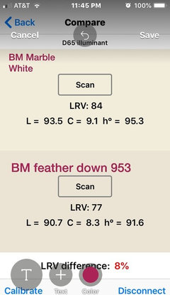
    Yes, it does. Here is the analysis and I did both the BM Marble White and the BM Feather Down. (having trouble posting) I have to back out of here and come back in. Another houzz "update"! Ugh! brb

    soleil72 thanked Flo Mangan
  • PRO
    7 years ago
    Trying from my iPhone.
    soleil72 thanked Flo Mangan
  • PRO
    7 years ago
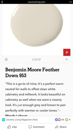
    Here is what the numbers mean. The Marble white is in the Yellow Hue family, however, it is moving toward the Green/Yellow Hue family o the Color Strategist Color wheel. It has a LRV of 84. So it is pretty light reflective. (84 out of a 100 scale, 100 being lightest. Feather Down is in the center of the Yellow Hue family so it is not going to lean green. It is at LRV of 77, so it is not as light reflective as Marble White. The LRV difference between the two colors is 8% so a pretty significant difference. If you want a purer white we can discuss what might work better than either of these two colors.

    soleil72 thanked Flo Mangan
  • 7 years ago
    Thanks for all the info on Marble White. We walked the swatch around the downstairs and in our space at least, it threw green. Thanks for the forensics on this. We are going to get some samples today and do some test boards. One color that someone blends well with the floor is a color called BM Elephant Tusk OC-8. As our house gets Tons of light, this might appear lighter in our rooms. Has anyone tried BM Elephant Tusk OC-8?

  • 7 years ago

    I think you should spend time shopping for a really good color consultant. There are so many beautiful colors and color combinations that would make this house look amazing. It is too nice for boring white-beige-gray.
    soleil72 thanked shivece
  • 7 years ago

    I really don't think white-beige-gray is boring in this light-filled home. On the contrary, it allows the architecture and furnishings to stand out. Not to say colour wouldn't work but I'd worry it would take over as the feature. You'd be standing in the terra-cotta room or the green room, etc. From the pictures, this looks like an elegantly designed home, full of graceful arches and great flow. I'd worry that colour would chop up that flow.


    soleil72 thanked tartanmeup
  • PRO
    7 years ago
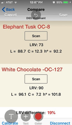
    I thought it might be helpful to analyze the current paint color with the Elephant Tusk. As you can see there is a significant difference. Even with a lot of natural light, i would be concerned about the LRV of Elephant Tusk at 73. The current color is striking with the architecture and your furnishings shine forward in this gorgeous home. Perhaps adding some textures in the form of wall hangings, pillows, rugs and throws is a way to achieve a warmer look without sacrificing the chic look you have now. A different coffee table in your room with the big TV and gray sectional along with perhaps a Flokati rug would possibly be your answer. I need more info on what you want but if it is warmth, I would try these ideas before repainting this entire space. I will play with some ideas for you to help diagnose what you are looking for.
    soleil72 thanked Flo Mangan
  • PRO
    7 years ago
    Just playing with some ideas of textured rug, driftwood (or any wood) bunching tables, fluffy pillows and a bit of green leafs along with removing the long mirrored piece and replacing with textural non-reflective wall hangings. You could use grass cloth wall paper perhaps behind the sofa and on the dining room wall keeping things neutral but adding texture which brings warmth.
    soleil72 thanked Flo Mangan
  • 7 years ago

    Hey Flo. We had to take a few day break from the project due to work schedule. Just wanted to thank you for your suggestions and kind attention. Really like your ideas and can try to play around with some of these. The issue w/the existing White Chocolate paint is that when the Northern light hits it (LR and Kitchen primarily), it completely washes it out to a lime green bright white. Apparently White Chocolate is a very, very light green on the BM strip which we don't really notice except in the rooms w/a ton of Northern light. We did p/u sames of Navajo, Niveous, BM's White Sand, Cotton Ball and Dunn Edwards Pueblo White. We like the white, just need a more Saturated one w/Yellow or Red undertones as the limeade green white just isn't working for us.

  • 7 years ago

    Oh, and yes, we did not p/u an elephant tusk sample. Your color analysis really cemented that for us in terms of the approach. We really like the tones of the wall in the RH picture below. We know it's probably been photoshopped but this is the kind of white/cream/off white we are trying to achieve in the space if possible. Again, we have crazy Northern light with tons of blue coming in from the pool and Las Vegas blue skies (no clouds in the sky 95% of the year). Do you have any color recommendations based on this picture?


    I forgot to mention that we do have an Ivory 8x10 Safavieh Paris Shag Rug under the grey sectional - it's just not in our picture. https://www.amazon.com/gp/product/B007XT08H6/ref=oh_aui_search_detailpage?ie=UTF8&psc=1 It is getting kinda worn out though (kids, pets) and was contimplating a different color. What do you think of the Safavieh Venice in Champagne? https://www.amazon.com/gp/product/B01B9AXJ6G/ref=ox_sc_saved_title_1?smid=ATVPDKIKX0DER&psc=1


  • PRO
    7 years ago
    Navaho is too yellow. You need a white closer to red hue family to cancel out green probably. I will take a look and see what might fit your lighting needs. Bbl. busy today. Later tonite.
    soleil72 thanked Flo Mangan
  • 7 years ago

    Flo, you are such a great advisor. Thank you for your time and design wisdom.

  • PRO
    7 years ago
    Soleil72- i have been looking over my Master Color Spreadsheet looking for the elements that would possibly be a good fit in your light conditions. This is a tough one. Most off whites are in the Yellow Hue family which we don’t want. I looked for off whites in the yellow red hue family hoping that would counter your green impacts. I found two that might have possibilities. SW 6077 Everyday White. It is in the Yellow Red Hue family and had LRV of 72 so it has a lower light reflective value and with your natural light could work. SW Fragile Beauty 7553 is also in Yellow Red hue family with a 70 LRV. Both these colors might have too much color for you but it might be worth getting samples and do good sample boards. If you want BM paint I can check to get color matches or near matches for you. These might help give us direction given your unique lighting conditions. I will continue to consider options fir you but we can start here.
    soleil72 thanked Flo Mangan
  • 7 years ago

    Hey Flo and thank you for your research. Fragile beauty looks like it might be a contender. I'm not sure if I mentioned this, but the Green that is reflecting off the the white walls now is the actually the paint as BM White Chocolate is technically a light green.


    The light coming in from the windows is actually Blue.


    So pretty much need something warm like the RH pic above that that isn't too bright white, that does well in North Facing Room with lots of blue light coming in from the Sky and Pool reflection.

  • 7 years ago

    FYI - sampled BM Navajo White yesterday as we had it anyway and it was completely washed out and looked pure white in our light :( Same for BM Niveous

  • PRO
    7 years ago
    This information leads me to lean toward a color with more chroma. I will look further tomorrow and see what else I can suggest.
    soleil72 thanked Flo Mangan
  • 7 years ago

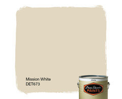
    Not sure if this is a Christmas miracle or not... I was driving out of the neighborhood and one of our neighbors was getting their home painted. The color was the perfect white (at least on her home). Her painter gave me a sample pot of the color they were using - it was called Dunn Edwards Mission White DET673. Here is the link: https://www.dunnedwards.com/colors/browser/det673 and a link from their promo material on whites:

    https://www.pinterest.com/pin/442760207093889671/


    It looked quite dark in the sample pot but purchased a quart of their Velvet Suprema as I knew what it looked like on the neighbors house and wanted to test it on 1 wall. I tested it on the 3rd arch wall in the hallway and it looked gorgeous - no blue, not washed out, and amazingly not dark. Going on it looked like darker than the BM color, but after painting the entire wall it looked really nice.


    If this works out on the other walls, could I use this on the trim and ceiling or will it be too dark for this? Our ceilings are 12 feet.


    If you could do some forensics on this with your Flo-Chroma-Meter I would really appreciate it. I also want to make sure the color will be good for the next 10 years and not be a dated white.


    Again, I appreciate your time and knowledge and just let me know whenever you get a minute. Really, no rush at all.

  • 7 years ago

    How can a white look dated?

    soleil72 thanked sloyder
  • 7 years ago
    last modified: 7 years ago

    I also want to make sure the color will be good for the next 10 years and not be a dated white.

    lol. I think you'll be ok as far as 'dated paint colors'!

    I can see why they call it Mission White. it reminds me of a Spanish adobe or something. looks very nice w/natural wood.


    I would use a brighter white for trim work.

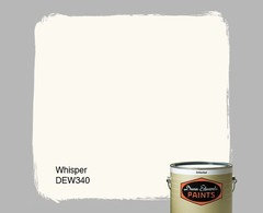
    I've used Whisper for trim

    soleil72 thanked Beth H. :
  • PRO
    7 years ago

    Heck if it looks good on your wall, go with it. You can use the same color for ceiling and trim, but just change the "finish" to get a subtle change in perception. Flat for ceiling, maybe matte for walls or egg shell; and satin or semi-gloss from trim. They will all look a bit different but work totally well with each other. I will see if I can find out about the color. I don't have a D&E paint deck, but I can look on a couple of my apps. bbl

    soleil72 thanked Flo Mangan
  • PRO
    7 years ago

    OK, The numbers for DunnEdwards Mission White are Lightness=86.35; Chroma = 12.5 (a lot of colorfulness) and Hue Angle 91. The 91 means it is in the middle of the Yellow Hue Family and just over to the cool side of the color segment. With your floors, I would be a bit afraid this would go too yellow on you especially over time, but I defer to your unique light conditions. Beth has a good point about doing a lighter trim color though. That would help tone this much color down. Might try some sample boards of it and move around and observe it in different locations at different times of day to get a better feel for it.

    soleil72 thanked Flo Mangan
  • 7 years ago

    Thank you kindly Beth and Flo. We are going to test these all today. PPicked up another sample while at Dunn that they said worked well for Spanish homes but had more of a contemporary vibe (not sure what that meant exactly at least with paint). The color is Pueblo White. Do you think the components of this one will look good with the Italian Teracotta?

  • 7 years ago
    last modified: 7 years ago

    A "more contemporary white" typically just means the white reads brighter and more crisp....less warm,less soft. DE Pueblo White would read brighter but in your space,it may wash out like the Navajo White did for you. I would be careful about contrasting the trim colour, because it could easily make your walls look more yellow.


    EDIT: I meant to type Pueblo White above. (now I did!) It is brighter than the Mission White but with the extra light bouncing around (higher LRV) and less chroma it might wash out more than you prefer.

    soleil72 thanked hollybar
  • 7 years ago

    Oh, I see about the contemporary reference. We do want warmth as in that RH proof of concept picture above but not for the color to be washed out by our natural light. Good point about the trim. The guys at Dunn were nice enough to provide some quarts of the semi gloss in a few different colors so we are going to paint some sample baseboards that we have and wall them around one we bet the wall samples / boards done.

  • 7 years ago

    Any assistance with that other color Pueblo White would be appreciated.

  • PRO
    7 years ago
    I did analysis of DE Pueblo White for you and did a color match in BM color. Pueblo White has Lightness notation of 88.6; chroma of 9.96; and Hue Angle of 95.84. The Hue Angle is in the near center if the Yellow Hue Family and slightly into the cool segment if the hue. So, it has a good amount of chroma which can help color hold up in your light. The BM Color Match I came up with in case you want BM is OC-6 feather Down. L=88.8; C=9.3; hue angle=92.6. This puts it in the Yellow Hue angle cool segment but a bit closer to warm segment. These two colors are very close. Did you try Feather Down? Interesting.
  • 7 years ago

    @Flo Mangan Could you do an analysis of the BM Navajo White that washed out for the OP?

  • PRO
    7 years ago
    Sure. Bbl
  • PRO
    7 years ago

    BM Navajo White has L=91.251; C=9.101; Hue Angle of 92.154. It is in the Yellow Hue family cool segment. Compared to Mission White DE, the Chroma is 12.54 so it has a lot more chroma. (Mission White has more chroma.) The Chroma of the Pueblo white is 9.96 so almost a degree more chroma. To me the Pueblo has too much Chroma for a contemporary look, but in that light I could be wrong. Lighting is the biggest issue in this home as we know.

    soleil72 thanked Flo Mangan
  • 7 years ago

    Flo, we tested Pueblo White this weekend on most areas and it looks like that will be the color we go with. We will send photos once we complete a few more walls. Thanks so much for your chroma analysis on this product as it was **extremely** useful information. The mission white looked dark in some areas which we really did not want.


    As we we want a monochromatic look for the house (paint), the walls and ceiling will be in Pueblo White in Matte/Velvet and trim semi gloss. Do you have an insight as to whether the "interior" front door should also be Pueblo White or should it fit more of the Spanish Motif of Espresso (dark brown) or black? It's a very large, arched front door in the entry. Currently painted the trim color but wanted your thoughts on this door and whether it should be different? This is the only door we'd consider doing a different colour.

  • PRO
    7 years ago
    Large, home specific front doors ate usually best with inside and outside finishes are the same. Could you post some photos?
    soleil72 thanked Flo Mangan
  • 7 years ago

    Our front foyer is stuffed w/15 gallon paint buckets and ladders. Once the crew clears out the stuff we'll snap a picture for you. Might be a few days so stay tuned...

  • PRO
    7 years ago
    Haha. Ok I understand. I can’t wait to see the Pueblo White. Glad my info helped. Big challenge you have. Good luck on your efforts!!
    soleil72 thanked Flo Mangan
  • 7 years ago


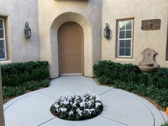
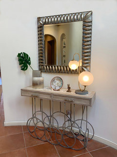
    Hey Flo & everyone else... Here are some pictures for your perusal. Below is a brief summary of what you are seeing:


    1. Exterior entrance. The landing is in a rotunda w/a spiral staircase


    2. When you enter front door, hallway is to your immediate left


    3. Directly in front is our funky table w/a vignette of items


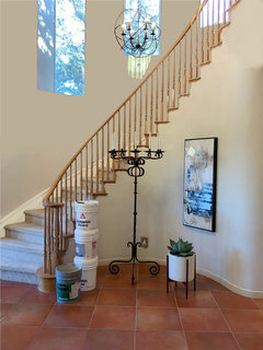
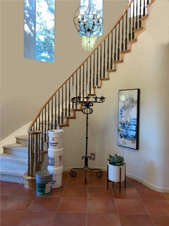
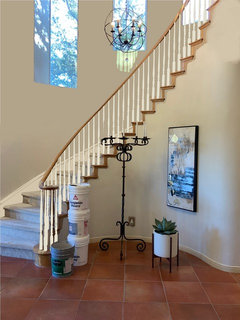
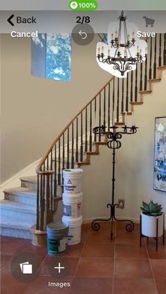
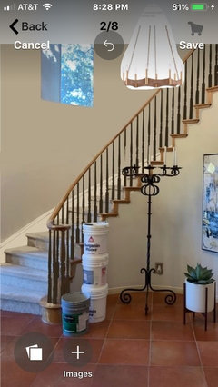
    4. Staircase complete w/15 gallon buckets. The color on the wall was painted pueblo white on about 1/2 of it (the bottom part). I photo shopped in the top parts/area around the stairs as we are going to have this professionally painted.


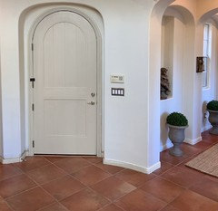
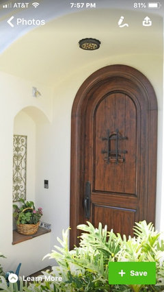
    5. The infamous front door.. What to do w/this when the painters come?? We can go safe and keep in monochromatic Pueblo White in Semi Gloss or go for something bolder. Our painter said a popular color scheme that his clients love is Dunn Edwards Pueblo White + Dunn Edwards Espresso Macchiato. https://www.dunnedwards.com/colors/browser/det680 Perhaps we can do this on the door and the staircase? The wood on the staircase (and the rug) is totally shot and has to go anyway so this could be an option. Comments/wisdom/inspiration welcomed on this one.


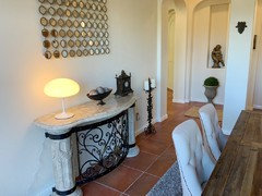
    6. I only put this pic of the dining room in so you can see the difference between the original color white chocolate (on DR walls) and the Pueblo White (in the hallway). Hopefully you all can see the difference. The post says it all...


    7 + 8. These are 2 proof of concepts of what the staircase would look like painted. I ran out of time and didn't do the handrail and the wooden parts on the bottom but think you can get an idea. I used the Espresso Macchiato color for the brown one (and chopped off some candlesticks in the process).


    Our door hardware is gold throughout the house and would prefer not to change it everywhere as there are about 1 million doors in this house (ok, maybe not 1 million but really a lot of them).


    Would really, really like some input on the painting of our arched door, staircase, carpet for stairs and perhaps a rug in the rotunda somewhere that would work with our Spanish Home. We also want to get a new chandelier so open to suggestions there.


    Thank you all in advance.

  • PRO
    7 years ago
    Let me start with paint color. It looks good but very hard to see difference from camera photos. I definitely would go for darker brown color for front door. Your painters suggestion looks pretty good but i might go a bit richer and deeper. More like a true stained Mediterranean wood door. The door is really under scaled for the size of your home and your grand entry. I am going to look harder at that and see what might be done about that. Bbl
    soleil72 thanked Flo Mangan
  • 7 years ago

    Thanks Flo. Would a deeper brown color go w/the gold hardware?

  • PRO
    7 years ago
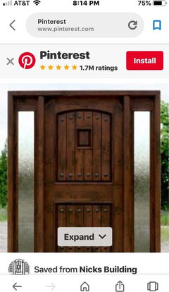
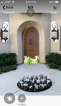
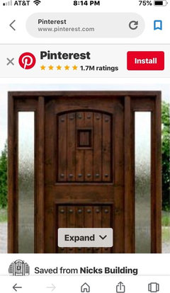
    Yes the brass/gold would be ok but i would change to black iron set. You don’t have to change all because doors are separate. I would consider adding some dark metal features on the door. They are called Clavos. Here are some looks. The way this could be accomplished with a painted door is to paint door color like painter suggested. Then come back with an ebony glaze to highlight some texture. Then add black metal detail such as clavos or faux hinges. Then get larger outside fixtures. I will look for entry chandeliers next.
  • PRO
    7 years ago
    Sorry, I couldn’t block out greenery in the mock up! Just ignore that. Lol
  • PRO
    7 years ago
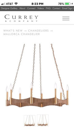
    Here are two concepts for your entry. One classical Mediterranean and one more contemporary but nods to the period.
  • PRO
    7 years ago
    Mock up
    soleil72 thanked Flo Mangan
  • 7 years ago

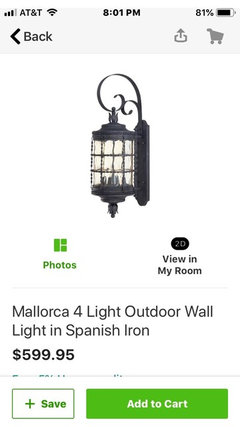
    Brilliant! How did you find that chandelier so quickly? You are simply an amazing designer. I am favoring the 2nd as it's more in line with our taste. I'll research that one and price it out. Regarding the clavos, I have a source for the clavos - excellent idea. Also, please provide link for those lanterns outside. Are they murray feiss? Love them.

  • 7 years ago


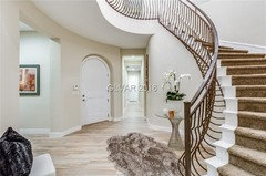
    I've attached pics of some of the neighbors homes who modified their staircases in addition to putting in some rugs / table vingnettes. The 1st is nice but a little to ornate for our family, while the 2nd is also lovely but reminds us too much of a catalog. The 2nd photo features a paint color on the banisters very similar to the espresso color our painter suggested.

  • PRO
    7 years ago
    Haha! I have just done many homes so know what products and companies fit into styles and hopefully can lock into client’s goals. Love helping folks get their dream even when they aren’t sure of what they want. So fun! I will post source of the outside lighting. You will have to verify sizing. But I would go big out there. The exterior light is really pretty in person because of the glass used. Of course, the other is from one of my favorite lighting companies.
  • 7 years ago

    We feel our entry is a little "empty" and can certainly make some modifications....


  • PRO
    7 years ago
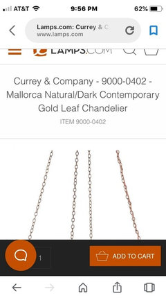
    Here is source for Currey Mallorca chandelier. I would call some local good lighting stores and see if they have this chandelier. It is fairly new.
  • 7 years ago

    This is great Flo thank you so very mucy. I'll go to Winter Market in Jan 2019 and stop by Currey & Co. I'm sure we'll meet their MOQ :)


    I really appreciate this.

  • PRO
    7 years ago
    That would be great. Seeing in person is so important. Plus this one is fairly new so might not be in local showrooms yet. Keep me posted as you move forward. You have a wonderful home and you will make it yours and even better! Merry Christmas and let’s make 2019 a great design year!
    soleil72 thanked Flo Mangan