Software
Houzz Logo Print
vivian2003

Help~what paint color to choose

7 years ago
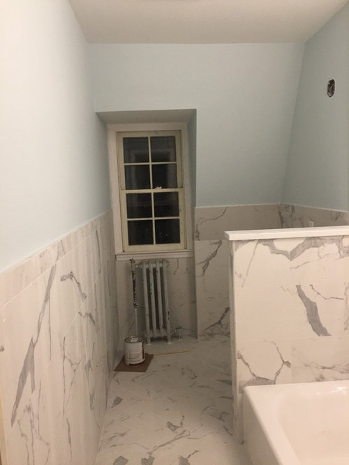
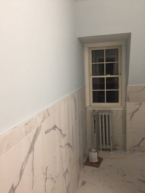
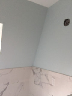
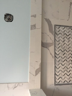
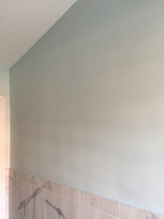
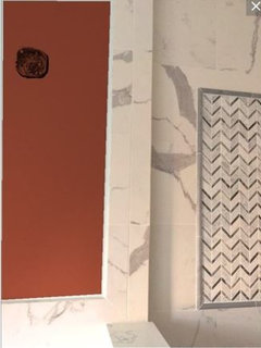
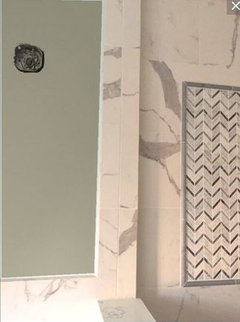
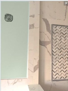
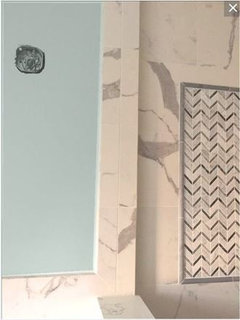
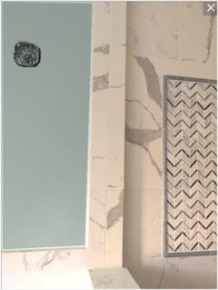
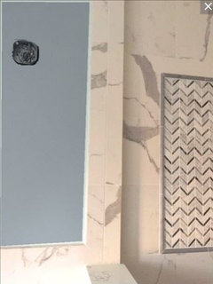
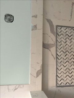
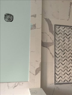
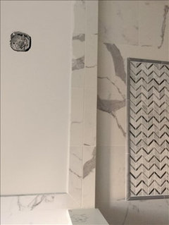
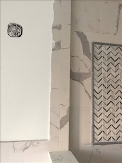
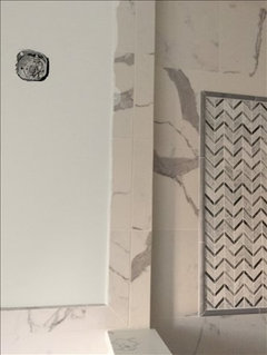
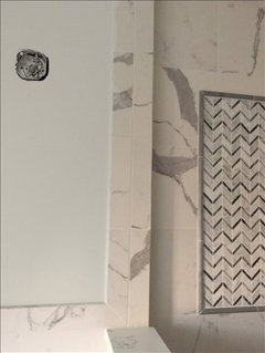
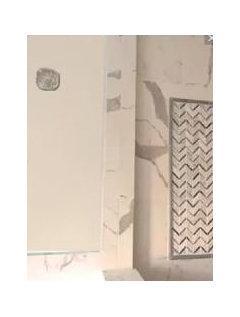
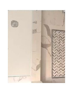
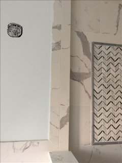
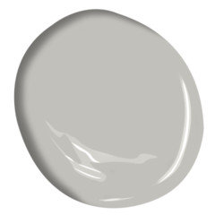
I picked Ocean Air by BM to paint one of the bathrooms with matte marble look tiles. I liked the refreshing feel from this paint color but it turned out to make the tile look darker and dirty. Please see picture below.

I have to get a different color. Any advice?

Comments (40)

  • 7 years ago
    last modified: 7 years ago
    before you repaint, have you tried different light bulbs? yours seem to be a bit too yellow or pink, which is throwing off the white in your tile. try bulbs w/a higher K temperature. maybe 4000K or so. or the daylight, cool blue bulbs. try the bulbs first and take another photo

    and you don't have any light toward the back. So, you really don't have a true sense of how that color looks. what does it look like during the day?

    get more lights, and cooler bulbs.

    I'd also paint your window a a different color. either a dark gray, or a white like White Dove.

  • 7 years ago
    Beth is absolutely correct - either your lighting is yellow or your camera white balance is off, the picture is coming through with very yellow tones.


    If you don't have daylight bulbs, get them.


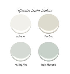
    That said, I think even with good bulbs the white marble is not as white as it needs to be to support Ocean Air. Try samples of Quiet Moments and Beach Glass for a similar feel, but a bit darker and less saturated.

  • 7 years ago
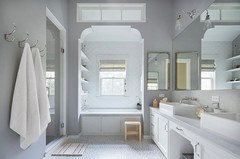
    If your marble is still reading yellow against the colors I just suggested you may want to move more toward green - Ask the Benjamin Moore store to mix a sample matching Devine Color Date.

  • 7 years ago
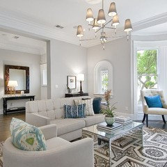
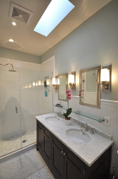
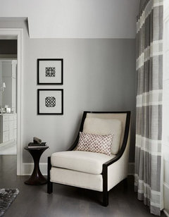
    I was thinking a greener tone as well (after trying the lightbulbs), I’m considering Benjamin Moore quiet moments for my master bathroom remodel that will have similar tile. Here’s an example in a bathroom I have saved.
  • 7 years ago
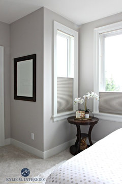
    Shoreline is also a pretty grayish green.
  • 7 years ago
    *gray blue not green. I haven’t had enough coffee yet...
  • 7 years ago
    I used BM Quiet moments in a bathroom with marble in my old house (sorry, I don’t have photos). It was gorgeous. Get a sample to see if it appeals to you.
    And, change the light bulbs anyway.
  • 7 years ago
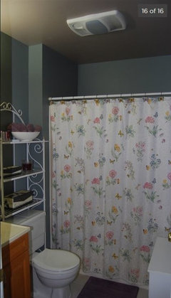
    Maybe?...

    Window trim & mullions: Worsted by Farrow & Ball; semi gloss
    Walls and Ceiling: Slipper Satin by Farrow & Ball; eggshell
    Radiator: Metallic silver (try Ralph Lauren paints)

    Coordinate with shiny nickel hardware; agree to changing bulbs, and install dimmers on all light switches
  • 7 years ago
    Thanks all! I went this morning and took a couple pictures with natural daylight. They still don’t look good to me. :( My contractor probably will hate me. Maybe I should just take it for now and put it down a future DIY project?
  • 7 years ago
    I agree with you it doesn’t work well...it’s too baby boy bedroom blue. I’d try something with a grayer tint. Don’t worry, he’s paid to do what you want!
  • 7 years ago
    The tile reads pinky beige and the walls read blue gray.
    I would try to match the gray in the tile, but a lighter version.
  • 7 years ago

    My opinion is that the color you picked is too blue, too light and vivid.


    I pulled one of your pictures and uploaded it to the ben moore site.


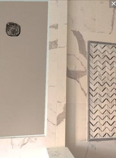
    Tried different colors to show what may or may not work for you. Hope it helps


  • 7 years ago

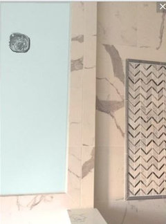
    First Pic is with their version of Ocean Air


  • 7 years ago

    Here are two not blue/green options just to demonstrate how other colors play off your marble.


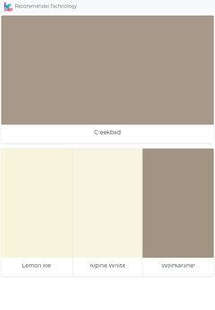
    Creekbed - pulls the gray from your marble.


    Tea - the Orange makes the orange undertones showing in your pics go away


  • 7 years ago

    Creekside Green


    Antique Jade


  • 7 years ago


    Beach Glass


    Greyhound


    Sweatshirt gray


  • 7 years ago
    In this case, the gray really is the best!
  • 7 years ago

    Thanks a million Jennifer. I tried a couple more colors. What bothers me is the tiles look yellowish. And I don't know what paint can make that yellow tone disappear. Imperial Gray and Raindance.


  • 7 years ago

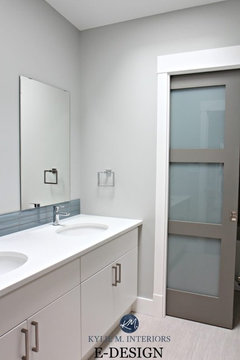
    I used Gray Cloud w/my bathroom full of marble.

    Have you switched the lights yet?


    and the colors you're using in there are too saturated with the blues/greens.

    try some of these

  • PRO
    7 years ago
    I think I would get some paint sample strips from the store, try to match it to the dark patches in your marble then paint the wall the lightest shade on the strip.
  • 7 years ago

    Another vote for Creekbed! Looks great with the tile

  • 7 years ago
    Creekbed - best one of the bunch!
  • 7 years ago
    last modified: 7 years ago

    creekbed looks dark and leans on the taupe side. unless you get an actual sample and try it on your wall, I don't think it will work.

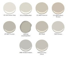
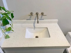
    Ive used Smoke Embers (mixed w/ a little Abalone, BM) and the color was nice in a bathroom.

    best pic I have during the remodel.

  • 7 years ago

    I tried Hazelwood, a shade lighter than Creekbed.


  • 7 years ago

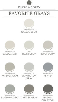
    I then tried Balboa Mist, and the next two shades: Cumulus Cloud and LaPaloma Gray


  • 7 years ago


    Bm Dusty Road

    BM Ionic Column

    I like the way it looks with Creekbed but I understand that some would not want a color that dark in the bathroom.

  • 7 years ago

    I kinda like the Smoke Embers that Beth suggested. Does it have a lot of blue in it?


  • 7 years ago

    smoke embers doesn't read blue, depending on your light


    and this is Abalone (BM) I mixed Smoke Embers and Abalone (less than half) and made the color you see in my previous comment w/the sink.


  • 7 years ago

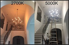
    Before you do anything else go to home depot and purchase Cree brand 5000K lightbulbs for your bathroom


  • 7 years ago

    Next understand that you took pictures in the morning. 5000K is the color of daylight at noon on a clear winter day. Sunrise is about 2500 K and it slowly goes to 5000 k by noon. It was probably 3000 K or 3500 k when you took the pictures with natural daylight.


  • 7 years ago

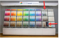
    The next thing you want to do is go to your local paint store and pick up the free paper color swatches. Pick up a large variety of colors from the neutral and muted colors. (Colors similar to the colors in the bottom row and the neutral column in this display)


  • 7 years ago

    The colors will look a bit drab and dreary next to all the vibrant colors above, but a wall is a huge space and a little bit of color can go a long way when you have 100 square feet of the color in front of you.

  • 7 years ago

    These small samples are going to be used to get an idea of the colors that you like with your marble. Tape 3 or 4 on the marble and see what you like. Pick your favorite next to the marble.

    Remove those that are not contenders and replace with the next group. Keep doing this until you are down to just a few colors that you like next to the marble.


    Now you are ready to start sampling. I like Benjamin Moore because you can get large color samples. You just have to ask for the 8x8 color sheet for the colors you want to try. They may not have all of them in stock, but they can get them for you. They are paper samples, but they will give you a good idea of what the color will look like in a larger format.


    Don't be afraid to use a mid toned color. Darker color will make the white look brighter and cleaner than a light color.


    Once you have narrowed your choice to 3 or 4 colors buy 2 at a time and paint large samples on large foam core or pieces of drywall if you happen to have spare sitting around somewhere. Place them in your bathroom and live with them for a day or two. See how you like them at different times of the day. Find your favorite and then tweek it until it is perfect.

  • 7 years ago

    Here is a picture of my last house - guest bath. Color was Devine Color Breeze. Showing you so you can get a feel for a dark wall color with lots of white stuff. I got complements all the time on the unique paint color.


  • 7 years ago
    Sometimes the tile/marble/stone is just not right. It is a lot of this large print marble in a small space and not a pure white, which makes it tough to add certain color. Can you remove the wall covering and leave the floor?
    Then with paint color of your choice, a rug, towels, accessories, you can add colors you like vs. matching something you feel “stuck with”.
    Don’t know from comment (or my memory) if marble was your choice and or if you love it, however if you think will remove later, why not now?
  • 7 years ago
    Just paint the walls a warm white ! It will brighten the room and look much better .
  • 7 years ago
    Am I the only one who sees more of a ‘beige’
    tone in that marble ?
    Jennifer Horgan posted a photo of Creekbed
    which appears to match perfectly.
  • 7 years ago

    It is very difficult to tell if whites are white or yellow or tan based on a picture. White is actually quite difficult because it is so reflective. Yellow or blue in lighting can be reflected, greens from outdoor trees can be reflected, colors from carpet and other things in the room can be reflected, all changing how the white appears. Then you have the camera and the white balance in the camera and the white balance in the photo editiing software (if used) plus then we all have monitors that show color differently, and very few people have monitors that are good enough to view paint colors.


    I often suggest that people take color samples outside at noon on a sunny day and look at them on a white sheet with samples of all of their stuff (Counter, cabinets, flooring, bedding, couch cushion, wood) . Figure out what color works in the best natural daylight and that color will still work when you bring it into the house, but you will see the little things that make it look "off" in natural daylight, where inside it can be evasive.


  • 7 years ago
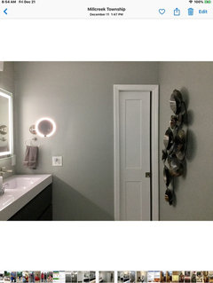
    Hi, I just remodeled our MB, and had a hard time picking a wall color. Wanted a soothing, spa like color with a hint of green & grey. Flo & HIWE were helpful in wall color selection. Metropolitan is BM’s 2019 color, & SW Chelsea Gray was comparable. Since Sherwin Williams was the only close paint store, I went with the Chelsea Gray. I love it. Different times of the day, it looks grey, and other times it looks green.