Software
Houzz Logo Print
webuser_521684

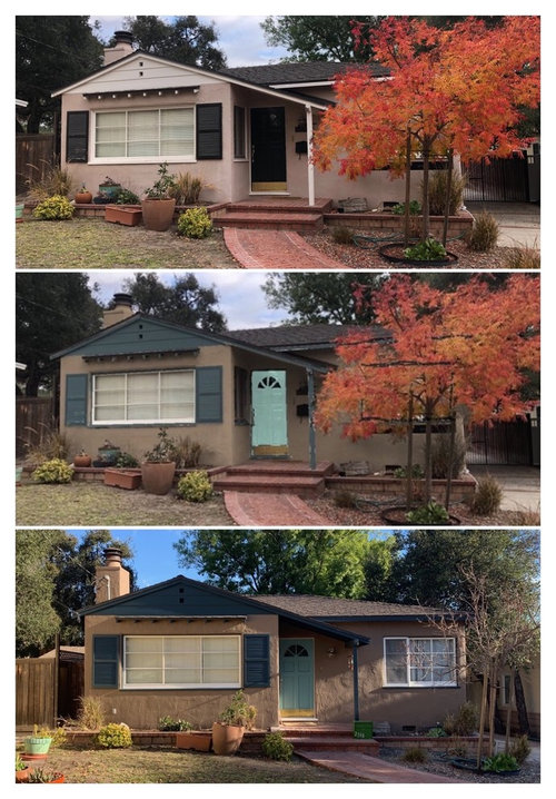
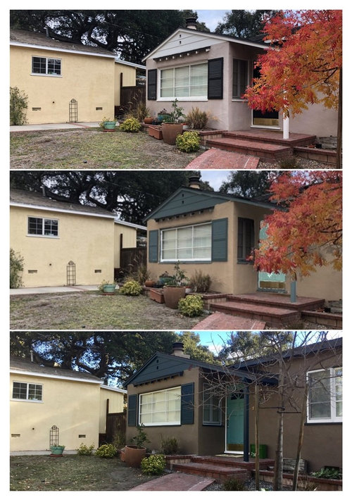
Testing Benjamin Moore’s “Personal Color Viewer.”

Before we got our exterior painted, I was trying to find a post anywhere showing how accurate the personal color viewer (PCV) on Benjamin Moore’s website was. I figured I’d make this post to help out the next person.

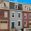
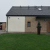
Our house is a 1938 Minimal Traditional in Southern California. Stucco, wood windows and door. These photos are the before on top, the “PCV” in the middle, and the end result on the bottom. Hope this helps someone.

Body color is HC-76 Davenport Tan.
Trim and gable are HC-157 Narragansett Green.
Sashes are OC-45 Swiss Coffee (i would have liked to go with something else but our back windows are white vinyl so it brought cohesion to the house IMO.
The door is HC-137 Mill Springs Blue.

Thoughts: It is surprisingly accurate for light to dark colors, less so for dark to light, like the door. I recommend doing multiple angles. As you can see, the color is fairly accurate to the opposite photo. Davenport tan changes quite a bit with the light. I still tested the paint on the house to make sure they were going to work together. I am impressed now with how much the PCV version looks like the final, but the colors are richer in person than on any of the photos Narragansett Green in particular is beautiful in person, but looks almost black in most photos, and even in a small painted sample.

Comments (4)

  • 7 years ago
    Beautiful color choices. They work so well together.
  • 7 years ago

    Thank you for posting this. I'm in the process of selecting exterior colors & was wondering how accurate the PCV is. Your house looks great.

  • PRO
    7 years ago
    last modified: 7 years ago

    A lot of people wonder about the visualizers and the swatches you find online in general.

    It's a really good question.

    I'm sharing the following because I think it's important to understand the limits of digitized color - virtual color, online color or whatever you wanna call it.

    The most important thing you need to remember is this:

    How the paint colors look depends 100% on your device and nothing else.

    Digital paint colors will look different on each and every monitor, phone, tablet, laptop, etc.

    The color I see on my computer is not the same as the color you see on yours.

    Has absolutely nothing to do with color "in" the paint brand's viewers.

    No effort is made to ensure color accuracy with visualizer programs because the people who design them knows it doesn't matter.

    Because, again, how you see the paint colors depends on the device your using to view it and nothing else.

    The color space the visualizers work in is called RGB.

    In color science terms the RGB color space is ill-defined. Meaning (among other things) that the RGB color space makes no effort to mimic the human visual perception of color - how we see color in real life.

    Human visual perception is defined by 3 dimensions: hue, value and chroma.

    The RGB color space lacks TWO of those three; it lacks the dimensions of lightness and chromaticity (colorfulness/grayness). Thus, why the RGB color space is ill-defined.

    The RGB color space is strictly about lighting up three channels of light (red, green, and blue) to make a bunch of other colors.

    RGB values don't correlate to paint colors in any way whatsoever.

    Creating a sense of grayness or color nuance (which is lightness + saturation) digitally in the RGB colors space is very difficult. Because you're trying to "fake" a visual sense of grayness using a combination of red, green and blue channels of light on some kind of a device that is most likely not calibrated properly for displaying color.

    What all that means is the visualizers, any and all virtual renderings are inspirational at best.

    No one should mistake online visualizers or swatches for color "tools".

    The brands that offer a visualizer could be a lot more transparent about how it works, IMO.

    But the point of the visualizers is not to help the consumer, it's not meant to be a resource for color information.

    The visualizers are part of a marketing funnel designed to get you in a store to get chips where the staff can sell you paint and supplies.

  • 7 years ago

    This:


    How the paint colors look depends 100% on your device and nothing else.


    Absolutely true, and the above advice also contains a phenomenal explanation of RGB vs. RYB, as well as seeing colors with light EMINATING from a thing (screen) vs. striking it (Film on a wall).


    You have no idea how frustrated my patrons (and myself) would get while I was trying to explain the concept from behind a Ben Moore paint desk. I would tell them, "Think of your computer's display functions... now toggle some variable up or down and what happens? The color changes. You haven't calibrated anything, you just put it where you like it. Now, you're asking Ben Moore to tell you 'what will this color look like' when you can't even pick between Linen White and Navajo White when it's physically on your walls and in front of you?" Good luck.


    The system is a tool, like any other tool. It is not a miracle. Once you get that pic, try to print it AS IS in the highest possible resolution. Bring the PRINT COPY to the Paint Store. Then, look at the color you've chosen that you (allegedly) printed, but ALSO look at the others like it that fall in the light & shadow areas of the picture. You'll find anywhere from 3-12 colors, give/take. That's your sample bunch. Start there.