Software
Houzz Logo Print
sanaabou

Living Room Interior Design

7 years ago
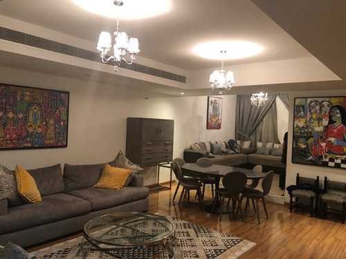
Hey All,
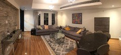
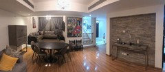
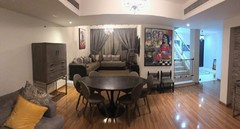
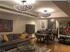
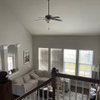
What do you think of the overall space?
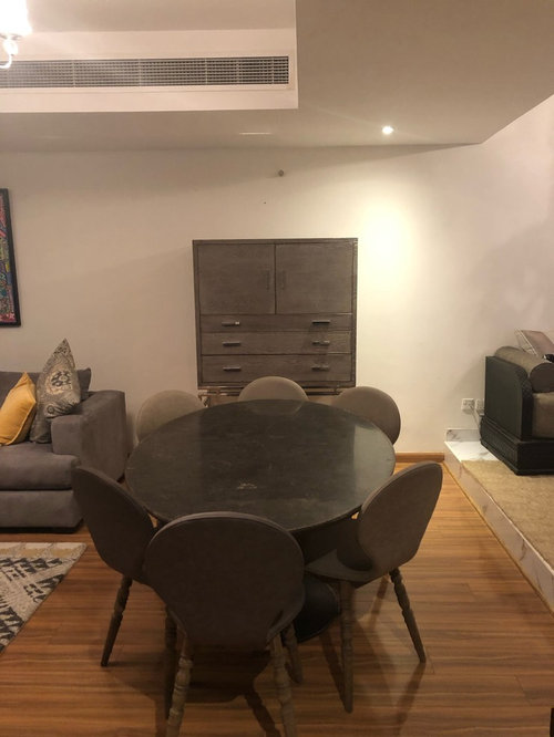
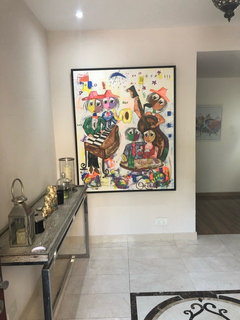
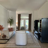
What do you think of the cabinet behind the dining table ?
Anything to enhance ?

Comments (20)

  • 7 years ago
    last modified: 7 years ago

    I dont care for the cabinet in that position. It appears to be too tall for the stand. It almost looks like a cabinet on top of a sofa table base.

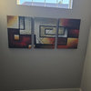
    Since you ask what I think of the overall space, I think your artwork is fabulous and that it could be enhanced if you rearranged the pieces. Right now they look great but if I were you I would make them the star of the show.

    Also, I think your rug is slightly too small and your chandeliers are much too high. Is the dining chandelier over the table? It appears to be to the side but that could be the angle that the photo was taken.


    I see a few minor changes that could be made but overall I think your space is great and you have solid pieces to work with.

  • 7 years ago
    The space is very crowded. Remove the large cabinet and unless you regularly need all those seats at the table, only keep four there. Find a new spot for the little chairs on the wall, and get a larger rug, or at least pull it to the sofa. Without seeing the space from more angles, it’s hard to see why you have things arranged the way you do.
  • 7 years ago
    Thank you for your feedback
    - for the art how do u recommend to organise it differently ?
    - for the cabinet I just bought it ( can’t return or exchange ;( is it too bad? Can I fit it in a different place ?
    I’m giving a picture of the whole space
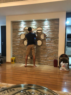
    As you will see the wall in tiles is empty as it’s work in progress ( thought of putting shelves and taking the console out to entrance )
  • 7 years ago
    last modified: 7 years ago

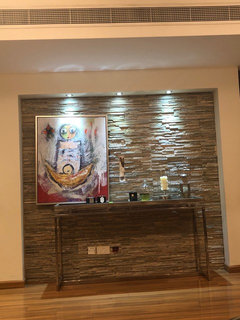
    For starters I would place the art that is above those tiny chairs where the cabinet in question is. Dont hang it too high.

    I remove the painting that is above the sectionional in the room to the right on the first photo and put it on the tile wall. Dont place it in the center. Put it towards the left or the right side but still above the table.

    The art above your sofa in the first photo, on the left side, is too small and hung too high. Do you have an additional piece of art you can add to that wall?


    Also, your two sofas dont look to be in ideal positions. Have your tried rearranging them so that they face each other? To my eye it seems that the sofa facing the tile wall would look better facing the other sofa if there is room. That would also create a visual seperation from that room and the dining table.

  • 7 years ago
    Thank you for the Valuable feedback!
    Below few questions:
    - so is it a rule of thumb to hang the frames 5” above sofa ? I always try to center ...but doesn’t look good
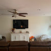
    - I like the insight about the TV placement and it does look high on picture as there is a step in this room but it’s aligned with dimensions
    - I will play around with different frames and try and share with you
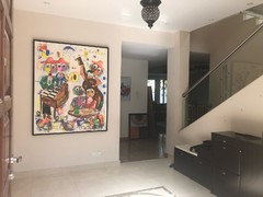
    - if I remove the cabinet , where can I place it? ( I’m attaching a picture of my entrance , was planning to put the console there but maybe I can put the cabinet there ?? Or not the right place ?
    - if I place the frame to the right or left above the console, what do I fill the other side with?
    See the picture attached where I tried it/ i have this mirror too?
  • PRO
    7 years ago
    On a positive note I like how you made use of what I assume is the dining room and made a sitting area. I love my dining room but only use 4 or 5 times a year. I think removing the chairs under the painting and only leave 4 chairs around the table will make it look less cluttered.I like the cabinet and I think it breaks up the 2 pieces of art above the couches. Maybe add a piece or 2 of pottery, jars, glassware or anything you may currently own above the cabinet and tall enough to make a statement.
  • 7 years ago

    I love the painting by the tile wall. I would line the left edge of the painting with the left edge of the table. Then keep the rest of the table styled as it currently is. Or maybe put the painting 3 or 4 inches to the right of the left edge of the table.

  • 7 years ago
    last modified: 7 years ago

    I would try placing the cabinet on the wall with the big painting but I am not sure that would work. If not then maybe try it where the large painting is in your foyer. God you have some fabulous artwork! As SJS Interiors suggested, try placing one or two statement pieces on top of the cabinet.

  • 7 years ago
    last modified: 7 years ago

    I love your art. I'd play with switching the console and the cabinet. Then put the two extra dining chairs on either side of the cabinet? I would also consider doing away with the heavy drapes and installing Roman shades in a simple pattern to visually unclutter and bring in some color.

  • 7 years ago

    My personal "rule of thumb" is 5-5-75 (centered 5' above the floor if hung alone, or 5" above furniture it hangs with, and no wider than 75% of the furniture's or wall's width. You might try the cabinet on the wall where the 2 little chairs are if it doesn't exceed 75% of the wall's width. You seem to have lots of nice art so just plan on moving things around until the ideal vignettes emerge. A lot of the pieces are too large to hang with furniture, but they could work alone as focal points. Strategically hung mirrors can also double the art. When art is too large to hang above furniture, try a mirror instead.

  • 7 years ago
    last modified: 7 years ago

    I disagree with decoenthusiaste in that your pieces are not too large to be with your furniture. Your art is fabulous. Use it! I have huge pieces of art, 6-7ft tall, right next to furniture in my home. Also, art does not have to be centered. The way you hang your art can be just as artistic as the artwork itself.

  • PRO
    7 years ago

    I would use the dining room for dining and place the TV where it was intended. It's really a great area for the placement.


    You're tall, maybe that is why all your art is hung too high in the space. I have lowered all the art on your walls and replaced your too small ceiling fixtures with an alternate light fixture.


  • 7 years ago

    "Rules" are meant to be broken, but the goal is to create a vignette with art, furniture, etc., so elements relate better than when art is just centered in the open space above the furniture. If you had 12-foot ceilings, you can see how disjointed it would be to hang the art in the center of the wall space above the sofa. Most people appreciate balance and the calm sense associated with it, but asymmetrical arrangements can work too. You should do what feels comfortable to your eye and doesn't elicit frowns from guests. Usually people are looking at the walls from a seated position most of the time, so bear that in mind as you try different placements.

  • 7 years ago

    I love your art and your cabinet! I would do as suggested above, keep your cabinet where it is and add pottery. I also agree with just 4 chairs at your table and put TV on tile wall.

  • 7 years ago
    last modified: 7 years ago

    I'm sorry but the drapes on the window look very odd and the color is not inviting. Hang off-white panels that are fairly narrow, and don't have double curtains, which you seem to have now. The whole area is confusing. If you need light control install shades that you can pull up and down with your fingers, without cords. The carpet is much too small, looks a bit like a postage stamp, make it as large as the space can hold. Other than your paintings, which are cool, you have no color, and everything looks gray and drab. The yellow pillows are a good idea, but carry some of the colors of the art into the (much larger) rug. An Oriental tribal rug would look great. Try esale. rugs, rugsUSA or other carpet stores for ideas. I agree that the cabinet will look fine with large ceramic or pottery pieces. The art does have to be in closer proximity to the furniture below it, circa 8 inches above. If you keep the present set-up (I wouldn't because it looks odd), at least put lots of colorful pillows on the couch in the room past the dining area to differentiate that area from the living room. You need a carpet there also. I'd also suggest table lamps because that overhead light is terribly harsh and unfriendly. Your rooms will look much warmer and more livable without the ceiling lights.


  • 7 years ago
    I would switch the console table with the cabinet, putting the cabinet in the stacked rock niche, then put the mirrors over console table by the table and chairs. Replace curtains with blackout shade that is same color as walls, adding a valance. Then add color with pillows and rug, colors from the magnificent art.
  • 7 years ago
    I think the overall space looks too crowded. I would remove the corner lounge in the area where the curtains are and put the dining table and cabinet there. Do the drapes hide a poor view?the window treatments seem very heavy. Sometimes less is more.
  • 7 years ago
    Forgot to add the art is lovely
  • 7 years ago
    Thank you for all the comments I’m trying to see which one can be done but very helpful .
    What about the floor ? I hate it!! Any wood floor color that can fit with the furniture and without making the space look small?
Sponsored
Peabody Landscape Group
Average rating: 3.5 out of 5 stars8 Reviews
Franklin County's Reliable Landscape Design & Contracting