Software
Houzz Logo Print
delfgill

Help with undertones!

7 years ago
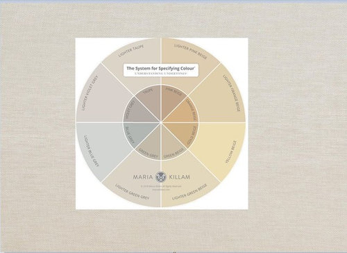
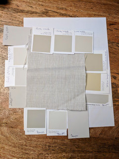
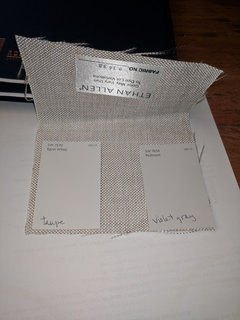
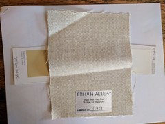
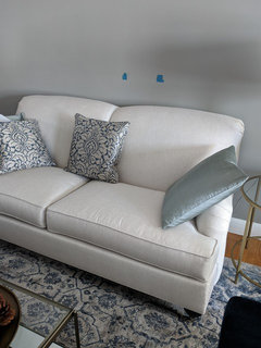
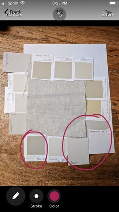
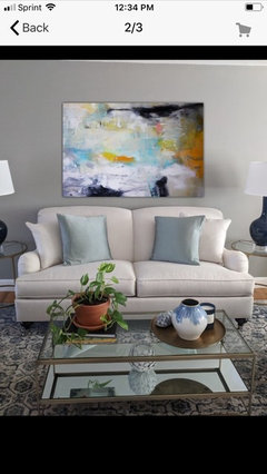
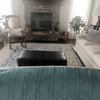
I'm loving Maria Killam's new color wheel !!! It's been helping me distinguish undertones throughout my house. But when I held it against my sofa I was surprised to find that I see more than one undertone. What color do you all see? I've attached a photo of the fabric swatch (which accurately depicts the color) and a photo of the sofa (which is a bit darker). I didn't realize until today the big difference in color between a photo taken with your phone and a photo of the fabric taken from the manufacturer's website. I greatly appreciate any and all help.


Comments (79)

  • 7 years ago

    Everything is so lovely! Trust your eye. You're doing just fine. (And see, here your wall colour looks fine on my screen.)

  • 7 years ago

    "...it's so much easier to help others but when it comes to your own home it seems challenging."


    I can really relate to that! ;-)

  • 7 years ago

    A friend was able to capture better photos of the fabric (she has a different phone). On my screen it looks exactly as it does in person. Hoping everyone can chime in with thoughts. Thanks so much!!


  • 7 years ago
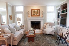
    Violet Gray seems close to me.
  • 7 years ago

    Be careful with light colors and the color Maria Killam's color wheel. She specifically did not include whites because they can't be accurately reproduced (Per her blog).


    I don't believe that your sofa is taupe or violet gray. The way to test for this is to look at it next to a yellow beige - does it turn pink or lilac? If so it has the pink undertones of taupe or lilac undertones of violet gray.


    If not it is a linen with mixed tones of creams and grays. Usually it is a blue gray rather than a green gray, but can appear green gray as the yellow undertones of the cream mix with the blue undertones of the gray- yellow and blue create green.


    Looking at your pictures I am not seeing any pink or lilac undertones.


  • PRO
    7 years ago

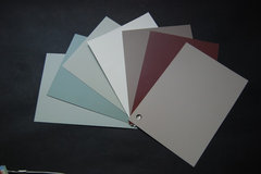
    Looking at your photo, any colors on the left side or bottom would seem to work. The colors on the top and right side do not look good with the fabric. But again, reproducing colors on a computer does not accurately reflect the way the color will look in your space.

  • 7 years ago

    Jennifer Hogan-- Your post is very helpful. Ethan Allen has the fabric in their Taupe category. They refers to it as having rustic character and variations in weave, shading, slubs, and texture. So it does appear to change color throughout the day. I honestly do see pink at times but not sure if it's the wall color clashing with the fabric. Other times I see a bit of yellow. The only yellow beige small swatch I have is Powell Buff. I will try and pick up a large sample during the week. My husband also thinks it more of a linen color mix but the designers at the store call it a champagne color. It's definitely a chameleon and I'm losing sleep over it!!


    Diana Bier-- I agree that the colors on the left and bottom seem to blend well. Just not sure what the next step is.


    Thanks so much... I appreciate the continued thoughts and suggestions.


  • 7 years ago

    Forgot to mention that the fabric has a subtle pearly sheen.

  • 7 years ago

    Years ago I had tile that was driving me crazy just as your sofa is driving you crazy.


    It started my journey into the world of color that has since consumed many hours but also brought me great joy, helping others get just the right color.


    One tool that I use constantly is my collection of sample boards.

    I started with the 50 Neutrals and Whites sold by Maria Killam ($329.00).

    I then purchased good heavyweight watercolor paper and make my own with every paint sample I buy or any samples used to help others.


    I have about 400 color samples in my collection after 15 years.


    Maria's 50 is usually my starting point for neutrals. If you purchase them you will use them over and over, as will your frineds and family. Mine have been used to help select colors for more than 100 homes, and I am not a color consultant or in the design business (I'm a data analyst).


    Using her samples you would have a few large samples in every neutral color category and be able to see what works. Maria is correct that no one can tell color with a 2x2 paper sample.


  • 7 years ago

    Jennifer Hogan-- Did you take her course? I'm saving toward purchasing the boards but guessing you need the hands-on class to fully understand how to use them. I plan on taking her course if she comes to the Boston area. I tried searching for true colour experts within Boston but was unsuccessful.


  • 7 years ago
    last modified: 7 years ago

    delfgill, what are you trying to determine at this point? I'm a bit lost, sorry. All your furnishings are beautiful and your space is, from what I can see on my screen, harmonious. I fear this colour wheel is overcomplicating things for you and giving you analysis paralysis. Let's be honest here. We shouldn't be losing precious sleep over colours. :) (I've done it so I'm not judging, trust me!)

    What's the worst case scenario if you choose an element with the wrong undertone?

    ETA: Everything changes colour throughout the day. That's because light gives us colour and the light changes throughout the day. It's a bit silly to try to pin down something's colour as it were permanent.

  • 7 years ago

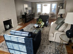
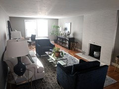
    tartanmeup-- I guess it would only bother me if I chose (or thought I chose) the wrong undertone... lol. But I do want to coordinate the background in artwork, pillows, etc. And a new wall color. The room is long and narrow without a lot of natural light... the gray makes it a bit cave-ish.


  • 7 years ago
    Have you thought of doing an on-line consultation with Maria.
  • 7 years ago

    That's a great idea, Tina! Another thought is if you're thinking of a new wall colour, start with the fireplace rather than the sofa. You know the sofa coordinates with the fireplace. Being a flatter surface, the fireplace might be easier for the apps to read.

    If it were my room and I wanted a change from the current grey, I would be looking at brighter colours than the samples you have surrounding your fabric swatch. Egret White looks nice but a bit dull in your pic. Probably the light. (And how true is my monitor in rendering the colour?)

    I really think you can trust your eye to choose pillows to coordinate. (Could you not return them if you chose wrong?) I really don't think you need to fuss with the wheel for that. I can understand misgivings about colour coordination when one is colour-blind but you've no need to worry. Trust your eye. :)

  • 7 years ago

    I have thought of a consult but unless I mail a fabric sample to ensure she sees the true color, I think online consult would be too tricky.


    Yes, I will use fireplace stone as my start!!!

  • 7 years ago
    last modified: 7 years ago

    What do you mean by brighter color?

  • 7 years ago

    What are you trying to accomplish? What do you want the room(s) to be that it isn't now? I get that you are focused on "the undertones" ( Teenage Kicks...what a great ditty,btw) but what is the goal...a room more (fill in the blank).

  • 7 years ago

    Perhaps cleaner rather than brighter is what I meant. On my screen, the paint samples surrounding your fabric swatch have a bit of muddiness to them. But again, I'm looking at my screen. How do they look to YOU? If I look at your pic with the fireplace, your surround seems brighter/cleaner than your wall colour. I prefer "clean" colours to muddy ones but understand that sometimes "clean" colours are too saturated for people, depending on that space.

    If I leaf through my Parrish-Hadley Tree of Life book, I find that the neutral wall colours look "clean and bright" not muddy. (But how much of this is photo retouching though?) I'll share pics providing my iPhone does the colours justice. :P

  • 7 years ago

    I am seeing the sofa floating on its own, and understand you wanting to anchor it to the wall. One way to help tie it to the navy chairs and fireplace is to put the sofa fabric pillows on the navy chairs.

    I would not try to find a wall paint that blends with your sofa because I am seeing pinks and violets as you have said. And I don’t think you want to have pink or violet beige walls.

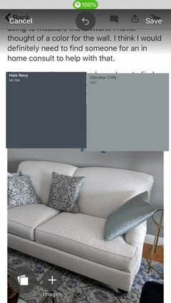
    So find a light paint that contrasts, in shaded blues or greens.

  • 7 years ago

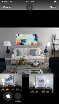
    hollybar-- I want a room more decorated and pulled together. I have artwork in mind to fill the space above the sofa but before committing I want to make sure it will blend and not look out of place.


    tartanmeup-- I actually prefer a muddier color scheme. I always have been. I am not one for bright, bold colors. I am drawn to muted shades.


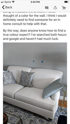
    ulisdone-- I do have the sofa cushions on the chairs. I also have pillows incorporating both the sofa and chair colors on the sofa. Pic attached... ignore the blue tape I was using to measure the artwork. I never thought of a color for the wall. I think I would definitely need to find someone for an in home consult to help with that.


    By the way, does anyone know how to find a true colour expert? I've searched both houzz and google and haven't had much luck.


  • 7 years ago

    delfgill, I purchased Maria's 1 color consultation ($100) for my living room. I tried 16 different paint samples, lol. I could see that none of them were correct, but I was so stuck trying to find the correct color. The color she picked is perfect. I am so glad I got her help, I was making myself crazy. Plus, the cost of all the samples was getting expensive, lol. Best of luck. I will enjoy following your journey.

  • 7 years ago

    I did not take her class - When you get the color cards they come with a list of the colors in each grouping.

    I organized mine in a binder with separators for each color family.


  • 7 years ago
    Check with your local BM and SW stores to see if they offer in home consultations.
  • 7 years ago
    I like your current wall color. Is that what you are trying to change?
  • 7 years ago
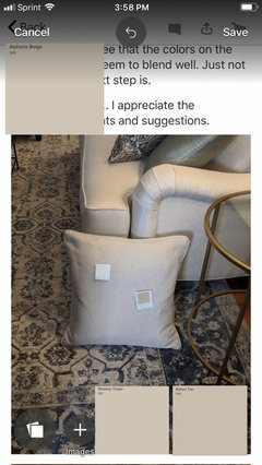
    Omg! I think you are really overthinking this!!! I’m not sure what you are wanting to” match” or if matching is even necessary! This sofa is a VERY light Taupe! It is neutral!! Quite frankly it will go with just about anything ! If you want the closest match it would be these!
  • 7 years ago
    The reason you see so many upholstered pieces in fabrics like this is because they go with so many colors! You are zeroing in on this
  • 7 years ago
    When you should be looking at this!!!!!
  • 7 years ago
    You can clearly see how well the sofa goes with your rug and other furniture. You don’t need anyone to point this out to you. Take your cue from the taupes in your rug if that’s the way you want to go.
  • 7 years ago
    Don’t trust the color on the screen or my picks or anyone else’s! That’s a cr@? Shoot! Trust yourself!
  • 7 years ago
    Your spending so much time trying to match that fabric it’s keeping you from exploring other options!
  • 7 years ago

    On my monitor, the colours in your framed art are clean, not dirty. Same with your lamps. Some of the colours in the artwork you're considering are muted but look at the bright blues and pinks. In any case, lynartist is right: there's no need for you to worry about coordinating things in your space. You can easily find pillows to harmonize with your pending artwork that will "go" with your sofa. You don't need to know the exact undertone names of everything to accomplish that. :)

  • 7 years ago

    lynartist and tartanmeup-- Thanks so much for your advice and encouragement. I truly appreciate it!! This is the only room I find myself struggling with.


    lynartist-- Thank you for adding colors options to show how it all blends.


    tartanmeup-- I will move forward with the art and pull a third color from it for the pillows.


  • 7 years ago

    Go to your local BM store and ask them to mix you a sample of Devine Color Almond and Devine Color Glass. Both look wonderful with taupe, blues and whites. The top color in this pallet is a true taupe (Devine Cappuccino) The bottom color is Devine Almond. It is a blue/green/gray that is cleaner than what you have.

    Devine Color was bought out by Valspar and when Sherwin Williams bought Valspar they discontinued the line, but the colors can still be purchased through Benjamin Moore's paint matching program.

    .

    colors · More Info


    It is tough to see colors on computer monitors, but I believe that this color will be cleaner and brighter than your current color, removing the cave feeling you described earlier.

    Without good natural light a color like dorian Gray can die on the vine. You need more depth to the color to be able to see it without good natural daylight. You need lighter brighter.


    Below are the color values of the three colors based on RGB - not the best, but gives you an idea of the difference between Dorian gray and the two colors I am suggesting. Devine Glass does actually have a blue/green tint - just doesn't seem to show up next to the almond and dorian gray in RGB.


  • 7 years ago
    last modified: 7 years ago

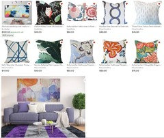
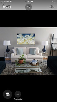
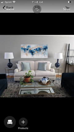
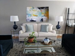
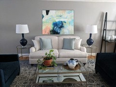
    A few months ago I browsed Etsy and chose some pillows that I like. I hadn’t yet looked into artwork but knew I wanted to incorporate greens, pinks, maybe some purple into the room.

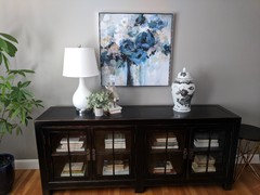
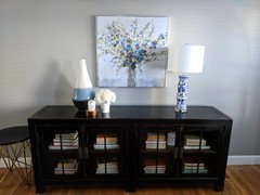
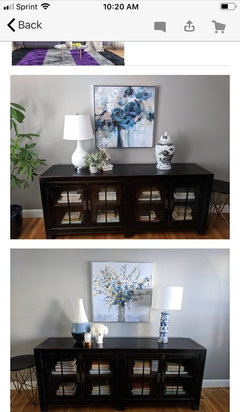
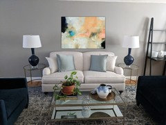
    As I mentioned before, I prefer toned down muted color schemes and so I was naturally drawn to these pillows. However, the artwork I have in mind is definitely too bold now that I compare it to the pillows. I did find a muted painting that I also love and thought it might be a better fit, especially given that it coordinate nicely with my existing art on the opposite wall (bottom pics).

    I would be happy with either painting but given the size and expense I want to try my best to get the overall look right the first time around :) It's easy to return pillows but not so easy to return oversize art.

    Should I mix bold painting with muted pillows or go with a muted painting and muted pillows? Your thoughts?


  • 7 years ago
    I think you should buy the art you love. Worry about pillows after!
  • 7 years ago
    I’m confused, which one of these paintings do you have?
  • 7 years ago

    I have both. One above each console. It's a large front to back room with a console on each end.


  • 7 years ago
    We’re are you looking for art?
  • 7 years ago
    Is this your other option? I’m a little Leary about that price. At any rate, I think considering your rug and console art this one seems to play better.
  • 7 years ago
    last modified: 7 years ago

    I'm looking on Etsy, Houzz, HomeGoods, Art.com.

    I need approx 46 wide x 36 high.

    Yes, I like that one but the size is too small. It's through Etsy and I've contacted the artist to ask if it's available in other sizes. It might work once I add pillows, etc. I haven't yet found any bright pillows that I like.


  • 7 years ago
    Hmmm.. I’m not a fan of buying”art” on line. When I see prices like that it’s more decor so I don’t really worry about whether you love the Art and I start thinking if it matches the decor! In which case you might want to consider the floral theme you have going or just keep it monochromatic so you have an easier time with pillows.
  • 7 years ago

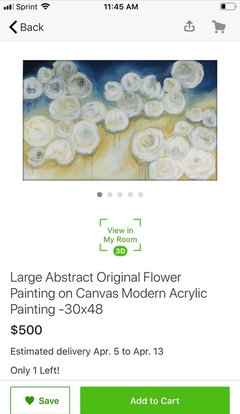
    lynartist-- I had reached out to a handful of Etsy artists for commissioned work but the prices averaged $1100. That's when I decided to shop around. I also thought of a neutral / monochromatic piece but didn't see anything I like. Most were bland and I do want some color above the sofa. I just heard from one artist who suggested the below. She can custom size to what I need. Price is $350/free shipping. Not too bad.

    Thanks for sending along some ideas... I will look into these.


  • 7 years ago
    I think this is rather nice.
  • 7 years ago
    And Btw, I like those silk aqua pillows;)!
  • 7 years ago

    Thank you!!


  • 7 years ago

    I will search for pillows based on both pieces of art. It will make it easier for me to envision the complete look.


  • 7 years ago
    Posting to see pictures
    delfgill thanked Molly
  • 7 years ago

    They don't call it "professional" photography for nothing. Amazing how the sofa in these pictures looks exactly as it does in real life. I came across this yesterday and learned that it is the same sofa and sofa fabric as mine. Slides 3, 5, and 10 are best. I'm waiting to hear back about the wall color around the fireplace.


    https://thedecorologist.com/featured_item/raintree/


  • 7 years ago

    Suzy-- I don't know why your comments aren't posting but thank you for sending them via message. Here are the pictures. Let me know what you think about the undertones/colors. As I mentioned yesterday, I'm waiting to hear about the wall color around the fireplace. Thanks.