

Complete Reno!
7 years ago


Featured Answer
Sort by:Oldest
Comments (10)
 PRO7 years ago
 7 years ago
 7 years ago
- 7 years agolast modified: 7 years ago
- 7 years ago
- 7 years ago
- PRO7 years ago
- 7 years ago

Related Stories
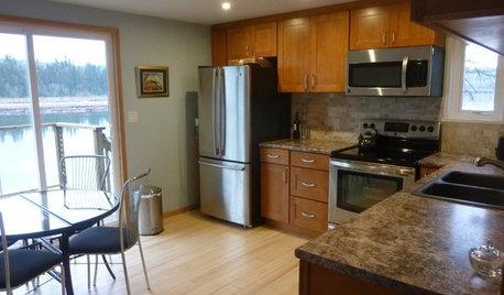
KITCHEN MAKEOVERSSee a Kitchen Refresh for $11,000
Budget materials, some DIY spirit and a little help from a friend turn an impractical kitchen into a waterfront workhorse
Full Story
CONTRACTOR TIPSYour Complete Guide to Building Permits
Learn about permit requirements, the submittal process, final inspection and more
Full Story
HOUZZ TOURSMy Houzz: Renovated 1950s Family Home in Texas
A complete overhaul reinvents a dark midcentury home, leaving a cool color palette, an open layout and a nursery splurge in its wake
Full Story
WORKING WITH PROSConstruction Contracts: How to Understand What You Are Buying
Learn how plans, scope of work and specifications define the work to be completed
Full Story
INSIDE HOUZZInside Houzz: Refaced Cabinets Transform a Kitchen
No walls came down. No windows were added. But this once-dark kitchen looks completely different, thanks to bright new surfaces
Full Story
COLORPaint-Picking Help and Secrets From a Color Expert
Advice for wall and trim colors, what to always do before committing and the one paint feature you should completely ignore
Full Story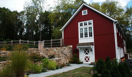
HOUZZ TOURSHouzz Tour: Farmhouse Meets Industrial in a Restored New Jersey Barn
Amish craftsmen, trusting clients and an architect with a vision save a historic barn from a complete teardown
Full Story
LIFEFall Planning for a Successful Big Spring Party
Get started now on assessing, completing home projects and cleaning to keep party stress and effort to a minimum come spring
Full Story
HOUZZ TOURSMy Houzz: Modern Sleekness and Serenity in Austin
Check out the before and after photos from inside and out to see a home's complete transformation in 10 months
Full Story
REMODELING GUIDES8 Lessons on Renovating a House from Someone Who's Living It
So you think DIY remodeling is going to be fun? Here is one homeowner's list of what you may be getting yourself into
Full Story




Ancient Stone