Software
Houzz Logo Print
cabo12219

Please help regarding a new build

We are building a new house, and need your advice on three things.

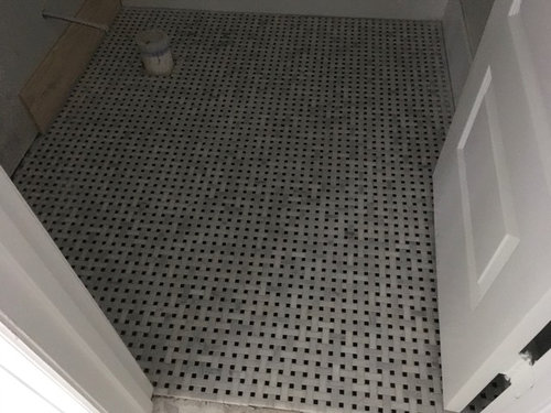
1. We selected AZT Manhattan polished basketweave mosaic tile (marble with black dots) for our powder room. We unfortunately selected Mapei grout “frost 77”. It is too white, not providing enough contrast. IMHO it should have been darker. What can I do to darken the grout? The cabinet is painted black with galaxy granite counter and white sink.

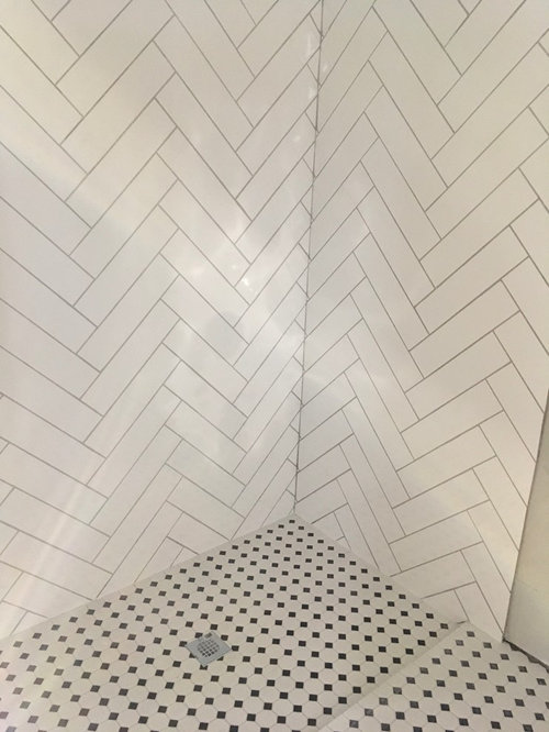
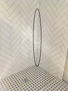
2. In an extra bath, we have 4x16 white subway tile for the wall in herringbone pattern with mapei grout “warm gray 93”, with AZT luxe white oct w/ black dot tile for the bath and shower floor with mapei grout “avalanche 38”. I’m sure some of you are cringing - the grouts should have matched. What can I do? I feel like I should lighten the wall grout and darken the floor grout.

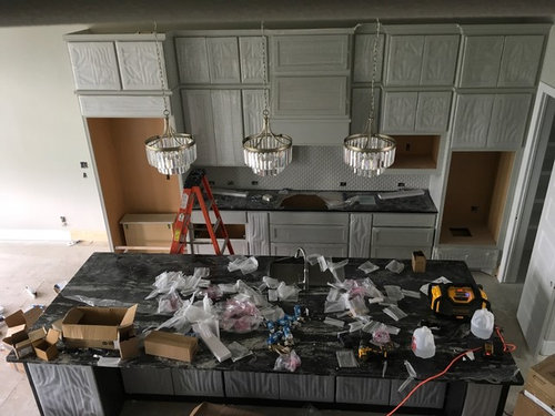
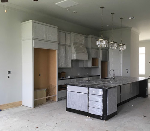
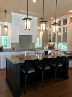
3. Our kitchen has 13’ x 5 1/2’ island with three pendant lights. They’ve already placed the pendants, and they don’t look right to me. They seem too close together and hung too high. How much space should be between them and how low should they hang? And shouldn’t they be centered length-wise and width-wise over the island? The pendant lights are P2326-134, 16 1/2” wide.

Please help! I am disappointed and worried about our new house. I’ve attached pictures. Thank you!

Comments (35)

  • PRO
    7 years ago

    Is this a custom home or from a developer?

  • PRO
    7 years ago

    "We selected AZT Manhattan polished basketweave mosaic tile (marble with black dots) for our powder room. We unfortunately selected Mapei grout “frost 77”.

    Therein may lie the answer.

  • 7 years ago
    It’s a national “luxury” home builder - it’s quasi-custom. We had a custom build (smaller and less expensive), and this is NOT. The experience makes me feel like building a prefab home.
  • PRO
    7 years ago

    Truly, you are worrying about nothing; it's all coming along beautifully.

  • 7 years ago

    @Mark - what difference does that make in trying to answer the OP's questions?

    @Newfie - Short of having the contractor drill out the grout (easier if just completed), you could try a grout enhancer to darken the grout? I had to use this on my grout and it darkened it quite a bit - I hated the before, but love the after.

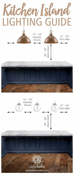
    For the pendants, there are some guidelines that have been posted on Houzz dilemmas that are helpful. I also found the website below very informative. They state that pendant lights above islands should be 30-36" above counter, and 30" apart. f you are unhappy with the pendants, I would have your contractor change the position. Looks like you will have a beautiful home when completed. Good luck.

    Lighting

  • 7 years ago
    Lynda,
    Thank you so much for the link. It’s very informative. I now can contact our builder and discuss with more knowledge than just my gut feeling!
  • 7 years ago
    Lynda,
    Thanks for the idea about the enhancer. I’d like to try this method. I will definitely do it over the extra bath. Can it be applied all over the floor or carefully over the grout? Our basket weave tile is going to be pain if I have to carefully go over the grout lines! Maybe worth it, though.
  • PRO
    7 years ago
    I think the grout looks fine as is, and the tile install looks really good.

    As to the pendants, they are too high and too close together. You will need to pay the electrician to relocate the electrical and patch/ paint the ceiling but there appears to be other work going on so should not be a big deal.
  • PRO
    7 years ago

    Lynda - There may be some contractual details that effect the selection of finishes.

  • PRO
    7 years ago
    last modified: 7 years ago

    As far as the pendants, it appears there may be other things going on above the ceiling that dictated the location of the junction boxes for the light, such as ductwork. It could be a very big deal.

  • 7 years ago

    I think it looks great. Please know you are focusing 100% on grout / tile right now. In reality, grout / tile will be about 10% of your entire room - so even if it was a 50% problem, that's still 95%!

    If your pics are representative - it looks VERY nice. Look how square that floor tile was laid, and the precision of your shower wall herringbone. THAT is the focus.

    Your pendants also look fine - although it's hard to tell with the angle if they are all off center. ;-)

    Worry not - this is coming along great.

  • PRO
    7 years ago

    I think the pendants are too large for the island and yes too close together.

  • 7 years ago
    Yes, it would be for grout only - But, I agree with the others, if pics are correct, the current color looks great!
  • 7 years ago
    last modified: 7 years ago

    Your tile and grout are fine. You are looking at it before everything is pulled together and pulled together means painted walls, towels, cabinets, knobs, and any decorative items we put in the bathrooms.

    Understand the most common thing is for people at your stage of the game to come here thinking they made a huge mistake. It's something most of us do at what I call the "ugly" stage. Relax. You made excellent choices for the bathrooms so wait until it's all pulled together.

    As for the pendants: It appears they are too high and also too centered on the island. Ideally the pendants should be centered over the eating area of the island. From about the back of the sink to the edge of the counter on the seating side.

    Then center the middle pendant and then the other two are centered between the middle and the edge of the counter.

    It appears your ceilings are 10' high? If so, I'd raise the bottom of the pendant to 42". I tried 36" with my pendants on my 10' high ceiling and they just looked way too low, plus they cut off the view. Here's mine at 42" off the counter and centered on the eating area so you can see.

  • 7 years ago

    Also if you can, I'd have them add a high hat over the sink and maybe 1 or 2 more along the perimeter.

  • 7 years ago

    I think the pendants are too large for the island and yes too close together.

    I don't think they are too large. However I agree they are too close.

  • 7 years ago
    Cpartist, thank you for your suggestions. Your kitchen is absolutely gorgeous! Wow - what a countertop! Beautiful stone.

    I’m afraid I’m pretty ignorant - what’s a high hat?

    I’m writing to the project manager regarding the pendant lights - that they are too high and too close.

    Yes, the ceiling is 11’.
  • 7 years ago
    To everyone who have helped with suggestions and comments . . . Thank you so much. I probably am too focused on the minor details. I will pull myself back and wait until everything is finished. Afterwards, I will take a step back and reassess. And I am contacting the project manager regarding the pendant lights.

    Thank you all for your insight and education. Although this is our fourth house to build, I hopelessly seem to be a novice and still have so much to learn!
  • 7 years ago

    Cpartist, thank you for your suggestions. Your kitchen is absolutely gorgeous! Wow - what a countertop! Beautiful stone.

    Thank you. The stone is the first thing I bought. Even before we had a final design for the house.

    I’m afraid I’m pretty ignorant - what’s a high hat?

    Can light. High hat. Recessed lighting.

  • 7 years ago
    last modified: 7 years ago

    your tiling looks fine. no one says you have to match grout! I have two diff grouts in my shower (warm gray is one of them)

    I'd be more concerned w/that corner in the shower where the pattern got screwed up. should have done the 45 downward in the corner. see how the pattern now has two of the same tile positions?


    the pendants could be lowered about 5" or so, and I prob would have given a few more inches in between each one. It doesn't look horrible. just a little high


  • 7 years ago

    On the pendants, aside from being a little close together, I agree with some previous posters that they are not over the correct part of the island (although it is a little hard to tell from the angle of the second pic.) The pendants should be over the eating area, not centered over the island when measured from front (sink side) to back (seating side.)

  • 7 years ago

    Beth with the 11' ceilings of the OP, I believe that making the pendants about 42" off the counter would work better and still look good. I found that 36" off of my 10' ceilings made it look like they were "falling" onto the counters.

    The shower corner doesn't bother me.

  • 7 years ago
    Beth,
    Thank you so much for pointing out the corner pattern being off. You are so right! Will send a message to the project manager on this.
  • 7 years ago

    OMG DO NOT harass your PM about this tile. Your shower is wonderful. Take a look at the shower in totality, it looks splendid. you need to pick your battles - this group on Houzz is judgmental - if your shower looks good here - it's amazing. If you complain about THAT - I'd expect that you'll be labeled a "never happy" customer and treated as such.

  • 7 years ago

    Agree with Janni. This is not a battle to fall on your sword.

  • 7 years ago

    Agree with janni and cp - leave the shower alone. We are only seeing one corner of the shower and there was obvious care taken. The layout in it's entirety needs to be considered - it's not always possible to get each corner to be a fluid continuation of pattern.

  • 7 years ago
    last modified: 7 years ago

    uh, those of you saying 'let it go' (the pattern goof), and 'it's good enough',,,huh? If i'm paying good money for a difficult pattern layout (and herringbone is one of the most difficult patterns to lay,,,,correctly) then i'm going to need it done right.

    Newfie stjohn,,,,by chance, were you charged extra money for this layout? you should have. takes 4X as long to do this layout than a standard one. So I'll ask opinions about that. If a customer pays extra money for a difficult layout to be done, but there is a mistake in the layout, should any consolation be given?

    I"ve taken hours to dry-lay tiles on the floor in order to get the best layout. I'm sure it was just an oversight on the tilers part because all he had to do was switch directions. It wouldn't have been anymore work for him to do it correctly. And if he had done the dry layout first, he could have adjusted the starting point so that he didn't end up w/tiny triangles in the corner. That's a no-no when doing herringbone.

    I'll also add, that if this was unavoidable from the tilers point of view, should he have mentioned it to the customer? (but I can guarantee, this was not. a dry run would have shown this). This would also be a nice lesson for the tiler. How else will he learn and get better?

    no one is saying to 'harass' the PM. And just janni,,,The fact that you state this group on Houzz is judgmental is really ironic. don't you think?!

    I never said the shower didn't look good. OP was concerned about changing grout colors for heavens sake. I told her it looks fine. I just mentioned the pattern was off in corner. I never told her to have it torn out for a redo, nor did I advise her to go to battle w/the tile or GC! Geez people. I'd prob just live with it if it were mine.

    Perhaps I look at quality of work in a different manner. Yes, I'm sure she can live with it and I'm sure no one will even notice. But, it's her money.

  • 7 years ago

    This group on Houzz is a bunch of tough customers. My meaning of judgmental.

    the OP asked about grout, got validation that it looked REALLY nice as is, and you pointed out a "flaw" that pretty much EVERYONE didn't notice with a big red oval. We can't even see the other side of the shower, or know where the fixtures are - all of which could play into the compromises that may have been made with the layout.... The OP then says they will bring it up with the PM. (what remediation is there for this? other than tearing it out?)

    I think "I'd just live with it" makes this sound like a big compromise and I think the general consensus is that it's good work.

    We see a LOT of bad work here - and this isn't that. It seemed to sow an unnecessary seed of doubt about the overall project that simply wasn't needed. And, honestly, if the OP goes back to the PM on this issue - I fear s/he will lose WAY more than s/he could gain.

  • 7 years ago
    last modified: 7 years ago

    just janni. did you read what I wrote? You are surmising everything, even your fear that PM will think she's a complainer who can't be happy. There's a difference in complaining and being difficult, or pointing out an error that you think shouldn't be there, politely, and waiting to hear the explanation.

    Again, If I'm paying extra for a difficult layout, then I expect to have it done correctly, or, refund a portion of the fee. Period.

    you pointed out a "flaw" that pretty much EVERYONE didn't notice with a big red oval.

    Stop reading into my comment. I never advised OP anything. I brought it to her attention. (and please show me the BIG RED oval. Stop exaggerating) Why do you have such a problem with this? Because no one else noticed it, I should have kept my mouth shut? Really? If tile guy screwed up, wouldn't you rather it be brought to HIS attention or would you rather be his next customer who gets mistakes in their layout? I mean, stop already.

    There's a lot of unknowns here and you're assuming quite a bit. You assume that because I said I'd live with it is a BIG compromise. Why would you assume that? I also said it was good work (from what I can see). I said I'd live with it because it's easier than redoing that entire wall on the right. What if PM doesn't get upset? what if tile guy is ok w/his mistake being pointed out to him so he can learn from his error and actually become better? what if, what if?

    What if you let OP make her own decision as she sees fit?

  • 7 years ago
    Hi, all.
    Just FYI . . . I appreciate everyone’s comments. I realize I was focusing on the minor details, and I appreciate everyone pointing it out to me.

    Here is what happened - when I walked into the bathroom, the herringbone tiles caught my eyes because the grout width was so varied. And dark grout made it so obvious. To my chagrin, I realized I selected a dark grout that looks beige instead of light gray, which is so wrong for the color palate of our house. And it was darker than the floor grout, which turned out to be more white than light gray. I should have discussed it in more detail with the designer.

    I admit I’ve been spoiled - my current home has herringbone subway tiles, and they were put in beautifully, so I was disappointed. Then thought perhaps a lighter grout to match the floor may be better to hide the uneven grout width.

    I am being picky - you are right. But I paid a lot of extra money for the herringbone pattern.

    Appreciate your guidance not to be an unreasonably difficult customer. I may be near crossing over to that side, so I will keep that in mind. For us, this is an expensive house, and we want a home that’s better than what we have today. We are probably overly picky because of the experience with our current home. Our current home was a new build, but because the oversight wasn’t there by their superintendent, the quality of work was very poor except for the tiles - they did an incredible job. There were so many issues we decided to build another one after we’d been there less than 6 months. That’s the Paul Harvey version.

    I appreciate everyone’s comments. Can’t thank y’all enough!
  • 7 years ago

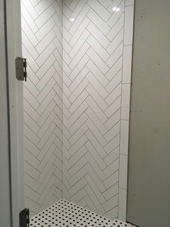
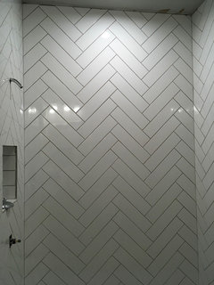
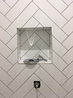
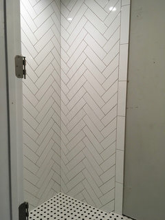
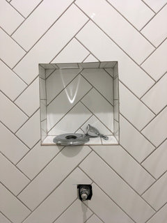
    Just wanted to provide an update on our herringbone tile in our bathroom. We mentioned the tile work to our superintendent, he took a look and before we knew what was happening, asked the tile vendor to redo the shower walls. They redid the tiles, and OMG, it looks so amazing. All the grout lines are even in thickness, patterns are amazing, and the bath room looks totally different. We’ve been so pleased that we wanted to share with all of you and to commend our superintendent. He’s been amazing. (We did not go to the project manager.). Here are the latest pictures. We are meeting this week to discuss the placement of the pendant lights. Once complete, I’ll post pictures. Again, thank you all for your advice and guidance.

  • 7 years ago

    Just wanted to provide an update on our herringbone tile in our bathroom. We mentioned the tile work to our superintendent, he took a look and before we knew what was happening, asked the tile vendor to redo the shower walls. They redid the tiles, and OMG, it looks so amazing. All the grout lines are even in thickness, patterns are amazing, and the bath room looks totally different. We’ve been so pleased that we wanted to share with all of you and to commend our superintendent. He’s been amazing. (We did not go to the project manager.). Here are the latest pictures. We are meeting this week to discuss the placement of the pendant lights. Once complete, I’ll post pictures. Again, thank you all for your advice and guidance.

  • 7 years ago

    The vertical corner section looks so much better w/o those tiny cuts. (and people were giving me grief for mentioning it. smh) The niche is a little off, but it's a very difficult pattern to do perfectly. Once you get your bottles in there, it won't be noticeable. I''m glad the super took responsibility and got it done right.

  • 7 years ago

    Thank you for pointing it out. I do believe that was what made him get it redone. I noticed the niche, too. I wish it was slightly more to the right, but as others said, I need to pick my battles. I’m just so thrilled at the improved tile work, I decided not to worry about it. Why I love building new homes, I’ll never know!