Software
Houzz Logo Print
mohanaray

Advice on a first time kitchen upgrade

7 years ago
Hello!

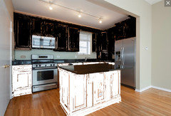
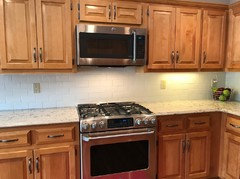
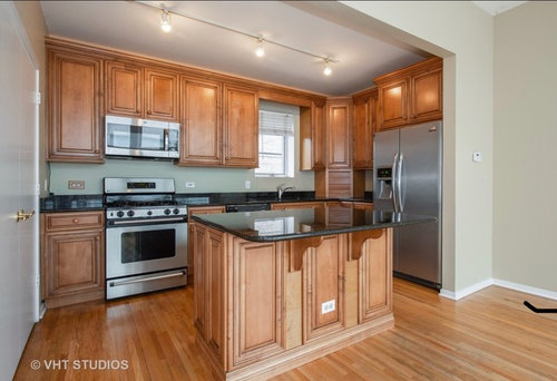
After years of renting, we just bought our first home! I am planning some fairly small cosmetic updates to the kitchen, and was hoping to get some advice (we plan to redo the kitchen entirely in the future). The picture below is what it looks like right now. It gets good light and the flow is fine as well. We are going to put in marble look tile backsplash. I love the look of black cabinets with gold hardware, but in the interest of not making it super dark in there I was thinking of doing black upper cabinets and white lower cabinets. I also think it would make upkeep easier since the upper cabinets near the stove will get cooking grease etc. Also since we are going to keep the black granite countertops for now, it would look wierd to have black lower cabinets with them. So I’m wondering:

  1. Is there a reason everyone goes for dark lower cabinets? Is it just to give a sense of space/airiness?
  2. I am worried that it might look a bit cold if it’s all black and white, so I am considering replacing the black granite on the kitchen island with wood. However, if I do that I will probably paint the cabinets in the island black because I love the look of dark cabinets and warm wood. So now, we have black upper cabinets, white lower cabinets in the kitchen, but black cabinets in the island. Is that going to look odd?
    Thanks in advance!

Comments (49)

  • 7 years ago
    It looks like a nice kitchen, why not live with it for a while, you may come up with other ideas you like better. I think black cabinets and black granite will make for a dark heavy space.

  • 7 years ago
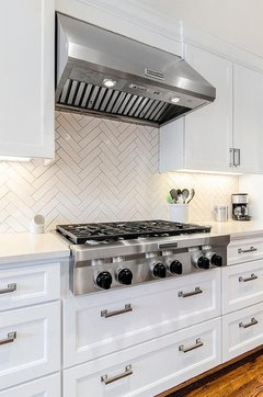
    I actually really like your natural wood cabinets (and I usually like painted), plus wood is making a comeback. Since you like black and gold and white....what about black matte blacksplash and switch out the hardware and lighting for brass and then white Walls?

    usually doing darker on top will weigh things down.

  • 7 years ago
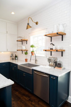
    I like your kitchen! Instead of an expensive redo, try adding funky pendant lights over the island, backsplash tiles and maybe new knobs on the caninets. This might help you get the look you want for a lot less!

  • 7 years ago
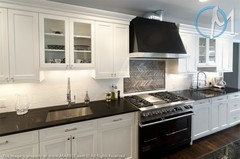
    I think your kitchen is gorgeous but definitely needs a backsplash. I’m not a designer but it seems like having dark cabinets on the top will visually make the room seem top heavy and short. Keeping white cabinets clean on the bottom is also harder especially if you have pets or small children. Have you thought of staining the cabinets a tone you like better? Can’t wait to see your photos as you go

  • 7 years ago
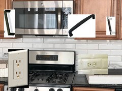
    Lighting, I would change the lighting.

  • PRO
    7 years ago
    last modified: 7 years ago

    I've personally done interim "facelifts" to my kitchens when I've moved into a new home and wanted to live with it a while but make it just a bit prettier in the meantime. So I understand where you're coming from. Just because you're waiting for the big renovation doesn't mean you can't make it more your style right now!

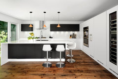
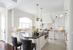
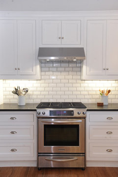
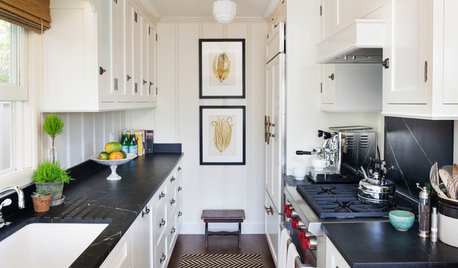
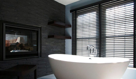
    Using the darker color on the lowers is more common and it will make the room look more spacious. The eye naturally follows the light upward. However, the opposite is not unheard of. Here are a few.


    Pinehurst, Etobicoke · More Info


    Poliform · More Info


    In addition, the bases see more wear and tear, so using the darker color on the bases makes sense from a maintenance standpoint for the homeowner who plans to live with their kitchen a long time to come. For you, that's not a worry - this is a temporary phase - so do what you like.

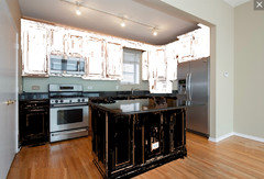
    Here's what your kitchen might look like with dark uppers and light bases (forgive the quality of the mock - I'm not at my computer and trying to use a rudimentary screenshot program, but you get the drift.)


    I'd do the paint first, then make a decision on the wood countertop. I don't think the island will look bad at all with the black granite, especially once you add the gold hardware you mentioned. You may also want to add two black and gold pendants over the island, similar to these:

    https://www.modernessentials.com/Nuevo-Living-Harper-Pendant-Lamp

  • 7 years ago

    I think asking for ideas here is a good start, but living with the house for at least a year will give you time to explore all options.
    I think black on top won’t work in your kitchen. It will weight it down. Keep looking at kitchens on Houzz with a similar layout and door style/color. The examples of black cabinets above are highly contemporary, open space kitchens. Yours is traditional.
    Rethinking just the backsplash and countertop, with possibly a painted color on the island could be an answer. Do you hate the wood?

  • PRO
    7 years ago
    last modified: 7 years ago

    I agree with RedRyder that the traditional style of the cabinets would look better white on top. The examples that I found are both starkly modern. Also, in that second photo the designer was dealing with extremely high ceilings and using the black on top gave the kitchen a more intimate and grounded feeling.

    Here's how white on top would register in yours.


  • 7 years ago

    Appreciate all the advice, certainly gives me some food for thought!

    I don’t hate the space as it is right now- my goal was to give the kitchen a more contemporary feel. The cabinets with the raised panel center and wooden knobs and decorative moulding on top (hard to see in the picture) look a bit dated. I was hoping the white/black paint would make those less noticeable. In general I like natural wood cabinets, especially flat panel ones paired with a matt black backsplash and countertops. Can I have the molding and center panels removed to acheive that kind of aesthetic?

    Also a few things I forgot to mention in my original post- we are getting recessed lights installed in the kitchen, and i also plan on pendant light(s) over the island. We are also getting the walls painted white, and the floor stained a medium brown.

  • 7 years ago

    Also thanks to renov8tor for the mock ups! The dual colored cabinets don’t look as nice in that kitchen as they do on pinterest, lol. Is there an app I can use for doing my own mock ups?

  • PRO
    7 years ago

    Your cabinet doors are very traditional. Trying to do anything to that to make it look more contemporary will just not work. It will not be inexpensive to do all that your are talking about so why not save the bucks and do your renovation earlier?

  • PRO
    7 years ago

    Mohanaray, photoshop does the best mocks. It takes time to learn it but there are good YouTubes. The above was done with Snagit Pro, a screenshot program that I use when I'm just having fun.

  • 7 years ago

    I would add a light colored back splash, add your pendant light. Possibly add under cabinet lights and metal hardware and call it a day. It looks nice already and that would be a fairly inexpensive face lift.

  • 7 years ago

    Nice kitchen. Add Can lights. Honestly, I'd stick with a painted backsplash so you can add/change colors at will. Metal hardware to match the appliances. And change out the outlet in the island to disappear better. What a strange place for an outlet, you have to finagle a way around stool legs to reach it?

  • 7 years ago

    Congratulations on buying your first house! And it looks like you have a nice one too, from the looks of the kitchen. Personally, I would live with it for a while before making too many drastic changes partly to see how the layout functions for you. It looks pretty functional as is, especially if those double doors on the left conceal any pantry type storage. And since the space is limited there aren't too many options for rearranging.


    My first reaction was twofold: forget the black and white painted cabinet thing -- that's a fad that won't last, AND if you want a really fresh look, change out just the cabinet doors for something sleeker.


    If you went with a very similar type & finish of wood as the current cabinets, then you could keep the appliance garage, cabinet faces, and other structural features so the project would be more economical. Even so, we might be talking more than you want to do right now, so consider a phase 1 and phase 2. Phase 1 streamlining would address the island -- which might be irritating you the most with its abundance of detail on the breakfast bar side. Replacing the decorative panels/braces with the style of thing you want in the long term for the entire kitchen could make you happy for now. Keeping the same woodgrain and finish would allow you to live with it until you have saved up for Phase 2. [Apologies if someone has already posted this -- I didn't read all the comments.]


    Finally, before doing ANY cabinet changes, I would unscrew one of the doors and take it to a cabinet shop to see if they can do "plastic surgery" on it for you.

  • PRO
    7 years ago

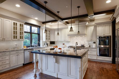
    We think you might want to wait to make a decision on this. It looks like you already have a 4" backsplash installed, so why do you need a marble one? If you are painting the cabinets we might recommend all white. Here is a design for you to look at:

    Issaquah Kitchen · More Info


  • 7 years ago

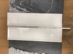
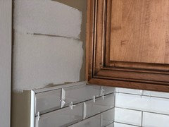
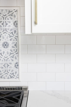
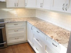
    I’m back with an update! I am mid facelift now, decided to take the advice from all of you and am keeping the cabinets natural wood, just changing the hardware to matte black. The contractor was able to remove the cabinet moulding that I hated and will replace the decorative support under the breakfast bar. Since the cabinets are already busy and the countertops have small green/brown flecks I went with simple white subway tile for the backsplash. I chose a longer beveled tile but can’t decide on the pattern and grout color.

    Picture of the standard brick/staggered layout and a stacked version attached. I prefer the cleaner look of the stacked version but maybe it’s too modern for my kitchen? Staggered is more boring but more timeless?

    Also as for grout i want to avoid adding anything busy. I wanted white but I cook a lot and I know dirty grout will drive me crazy. So maybe a light grey? Warm toned to match the flecks in the granite? I was also thinking of 1/16 in instead of the standard 1/8, will that be easier to clean?

    Thanks again for all the advice, I really appreciate it!!

  • 7 years ago

    I had white grout and white tiles for close to 30 years and it looked like new when I tore it out. I sealed it initially and that seemed to do the trick. I cook a lot also so its not like the backsplash didn't get spattered over the years. I always just cleaned it up in a reasonable time. Now I have a very light off white grout which is sealed and it never gets stained either. So I think if you seal it with a good sealer, you would not have a problem.

  • 7 years ago

    Are you removing the 4" backsplash? I like the 1st option with your traditional cabinets

  • 7 years ago

    Change the track lighting if it doesn’t really light the kitchen counters where you will do your prep. It appears to light the walkway, so it may put shadows on the counters. Leave the kitchen as it is until you are ready for the redo. There is no point spending money for things you will replace in the future.

  • 7 years ago

    first change out the track lighting & then live with it for awhile while thinking on a backsplash.

  • 7 years ago

    Yes, can lights are being installed on Monday. Should I have 2 or 3 installed (they are 6 inches)? I also plan to add some under cabinet lighting.

  • 7 years ago

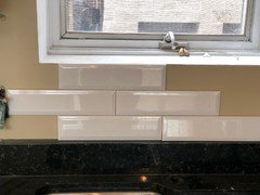
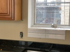
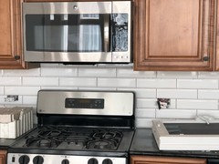
    Back with an update- can lights are in, as are the electrical boxes for the pendant lights! Backsplash has been installed as well. I love the brightness it brings to the kitchen! But, what color grout should I choose?

    I am leaning towards white, because I don’t want to add busyness, cabinets are busy enough. And the tile is beveled so that should give it some contrast already.

    Should I go darker, like charcoal to try and tie in the black granite countertops?

  • 7 years ago

    Sorry forgot the photo!

  • 7 years ago

    I’m no help on grout color (I’d personally just do white), but wanted to say that your kitchen looks fantastic in these small peeks we’re getting. I’m so glad that you didn’t paint the cabinets. They really look great against the white backsplash. I’m looking forward to seeing a full shot of the kitchen.

  • 7 years ago

    I'd chose a light greige color to tie in the cabinets with the tile. Tile looks great btw.

  • 7 years ago

    What a difference the backsplash makes...looks great so far. I'm no expert so can't help but I wanted to follow your journey.

  • 7 years ago

    Yes, an all black-and-white kitchen would be cold, in my opinion.
    Dark uppers with white or light lower cabinets would give the room a top-heavy feel. Also not desirable.
    You are lucky to have bought a house with a nice kitchen. I would wait a while and live with this kitchen to find out how the arrangement works for you. Meanwhile, edit your Houzz kitchen ideabook and put your favorites into a new kitchen ideabook of photos which you think would work in your new kitchen.

  • 7 years ago

    Thanks for all the advice everyone! I too am pretty happy with the backsplash. I think I need bigger/bolder cabinet knobs/pulls though? The one I chose seem to disappear to the many layers of trim on my cabinets...

  • 7 years ago

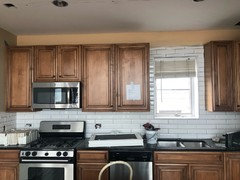
    Here’s a current picture of it, still a WIP...

  • 7 years ago

    So far, so good! Are you able to get a sample board with a couple of your top grout options? That way you can put it there in the kitchen to really see.

    As far as your disappearing hardware, why not go for pulls everywhere? More mass for more punch! This was my update from knobs...


  • 7 years ago

    Mimi, can you take a couple pictures of where the cabinet molding was removed, please?

    Was there a diff color under where the molding was? I have very similar cabs as yours and have thought of removing the molding but was afraid there would be demarcation areas where the underneath wood wasn’t exposed to the light.

  • 7 years ago

    Change the overhead lighting (it looks temporary), and add under-cabinet lighting. Finished! Game over!

  • 7 years ago

    Pam- the molding was nailed on, a nail every 4 inches or so. It came off pretty easily and the wood underneath is the same color. There are tiny nail holes which the contractor will fill in with wood filler. I will take a picture when I am in there next.

  • 7 years ago

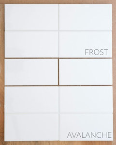
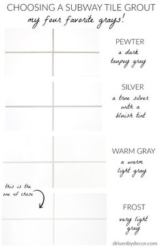
    I tried a few grout sample sticks against my tile at floor and decor. Still like the white (mapei avalanche) but the light gray (frost and warm grey are nice too). Is white grout impractical for someone who cooks a lot, and sometimes uses turmeric? The grout specialist at floor and decor suggested the grout with the sealer added into the formula, plus I picked up some 511 penetrating sealer, and my contractor says it will be fine. Should I do epoxy grout instead?

  • 7 years ago

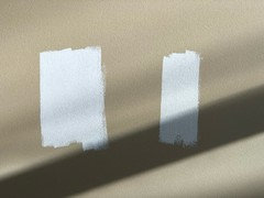
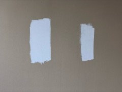
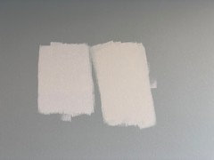
    Ok, yet another question, lol why is every decision so hard?! Anyway, i am trying to choose a white paint for the kitchen and the rest of the townhouse. I got samples of Benjamin Moores Simply White (warm white) and Chantilly Lace (crisp, neutral maybe slightly cool toned white). My eye is drawn to Chantilly Lace, but would a warmer white work better with my cabinets? My floors are walnut, fairly neutral. The first picture shows SW (bottom) and CL (top)- the difference is small, but SW is more similar to the backsplash tile and CL is more similar to the tile edging.

    The townhouse faces NE and SE, good natural light all day and really lovely late afternoon sunlight. Including some more pictures of the the paint in different lights and background color (SW on the right, CL on the left in all the pictures). Also, I do have a lot of white ‘stuff’- planters, shelving, vases, chairs- will the bright white make them look dirty?

  • 7 years ago
    last modified: 7 years ago

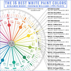
    Simply White has a higher reflective value than Chantilly. Snowfall is just a tad higher than simply White. Chantilly tends to lean on the cooler end of white.


    If you want a Pure White w/no tint, then just use the white straight out of the can. The Base white. I use that on my ceiling and baseboards. I don't add any tint to it. Bring home a can (It will be Base 1) and try it out. if you think it doesn't work (and there's no reason why it shouldn't) take it back and they'll add some tint to it. just keep track of how much paint you've used. The other option is to use BM White. That's prob one step down from the Base White straight from the can.


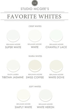
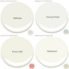
    here are some other whites


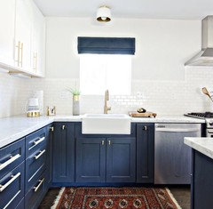
    Simply White on these kitchen cabs.

    It's not a very 'warm' white. it's a neutral that leans a little toward the yellow side. But it still comes off as a bright white


    By the way,,,on your grout? use the light gray. if you use a bright white, there will be no contrast w/the white tiles. you might as well have painted the wall all white. With the light gray, the eye really doesn't 'see'' it. I used Mapei Warm Gray w/my white subway tiles. it's just enough contrast. and Warm Gray is really a warm looking white up close


    This is Frost


    to me, the Avalanche just blends in too much


  • 7 years ago

    Thanks for the advice, Beth! A few follow up questions:

    1. What does higher reflective value mean IRL? Shinier? More crisp?
    2. My subway tile is beveled and since the cabinets have so much trim and detail, I want to keep the backsplash less busy. I am also installing under cabinet lights which will add some shadows. Do you think that might work with the Avalanche?
  • 7 years ago
    last modified: 7 years ago

    LRV-Light Reflective Value. (Actually I correct my last statement,,their(simply and chantilly) LRV are the same) the amount of light that gets reflected off of the color. Think of how black sucks up the light in a room, the LRV of white would be the opposite. Lori and Flo are the experts on this, but this chart should explain a little for you

    If you look at he hue, you'll see that chantilly falls more on the Green/Yellow end. Simply White is more yellow, a cooler yellow. Everything else is almost identical which is why in a few of your pics you can't tell the diff.

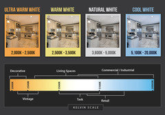
    As for your under cabinet lighting, make sure you get a bulb in the 4000 temperature. anything lower and it will give off yellow light. Cooler will give off bluer light. 4000 is the perfect middle for the kitchen. Ditto on your pendant or canned lighting.

    Don't worry about doing an epoxy grout. a regular, UN-sanded grout, that you can seal after it dries, will be fine. Epoxy grouts are more difficult to work with if your tile guy isn't familiar w/it.


    As for Avalanche, do you want your backsplash to look like a giant white sheet?


    if so, use the white grout. (BTW, the under cabinet light to the right, above, would be considered a warmer bulb. prob 3200K or less. see how it gives off a yellow hue? )

    Here is a beveled tile w/a soft gray grout and neutral white under cabinet lighting. This is the look you should strive for


    similar tile to the pic w/the wood cabinets, above , only they used a very light gray grout here:

    light gray

    light gray.

    white grout.

    to me, this just looks washed out.

    Also, your hardware is too small and basically disappears. try some handles in black or the black/nickel. I'd use handles on everything


    (and get some different outlets. try the flat style in the same white as your tile) Or, look how they can be cut right into the beveled tile!

  • PRO
    7 years ago

    I like your idea on marble look tile backsplash. I would actually go with marble look quartz (Caesarstone has some great options) on countertops and backsplash. This alone would give your kitchen amazing flow and create a lovely contrast with black cabinets. Look for marble look quartz with goldish veining to compliment gold hardware. If you do black countertops and black cabinets, I'm afraid it will just be too much, regardless of the amount of light you have in your kitchen.

  • 7 years ago

    About under cabinet lighting -- I recently bought an inexpensive LED one at Home Depot for my laundry which has a three level setting for the "color temperature" of the light. It can be set at 4000K, 3000K, or 2700K, depending on preference or task. I will likely keep it at 4000K, but it's interesting to see the difference in the space instead of trying to imagine it based on examples in a store.

  • 7 years ago

    Thanks for the reply Mimi

  • 7 years ago

    Pam- here is a picture of the underside of the cabinets. You can see a few tiny holes where the nails were but you have to stick your head underneath the cabinets so it’s not a big deal as far as I am concerned. Hope this helps!

  • 7 years ago

    Back with an update- we went with BM Simply White for the wall color and I’m really glad because it looks pretty darn white! Now that the paint is on, I am leaning towards light grey grout- thanks Beth for the advice and pictures, they were really helpful in visualizing what it might look like.

  • 7 years ago

    It's really great to see how your kitchen is coming together, Mimi! Once the trim above the cabinets was removed, I was amazed how much space there was up there.... Don't know if your contractor plans to enclose that soffit area for you, perhaps adding a small can light over the sink as so many find useful, but I would be SO tempted to ask him to incorporate some kind of hidden door for a place to stash the cookie sheets, turkey roaster, and other bulky, rarely used baking pans. (Unless you have a pantry somewhere to stash them!)

  • 7 years ago

    Lovely kitchen...wait before you do anything!

  • 7 years ago

    I think you have a very nice looking kitchen. If you want to change it though I think you should do your backsplash and then makeover the island how you prefer it. The island painted black with butcher block top would really look nice and give you your black cabinets you are looking for.
    the reason for painting lowers black and uppers white is for light reflection and airiness.

  • 7 years ago

    You’ve made great progress! As you can see, Beth is an expert as tiles, grout and color. I agree that the light grey grout will give some definition to your tiles without making too much of a statement.
    Do you have room for pulls, as Beth suggested? I’m sure your cabinets had only one hole for a single knob, but if you could fit in handles, it would make the hardware stand out more.
    Great job so far!

Sponsored
Whisler Home Improvement
Average rating: 5 out of 5 stars9 Reviews
Franklin County's Committed Home Improvement Professionals