Software
Houzz Logo Print
becca_heffernan

Clashing backsplash

7 years ago
last modified: 7 years ago
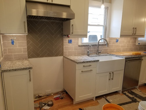
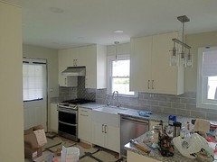
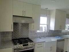
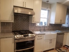
Hello! I feel so terrible. My husband finished the backsplash today and I thought with the grout I would maybe like it, but I still think it is too busy. I wanted white as the main tiles from the get go, but he really wanted more color. We settled on 2 shades of gray, the darker for the feature above the stove. Now I just feel like between those 2 and the granite there is too much going on! He's willing to change out the feature wall with white tiles (bless his heart), do you agree this should be done? Thanks in advance!


Comments (61)

  • 7 years ago

    i agree with Bri Bosh. Backsplash looks too pinkish.

  • 7 years ago

    Posted too soon...I hope you figure it out without too much of a headache.

  • 7 years ago

    I really appreciate the feedback, but really our only options are leave it as is (his vote) or change the dark gray 'feature' to a white (my vote). Changing all the gray tiles is not really an option. In person, they do not look pinky, more like a water color gray with white undertones which is why I think the white feature will bring out that contrast. Independently , they are all very nice but together I guess it's just not working for me. Compromise is hard and so is design apparently hah

  • 7 years ago

    What if you do a stainless steel splash behind the range? It will pick up on your other appliances and break up the busy-ness of the rest of the tile/counter. I wonder if you could even just lay it over the existing dark gray tile to avoid ripping it all out.

  • 7 years ago

    can you just use the current main backsplash in the feature area- run in a different pattern if you must. white will also feel like a mistake. I would just do the same tile. the softness of those dont go with a classic subway (to me).

  • 7 years ago

    They are not working together nor will redoing in white work. Use all the same tile. No “feature” area at all, which is really not improving anything. Looks like your kitchen will be very nice when redone. Sometimes what we think is a great or important idea just doesn’t work. At least it’s fixable.

  • 7 years ago

    Computer monitors do not show true color, so only you and your husband can really comment on how the colors work. The light gray looks fine and if you don't like the light grout - if that feels busy, you can use grout paint in a silver or gray to lessen the contrast though I don't think it looks bad - but I am not standing there. I am not even bothered by the area behind range. Once the range is in, you might not be bothered either. However, if you need to change, I would make it all the same tile. Your kitchen looks like it is coming along well - and I am not usually a gray fan:)

  • 7 years ago

    I’m going to be the odd one out here and say I think the tile you currently have will look perfect when you get the range in place. Your countertops have light and dark tones, and now your backsplash will, too. It looks like he did a great job installing it, too.

  • 7 years ago

    Im not fan of a “feature” behind the stove. I think it would look best with the same tile continued throughout the space consisttently

  • 7 years ago

    It sounds like your decision is made, you really want the white and your husband is willing...so...please post pics when you are done?

  • 7 years ago

    we will upoad a picture with the slide in range in place tomorrow morning

  • 7 years ago
    last modified: 7 years ago

    Wish you had posted here before you bought that tile. I too prefer the gray tile. The other tile seems to clash with the counter in those pics, but really it is hard to tell by just the pictures. If you like that tile, then stick with it.. And since redoing the counter backsplash is not an option, then your only choice is to make the range backsplash match the rest. NO herringbone there either.


    I agree with the above poster too about "features" behind the stove. The hood is "feature" enough. I think making that area different is always too distracting and busy in a kitchen.

  • 7 years ago

    I think even changing the tile behind the stove to March the counter, but laid in a herringbone, is just too much. It’s a small space. Between the counter and backsplash, there’s a lot going on. I’d do a stainless steel panel behind the stove. It’s neutral, and marries the stove to the exhaust fan, making for a vertical unit as a centrepiece. It avoids the small space looking like a tile sample sale.

  • 7 years ago

    Also, don’t pay any mind to the people who are saying it is too pink or they don’t like the dominant tile. If one looks for a second at the overall color temperature of the picture, you can see it is artificially yellow. Everything looks much warmer and distorted than it is in real life. Those cabs, while off-white, aren’t yellow IRL. I’m guessing your other tiles are a pretty very light cool gray. So don’t feel badly about going back and tiling the whole thing with those. I bet it will look great. Come back and post an after picture!!

    Becca Heffernan thanked NYCish
  • 7 years ago

    Yes, I would change the feature wall. For me there's too much pattern going on with the counters, splash and behind-the-stove feature.

  • 7 years ago

    Following

  • 7 years ago

    I think what bothers me is the different patterns......herring bone and square. Color looks fine.

  • 7 years ago

    You can also reduce the busyness of the backsplash by using a grout colorant to slightly darken your grout lines--reducing the contrast between grout and tile will reduce the busyness. I also vote for just continuing the backsplash tile, in the same pattern without a feature tile over the range. I don't like that the feature tile and backsplash tile are such different sizes and textures.

  • 7 years ago

    Thanks again for the feedback! This stainless steel option is intriguing us both. We never thought of that and I love the way it looks polished and professional (& maybe I will be a better cook, hah). It would also juxtapose nicely with the dishwasher on that wall.


    If we were to change it to white like I originally suggested, it would likely be a more ornate tile shape like a hexagon.


    And yes this picture is very yellow toned. Tomorrow with some daylight we will get a nice picture with the range in place.


    Keep the ideas coming! Thanks


    Any changes will likely take place next week so stay posted :)

  • 7 years ago

    Just wondering why your against doing behind the stove the same as the rest. Usually when there is a feature tile used,a trim piece separates the two different areas. That could be also why it isn’t working.

  • 7 years ago

    I am not against doing the same either, we also like that idea. The hubs was really into a feature so I wanted to to let him, which is why herringbone in the light gray is also what we're deciding on. To continue the horizontal in the light gray, he would have to remove the left wall.


    Overall, I just don't want him to have to spend a substantial amount of time on something we thought was done. Thankfully he is super skilled and incredibly patient with me!


    It does look more complete as is with the range in place, but just not what I imagined overall. Hopefully we come to a decision that we both like and not too much more work for him.

  • 7 years ago

    Keep the same backsplash, in the same pattern, behind the range. Whatever back splash tile he has to remove, (the partial tiles on the right facing the range, & possibly the left side) get grout stain and try it. Go one shade darker than the tile. I think it will all look great when you're finished. I don't recommend the stainless behind the range. I just don't think it will be a smooth transition.

  • 7 years ago

    I think your space is too small to justify a feature above the stove. The windows and cabinets chunk the space up and a feature is one more interruption on that wall. That said, I am lazy as hell so I feel for your husband. My choice would be in this order:


    1. Slide the range in *and* place on the countertop what you would normally have there if anything - a toaster, canisters, coffee maker, towels over the oven door handle. Really put into the space all of the visual distraction that will normally be there and see what you think. Hopefully you like it, if not....


    2. Can you simply change the grout on the feature to have it look less busy? If not...


    3. Replace the feature with the same tile you have on the walls but done in a feature pattern that is the least amount of work for your husband.


    I think that both of your tile choices are rather large for the size wall. Does the wall tile you have up come in other shapes that you could make into a feature so the color is consistent but there is another design element to it? I would absolutely not replace with white subway tiles!

  • 7 years ago

    Please post pics with the morning light if you think the original pics are yellow toned. I too think horizontal tiles don’t match the counters well but am guessing it’s the lighting. The backsplash area is small so I’d continue the horizontal tiles and forgo a feature (or if you just, use same tiles in herringbone or at least same color tiles). Though it may look totally fine once range is in and counters with other appliances if there are any

  • 7 years ago

    If you do go with white, I would absolutely not do a "more ornate tile shape." That would clash just as much as this does.

  • PRO
    7 years ago

    I would not add a different tile above the stove- too busy. Either extend the backsplash tile into this area or use a stainless panel to connect the hood to the range. You don't need another material.

  • 7 years ago

    I'm in the minority but the backsplash looks great on my monitor.

  • 7 years ago


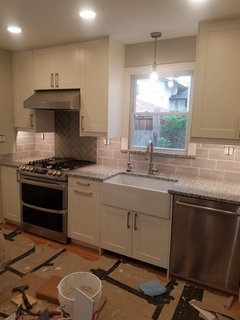
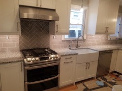
    Here are some pics this morning in different lighting. It is super overcast today, of course!


    With the range, I most definitely like it more. We aren't moved in so we don't have any other belongings for visual affect. I absolutely could live with it, it just is not entirely what I pictured as a whole. I should have spoke up when I felt unsure. Overall, just looking for the least painless alteration to like it more.


  • 7 years ago

    I wonder if some of the problem is your lighting-the pics in natural light look fine to me but then it gets a clashing look with lights on.

  • 7 years ago
    last modified: 7 years ago

    The latest pictures make it look very nice. If you want to change- the SS option of covering, instead of tearing it out, might work. You can buy different finishes in pre-cut sizes that should fit behind your stove.

    https://www.homedepot.com/b/Backsplash/Stainless-Steel/N-5yc1vZ1z0ukaoZ1z0x8f5

    We used this behind our stove.


    Kitchen · More Info


  • 7 years ago

    I like it even better with the range in place! I don‘t know if I can explain what I’m seeing, but I think the impression I get is that your kitchen is full of rectangles...the cabinets, the pulls, the tiles, the bar in the island light, the sink. The curves on the lights and the faucets are counterpoints to the rectangular “theme” and then the tile behind the stove takes the “theme” and literally shakes it up a bit to keep it from being boring.


    It would look wrong if it were just a random patch in the wall, but a range is often one of the focal points of the room. You could put white there instead, but I think if you do you’re going to feel like it clashes with the range.

  • 7 years ago
    last modified: 7 years ago

    It does look better with the range in. I still would have preferred the darker tile everywhere - I think it is a better match to the counter. But at this point, I'd say just leave it.

  • 7 years ago

    I was going to say it was fine as is and now seeing the pics this morning I'm even more convinced it's fine. The darker backsplash visually ties the hood to the stove and makes it look like it's meant to be like that. The reason is the backsplash color and value is similar to the hood and stove so it reads as one piece. Great job even if you didn't mean it like that.

    Trust me white would have been completely the wrong choice. It would have been jarring and wouldn't have tied the hood to the stove because your eye would've immediately gone straight to the white and then bounced back and forth between the hood and the stove. Why? Because we are visually drawn to the lightest color in a room. In white it would have stuck out like a sore thumb.

    Your "mistake" was the right decision.

  • 7 years ago

    And this also proves why it's best to wait until all elements are put into a room before freaking out. :)

  • 7 years ago

    If you make the decision to replace the herringbone behind the range with the same tile as the rest, measure carefully prior. Generally when you tile you measure whole tiles and cut off at the edge. If you remove the herringbone, do you have the appropriate dimensions to finish the middle without cutting full tiles? I hope I am explaining this correctly.


    If you decide to remove the herringbone, I would do an edge prior to the subway before you transition to the other tile on the inside feature.


    Rather than tile, the stainless option might make it easier to finish it differently at this point.


    I don't dislike the feature herringbone once you put the range in. My vote would be to live with it for awhile and see if it bothers you. Fix it later with a stainless sheet (or copper or a decorative glass piece - anything that is easy to clean).

  • 7 years ago

    The reason is the backsplash color and value is similar to the hood and stove so it reads as one piece. Great job even if you didn't mean it like that. cpartist


    I agree with cpartist - looks nice now that the range is there. Now I think you just need to give yourself some time to get used to it and so "to like it more".

  • 7 years ago

    Not a Pro.


    Take the gray color behind the stove and try to find a planter, tray, or canisters in that color to add to another area of the counter. Disperse the color in small amounts throughout the kitchen. In a painting, kitchen valance, area rug.

    In the end, it will look like it always belonged.

  • 7 years ago

    Agree with njmomma.

  • 7 years ago


    Another vote for introducing the darker gray in accent pieces. And don't worry about the comments regarding the color of either tile with your countertops. On my monitor, your darker tiles look positively green, which I'm sure they're not. Independent of lighting conditions, the same tile and granite can look incredibly different just depending on camera and computer monitor. After granite shopping this weekend, I looked at my photos using four different computers at the same time (just as an experiment), and no single granite/tile combo looked the same on any of the same four screens.

  • 7 years ago
    last modified: 7 years ago

    Hi Becca,

    What a great hubby you have!

    I feel terrible, don't think you're going to like my post..

    But I agree with your original post. To me it looks too busy in this space regardless of the appliances or not.

    The white grout lines are HUGE!

    The design behind the stove attacks what should be a simple viewline and the counters.

    The sink and the cabinets and the grout are 3 different colors of white.

    Then, unless they are getting refinished, on my screen your floors look very orange.

    My vote, at the very least, is to darken all of the grout and then live with it.

    I'm sorry, ugh.

  • 7 years ago

    At first I was in the “change it” group, but now seeing it done I think you are fine!

  • 7 years ago

    I would not change it. Your kitchen looks great! I agree with the comments to pick up the darker gray with accent pieces. Enjoy your new place!

  • 7 years ago

    It looks much better in the daylight, and so very much better with the stove. I agree with getting just a few darker accents to place throughout the kitchen here and there. Do so and live with it like this for a year. Then see if you have grown to love it. I suspect you might.


  • 7 years ago

    He did a great job, especially centering the herringbone pattern.

    Do nothing.

    Live with it.

    You could stain the grout if you feel it's too obvious.

    But for now, put down the float and the sponge and step away from the tile.

    It will be no more difficult to make a change a year from now than it is now, and now is the time to let him revel in a job well done.

  • 7 years ago

    Thanks to all! I'm going to try to warm up to it for now. I forgot to mention I'm pregnant, emotional and have a wide range of opinions day by day! Moving is stressful but we are looking forward to enjoying our first home together and I think the kitchen will grow on me, especially once we have our stuff there. Thanks again for all the feedback.

  • 7 years ago

    Oh, wow, you've got a lot going on at once! You're going to love having everything all shiny and new as you're getting settled in with your little one. And I agree with tatts, you can always change things down the road if you come upon a different backsplash idea that excites you both. By then your husband will have a little apprentice to work with him! :)

  • PRO
    7 years ago

    It doesn't look bad as is, but we empathize with your situation. A couple other comments on here suggested a stainless steel option, which we second!

  • 7 years ago

    I agree with most of the others, the accent wall looks much better with the range. I have two simple things that might help your discomfort. Go to a tile store and look at grout stain. If you can stain the grout closer to tile color I think you'll be happier. Also, you can look for a trim piece (I'm sorry I didn't notice if the herringbone has straight edges) to separate the two tiles.

  • 7 years ago

    I’m with the “live with it and see” crowd. Looks better with the stove in and also likely to look and feel different once all the usual countertop stuff moves in and easy enough to change later if you really dislike it. That said, what I see as the issue is the difference in “feel” of the two tiles. The lighter tile has gradients of color (some areas lighter than others), giving it a “soft” feel. The darker tile reads as a single color, so it feels “hard” against the softer light tile. I suspect if the dark tile also had clear color gradients, the transition would work a little better.

  • 7 years ago

    I think it looks great with range in place. Call it a day, you'll love it in no time!

Sponsored
Wannemacher Interiors
Average rating: 5 out of 5 stars26 Reviews
Customized Award-Winning Interior Design Solutions in Franklin Cnty OH