Software
Houzz Logo Print
dovechaser

kitchen ready for color

7 years ago
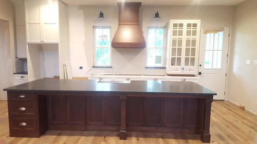
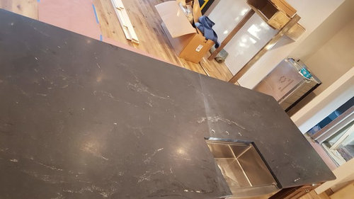
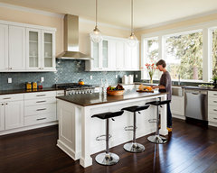
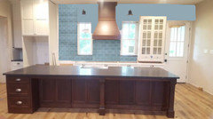
Our new kitchen is almost ready for some color. I am partial to blues and greens. My cobalt Kitchenaid will likely live on the counter by the stove as I use it almost daily. Kitchen is open to dining and living. Perimeter counter will be same as island - just waiting on a cabinet fix. Walls are SW Modern Grey (aka beige, lol). painted Cabinets are White dove. Counters are honed misty black. Windowsill match counters. Hutch will likely contain home canned goods, so not sure how that would look with a colorful background.


Would love ideas for backsplash, pendants, inside of hutch, front door color, barstools, rugs, or anything else you can think of to add a little pizzazz.???


Any ideas?

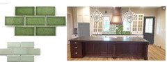
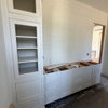
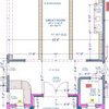
My kitchen:


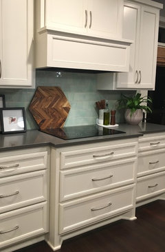
close up of counters (not cleaned or enhances yet):


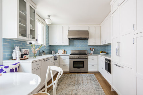
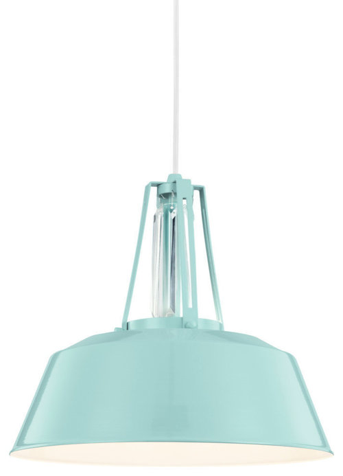
inspiration...

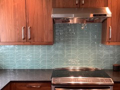
Coastal Kitchen Blue Backsplash · More Info


1-Light Pendant, Hi Gloss Blue · More Info


Comments (65)

  • 7 years ago

    I like your choices. Being a blue girl, I'd bring home samples of blue tiles you like. Everything else in here is neutral so it should go. My LR, DR, and kitchen are neutrals and blues and I find it perfect for me. Without some color it would be another Joanna Gaines kitchen. AND, that island is stunning!


    Cyndy thanked lizziesma
  • 7 years ago

    Not a pro...

    A light color with some shimmer would look great. I have used something like these in one of my household projects.

    I feel like a colored backsplash would be very busy with the dark cabinet, dark counter, off-white cabinet, so a light color with shimmer may be a good option. Just my opinion though! Your kitchen will be beautiful no matter what you choose.

  • PRO
    7 years ago

    Every good design and composition has a focal point, or "star" of the design. The choice of a dark finished island, in an otherwise rather neutral composition automatically make the highly contrasting island the dominant visual element and the "star" of the kitchen.


    There's no room for other "stars" in this design. The remaining elements must be secondary and supportive, not competitive, of the kitchen's star--the island.

  • 7 years ago

    PS: your kitchen hard surfaces are the same colors I am working with in my home, and I am also adding in blues and greens into my decor, too. Look forward to seeing your final product!

  • 7 years ago

    Every good design and composition has a focal point, or "star" of the design. The choice of a dark finished island, in an otherwise rather neutral composition automatically make the highly contrasting island the dominant visual element and the "star" of the kitchen.


    There's no room for other "stars" in this design. The remaining elements must be secondary and supportive, not competitive, of the kitchen's star--the island.

    Gee then like I said, my kitchen must be a hot mess and awful by your thinking.

  • 7 years ago

    Cyndy, do you have any other cobalt elements besides your mixer? I also have a beloved cobalt KA, and I can’t quite picture it with the light greeny blue of your inspiration kitchen. Likewise the canned goods. I grew up canning with my mom and as I remember the colors of the foods in our canning cabinet they were mostly warmer, earthier colors: gray green of green beans, deep orange red of tomatoes, deep burgundy of strawberry jam, dark purple of blackberry jam...


    This may be way outside your vision, but I’m wondering if you need to think deeper/richer/warmer colors to tie together the wood with your dark countertops and the mixer, etc. I’m not sure how this would play out on a backsplash. Maybe copper? Maybe creamy beige tile with cobalt accents?


    My other suggestion would be to go with a combination of blues. I think if you got really brave and put cobalt AND the light aqua blue together in your backsplash, and then carried both colors through the room, it could look amazing!

    Cyndy thanked SapphireStitch
  • 7 years ago
    last modified: 7 years ago

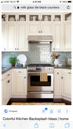
    Someone posted this beautiful milk glass tile on a thread in the last week or two. It could be a beautiful way to introduce a soft blue. https://www.susanjablon.com/shop/glass-tiles-mosaic/tile-collections/milk-glass-tiles.html

    I also love this larger soft blue.

  • 7 years ago

    additional colour for the backsplash

    ref pic

    Lake Oswego Custom Home · More Info

    The name of the tile line is Moda Vetro Single Color. We did a mix of gloss and matte finish in the color 13. Hope this helps.

  • 7 years ago

    Your kitchen and the comment about liking blues and greens reminded me instantly of an amazing reveal from the old GW Kitchens forum, with wood cabinets on the island, dark counters, and a gorgeous green Fireclay backplash.

    I'm just a lurker, not a pro, but this one stuck in my mind for 7 years (with total admiration.)

    Finished Kitchen Pictures! by ayerg73

  • 7 years ago

    I love the idea of Fireclay tiles in Kelp Green with touches of cobalt blue, like the KitchenAid mixer.

  • 7 years ago

    calidesign- I have always loved soapstone. It is not in my budget though, so I chose a granite that had a similar look.

  • 7 years ago

    Virgil I think we shall agree to disagree. I see my island as a big ol' hunk of wood furniture. I love it and it is well designed...but not a 'star' in my book. My hood is pretty and ties the island and perimeter together, but is essentially a very simple wood hood, again in my view, not a star. I know it sounds funny to say I LOVE color by looking at that very neutral kitchen photo - but I do and I don't think I will be happy with more neutrals.


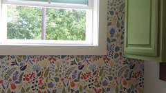
    Here is a photo of my laundry which can be seen from the kitchen (down a hall)

  • 7 years ago

    cpartist - I appreciate the photoshop. I would LOVE to paint the walls a pretty color, but the kitchen is connected with dining and living (one long room really) and the way it is there aren't natural stops for different colors. I think I am going to have to rely on backsplash and perhaps the inside of the hutch , or door for some color.

  • 7 years ago


    Completely different style but here is our blue backsplash with wood ( walnut) cabinets. I think it would look fantastic with white uppers as well.

  • 7 years ago

    CindyR - I hadn't thought about shimmer - I will add that to my list to look at. I wonder if a light shimmery green would work?

  • 7 years ago

    Cyndy, do you have any other cobalt
    elements besides your mixer?

    Hmmm- my dish towels used to be blue. some of my dishes are blue. Our build was an unplanned one. Most of what I own was flooded/washed and either tossed, given away, or packed up for 2 years. I don't even know what I own anymore, lol! Unpacking boxes will be like Christmas!


    This may be way outside your vision, but I’m wondering if you
    need to think deeper/richer/warmer colors to tie together the wood with
    your dark countertops and the mixer, etc. I’m not sure how this would
    play out on a backsplash. Maybe copper? Maybe creamy beige tile with
    cobalt accents?

    I am pretty open. I don't have a 'vision' specifically for the backsplash. I think that is part of my problem. I like lots of things and really want some color, I am drawn to greens and blues, but could be convinced otherwise!


    My other suggestion would be to go with a combination of blues. I
    think if you got really brave and put cobalt AND the light aqua blue
    together in your backsplash, and then carried both colors through the
    room, it could look amazing!

    I would love to see something like this! sounds amazing.

  • 7 years ago
    last modified: 7 years ago

    OMG - BeckySharp! I just looked up the fireclay kelp color. I am in love.


    and smalloldhouse_gw - LOL, I just clicked on your link and realized I posted a pic of the same house. LOVE the colors.

  • 7 years ago

    My other suggestion would be to go with a combination of blues. I
    think if you got really brave and put cobalt AND the light aqua blue
    together in your backsplash, and then carried both colors through the
    room, it could look amazing!

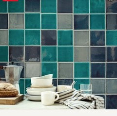
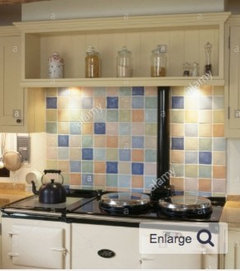
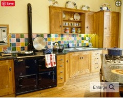
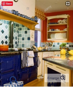
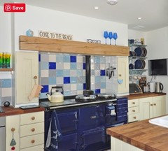
    This reminds me of the traditional British backsplashes that are a several different solid color 4" square tiles, usually behind an Aga, and often co-ordinated : ) .

  • 7 years ago

    WSEA - that color is stunning and soft. It really looks great in your space!


  • 7 years ago

    beckysharp...like this?

  • 7 years ago

    Cyndy, yes, just like that. Or this, from the same page,

  • 7 years ago
    last modified: 7 years ago

    Thank you Cyndy I think it could really work nicely with your elements , you’d just need to get some samples in your light. Obviously not that tile style though.

  • 7 years ago

    Oh I love that look!

  • 7 years ago

    beckysharp, I was picturing a field of the aqua tiles with a little liner strip of cobalt, but this is glorious! It’s so much the opposite of what’s on trend that one would have to be willing to trigger the One True Kitchen police, but what cheerful warm kitchens those are.

  • 7 years ago

    The nice thing is you can pull in as few or as many colors as you want -- contrasting or complementary, or color block, or gently varying shades of the same color.

    Some of the ones I've seen are bonkers, others very elegant. All are cheerful and warm, as you so aptly said, SS.

    Cyndy thanked beckysharp Reinstate SW Unconditionally
  • 7 years ago

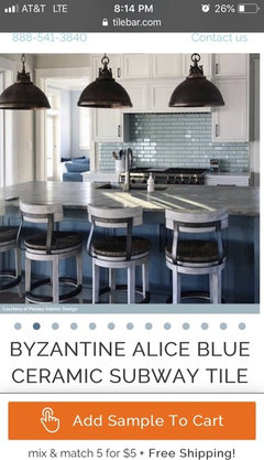
    Here is a gorgeous pale blue combined with your colors (brown and white/cream). Also a link. So soft and pretty.

    https://tilebar.com/byzantine-alice-blue-ceramic-tile.html

  • 7 years ago

    following

  • 7 years ago

    well I have a lot to think about. the square tiles really are really cheery and fun but they don't speak to me the way the fireclay kelp color does. I will definitely get some samples and possibly some paint samples to play with color on the backsplash and other areas before I commit.

  • 7 years ago

    Pick something that makes you feel happy to see it! I hope you’ll post more pics as you go along; I‘m looking forward to seeing how it all comes together!

  • 7 years ago

    well I have a lot to think about. the square tiles really are really cheery and fun but they don't speak to me the way the fireclay kelp color does.

    You could also do an almost entirely solid 2x6 Fireclay Kelp Green backsplash with a few randomly scattered Azul, Santorini, or Lapis (etc) blue tiles to tie-in the KitchenAid mixer and other cobalt blue accents.

  • 7 years ago

    If you go with the kelp I would not do a teal/aqua pendant, I would go with a simpler finish on those, I know you are against what Vigil said, but with all the elements, you will get to a point of "what do I look at here?" the tile, the hood, the counter the island the door.... you do need cohesion. I like the kelp, the picture you posted with it has some very simple pendants that would do well in your space as well. Also not those scones, as I stated before are too small and will continue to shrink as your install completes. Id want to replace them after the tile goes in. I also would leave the door white, otherwise the space will look lopsided.

    I did half rosemary tiles for a lighter approach.


  • 7 years ago

    RL - I agree! Thank you for that visual. I do love that kelp color. The charcoal door looks nice as well. Question - would you paint the pantry doors (2x24" not present yet- but visible to the left of the fridge) the same color grey?

  • 7 years ago

    Also not those scones, as I stated before are too small and will continue to shrink as your install completes.

    I don't know. Every time I install scones, even ones I consider small, I seem to expand.

    (sorry couldn't resist.) ;)

  • 7 years ago

    I would paint all the doors white to match the walls or cabinetry, and I'd keep the island lighting quite simple.

    What are your sconces?

    Not sure yet, and it depends what you're going to put in the cabinets, but I'd consider painting the back of the glass fronted cabinets in a green to match/co-ordinate with whatever tile color you choose.

  • 7 years ago

    I'd be sorely tempted to back those glass fronted cabinets with the same wallpaper you used in the laundry room and use them to store white pottery or a few favorite colors of either Depression glass or Fiestaware.

  • 7 years ago

    Cyndy I agree with you completely. A beautiful color tile on your backsplash would add COLOR. I am like you and feel neutrals need color. Love your kitchen and cant wait to see what you choose. Do what YOU like and what speaks to you, it is your kitchen! Lots of really nice pictures with suggestions!

  • 7 years ago
    last modified: 7 years ago

    Sapphire - I would LOVE that look, but I need a place to store home canned items and that was the entire purpose of the hutch in the design. I might paint some posterboard and see what it looks like behind jars. or perhaps a small pattern. Luckily it is easy to play with that. I was also thinking some glass knobs for that piece. maybe something to coordinate with the tile color? I love my pulls but not my cabinet knobs. Willing to change those, haven't really even looked.


    CPartist - YES the sconces will change to something larger. will probably wait a bit so hubby doesn't notice, lol.

  • 7 years ago
    last modified: 7 years ago

    I was also thinking some glass knobs for that piece. maybe something to coordinate with the tile color? I love my pulls but not my cabinet knobs. Willing to change those, haven't really even looked.

    You could get green or cobalt blue glass knobs. Blue glass knobs might look good with a painted green or wallpapered interior. And I think canning jars would look terrific with a painted background.

    CPartist - YES the sconces will change to something larger. will probably wait a bit so hubby doesn't notice, lol.

    I wouldn't choose island pendants until you know what you want to replace sconces with.

  • 7 years ago

    I love those green tiles and the light blue tiles. I'd wanted white hex tiles w/yellow grout but the colored tiles make me rethink.


  • 7 years ago

    Cyndy, the canned goods will add a lovely touch of charm and warmth, and I think glass knobs (cobalt or green!!!) would be delightful. There are lots of easy things you can put on the back wall of a cabinet that don't require committing to anything permanent. My daughter covered foam core boards with patterned scrapbook paper to put in her china cabinet.

    Cyndy thanked SapphireStitch
  • 7 years ago

    I was hoping you wouldn't like the gray door lol. and no I would not start painting doors gray.

    I reallllllllllllllllllllllllllllllllllllly think you should get the backslash and counters installed then make other choices. too much too soon. Pendants should be very last choice.

    Cyndy thanked RL Relocation LLC
  • 7 years ago

    RL I promise I will go slow. We are finishing most of the house ourselves and SLOW is our middle name. Right now the doors are just primed. I will likely just spray them the white trim color and if I feel crazy- test paint one later on. This weekend we are trimming more windows and building pantry shelves. i NEED a real kitchen - so trying to get this one up and running ASAP. The last counter goes in tomorrow.

  • 7 years ago

    I think your inspiration tile would look great in your kitchen. I’m not good at the mockups. The tiles would obviously not be different sizes and would be to scale! ;-) I just thought this might give you some idea for the color in the room. I think I’d tile that whole back wall.


  • 7 years ago

    Your kitchen is beautiful so far. If you like the look of fireclay and the British style of mixing colors, have you seen the subtle variation of mixing different fireclay color tiles together? I think it gives a subtle depth. I mostly see this in whites but I posted a few below.

    The last picture I have always loved and it reminds me of your kitchen (dark island, counter hutch and different hood), they also used fireclay and while they used white tile, I think they have a lot of focal points and it all still comes together nicely.

    I also wanted to throw out zellige tiles as an idea since they have such pretty colors variations in an array of colors.

  • 7 years ago

    Your kitchen is beautiful so far. If you like the look of fireclay and the British style of mixing colors, have you seen the subtle variation of mixing different fireclay color tiles together? I think it gives a subtle depth. I mostly see this in whites but I posted a few below.

    The last picture I have always loved and it reminds me of your kitchen (dark island, counter hutch and different hood), they also used fireclay and while they used white tile, I think they have a lot of focal points and it all still comes together nicely.

    I also wanted to throw out zellige tiles as an idea since they have such pretty colors variations in an array of colors.

  • 7 years ago

    Your kitchen is beautiful so far. If you like the look of fireclay and the British style of mixing colors, have you seen the subtle variation of mixing different fireclay color tiles together? I think it gives a subtle depth. I mostly see this in whites but I posted a few below.

    The last picture I have always loved and it reminds me of your kitchen (dark island, counter hutch and different hood), they also used fireclay and while they used white tile, I think they have a lot of focal points and it all still comes together nicely.

    I also wanted to throw out zellige tiles as an idea since they have such pretty colors variations in an array of colors.

  • 7 years ago
    last modified: 7 years ago

    I LOVE the kelp green and think that would be amazing! But don't be afraid of the pastels. They can look great with grey counters and white cabinets. My floor is dark and I did a handmade tile in a minty green trapezoid shape. The handmade tiles typically have a decent amount of variation in color and keep it from being boring OR distracting.


  • 7 years ago

    cant wait to see the counters installed!

Sponsored
NME Builders LLC
Average rating: 5 out of 5 stars2 Reviews
Remodeling Company in New Albany, Ohio