

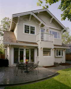
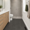
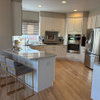
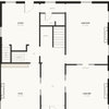
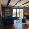
Same house, but two different looks. Which one appeals to you and why?
13 years ago

Featured Answer
Sort by:Oldest
Comments (19)
Related Professionals
Oklahoma City Interior Designers & Decorators · Lebanon Interior Designers & Decorators · Minot Interior Designers & Decorators · Decatur Architects & Building Designers · Monroe Architects & Building Designers · Duluth Architects & Building Designers · Great Falls Architects & Building Designers · Logan Architects & Building Designers · Baltimore Kitchen & Bathroom Designers · Tupelo Kitchen & Bathroom Designers · Augusta Kitchen & Bathroom Designers · Willmar Kitchen & Bathroom Designers · Watertown Kitchen & Bathroom Designers · Farmington Kitchen & Bathroom Designers · Sanford Kitchen & Bathroom Designers PRO13 years agoOttawa General Contractors thanked Out of the Woods Inc.- Window & Door Specialists
 PRO13 years agoOttawa General Contractors thanked Kasper Custom Home Remodeling
 13 years ago
 13 years ago
 13 years ago
- 13 years ago




Related Stories
KITCHEN DESIGN12 Great Kitchen Styles — Which One’s for You?
Sometimes you can be surprised by the kitchen style that really calls to you. The proof is in the pictures
Full Story
SHOP HOUZZHouzz Products: One Mod Sofa, Two Cool Designer Looks
Choose your style slant: classic or glam. Designer Kyle Schuneman puts everything together for you with Houzz Products picks
Full Story
LANDSCAPE DESIGNGarden Overhaul: Which Plants Should Stay, Which Should Go?
Learning how to inventory your plants is the first step in dealing with an overgrown landscape
Full Story
KITCHEN SINKSWhich Faucet Goes With a Farmhouse Sink?
A variety of faucet styles work with the classic farmhouse sink. Here’s how to find the right one for your kitchen
Full Story
REMODELING GUIDESWhich Window for Your World?
The view and fresh air from your windows make a huge impact on the experience of being in your house
Full Story
BATHROOM VANITIESShould You Have One Sink or Two in Your Primary Bathroom?
An architect discusses the pros and cons of double vs. solo sinks and offers advice for both
Full Story
DECORATING GUIDESStaging vs. Decorating: What's the Difference?
Unlike decorating, staging your home isn't about personal style — it's about creating ambiance and appeal for buyers
Full Story
HOMES AROUND THE WORLDHouzz Tour: When Two Houses Are Better Than One
Subdividing a Melbourne backyard opens up space to build a second home on this family's property
Full Story
COLORColors of the Year: Look Back and Ahead for New Color Inspiration
See which color trends from 2014 are sticking, which ones struck out and which colors we’ll be watching for next year
Full Story
KITCHEN DESIGNOpen vs. Closed Kitchens — Which Style Works Best for You?
Get the kitchen layout that's right for you with this advice from 3 experts
Full Story

Teri