Software
Houzz Logo Print
webuser_553263610

SW Quietude MINT GREEN - help!

7 years ago

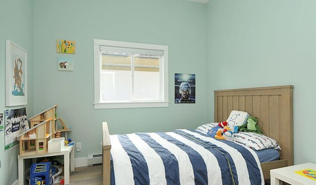
Painters are still painting the lower level so once they leave I can take pictures. Here’s the thing. I looked up a blue/gray/green for my windowless spa bathroom and narrowed it down to SW Rain and Quietude. Went with the latter bc I wanted a touch more green but now it looks minty green. Suggestions for ridding of the mint? Is Quietude warm or cool??
Change lighting to a cool spectrum?
Pull more blue tones via pictures rugs?
Suggestions please!

Comments (10)

  • PRO
    7 years ago

    Test, test, test. When you select a paint, the natural and artificial light can shift the color in that particular room. So instead of painting the entire room and then finding out it is not the color you envisioned, test your paint first on a wall or a card and watch it for a day or two.

    Sorry you are now having to repaint. For more information on paint, go to my newsletter I wrote for that very subject: https://www.ljacobsendesign.com/wp-content/uploads/2019/05/April2019.pdf


  • 7 years ago
    <?xml version="1.0" encoding="UTF-8"?><md>I did test but I think the walls magnified the green.
  • PRO
    7 years ago

    Yes, that can happen. In this case paint 2 walls or large sections next to each other. It will be what I term "sympathetic to its surroundings. I have even had times where the outdoor vegetation reflecting on the interior paint.

  • 7 years ago

    Hello Sue. I'd like to share some info NOT included in Ms. Jacobson's info on choosing paint color, and include with it my own window-less wall color experience. First please allow me to begin by saying that I have a great eye for color, no boast, just true. First, ALL paint begins with either a white (cool) or beige (warm) BASE. The white base will give any color (recipe) you choose a clear, or more "bright" color, where the warm base will give the color (recipe) you choose an earthy or "muted" color. I looked up both your Quietude & Rain choices, and Rain is definitely more blue, but both are similar "shade" densities on their multi-color swatch tabs, so if the base for Rain is the same base as Quietude then hopefully you can intuit that if you change to Rain the color may be just as "loud" as you are now feeling the Quietude is, only blue? So the question is: the COLOR itself. Even though now that it is on the walls and seems far too saturated a color. Still....both Quietude & Rain might have the same BASE or the opposite; you'd have to go back to the store and ask. For argument's sake, and since you're describing the Quietude as too "minty"....which says "bright" or too much color, to me, that if the Quietude begins with a white BASE and the Rain begins with a warm BASE, once the Rain gets on the walls of you window-less bathroom, and dries, it might STILL be too strong a color for a "spa" feeling. Do you follow so far? Both of your color selections might just be too saturated, or too much color. So the question you should answer for yourself is this: Do you still LIKE the Quietude color?


    My story might help you decide what to do next. Because my hall bath is small and window-less I wanted to redecorate it to make it as light as possible, and began by choosing a white porcelain tile with a faux marble veining, but when I brought home 4 to 6 grey paint swatches to try NONE of them worked. It was because there is a hint of puce (purple) in the grey veining, so back I went and returned with 3 to 5 purples and found an EXACT match! When I cut away all of the more saturated colors on the tab and set the one I liked on the tile suddenly the paint color looked GREY! Perfect!, I thought. I'd have the faux marble floor tile with soft grey walls, and a quartz countertop. My paint was a warm BASE, but when I'd painted the room and looked the next morning it was SO saturated it looked like a 12 yr old girl's bedroom!!! I KNEW there was NOT another swatch better, but I didn't want a purple bathroom!!! Back I went for help from the most experienced color mixer in the store asking if it could be LIGHTER. LONG story short, Sue, even though there one one shade lighter on the SW color tab it was too "bright" lavender. Here's what I learned. Even though the shades of colors on the tab appear to be the same color, but growing evenly darker & lighter the RECIPIES to create those shade couldn't be farther from true; you can't try altering the numbers of drops in the recipe. Here IS the answer to getting the same color you love but not so saturated. I began with a gallon of the base paint and had them prepare the color using the recipe for 2 quarts. Finally it was PERFECT!!! Now when I walk in I see soft grey walls that coordinate perfectly to the shade of grey in the floor tiles! If you still love Quietude you should consider starting over with a gallon with 1 quart of Quietude's recipe, see a sample, and add more color 1 quart at a time. I think if you do you'll have the soft spa feeling you're wanting. I hope this helps. Good Luck. : )

  • 7 years ago

    Wow ms you really understand color! I don’t want to have to repaint so I’m thinking once I get stuff on the walls it will better.

  • 7 years ago

    Well, are all walls painted already? If not, what is the existing color? Just saying that things might change when everything is painted. I painted SW Agreeable Gray in a yellow room. Until all walls were painted, the Gray looked positively purple. So much so, that I kept on checking the paint against the chip.

  • 7 years ago

    You said they were still painting. Color will look different after it cures for a few days.

  • PRO
    7 years ago

    I can’t imagine that color looking minty so the advice to wait until all the walls are painted is good. Once all the room is done and decorated I think it will look great.

  • 7 years ago
    last modified: 7 years ago

    Hello again Sue. I hope my solution was understandable should you live with your bathroom and still feel like there's just too much color. I went through this same experience a year ago and before falling asleep last night I remembered that I went back after trying the gallon BASE with 2 Qts of the recipe in it because it was just a scosh too pale, and had them add one PINT worth of the recipe and that was the perfect saturation of the swatch color I chose. I've been accused of being a "perfectionist" when it comes to color and design, LOL! You know you can buy paint in pints, quarts, and gallons, and once it's on the walls and is not quite "perfect" you have more knowledge about color saturation and the "tools" to get you to "perfection."

Sponsored
Bella Casa LLC
Average rating: 5 out of 5 stars17 Reviews
The Leading Interior Design Studio in Franklin County