Software
Houzz Logo Print
webuser_5721134634653919

Purple Paint Color...can I cut the color by 25% 50% bring down purple?

7 years ago
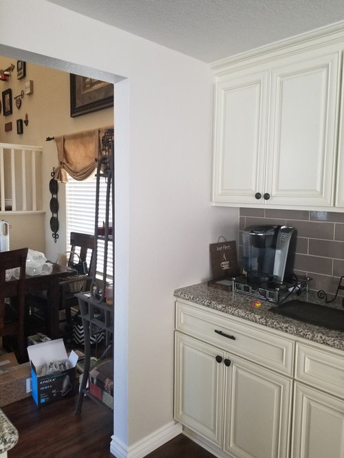
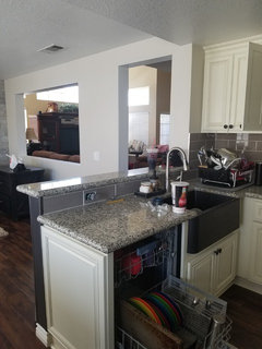
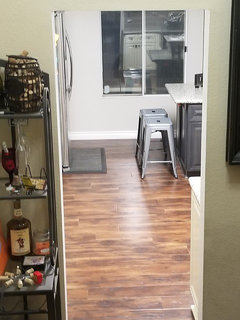
Accessible Beige paint color is showing purple closest to the cabs compared to the rest of the kitchen and adjoining room probably due to the cream cans and/or taupish backsplash. Would it be possible to cut the color by 25 or 50 percent just in this area to lessen the purple color and make it a little more white???

Comments (20)

  • 7 years ago
    last modified: 7 years ago

    I'm neither a pro nor an expert, but I don't think it works that way. You may just get a lighter version of what you're trying to eliminate. Why not look for a color that works in the entire space?

  • 7 years ago

    Given that the Accessible Beige isn't working, why would you use it as a starting place for a lighter color? Why not just go back to paint swatches and samples?

  • 7 years ago
    last modified: 7 years ago

    Check with your paint store to make sure they mixed the color correctly.

  • 7 years ago

    We just spent so much money painting the entire kitchen and backroom with it. I'm hosting a large party soon so wanted a quick fix for now since it seems to clash in a smaller area.

  • 7 years ago

    Other areas

  • PRO
    7 years ago

    You need to go to your local paint store and find out what color was added to Accessible Beige that is giving it the "purple" tint. It is most likely a very small amount of magenta or other such color that was added to the formula to keep it from going "green". I found this to be the case with SW Repose Gray. I just had them mix it without that extra colorant, and since it was going on the walls with my Repose Gray cabinets, I had it made 1/2 strength. It worked!

  • 7 years ago

    I have painted similar colors next to each other where the direction of light changes...like your case with the wall turning. Your eye will not be able to tell that it's a different tone. Get samples and paint the small continuous area only with a close color that doesn't pull purple.

  • 7 years ago
    last modified: 7 years ago

    It’s the yellow cabinets, not the wall paint. It isn’t reading purple at all. Your eyes are just overloaded with the yellow.

  • 7 years ago

    I remember, years ago, my grandmother telling me about a house painter she hired to paint her kitchen. This was back in the days when painters would mix their own colours...no big box store paint sections to run to. The painter mixed the kitchen colour in four different shades of the same base colour (blue) in order to lessen the differences produced by how the light reflected off the different walls and lighting on them. When done, the kitchen appeared to be a uniform blue...all through the day and evening! I don't think anyone has that expertise anymore.

  • 7 years ago

    Are you sure you aren't being too critical?

  • 7 years ago

    I don't see it as purple. Why no leave it and ask your guests for opinions? :)

  • 7 years ago

    I know exactly what you mean about beige going over to the lavender side, it is one of my favorite reasons for selecting beige. You can cut it with white but that will just give you a lightened version of the same color. Opposite purple on the color wheel is yellow. A very small amount of yellow artist acrylic paint will warm up your neutral. Be very careful if you go this route it is easy to add too much. Or if you want to dull it down you can always add a couple drops of black. Black is magical when it comes to calming down a paint color. And finally, if your paint can has te formula on a label ask the folks that mixed it what they can add to it to curb the violet undertone.

  • 7 years ago
    last modified: 7 years ago

    I don’t see purple. I do see yellow in the cream cabinets. That means that you need a warmer color palette for your room. Pick a creamier, tanner, beige. Stay away from gray anything. Beyond it clashing, it is on its way out.

  • 7 years ago

    Why stress yourself when you are having a large party? After the party you can fix this. My mother used to say if people were just coming to judge, they could stay home. ( of course, being so sweet, she never said anything like that to anyone outside our family). We only had warm, lovely friends who were coming to enjoy her hospitality and my dad’s great sense of humor. Oh, she also only straightened the house before the grandchildren visited, cleaned after they left! Spend your valuable time working on your menu, your seating, and the serving dishes you will use. I find organizing ( ok, I use post-it notes) ahead of time makes for a relaxing time for the host and hostess.

  • 7 years ago

    Dana, check out the 2 color collections at Sherwin Williams that have Accessible Beige within them. You'll find it on both Coastal Cool and Neutral Nuance.


    The "white" colors for each collection are Eider White on CC, and Dover White on NN.


    Another option is SW 7035 Aesthetic White. It's an official coordinating color to Accessible Beige on SW's website, but of course, must be seen in person.


    I do think your photos looked good though!

  • 7 years ago

    First make sure the wall color is, in fact, the color of the swatch. Sometimes colors actually get mixed incorrectly. If that ended up happening here and your painter got the paint for you, you can have it repainted.


    However, I'm betting that's the right Accessible Beige and you did not realize how much yellow was within the white cabinets until your walls were painted. It goes great with your counters and backsplash, but your cabinets are fighting it


    For now, if your party is at night, maybe it won't show as much. You could also try to put in some retrofit LED cans that allow you to "color-adjust"...they sell them at Home Depot.


    After the party, however, if you repaint, first buy a sample pint of a new chosen color and paint a poster-board (2 coats). Then you can put color up on different walls at different times of day and get a better feel for what it will do with your cabinets/backsplash/etc. I never choose a paint color without a large poster-sized swatch because it reveals so much that a small swatch can't.


    Also, while SW has beautiful colors, I find that their neutrals (whites, off-whites and grays) tend to run warm. I have better luck with Benjamin Moore having more options and solutions to problems like yours.

  • 7 years ago

    For the party I would get a beautiful bouquet of flowers (or a platter of chocolate-dipped strawberries) to distract the eyes of your guests if you really think people will notice the slight purple hue. (No man I know will notice!) Then fix the paint at your leisure if it bothers you. Maybe even make that wall a darker shaded accent wall so that it doesn't match on purpose. Coming from a printing background I can say from experience that beige is one of the toughest colors to get right on printers and plotters.

  • PRO
    7 years ago
    last modified: 7 years ago

    The undertone of Accessible Beige is similar to a Hershey’s milk chocolate bar, not the best coordinate for the off white cabs, counters, backsplash. The natural light is showing you what it can do to any paint color you put on the walls, so my suggestion is you accept it, not fight it.


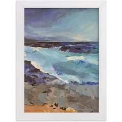
    A temporary solution, would be to hang a colorful piece of art on the wall…something like this with hints of other colors in the kitchen..


  • 7 years ago

    Before changing the color on your wall try changing the color temperature of your lighting, assuming that's the least cumbersome option. We recently had all of the common areas in our house painted using Modern Grey by SW. In our kitchen, where we get a TON of natural sunlight & have recessed LEDs in a cooler light temp (4,000K), the walls have a grayish tint. In the hallways, where we have little natural light & warmer lighting (2,500K), it took on more of a beige color. We replaced the bulbs in the hallway w/ bright white (3,000K) ones & it made a difference. I would recommend taking paint swatches for your wall & cabinets to a hardware store & see what the colors look like next to each other under different lighting. Many large hardware stores (like Home Depot) have lighting displays that demonstrate the color variations you can get by changing the color temp of your bulbs. Here's a link that has more info on color temp. Hope this helps. Good luck! http://www.westinghouselighting.com/color-temperature.aspx