Software
Houzz Logo Print
nayla_chaptini

Help with Black Kitchen

7 years ago
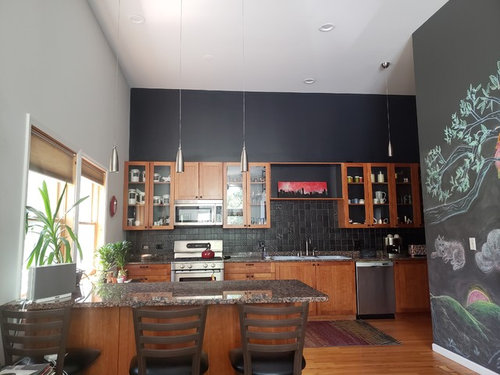
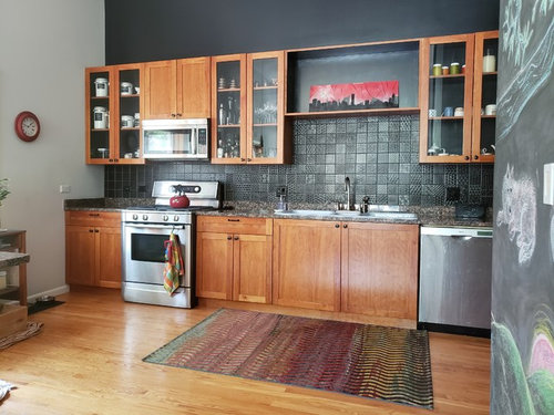
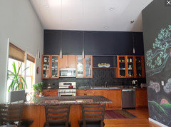
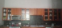
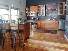
I finally put a backsplash and decided to go dark to update what I have at low price (saving for a bigger kitchen remodel).
I felt that this would make the countertops a little more hip than they are.
I intend to place dim area lights on top of the cabinets.
But I feel something is missing.
What do you suggest I do to improve on this look?
Be honest :)
Thank you.
-tiredeyesandprespective.


5 Attachments


Comments (49)

  • 7 years ago

    LIGHT is what is missing. You can’t do that amount if black without adding a heck of a lot more lighting.

    Nayla Chaptini thanked User
  • 7 years ago

    IMHO the wood cabinets are what's missing. I would paint them either whitey white white or a less black shade of charcoal.

    Nayla Chaptini thanked dchall_san_antonio
  • 7 years ago
    I really like the look. Sophisticated and simple. I see you've added red. The only thing I would change would be the art over the sink, which doesn't appeal to me, but it's a personal thing and you should keep it if you like it. I would replace it with something bigger to fill the space, perhaps bringing in that red again? Or porcelain that's in the cabinet. I appreciate that chalk wall!

    Nayla Chaptini thanked User
  • 7 years ago
    last modified: 7 years ago

    Your kitchen is fab. I suggest a long, skinny rug that spans most of the width of the kitchen and different bar stools. Maybe a large, tall, carved statue on top of the upper cabinets.

    Nayla Chaptini thanked ilikefriday
  • 7 years ago

    I love your kitchen! It's very unique!

    Nayla Chaptini thanked drsaj
  • 7 years ago

    That floating pendant near the sink needs to be replaced with more appropriate lighting. Flush mount - maybe.

    Nayla Chaptini thanked shirlpp
  • 7 years ago

    I really like your kitchen, and I love the wood with the black. I don't necessarily think anything NEEDS to be changed, but since you seem not 100% satisfied, I'll throw out some suggestions.


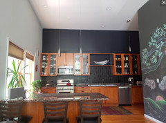
    I can't tell from the daylight pic whether the lighting is sufficient. The pendant back by the fridge seems like an odd choice for that location, and I agree something recessed or flushmount would make more sense. Other than that, the counter stools seem a bit pedestrian compared to the rest of the kitchen, and the color of the blinds seems slightly off to me (these are very minor criticisms).

    Nayla Chaptini thanked cawaps
  • 7 years ago

    I like this whole kitchen a lot. I wish you'd removed the little 4" self-splash before installing the tile, but what's done is done.


    I think you can do better than the red art.

    Nayla Chaptini thanked groveraxle
  • 7 years ago

    Surprised no one has thrown out the idea of matching that upper black wall with the lighter grey/white side wall(s). Think that would really lighten it up, while still loving the black backsplash and black details inside the beautiful wood cabinetry.

    Nayla Chaptini thanked Jocelyn Hastain
  • 7 years ago

    I would just paint the top wall a lighter shade of gray. That will add light and put the focus down below. I think the wood cabinets are gorgeous.

    Nayla Chaptini thanked cyndiego
  • 7 years ago

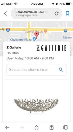
    Something more sculptural and organic:


    Nayla Chaptini thanked groveraxle
  • 7 years ago

    I think it’s nice. What is the pendant over the dishwasher? If possible I’d remove that one. If there’s light needed there put in a fixture not pendant

    also tile in between the floating shelves appeals to me. This may look different in person vs photographs so I may be wrong there

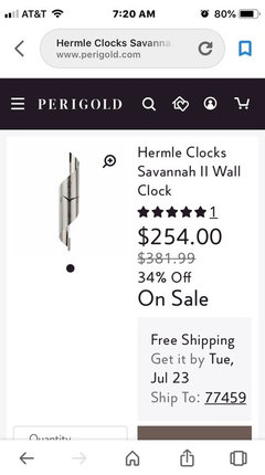
    The clock seems small for the space Apparently bigger clocks are unfashionable but maybe art there if a clock not needed


    Nayla Chaptini thanked roccouple
  • 7 years ago

    I love the drama....I think you’ve really achieved your goal...

    Nayla Chaptini thanked fissfiss
  • 7 years ago

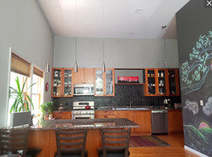
    I assume you painted that back wall to bring a little drama to the kitchen. I like it. I don't think this kitchen wants to be lightened up. I repainted so you could see how boring it is:

    Keep the black wall.

  • 7 years ago

    I like it a lot too! Maybe some spiky plants (snake plant?) on top for the uppers would add an organic texture.

    Nayla Chaptini thanked Isaac
  • 7 years ago
    last modified: 7 years ago

    I love this kitchen, too. The wood is great in this setting. As some have suggested, stronger lighting, but then again I really can't determine how much lighting you do have for this area of your home. But your kitchen has personality, SO many lack that essential feature these days!

    If anything.... another plant?

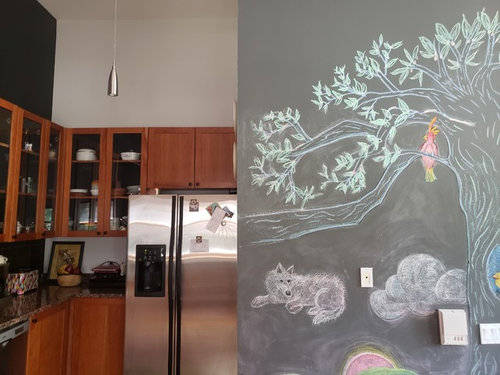
    I love that wall that appears to be painted with a tree and critters. Or is this wallpaper? Or did you paint this yourself?

    Nayla Chaptini thanked artemis_ma
  • 7 years ago

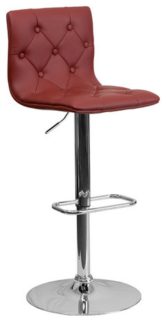
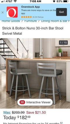
    Red bar stools would be a nice addition


    Flash Furniture Contemporary Barstool, Burgundy, CH-112080-BURG-GG · More Info


    Nayla Chaptini thanked maree85
  • 7 years ago

    I like it a lot too. Don't think it needs anything dramatic, but if you're looking for ideas, perhaps putting some kind of stainless backdrop in the back of the glass cabinets. Perhaps there's some kind of paint that appears to be stainless steel. (maybe)

    Nayla Chaptini thanked Mrs. S
  • 7 years ago

    What an interesting in a good way kitchen! Not loving the granite, it just doesnt seem special enough! My eye kind of wants the backsplash continued to above where the red art piece is. I would consider adding a couple of taller, minimally framed or not framed at all, art pieces on top of the cabs. Fun!!

    Nayla Chaptini thanked zinnia
  • 7 years ago
    last modified: 7 years ago

    How about some koi chalk fish and white lilies above your cabinets to coordinate with the wall?

    ETA: or maybe some bamboo in simple, sleek pots.

  • 7 years ago

    I love these cabinets with the black wall. Really love the combo.

    Nayla Chaptini thanked Flo Mac
  • 7 years ago

    Nice kitchen. Changing rug to a runner would look great

    Nayla Chaptini thanked kristinhallett
  • 7 years ago

    (Nayla, please keep in mind, that your kitchen is actually really nice as is. Unique, subtle, and has a lot of style). I, too, admired that chalk painting. Coolio.

    Nayla Chaptini thanked Mrs. S
  • 7 years ago

    I might,might change to a long runner. But then I would likely change it back ;-) Love what YOU have done. Kudos!

    Nayla Chaptini thanked hollybar
  • 7 years ago

    A more vibrant colorful rug maybe. Love the black with your cabin ets.

    Nayla Chaptini thanked gustaruygers
  • 7 years ago

    Change the black above the cabinets to match the rest of the walls

    Nayla Chaptini thanked jbtanyderi
  • 7 years ago

    There’s no sparkle, and it needs some sparkle.

    Nayla Chaptini thanked Ellen Tracy
  • 7 years ago

    I’d add a couple or three red vases to the glass door cabinets. It’s a beautiful kitchen.

    Nayla Chaptini thanked teamaltese
  • 7 years ago

    I LOVE it! I would change the clock to something larger and more dramatic. A colorful art piece! I like the drama of the black wall above the cabinets. The lighting doesn’t seem to go but is perfectly fine for the interim while you save for the dream kitchen. I think the suggestions of adding plants like the snake plant are excellent.

    Nayla Chaptini thanked teddytoo
  • 7 years ago

    i don't think there is anything you should do, you have decorated as you wanted. Love, love, the warmth the wood gives to the black. I wouldn't even consider a remodel unless there are elements that just are not working. Not knowing what sort of look you were seeking to achieve, it's hard to comment. If modern, as in streamlined modern, then the only suggestion I would put forth is white blinds. That's it...be proud of your work and enjoy your achievement. It's a kitchen which is warm, inviting and not designed within an inch of it's life.

    Nayla Chaptini thanked kazzh
  • 7 years ago

    Looks great! The light-colored side walls now look too safe. Bold 'em up I say.

    Nayla Chaptini thanked Joe T.
  • PRO
    7 years ago

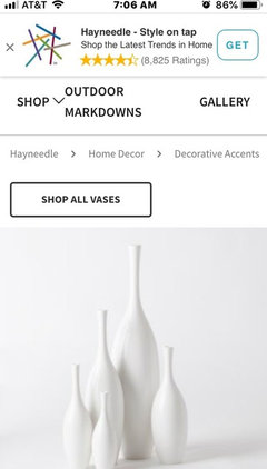
    It is great. A couple of suggestions. Paint the light switch cover on mural wall to match background of mural. Change out bar stools for wood or stainless backs. Try a color from the mural for accent instead of red. Perhaps light aqua? Remove all the reds. Add tall white vases to upper left cabinets. Two different heights.

    Nayla Chaptini thanked Flo Mangan
  • PRO
    7 years ago

    Ideas

    Nayla Chaptini thanked Flo Mangan
  • PRO
    7 years ago

    Items

    Nayla Chaptini thanked Flo Mangan
  • PRO
    7 years ago

    Items

    Nayla Chaptini thanked Flo Mangan
  • 7 years ago

    I am a white kitchen lover, but your kitchen may convert me! It's just great!

    Nayla Chaptini thanked shwshw
  • 7 years ago

    I really like your kitchen too. The art may be the only thing I would change!

    Nayla Chaptini thanked kulrn
  • 7 years ago

    Wow wow!

    Thank you all for your input and attention to detail.

    This is my first forum and boy did you deliver!

    Here's what I will do so far:

    -Find another place for that red art. (It was supposed to be hanging in the middle but its attachment was too weak).

    -Get rid of that corner pendant and replace with a flush light.

    -Invest in more lighting, will get professional help for more outlets etc.

    I DO have rather decent natural light ( hence my decision to go black-see pic) but more light is always good.

    1-Find a different clock, slightly bigger but not too big. I like the one suggested. I DO look at it and use it. OR I'll try to relocate it if possible. Another cool art perhaps.

    2-Find another runner/rug. Your suggestions welcome!!

    3-I will try to camouflage the 4 inch self-splash with either black paint (oil based/oil based primer?) or black contact paper. ( I don't like these granite countertops, but this is a no-demo makeover and budget).

    4-I will spray paint the white lightswitches/electrical outlets to match the dark wall.

    5- The chairs! Ha. Yes they're kind of meh, but I forgot to point out that they're tall chairs (the pics didn't show it) and I had to get them from a Big and Tall Men website, though I'm not this size :)

    I love all the chairs suggested, but even the one that is 43 inches tall falls kind of short.

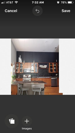
    I am attaching another picture to show you the steps and how high the bar is. (I also am trying to play around with yarn to see if it works to restyle the chairs) I will keep an eye peeled for cooler tall chairs.

    6-The space above the cabinets: I did think about the charcoal instead of black to tie with the other wall and lighten it up. I haven't ruled it out but I will live with the darker wall for now.

    While I will add lighting (either upward from the top of the cabinet or from new established 4 or 5 pendants from the ceiling), I want to experiment with organic elements like tall vases and bamboo etc. as suggested.

    7-The above the sink area used to be a perfectly functional cupboard. I just removed the doors to try to create an open space. I am impressed by your suggested art that is so much better than that piece. I will change it, or perhaps just put the doors back :)


    I AM a fan of white kitchens as well, but I had these nice warm wood cabinets to work with and this rather ugly countertop.

    I don't think I have it in me to paint the cabinets white (that's a lot of painting, including the 'peninsula'), but I think it could make the space look cool and unique.


    Thank you again for these awesome replies. I love you guys, I really do.

    -betterperspective.


  • 7 years ago
    last modified: 7 years ago

    This kitchen needs NOTHING. It's fabulous.

    My opinions below:

    -Find another place for that red art. (It was supposed to be hanging in the middle but its attachment was too weak).

    I like Grover and Flo's idea for a sculptural piece to sit on the shelf there. A great piece of glass or metal would work. Any color would work too.

    -Get rid of that corner pendant and replace with a flush light.

    I have no problem with the corner pendant.

    -Invest in more lighting, will get professional help for more outlets etc.

    I DO have rather decent natural light ( hence my decision to go black-see pic) but more light is always good.

    Do you feel you need more light? If you feel you have enough to see well and you have under cabinet lighting, then you're fine.

    1-Find a different clock, slightly bigger but not too big. I like the one suggested. I DO look at it and use it. OR I'll try to relocate it if possible. Another cool art perhaps.

    Agree that a more interesting clock would work.

    2-Find another runner/rug. Your suggestions welcome!!

    My suggestion is to keep the runner. It brings color in subtly.

    3-I will try to camouflage the 4 inch self-splash with either black paint (oil based/oil based primer?) or black contact paper. ( I don't like these granite countertops, but this is a no-demo makeover and budget).

    Don't waste your time. It's fine as is and not worth the effort of possibly screwing it up.

    4-I will spray paint the white lightswitches/electrical outlets to match the dark wall.

    Good idea.

    5- The chairs! Ha. Yes they're kind of meh, but I forgot to point out that they're tall chairs (the pics didn't show it) and I had to get them from a Big and Tall Men website, though I'm not this size :)

    I love all the chairs suggested, but even the one that is 43 inches tall falls kind of short.

    I am attaching another picture to show you the steps and how high the bar is. (I also am trying to play around with yarn to see if it works to restyle the chairs) I will keep an eye peeled for cooler tall chairs.

    The chairs are fine. Find a fun funky fabric and recover the seats.

    6-The space above the cabinets: I did think about the charcoal instead of black to tie with the other wall and lighten it up. I haven't ruled it out but I will live with the darker wall for now.

    Please do not do that! The black walls make the space. You'll find on these forums that most people want to play it safe and are afraid of anything too different. Don't fall for it please because what you have is as I said, fabulous.

    While I will add lighting (either upward from the top of the cabinet or from new established 4 or 5 pendants from the ceiling), I want to experiment with organic elements like tall vases and bamboo etc. as suggested.

    I would not put anything on the top of the cabinets or it will feel too unbalanced. If you want to do anything, maybe put tape lights on the top to give a soft glow to the wall as uplighting. That's all.

    7-The above the sink area used to be a perfectly functional cupboard. I just removed the doors to try to create an open space. I am impressed by your suggested art that is so much better than that piece. I will change it, or perhaps just put the doors back :)

    No please leave the doors off. Having it open is what helps to tie the upper painted black area to the lower black tile area. It makes it all cohesive. If you put the doors back on, it's going cut the wall in half.

    Just find an amazing piece of sculpture. If you live near any areas that have outdoor fine arts and crafts shows, that's where you'll find amazing pieces.

    I don't think I have it in me to paint the cabinets white (that's a lot of painting, including the 'peninsula'), but I think it could make the space look cool and unique.

    No it will make the space look like every other person's kitchen. It's what is suggested when people are afraid of anything different. This works because the black helps highlight the wood cabinets. If they were white, it would be too stark a difference.

    You have a keen eye and a great sense of style. Don't let anyone tell you differently.


    Nayla Chaptini thanked cpartist
  • PRO
    7 years ago

    Pleased to help you tweak a great job. Please leave the black above cabinets. Absolutely critical to your look. The other tweaks are fine. Show us your progress. But understand you pulled of a genius number of changes without spending a lot of money. Be proud!

    Nayla Chaptini thanked Flo Mangan
  • 7 years ago

    I like the drama ! Bigger pulls or knobs on the cabinets.

    Nayla Chaptini thanked lindahambleton
  • 7 years ago

    I’m also a big fan of the wood and black. I think the doors look great and would put them back on. The small changes you are planning to make will be great. Do give some thought to the fact that plants up on top would be a pain to care for.

    Nayla Chaptini thanked barrowp
  • 7 years ago

    Love it! <3 I would add in recess lighting across ceiling in front of cabinets & sink needs lighting. No warm lights. Under cabinets.

    Nayla Chaptini thanked happyleg
  • 7 years ago

    fab kitchen

    Nayla Chaptini thanked J J
  • 7 years ago
    last modified: 7 years ago

    Nayla said: I will try to camouflage the 4 inch self-splash with either black paint (oil based/oil based primer?) or black contact paper.

    No no no. Just leave it; it's not critical and will likely draw more attention, not less.

    Nayla Chaptini thanked groveraxle
  • 7 years ago

    I agree that the black is dramatic and really interesting. If you paint above the cabinet line, you run the risk of making the room appear much shorter.

    If it were my kitchen, I would add another (shorter) cabinet above (or raise the current one) ove r the sink. Then I would add floating shelves to either side that match the cabinet finish.

    Nayla Chaptini thanked Deborah Harn
  • 7 years ago

    I think your kitchen is super nice. You’ve done some bold choices that worked out well! Be wary of spending too-too much more time or money in it, as I suspect the returns might diminish. Perfection is elusive: this space is dramatic but still warm, that’s a coup! I personally love the chalk mural.

    Nayla Chaptini thanked wanderlust07
  • 7 years ago
    last modified: 7 years ago

    Beautiful and unique kitchen, BRAVO!

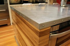
    If anything... consider wrapping the peninsula counter in zinc. Leave a rustic/industrial texture. https://www.thisoldhouse.com/how-to/how-to-build-zinc-tabletop

    Nayla Chaptini thanked THOR, Son of ODIN