Software
Houzz Logo Print
webuser_39177052745

Kitchen Cabinets - Ideas Needed

7 years ago
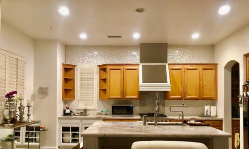
Hi Everyone,


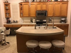
(Please excuse the mess in the kitchen, it was taken after dinner/before clean up).


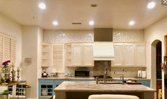
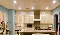
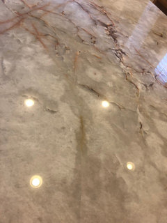
So, we recently replaced our 6 x 6 tiled countertops and 6 inch tiled backsplash with Cristallo Quartzite/Countertop and Mother of Pear/backsplash.

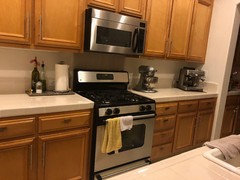
We also took out our over the range microwave and built (work in progress) a range hood (combo of wood/stainless steel).

We replaced our old SS range with a new one, and will soon be replacing our fridge as well.

We never planned on replacing the cabinets, as they were in pristine condition.

During the minor kitchen makeover, however, the workers did a good job 'banging' the lower cabinets. Unfortunately we didn't noticed until a few weeks after they'd finished (so no recourse on getting them to fix the issue).


Our upper cabinets are in fantastic condition! But the lowers...oh the lowers....


SO, what do we do? Looking for suggestion on working with our existing cabinets, as replacing/refacing them is not an option.


We've considered having the lower cabinets painted an off/soft white, and not messing with the uppers... however I'm not a fan of darker upper cabinets (in our case honey maple) with lighter lowers.


Any suggestions (from both Pros and non-Pros) on what route/paint we should take with the cabinets?


The kitchen is work in progress as we still need: Under cabinet lighting, lighting for above the island, hardware, etc.


Thank you in advance!

Comments (39)

  • 7 years ago

    So in looking at your picture, it looks like a couple of your lower cabinets on the left are already painted white? Is there a reason why you want to keep the upper cabinets natural? I think painting would be the easiest option to cover the dings on the lower cabinets, but I agree with you that painting the bottom cabinets white and then leaving the upper cabinets natural would look strange and unfinished. I would suggest painting the lower cabinets a darker color, such as grey or other colors found in the counter top if you want to stay neutral. If you are willing to infuse some color, maybe a blue on the bottom or anything that compliments the counter top would look nice. I did see on example of a darker cream top and white bottoms that looked nice, but was painted and not natural wood. The only other option would be to sand your bottom cabinets and restain them, but that would require a LOT more work.


    Jora thanked Rachel H
  • 7 years ago

    Hi Rachel, Thank you for the response.

    That one lower white cabinet (to the far left of the picture) is a temp. (long story).

    The suggestions you had was actually what my husband and I were considering should we were to paint all the cabinets (upper & lowers). Either a light gray lower with white upper or BM's Hale Navy (lowers) and White Dove uppers, but wasn't sure if those colors would work in our space, so I appreciate the input.

    Suggestions for hardware and island lighting are also appreciated.

    Please note that we are planning on only one island chandler where the middled canned light currently is.

  • 7 years ago

    The navy color sounds lovely or I always love grey. What tones are in the counter top? Depending on how warm or cool the tones are, that would help determine what color to paint your lower cabinets. Also, what style do you prefer when it comes to lighting and hardware? Do you like Farmhouse, modern, etc? Looking at your decor, such as the mirrored buffet, it looks like you could go either way.

  • 7 years ago

    I love the Hale Navy, but. think it will be too dark for our kitchen.

    The Cristallo is a mix of cool and warm (has both grays as well as copper veining).

    I really don't have a style (as evident in the pix). Rather, I just mish mash things I like together. :) :)

    I appreciate any suggestion you may have.

    Can you also recommend a light gray paint for lower cabs?

  • 7 years ago

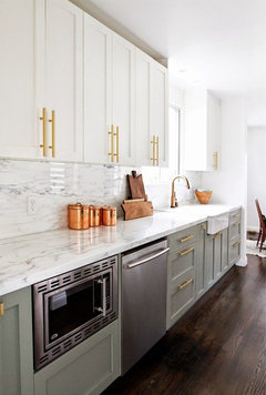
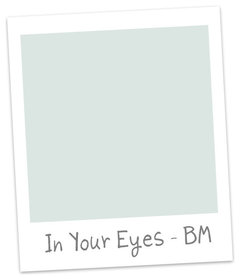
    Interested in a green blue?


    Jora thanked Yayagal
  • 7 years ago
    last modified: 7 years ago
    Ohhhh, Yaya, I like that blue-green color...maybe even a darker version!

    Jora, this article has some good suggestions on different shades of gray to use in your kitchen: https://www.makinghomebase.com/best-paint-colors-gray-kitchen-cabinets/

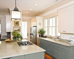
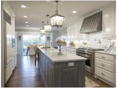
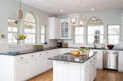
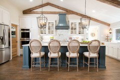
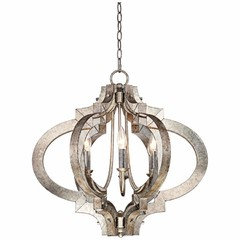
    I'm getting a little bit of a Joanna Gaines Industrial/Farmhouse vibe (ie. eclectic), so for your lighting, possibly go with something that looks vintage for the light over the island. I personally love the lantern style lights, like these:


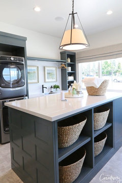
    Besides the lighting, on this last kitchen, note that they painted all the upper and lower cabinets white, and just left the dark blue for the island. That would help make your kitchen seem bigger, if you still wanted to use the navy blue.


    One last question on your hood, as it's hard to tell from the pictures. Is that one square area a large open space that hasn't been filled in yet or is that chrome, hard to tell from the pics? If it is chrome, then I tend to agree with Grover, that it probably needs to be painted white or even the color you put on your bottom cabinets (similar to the picture above).

    Jora thanked Rachel H
  • 7 years ago

    Grover - Thank you for the photoshop. We are not fond of the maple PERIOD. Regardless of the MOP backsplash! :)

    Yaya- LOVE that blue green. Will it go with the countertops and gray kitchen flooring?

    Rachel - Thank you. Thank you! I love the pictures. Although I am really partial to the Hale Navy, doubt we will incorporate into the kitchen. I don't want it too dark in here.

    The Island is new (changed from half moon to a rectangular) and already painted. So, that is staying.

    I'm really gearing towards a grayish (blue gray/green gray) for the lowers, and an off white for uppers.

    Although it's difficult to tell from the pictures (used an iPhone), the hood is actual Stainless Steel over wood, but the project is in the works. The is going to be wood trim on the very flat top part of the stainless and there will be a band of stainless right on the first operation of the white trim.

    Rachel - You crack me up. I'm prob. the LAST person to be fan of J.G.'s OR Farmhouse (just not for me), so I'm hoping the kitchen is not going that route.

    Both hubby and I much prefer the glam look. Makes me sad that we failed achieving it. :)

  • 7 years ago
    last modified: 7 years ago
    Oh, nooooo, you didn't fail in achieving a glam look. Just the mirrored console on the left, which is really all I can see in your room made me think eclectic, as J.G. mixes a lot of mediums with mirrors, wood, metals, etc., but I think your kitchen looks great. What type of light fixture are you picturing? Something more modern?

    Jora thanked Rachel H
  • 7 years ago
    last modified: 7 years ago
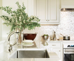
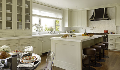
    Jora, I love what you've done! Would you share the details of the tile, paint color (walls & shutters)? Here is a kitchen with similar tile.

    Back Bay Pied-A-Terre · More Info


    Back Bay Pied-A-Terre · More Info


    Jora thanked My House
  • 7 years ago

    I'm not too much of a fan of two=tone cabinets. I think it's a trend that will fade. And your mother-of-pearl backsplash takes this kitchen up a notch from casual. How about painting the walls a color instead?

    Jora thanked groveraxle
  • 7 years ago
    last modified: 7 years ago


    Jora thanked groveraxle
  • 7 years ago

    following

    Jora thanked lindastein
  • 7 years ago


    Jora thanked groveraxle
  • 7 years ago

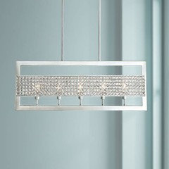
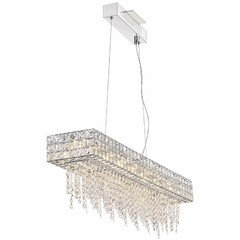
    Rachel - I said I consider my style 'mish mash' - I didn't lie! ;). I prefer a chandelier of some sort. Thinking of rectangular shape with crystals? I don't know to be honest.

    DK - Thank you for the compliment. I really didn't think anyone would like our kitchen, or what we've done - I know our taste doesn't really comply with the rules of design.

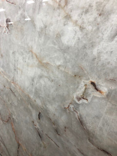
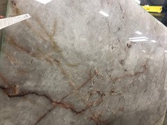
    Wall color = BM White Dove, Tile = MOP grout less (although we grouted), Window coverings = Plantation shutters (sorry can't remember the color). Countertops = Cristallo Quartzite (I know it looks beige/yellowish in the pix -but they are actually translucent gray with a lot of white & light gray veining, with a hint of copper veining here and there.

    grover - Thank you for the photoshop - it REALLY helps, and I'm SO grateful! Thank you. Thank you. I'm not sure if I'd like the two toned cabinets either - although was originally thinking of off white on top with another color on bottom. There is no way hubby and I are going to paint the kitchen again, mainly because it was a DIY and nearly killed us as the kitchen is adjacent to the family room, with a long hallway and adjoining dinning and living rooms. We painted it ALL in BM. White Dove a few months ago (ceiling inclusive). Also, we are not fans of any color on walls beside the white family. :). Although I literally JUST finished painting one wall in my hobby/craft room BM Hale Navy (it is the wall that will hold my paintings and I wanted them to POP).

    :)

  • 7 years ago

    Jora, if you’re too burned out on painting to do your walls, you may want to rethink painting your cabinets. It’s one of the most time intensive and detailed DIY paint jobs you can do!I think gray is going to be too cold with those counters and the MOP backsplash.

    Jora thanked Bri Bosh
  • 7 years ago

    Bri - Funny you mentioned that about the painting (was thinking someone would mention what you said after my comment).

    TRUST ME, I know how tedious and time consuming painting cabinets will be. AND how meticulous one has to be as I've painted many many cabinets, both kitchen and bathroom (and I'm an artist, so enjoy painting), but not doing the kitchen walls a second time (it's like watching water boil). :)

    I really appreciate the heads up though. :)

  • 7 years ago

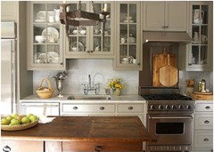
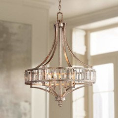
    Jora, actually I think something with crystals would be right on the mark if you want glam, and would look great with your back splash and other decor. I also noticed you had the crystal sconce on the wall too. There are lots of ways you could go with it. Rectangular would look fine, but something more interesting like the last two pics would add some character. :)


  • 7 years ago

    I think Ben Moore's Knoxville Gray would be a lovely neutral and go perfectly with the backsplash and counters. I love the two tone look and would do your uppers in the White Dove you've used elsewhere.

    Jora thanked daisychain Zn3b
  • 7 years ago

    For your lighting over island, I might stay away from more sparkle since there is so much already. If you paint out the stained wood cabs, I'd do something that would bring in more warmth. Maybe a wicker or fabric shade or something with a frosted glass.

    Jora thanked daisychain Zn3b
  • 7 years ago

    Daisy - Thank you for the recommendations. I LOVE that gray...it's gorgeous. I'm very very VERY color shy, I want to do the two toned (even though never been a fan) to give the kitchen a pop of color, but can't imagine how it would look with the darker gray on bottom and WD on top (we are keeping the island the color it is.

    Also, thank you for the lighting recommendation. Unfortunately I really am not, nor have ever been, a. fan of wicker anything and def. not a fabric lighting. I can do without the bling as long as it has a pop.

    If we go the WD on the cabinets, we will consider bronze hardware which will open us to bronze lighting.

    Thank you again.

  • 7 years ago

    Below is close ups of our countertop to give the idea of the coloring we are dealing with.

  • 7 years ago

    ooh that's some seriously gorgeous counter top!

    Jora thanked salonva
  • 7 years ago

    I'd think twice before putting a lot of small crystals or fabric over the island -- think what a few years of cooking grease will do to those materials! 0.o

    Jora thanked acm
  • 7 years ago

    I second that, salonva - wowza to that counter top.

    jora, I'm glad you like the Knoxville. I've got a can of it in my car ready to paint the cabs at our lake house this weekend ;-)

  • 7 years ago


    Jora thanked groveraxle
  • 7 years ago
    last modified: 7 years ago
    Thank you for the compliments.

    We do regret not having backlight the Cristallo on both the island as well as the backsplash. It's actually one of the reasons people purchase this stone. The back lighting shows the depth and the stone fully. Unfortunately since we picked this stone at the last minute we didn't have time to process it's ability.

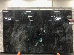
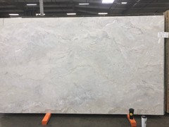
    We originally had purchased the two Labradorite Blue slabs, for the whole kitchen. I then chickened out (thinking it would make the kitchen too dark), and we changed it to one Labradorite for the island, and a Dolce Vita for the perimeter, and were going to incorporate a copper sink and hardware to match.

    At the eleventh hour, I chickened out mainly because of our honey maple cabinets, (hubby still hates me for that one), and went with the Cristallo. Had we known we'd end up painting the cabinets, I most likely would have stuck with our original plan (Labradorite).

    My FIRST Love - Labradorite Blue

    Dolce Vita - This one looked like melted latte ice cream

    We were at the Stone store, where we purchased all the slabs, last Saturday and they had a new batch of Labradorite Blue. Hubby was trying to convince me to purchase it and replace our kitchen island with it. I had to repeatedly remind him that we haven't even had this stone for a year, AND that our 'money' tree in the back yard didn't do too well this year! ;). He did come pretty close to swaying me though, until I slapped myself back to reality. :) :)

    acm - Good point. I'm very OCD clean person.

    daisy - What is your painting project? Would LOVE to see before and afters (yes, I actually live tor this king of stuff).

    grover - I'm really envious of your skill, and I THANK you for it. :)


  • 7 years ago

    You have a beautiful kitchen and I agree, the orange wood cabinets need to go. I would paint the uppers and lowers the same white as the shutters as mentioned above, keep the white walls for now (for a nice clean monochromatic look). Focus on bringing out the copper veins in the countertop....look at the copper canister in the picture above. Nice! Also, would you consider a copper insert instead of the stainless in the hood?? Allison, a frequent poster in home decorating, had a beautiful copper piece made into a sliding cover for her TV in her previous stone cottage. Perhaps copper toned hardware.

    Jora thanked tuesday_2008
  • 7 years ago

    Following

  • 7 years ago

    Century - Thank you. Yes, the hardware in the pix are old ones that will be replaced once we start, and complete, the paint job.

    Tuesday - I greatly appreciate the feedback. I actually gear towards monochromatic looks with a hint of this and that here and there.

    We had originally considered a copper hood, but all the ones we found weren't going to work in our area (without doing a complete gut of that back wall). We also considered a copper insert in lieu of stainless, however weren't sure how that would all incorporate into the rest of the kitchen. Unfortunately TOO late now as the prices have been purchased, ordered, and cut. And, double unfortunately - we don't have the funds to re-do it. :)

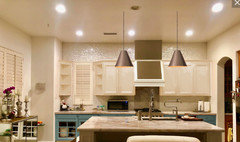
    Below are a couple of pix of our kitchen before we started with the minor upgrades. Since we had intended on JUST replacing the countertops originally, we didn't really plan for anything in the kitchen. Things just snowballed after the counters went in (isn't that how the ball sometimes rolls? ;)

  • 7 years ago

    Hi Everyone, Happy Saturday!

    So...should I replace the doors (cabinet and drawers) or just paint them?


  • 7 years ago

    You said the cabinets were in great condition, and they aren't bad looking. I'd price out the difference between refacing and painting and if it's significant, I'd probably repaint.

    Jora thanked groveraxle
  • 7 years ago
    last modified: 7 years ago
    Grover - Thank you. Yes, they are in great condition...aside for the few nicks on the bottom of three drawers to the right of the range. :)

  • PRO
    7 years ago

  • 7 years ago

    Is there a reason you're quoting me?

  • 7 years ago

    I'm BACK. So found out that the shutters are Kelly Moore Acoustic White.

    Can anyone suggest if that would be the best choice for the kitchen cabinet colors as well?

    I also have a question about the BEST primers (non-sanding preferred). I am only familiar with, and have used Zinsser 123 Bullseye....can anyone recommend anything better?

    Thanks in advance!

  • 7 years ago
    last modified: 7 years ago
    KILZ primer is the go-to primer that my spouse swears by

    Jora thanked My House
  • 7 years ago

    Thanks DK. I was reading on KILZ last night and many raved about it, but a few said that it required too many coats as it's very thin...


  • 7 years ago
    last modified: 7 years ago
    Hmmm. That's weird- He always tells me it is the best. He is quite knowledgable about all things home repair and DIY. We are in the process of oak cabinet makeover. He used 2 coats of primer on an oak cabinet door- I can't see the oak wood grain- not at all.

    There was a mural on all four walls of the master- & one coat covered most.- The tree, owls amd hummingbird required touch up coverage, but the blue sky & puffy clouds were covered easily.