

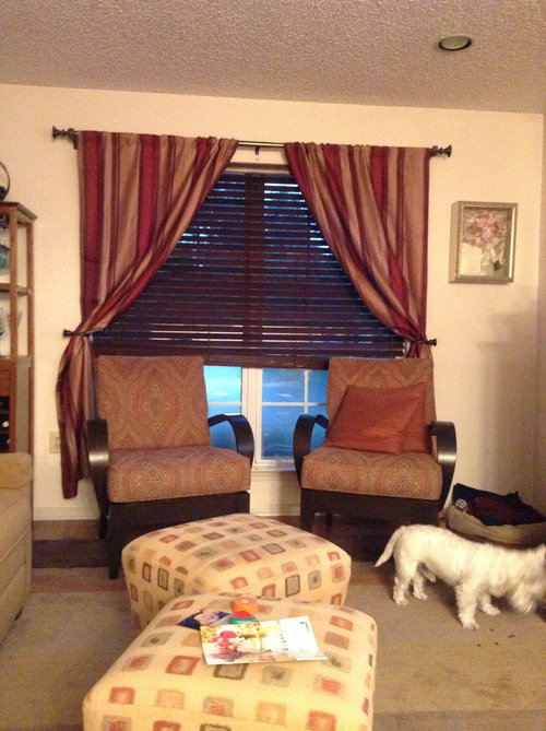
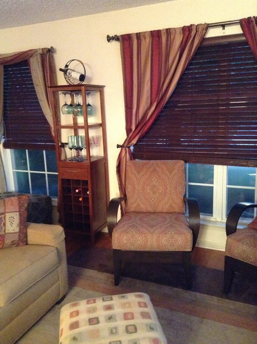
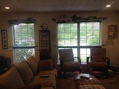
So can't decide on paint for living /dining room....lighter or dark?
13 years ago

Featured Answer
Sort by:Oldest
Comments (24)
 13 years ago
 13 years ago
Related Professionals
Elizabethtown Interior Designers & Decorators · Branson Interior Designers & Decorators · Columbus Interior Designers & Decorators · Norfolk Interior Designers & Decorators · Danbury Interior Designers & Decorators · New Haven Interior Designers & Decorators · Saint Joseph Architects & Building Designers · Winston-Salem Architects & Building Designers · Keene Architects & Building Designers · Tallahassee Kitchen & Bathroom Designers · Carbondale Kitchen & Bathroom Designers · Anniston Kitchen & Bathroom Designers · Grand Rapids Kitchen & Bathroom Designers · Keene Kitchen & Bathroom Designers · Santa Fe Kitchen & Bathroom Designers 13 years ago
- 13 years ago
- 13 years ago
 PRO13 years ago
 13 years ago
 13 years agolast modified: 13 years ago
 13 years agolast modified: 13 years ago
- 13 years ago
- 13 years ago
 13 years ago
 13 years ago
 13 years ago
- 13 years ago
- 13 years ago
- 13 years ago
- 13 years ago
- 13 years agolast modified: 13 years ago
- 13 years ago
 PRO13 years ago
- PRO13 years ago
- PRO13 years ago



Related Stories

COLOR8 Color Palettes You Can't Get Wrong
Can't decide on a color scheme? Choose one of these foolproof palettes for a room that feels both timeless and fresh
Full Story
LIFEHow to Decide on a New Town
These considerations will help you evaluate a region and a neighborhood, so you can make the right move
Full Story
DECORATING GUIDES10 Ideas for a Lighter, Brighter Living Room
Give your space a boost all year round by making the most of every bit of daylight
Full Story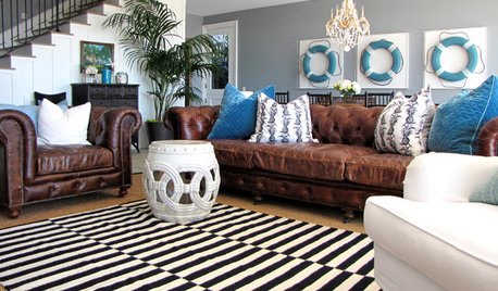
PETS5 Finishes Pets and Kids Can’t Destroy — and 5 to Avoid
Save your sanity and your decorating budget by choosing materials and surfaces that can stand up to abuse
Full Story
MOST POPULARSo You Say: 30 Design Mistakes You Should Never Make
Drop the paint can, step away from the brick and read this remodeling advice from people who’ve been there
Full Story
KITCHEN OF THE WEEKKitchen of the Week: We Can’t Stop Staring at This Bright Blue Island
A single mom updates her childhood kitchen, so she and her daughter have a functional and stylish space
Full Story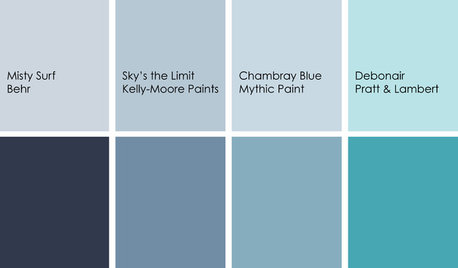
DECORATING GUIDESColor Feast: Yes, You Can Use Blue in the Dining Room
The sky's the limit for beautiful blues in your home's dining spaces; here's how to make it work
Full Story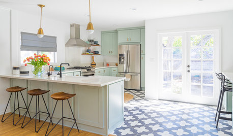
KITCHEN DESIGNTrending Now: 25 Kitchen Photos Houzzers Can’t Get Enough Of
Use the kitchens that have been added to the most ideabooks in the last few months to inspire your dream project
Full Story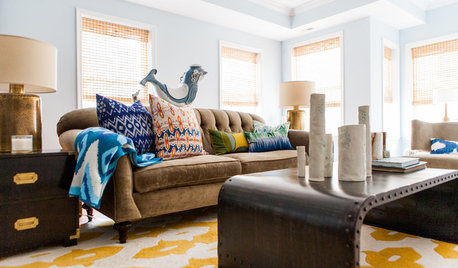
DECORATING GUIDESRoom of the Day: Lighter Look for a Townhouse Great Room
Built-in cabinets consolidate media equipment and collectibles. Beach-cottage-style touches create a relaxing vibe
Full Story
DECORATING GUIDESSo Your Style Is: Darkly Romantic
Envelop yourself in mysterious luxury with deep colors, rich textures and unexpected details
Full Story



decoenthusiaste