Software
Houzz Logo Print
kpchanko

curb appeal help!

7 years ago
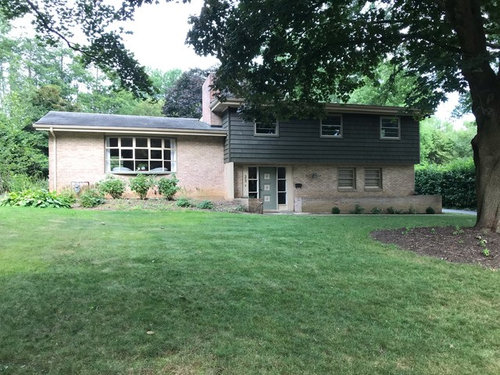
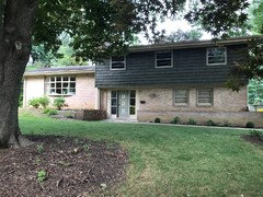
Our curb appeal feels non existent. Awesome 1950’s home deserves it, but I don’t know where to begin! Any ideas?!

Comments (37)

  • PRO
    7 years ago

    Show a closer picture of the right half of house.

  • PRO
    7 years ago

    To the same camera position as above, also add a picture facing to the left and one facing rightward, both slightly overlapping with the first.

  • 7 years ago

    This is what I have for now.

  • 7 years ago

    Brilliant color scheme Doug!

  • 7 years ago

    It needs better landscaping and cleaning the brick on the planters. I think I see efflorescence.

    What is the depth of the planters from front to back? That will tell if you have room for shrubs.


    One thing that stands out is the trim on the bow window muntins. It looks pink. I would change that.

    What is your growing zone?


  • 7 years ago

    Like the garden layout above, you need visual heft on the left to counterbalance the dark bulk of your upper floor on the right. Purple is a smart choice as it’s dark but still pretty.

  • 7 years ago

    Emmarene - bay window (and all windows) are tan with sage green trim. The front planter is 2ft in depth

  • 7 years ago

    Is the dk gray new? I don't think it is the best choice with the brick color. Perhaps a color in the browns would brighten the brick up too? Why are the great planters empty? Color is your friend!!!

  • 7 years ago

    You might see if there are is a low branch or two that could be removed from the side of the big tree nearest the door. The way the branches hang down now creates a sort of lowering, gloomy look.


    It seems like is maybe something funny going on with roof line and the way the windows disappear into the eaves. (Is there some sort of guttering system that has lowered the roof line below that originally intended?) Not sure how fixable this is, but might be worth being aware of.


    A bright warm gold, about the tone of the crust of a fresh baked loaf of bread, for eaves, gutters and trim. And then bright blue, the color of the bird bath in Dig Doug's landscaping mockup, to punch up the door, mailbox, and house numbers.


    Landscaping along the lines that Dig Doug proposes, maybe a somewhat taller shrub to the left of the bay window to add that visual heft and hide the utilities box. Window boxes with trailing plants at the upper floor windows.


    And definitely a nice inviting footpath like in the Dig Doug's mockup.

  • 7 years ago

    The house is dark green, trim/windows tan with bits of sage. The footpath won’t work as the tree in the picture is actually in front of the door. There is a tree we planted to the left of the bay window (not pictured) and just finished a watering system for the front planter, just haven’t planted anything yet. We live in an affluent neighborhood and are trying to bring life back to this house. I like Doug’s ideas but they seem a little much, no?

  • 7 years ago

    This would be my takeaway from Doug's ideas. Most homeowners do their plantings way too tight up against the house and don't think expansively out into the yard and take the "landscape" in as a whole. They have a piecemeal approach often with no "big picture" in mind. It can work, but very often does not. To truly landscape, you need to take both the house, it's design, color, etc. and the lay of the land and other features all into account and try to harmoniously blend them. Doug has used color, texture and the curving design of the bed as unifying elements. You have a big tree with a round bed around it and then very severe narrow linear planting beds around the house. It creates a sad, pinched effect, even though your home is lovely. Doug's color scheme and expansive, curved beds unify your yard. But you don't have to do it all, take the basic concept and you can do it a bit at a time. For example, as you mentioned, a walkway as pictured might not work, but see how an expanded, decorated walkway makes a welcoming effect to the home. That's the takeaway, not necessarily an exact copy. Or at least that's what I'd do. Obviously you would adjust to your taste and needs, but the overall thing your home needs is an expanded view of landscaping that integrates all the elements together and leaves room for the plantings to breathe and show off their full mature form and beauty, in addition to giving a welcoming look to your front yard. Plus think about things that will give you pleasure to see each day as you get home!

  • 7 years ago
    last modified: 7 years ago

    I think the dark paint color on the top half is making the house look top heavy and out of balance (as well as dark). Because of the lighter brick on the bottom, the top appears to be ungrounded, hovering or floating, but not in a light way!

    I'd find a lighter color to complement the brick, then figure out the landscape.

  • 7 years ago

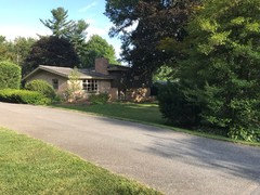
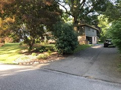
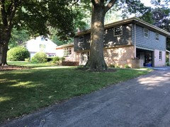
    Okay so a couple people asked for more photos. See below. Is the color scheme of the house the problem? Or is it just lacking landscaping? Criticisms welcome. Just want this house to be inviting and awesome.

  • 7 years ago

    Viewing your house from either side, now I can see how charming it is. I agree entirely with Olychick - a lighter paint color on the upper part of the house would change the whole mood and feel. Either a pinky sandstone to blend with the brickwork, or a pale sage like the garage door trim or a bit lighter.


    The tree is at the let corner is just what's needed, or will be in a few years. In the meantime, maybe you could put in a trellis with some flowering vines to sort of "hold that space."


    One thing that's not been mentioned is the windows with the three horizontal panes/ jalousies. Are they original? If not, there's something sort of shut-off and sleepy-lidded about them that would make me want to change them out.


    (Also, not to nag, but I'm sure you're planning to fix that pothole at the end of the driveway ASAP; and certainly before winter, of course.)


  • 7 years ago

    Evelyn, thanks for the response. The windows are original with tan blinds on the inside. Pot hole will be fixed soon when we replace. With that said, I wanted to put a liner of stone at the bottom of the driveway, and have matching stone half walls on either side to make the drive way more exquisite.

    As far as the colors, my wife wants white trim and windows. But not sure what color scheme would work considering the brick color we have. Open to ideas.

    Also she plans to have someone out to transplant most of what’s in from of the bay window, and put in ewe’s in front of it. With some other low lying shrubs surrounding (and leave that tree). As far as the other big trees in the yard. Lots and lots of pachysandra.

  • 7 years ago

    Maybe some flowers along the pathway and some berry bushes could look nice. I made this in Sprucer get-sprucer.com here's a video of it growing! https://gfycat.com/essentialillegalichthyosaurs-landscape-garden-growth-design


  • 7 years ago

    I wouldn't overthink it. Some might like the color, some might not. If you want something lighter, go for it, but don't feel like it is an insurmountable obstacle. Basically what I see has a pretty simple fix. The shrubs at the edge of the property are overgrown, hiding the house and making a less than welcoming first impression. Easily fixed by proper pruning. Depending on what kind of shrubs you have, they should be able to be pruned for shape this fall and pruned next spring to promote bushier growth, and if not, can be taken out and replaced with smaller versions. Then the area right up next to the house needs to be brightened up with some colorful plantings that are given room to breathe. Those shrubs under the bay window need to be balanced with something on the ends, add some colorful foliage plants like maybe hosta if it is shady, or heuchera if it is not, or spilled wine weigela, and some colorful consistently blooming flowers (like impatiens if shade or petunias if sun) and call it a day. This could all be easily done in two weekends at the most.

    You can always enlarge the beds around the house later if you so desire. I'd start with creating a bed along the entrance walkway (if you don't want to redo it or snazz it up, which is a standard way to upgrade your front landscape). A colorful flower border with something easy will define it from the road/driveway.

  • 7 years ago

    Depends on your budget but if you could ...
    Terrace the hill and plant it w low growing flowering perennials & bulbs. Create a stairway from the front of the house bisecting the terrace and curve it as it approaches the door. Significantly expand the existing beds at least 15ft wide, put in a fountain to 1side w seating scattered throughout. Could install a rose covered arbor in 1 of the beds w seating set for coffee, conversations.
    Expand the entryway creating a covered patio safe from the elements for guest before approaching the door.

  • 7 years ago

    I don't think anyone has mentioned shutters. I would put cream-colored shutters by the three lower-level windows. These would help to brighten/lighten the house and balance the heavy second level. And I agree with expanding the flower beds and carving out a space for a charming bistro set for coffee. a couple of pillows and a flowering plant would add to the charm.

  • 7 years ago

    I would paint the brick so the house is one color and does not appear top heavy. That style of building with the top portion overhanging the bottom is dated and one color on the house would minimize that look. Whether you choose a dark color or something lighter is a matter of personal preference but you could do lighter trim and a pop of color for your front door..

  • 7 years ago

    Paint the entire house a dark steel grey. Paint door a mustard gold color. Get rid of the brick retainer/planter wall. Paint all window storms black. Natural wood shutters on top level. Natural wood flat decking out front with black steel railing and lots of landscaping! love it!

  • 7 years ago

    One reason Doug's picture is so attractive is that he's using that pathway to break up that wide expanse of lawn. The pictures of the other angles are more interesting because there are a lot of things that draw the eye but in your original picture the plainness of all that grass is what the eye is drawn to. Along with some of the other ideas addressed here, even if you choose not to change the color of the upper siding, painting the front door a bold color would draw the eye more invitingly to your home. As it is now the door just kind of blends in to everything around it.

  • 7 years ago

    I started with a blank canvas as well. Still looking for ideas. Looks like it's going well!

  • 7 years ago

    Thanks everyone for the contributions while we were on vacation. Coming back we are thinking lighter color up top. So, with that said....a gable porch, white trim/windows, white shake, power wash the brick back to reddish. And black shutters/door. Down lights along the front over hang (3 or 4) to illuminate the stoop and long bed. Landscaping will be heavy green shrubs around the bay window with bits of color from flowers. Remaining beds will be pruned and pachysandra throughout. Landscape lighting on the 3 largest trees and bay window area.

    Thoughts on color scheme and or landscaping?!

  • 7 years ago
    last modified: 7 years ago

    This is a mid-century MODERN house that is best set in s modern landscape. No to painting stained wood or brick. No to white trim (Sorry wife). No to shutters. No to petunias and hybrid tea rose beds or cute trellises. Yes to the concept of tying the house to the whole property do well described by pinkmountain but could we see it done with bold sweeps of hosta or pachysandra?

  • 7 years ago


    I think white trim is a good idea and will bring out the details of the bow window.

  • 7 years ago

    Kitasei,

    Love that you didn’t take the bait. What can we do to add depth to the house? Hanging plants along the front where the second floor overhangs? What else?

    Honestly we don’t plan on painting the brick. And the house colors are growing on us but we feel it does lack depth. We did think shutters would add depth if we had wood stained ones.

  • 7 years ago

    It isn't MCM. The Philly real estate people called them Betsy Ross splits. There were contemporary splits, but they looked more like the Brady Bunch house.

    The big problem I've been having with this house is what to do about the planter in front of the garage. It isn't deep enough for a decent foundation planting, but there isn't enough room currently between it and the walk to put plants there either. Ripping it out is a possibility, but that would unbalance the house. (I don't usually like splits where the front door is on the ground level. They look wrong, but this one doesn't.) So keep the planter, but plant low things like vinca, ivy, or bllue rug junipers - something that spills over. Either more low things between the walk and the planter, or move the walk for more space. A yew hedge on the other side (deer permitting) and a slender, graceful tree off the far corner.

    All this is assuming I'm reasonably correct in my guess about where in the world this is - northern Illinois.

  • 7 years ago

    Mad gallica - is be interested to get your take on the house colors.

  • 7 years ago

    Is that also a planter to the left of the door?

  • 7 years ago

    OK, I'll concede that your house is on the split level side of mid-century modern, but is that the direction you want to emphasize? I would work with its flat geometric features and natural materials and de-emphasize the bowed, divided window. You can go either way, but I think the success will come from being consistent.

  • 7 years ago

    Emmarene - yes

  • 7 years ago

    Kitasei - I agree. There no way around the fact that this is a split. The inside is modern with a touch of MC. Not the other way around.

  • 7 years ago

    I don't have trouble with the color scheme. Usually, the brick has extremely strong opinions on what color the siding should be, and these colors are definitely on speaking terms. It isn't what I would have picked ( I like blue :-), and a lighter, greener green would probably be better. However, I wouldn't go out of my way to change it. The white trim is a no-brainer. Anything else is going to scream 2019 trendy. Sticking with the original colors is rarely a bad idea, though the colorphobes often cringe at house colors from the 50's.

    Our first house was a small split in suburban Philadelphia. Having lived in one, I have a great deal of respect for them as good, solid, family housing.

  • 7 years ago

    Just a little note on that maple tree in the middle of your yard (not the other big tree by the front walkway of your house). It is a Norway maple and you're not going to get much to grow under it. And it also appears to be reaching it's old age, they only live 80+ years. Watch out for hollowing out and top falling off. Not saying it is happening now or tomorrow or next year, but watch out, because that is how they roll in their final years. Nice bark mulch around it will be fine though. Use planters if you want spots of color.

  • 6 years ago

    Like the landscape design by Doug. The house itself could use some cohesiveness as the dark second story looks heavy and too dark, especially with the shade drawn from that beautiful tree.
    Suggest you paint front all one color. Remove the raised flower beds so that you can give plantings more dimension. Add window boxes to the three small upper windows to give them better size balance. Lastly I would change out your front door to a more modern one in a dark wood tone.