Software
Houzz Logo Print
funkyartoo

Help me select curtain fabric?

7 years ago
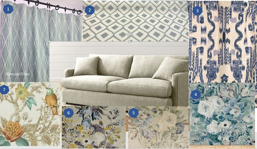
I will be having curtains made for one large window seat area of my LR.. it is in view of the kitchen where I will also have either shades or curtains made. I was focused only on LR but as I looked at options, I realized I may be able to choose both at once. They aren't close enough to NEED to coordinate but I think it would be nice if they did.


Option x was the fabric I thought I was set on-- but it isn't my favorite anymore. I won't share my fav just yet, I'd like to see what sparks you all.


Additional info-- walls will be GM Gray Owl, floors are finished oak, rug will be replaced so isn't important.


Comments (34)

  • 7 years ago
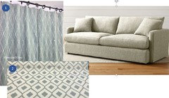
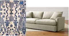
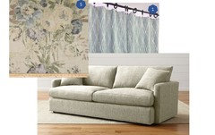
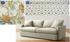
    Here are some of the combos I thought might work.


    Option 1 for LR, 2 for kitchen/breakfast room


    My original plan was option 3 .. I don't care for any of the other fabrics to coordinate. I'd probably go with a blue ticking or just flax linen shades in Kitchen/Breakfast room.


    Option 5 in LR, 1 in kitchen/breakfast room


    Option 7 in LR, 2 in Kitchen/breakfast rm


  • 7 years ago
    #7 is lovely!

    Funkyart thanked just_terrilynn
  • 7 years ago
    7 for sure. Not keen on gray for the kitchen though.

    Funkyart thanked Oakley
  • 7 years ago
    last modified: 7 years ago

    They’re all pretty but I’m partial to #3 and like the idea of ticking or flax as a coordinating fabric. 7 is my second choice.

    Funkyart thanked User
  • 7 years ago

    I really like 7 and 2 together.

    Funkyart thanked daisychain Zn3b
  • 7 years ago

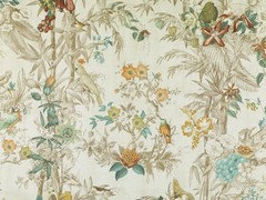
    Thank you all for your opinions! As I noted, 3 was my original plan.. but when I looked at other fabrics, I became enamored with 7... however I researched the print (Duralee Birds of Eden) and I don't care for the full repeat of the pattern.


    Oakley, none of the patterns are gray-- I think what you/your monitor is reading as gray is Robert Allen's "Spa" colorway.

  • 7 years ago
    last modified: 7 years ago

    Yes, the full of that pattern isn't as appealing as the section initially shared. I don't care for the grapes or the hints of tropical leaves--the whole scene doesn't mix well together, IMO. Saying that, if you liked that small section, there are many similar fabrics out there you could find.

    I like your pattern #3. My challenge is that I find it difficult to match a secondary pattern with that Ikat-type style. Florals, geometric, stripes, all seem to compete so I'd have to look far and wide for a good complementary pattern.

    Funkyart thanked Feathers11
  • 7 years ago

    I love 7 as well. 6 was my second favourite and then 3. Does the second fabric need to be a pattern?

    Funkyart thanked tartanmeup
  • 7 years ago

    No need for the second pattern to be a print-- in fact, I only threw in the option of the second pattern because I liked a few that coordinated.


    If I stick with 3, then I will likely use a plain linen or blue ticking. They are two different rooms-- so I prefer that they work together/coordinate but they don't need to be perfect.

  • 7 years ago

    Love #3, and also like the small piece of #7.

    From the small "chips", I could see curtains in #3 working with a window seat in #5 -- I like that periwinkle blue they seem to have in common -- but I'm very freewheeling with patterns : ) .

    Funkyart thanked beckysharp Reinstate SW Unconditionally
  • 7 years ago

    I love #3 - I will always be a sucker for blue and white. Perfect with a blue linen or ticking. What is it called? I am currently having two living room chair slipcovers made in blue ticking stripe, and it would be a great coordinating kidney pillow. Thx!

    Funkyart thanked Bluebell66
  • 7 years ago

    I kind of love option 5 with option 1.

    Funkyart thanked rubyclaire
  • 7 years ago

    I love blue and white combinations, but I'm also drawn to the first option. If it were me, I would probably splurge on a 1/2 yard of the fabrics I liked best so I could see them in my room. You could always use that sample fabric for pillows, placemats or napkins.

    Funkyart thanked Fun2BHere
  • 7 years ago

    Thanks for the votes and recommendations! !I have ordered swatches of 2 of the designs.. and one is available locally.


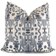
    Bluebell, it's Lacefield Mumbai in indigo.

  • 7 years ago

    Ooohhhhh these are right down my alley as I love aqua/spa and soft blue colors. Main accent colors in our home. I like that duralee print also put once you showed the larger pic, is that brown or red/rust in the print? I do like number 3 and think flax or ticking in the kitchen would coordinate great! I also love #5 (can you tell I love florals?). Would you care to share name/maker of that fabric? Can't wait to see what you choose!

    Funkyart thanked tinam61
  • 7 years ago
    last modified: 7 years ago

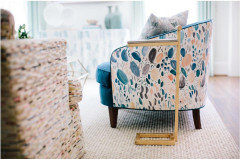
    HI Tina.. I really like the florals too. The one you're asking about is P Kaufmann Lisette. I show three colorways, buttercup, stonewash and pearl-- #5 is pearl. On screen it's the one I prefer but I've ordered swatches.

    Becky, I also like some unexpected pattern matching but I hadn't thought of 3 with 5. I can see it as a possibility but will need the swatches to be sure. Sometimes 3 (lacefield Mumbai) is shown with a much whiter background.

    Ruby, I also like 5 and 1 together-- I like the contrast of modern and romantic vintage vibes but the color keeps it from being in your face or jarring.

  • 7 years ago

    The more I see examples of the Mumbai print, the more I like it!. Much as I love florals, I don't often like them in curtains. I think this will give me visual texture and I think I will love it with splashes of floral in pillows, artwork, etc.


    I've now ordered swatches for most of the above-- and a few other prints.


  • 7 years ago

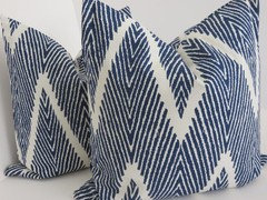
    I also ordered a yard of another favorite print-- also by lacefield. This is Bali and it was on an inspiration board I created a number of years ago.


  • 7 years ago

    I would do the ikat #3 in the kitchen and the floral #6 in the LR. Remember when you are having drapes made, the pattern is not seen flat but in folds so the repeat becomes less prominent than the colors (unless you're thinking roman shades). 3 & 7 don't color coordinate close enough for me. 1&2 don't bring enough color to the palette for me.

    Funkyart thanked Annie Deighnaugh
  • 7 years ago

    Never considered 3 to combine with 7 — so no fears there. Plus, as I discovered upstream, I don’t care for 7 at all now that I see the full repeat.


    3 could easily work in the kitchen but I’m not a fan of florals in full length panels — for just the reason you state. I don’t like them in the folds. You get a hint at the Floral. I just don’t like it.


    My focus is lr. If I get a kitchen/breakfast are fabric also, well then it’s a bonus. I currently have white hem stitch in there that is tired but could work with whatever I do in the lr for a bit.


    Thanks all!

  • 7 years ago

    #7 is the only one I really like. Don’t know about Gray Owl but I’d pick a paint that goes with #7.

    Funkyart thanked Bunny
  • 7 years ago

    #2 in the kitchen and #5 in the lr would be nice too...

    Funkyart thanked Annie Deighnaugh
  • 7 years ago

    I like Mumbai and Bali, but I might choose a smaller scale print to complement the Mumbai?

    Funkyart thanked mtnrdredux_gw
  • 7 years ago
    last modified: 7 years ago

    7 is completely out.. the full repeat pattern blew it for me. I don't like the colors or pattern. I didn't order a swatch.

    I also like bali and Mumbai together and they are both from the same company so likely they'll coordinate well. I wouldn't like bali in a curtain panel as the repeat is too regular-- but i'd love it in pillows or even a chair!

    The rest are really a guess until I get swatches. I don't like backgrounds that are dissimilar-- and while they don't need to match (they are not that close), I don't want them to be jarring when you are in one room looking to the other. I'd like them to look like cousins-- not necessarily sisters. if that makes sense.

  • 7 years ago
    last modified: 7 years ago

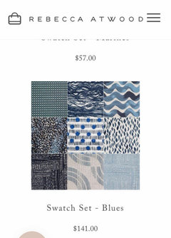
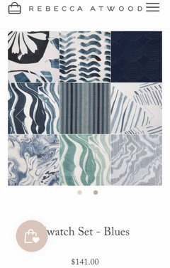
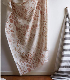
    Hey Funk! I was on Emily Henderson‘s site and came across this... A section of Rebecca Atwood fabric and wallpapers. I had a look around and saw some nice patterns. I’m showing the swatch “sets” but one doesn’t have to do a set.

    https://rebeccaatwood.com/collections/all/products/marble-fabric-in-sea-blue


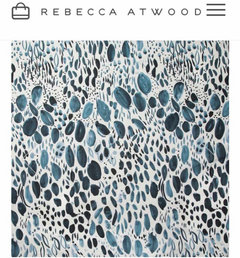
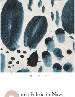
    Edited to show my favorite. I put the other colors of the same design in to show the scale.


    Funkyart thanked just_terrilynn
  • 7 years ago

    Thanks, JT! I'll check them out if none of the swatches I ordered work out. There are some interesting designs -- esp for pillows.

  • 7 years ago

    I received my swatches today-- the only ones I like even a little bit are Mumbai and Bali. None of the others coordinate with them. I think I am going to hold off making a decision until I can hit my local stores. It's too tricky to pick out fabrics online I think-- and while the swatches arrived SUPER quickly, I don't want to keep paying for swatches or 1 yard of various different fabrics.

  • 7 years ago

    Since I've read all the posts, and you're not happy with samples, I will just add I love #3. It reminds me of our LR drapery fabric, which makes me happy every time I see.


    Funkyart thanked Allison0704
  • 7 years ago

    I'm sorry the samples are disappointing, Funkyart, but I'm glad you got them so you didn't make an expensive mistake.

    Funkyart thanked Fun2BHere
  • 7 years ago

    Yes, Fun.. I am glad too! Sometimes I can be impulsive.


    Allison-- #3 is still my favorite too however, the scale isn't quite large enough to have the look of your curtains-- which are literally the look I had in my minds eye.


    Pardon my lazy design skills.. but I think this is fresh and fun but still looks like an adult space


    Did you have them custom made? I have seen other similar designs but I couldn't picture them as curtains. Do you mind sharing the fabric?

  • 7 years ago
    last modified: 7 years ago

    Disappointed the scale isn't large enough. When DD1 was sourcing fabrics, I was often disappointed by the pattern as a whole once seen in person. Color was usually the reason when she ordered samples not found locally.


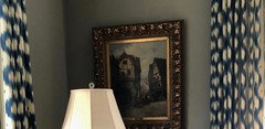
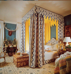
    Yes, they are custom. DD1 has to the trade access, and a local TTT only workroom made all of the drapes. The fabric is Pierre Frey, Toiles de Nantes; one of their classic patterns. Mario Buatta bedroom, 1980s. I was hesitant to use this fabric, but the blue is perfect with our rug so DD1 kept pushing me outside my comfort zone. The room is very formal and the pattern knocks down the formality.


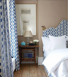
    There is a copycat fabric called Palma by Bernard Thorpe, below. Smaller scale and color difference, but I don't know how he gets away with it.


  • 7 years ago

    Oh, Allison, the corner of that room, the moody wall color, the picture, the curtains that break up the formality and the color, all so perfectly done.

  • 7 years ago

    Oh Allison, it's even more beautiful than I could tell from first look-- absolutely perfect for me if it weren't for price. Thank you for sharing and for helping me confirm my vision. And the copycat is crazily similar.. it looks like a crime!


    I will use the Mumbai in some way-- maybe even the curtain panels-- but they won't have the airy feeling that your larger scale pattern does. I think that's important to the look.


    I have a yard so I should at least use it for pillows!


    Thank you again to all-- I'll keep you posted on my search.