

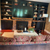
Do You Like Tile Used This Way?
6 years ago
Featured Answer
Sort by:Oldest
Comments (33)
 6 years ago
 6 years ago
Related Professionals
Charlottesville Interior Designers & Decorators · Plainfield Interior Designers & Decorators · Phoenix Interior Designers & Decorators · Lubbock Interior Designers & Decorators · Toms River Kitchen & Bathroom Designers · Aiken Furniture & Accessories · Fargo Furniture & Accessories · Lincoln Furniture & Accessories · Missoula Furniture & Accessories · Columbia Interior Designers & Decorators · Medford Interior Designers & Decorators · Indianapolis Architects & Building Designers · Branson Architects & Building Designers · Jamestown Architects & Building Designers · Las Vegas Architects & Building Designers 6 years ago
- 6 years agolast modified: 6 years ago
 6 years ago
 6 years ago
 6 years ago
 6 years ago
 6 years ago
 6 years ago
 6 years ago
- 6 years ago
 6 years ago
- 6 years ago
- 6 years ago
 6 years agolast modified: 6 years ago
 6 years agolast modified: 6 years ago
 6 years ago
 6 years ago
 6 years ago
- 6 years agolast modified: 6 years ago
- 6 years ago
- 6 years ago
 6 years ago
 6 years ago
 6 years ago
 6 years ago
- 6 years ago
 6 years ago
- 6 years ago
- 6 years ago
 6 years ago
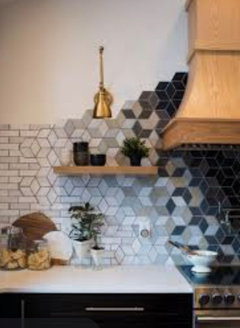
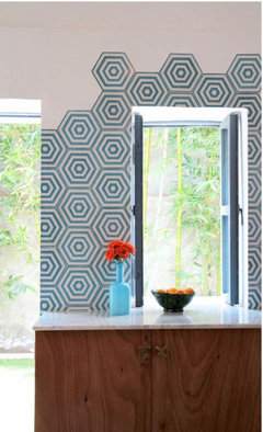
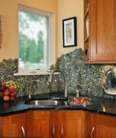
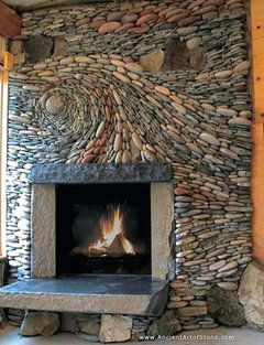
Related Stories
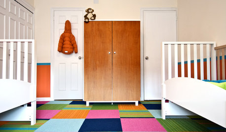
DECORATING GUIDES21 Ways to Arrange Carpet Tiles Like a Pro
Some Great Patterns to Try In Your Own Brave Custom Rug
Full Story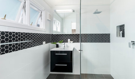
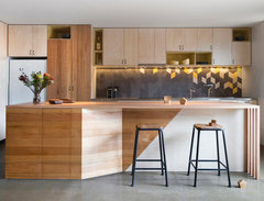
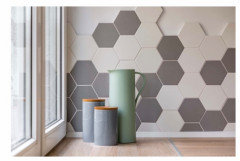
TILE10 Fresh Ways to Use Hex Tiles
Interested in this popular tile shape? Here are some ideas for incorporating hexagons into your home
Full Story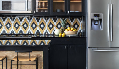
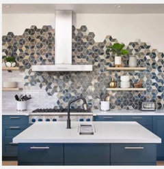
TILE6 Ways to Amp Up Your Kitchen Style With Patterned Tile
A designer shares how to use patterned tile in the kitchen, along with tips for making your installation a success
Full Story
COLORBest Ways to Use the Soft Yellow Color of 2014
You may fall for PPG Pittsburgh Paints’ Turning Oakleaf if you like your hues warm, mellow and cheery
Full Story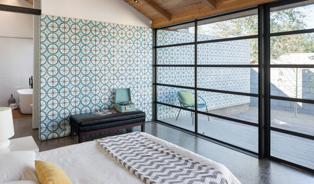
DECORATING GUIDESA Dozen Ways to Work In Patterned Tile
Use colorful and eclectic tile motifs to add interest to flooring, walls and fireplaces
Full Story
BATHROOM MAKEOVERSMarble Tile Brings Spa-Like Luxury to a Master Bath
A designer liberally uses the stone to deliver bright, refreshing style to a once-dark California bathroom
Full Story
MORE ROOMS10 Great Ways to Use Room Screens
Flexible Screens Bring Instant Style and Intimacy to All Kinds of Spaces
Full Story
DECORATING GUIDES9 Creative Ways to Use Chalkboard Paint
You can draw in woodwork, compose music or create a menu with this fun decorating idea
Full Story
KITCHEN BACKSPLASHES6 Ways to Add Style to a Basic Tile Backsplash
Bold grout lines, bright colors and unusual layouts can turn rectanglular tiles into an eye-catching focal point
Full Story
BEDROOMS10 Ways to Use Black on Bedroom Walls
Dark walls help create focal points, contrast, glamour — even a cozy feel
Full Story
lobby68