Software
Houzz Logo Print
webuser_77913953

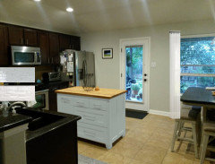
Dark cabinets, dark counters, what backsplash??

7 years ago

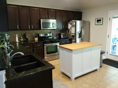
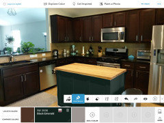
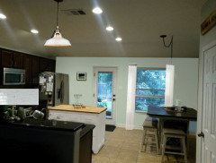
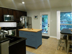
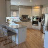
I'm trying to decide on a new backsplash to put in my kitchen. I'd like something to brighten up the area and am considering beveled white subway tiles - would this look good? The walls are a soft grey, and I'm considering repainting the island with a warmer white. All ideas appreciated!


Comments (44)

  • 7 years ago
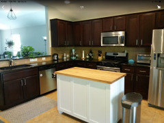
    Here is another angle.


  • 7 years ago
    I’d leave the backsplash there. You have a ton of bright natural light, so the kitchen during the day doesn’t look that dark.

    Amay thanked teamaltese
  • 7 years ago

    What you need is more lighting, over the island and under the cabinets. I also agree with the poster above, a different, larger island would suit better.

    Amay thanked teamaltese
  • 7 years ago

    I was thinking that about the island.. I used a really bright white paint on it that I regretted later. Do you have any paint color suggestions that would make it blend in better? Or maybe getting a black granite top on it would tie it in.

  • 7 years ago
    The kitchen is fine, the island is not. Remove a drawer, take to paint shop for a color match, paint the island. Same material as your countertops, or Stainless Steel, for the island top.

    Amay thanked chiflipper
  • 7 years ago

    To my eye (and with the disclaimer that my computer might not be showing the colors accurately) you have several elements that aren't really working together.

    The island is the most obvious, but also, the wall color, although pleasant, isn't right for the cabinets or the backsplash. (Is it carried in from other rooms?) The backsplash and the floor in one view seem to match, in the other don't. but either way don't seem to harmonize with anything else. The counters and cabinets are okay together (although I really can't get a good look at the counter) but do need a little more lightness on the backsplash and wall..

    Look carefully at the counter for colors that are part of it -- are there any ivory, greenish or bluish tones? You will have to take time to find colors that harmonize with both the reddish brown in the cabinet finish and the dark counter, for the backsplash, Island and walls. Some shade of off white will probably be best, perhaps a very pale, creamy green or blue for the walls.

    I think if you get replace the backsplash and repaint the walls and island, you can perhaps minimize the yellow floor.

    Amay thanked raee_gw zone 5b-6a Ohio
  • 7 years ago

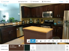
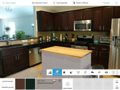
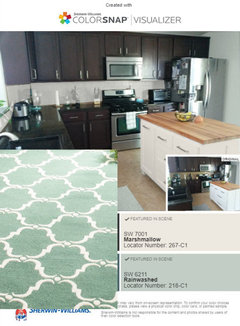
    Try the ColorSnap app by Sherwin Williams to play around with various colors. The current color of your backsplash is hard to tell on my screen, so I didn’t try the island in a blue or gold or whatever would compliment the tiles. I liked the suggestion of matching the island to the stain and finish of your cabinets, and changing out the butcher block top for a different color, maybe to compliment the new backsplash.

    Amay thanked NancyD
  • 7 years ago
    last modified: 7 years ago

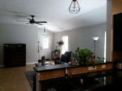
    The wall paint color does carry over into the living room. I've really been trying to minimize the yellow/beige tones in the house. But I'm realizing now a lot of the tones are working against me!


  • 7 years ago
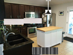
    I turned the lights off and repositioned the island, this seems to give a better color representation of everything.


  • 7 years ago
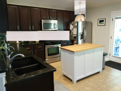
    Your back splash works well with your floor tiles. Your mistake was trying to incorporate gray walls with beige tiles everywhere. You can minimize the yellow tones without going gray. The gray just makes the color stand out even more. I would paint all the walls a neutral shade of white or a very light sage/greenish white. I think you can either paint the island dark to help incorporate it into your kitchen, or stain the island butcher block top dark, and paint the base the same color as the new wall color.
  • 7 years ago

    The cherry color of your cabinets and the warmth of your floor worn't work with crisp whites and cool grays. I understand that conflict because I have it in my own house...have slowly been moving toward grieges that run warm - Benjamin Moore's Pale Oak, London Fog and Revere Pewter are in various rooms, but in my kitchen my [glazed] ivory cabinets and cherry island are not wanting to cooperate with even the warmest grieges.

    So I have gone through every white and ivory there is and the only one that will work in both my kitchen and still compliments the room you see behind it and next to it is Benjamin Moore's classic White Dove. It's our trim paint too but in the eggshell it will look a bit darker than the trim...and it is a warm white, could possibly work on your island with a countertop that's the same as perimeter top.


    1) I would recommend getting a "whites" (or it may be "off-whites") swatch book from Benjamin Moore (or Sherwin Williams). Bring the book into your kitchen and settle there in that space on a color that contrasts, complements, and yet tones down your yellow in the floor.


    2) Also, I would look at getting some creamy colored backspalsh samples. Bring them home and see how they work with your floor...and keep them in mind when picking your paint. Usually I would pick subway last, but you have tricky elements you are trying to marry together so I would try to find at least one tile that works with your floor before completely settling on an island paint color....and use that backsplash tile to keep your island color-choosing in mind. Whites can flare red, green, yellow, etc...so if you find a tile you like, you can be sure to pick an island color that won't flare against a similar color backsplash with different undertones.

    3) Put the same countertop on island that you have on perimeter.

    4) Find a new wall color for kitchen and family room that has more warmth in it to help tie your house together, but is light (freshens up the way you feel in it :)

    5) (Consider a counter depth fridge)

    Here are some Off-White colors that could possibly go with your floor for island or walls

    • BM Pale Oak (may be too gray, but beautiful)
    • BM White Sand
    • BM White Down
    • BM Feather Down
    • BM White Dove
    Amay thanked ccwatters
  • 7 years ago

    I would try to paint the island a color close to the backsplash color instead of trying to match the cabinets. Try a color that will marry the flooring and backsplash.

    I actually like your backsplash with your kitchen cabinets and flooring.

    I think the wall color need to pick up elements of the floor and backsplash also. You really cannot use grey with the beige that you have.

    Amay thanked Kathi Steele
  • 7 years ago

    I would also change the plugs to match the back splash.

    Amay thanked Kathi Steele
  • 7 years ago

    I think Calidesign had a good idea of adding a hint of color (not another neutral especially not gray.) A soft sage green would work with the warm wood and tile. I noticed some teal or turquoise appliances, so a soft smoky teal might work. it needs to be a color you love and used in accents like linens to tie it all together. You also need a wall color that work with the adjoining room. it could be a very pale tint of the color you use on the island.
    For a neutral way to brighten the room, start with a warm creamy ivory backsplash tile. Take one and have paint color matched to it for the island and the walls. It would lighten things but keep the warmth that grey lacks. Staining the island top a bit darker would help to match the beautiful cabinets.

    Amay thanked kathleen MK
  • PRO
    7 years ago

    I'd get rid of that dark countertop and choose something light. Then see how the island works. That dark countertop with the dark cabinets will always look bad, no matter whatever else you do It was a poor choice when it was done.

    Amay thanked Anglophilia
  • PRO
    7 years ago

    Island paint color ideas to tone the island back into the kitchen. I suggest a matte or very low gloss paint


    Amay thanked Business_Name_Placeholder
  • 7 years ago

    I know it’s all about greys and whites now but I’ve always had a fondness for yellow. Pale, muted, golden yellows. Yellow looks so warm and cheerful to me.

    Amay thanked Ellen
  • 7 years ago
    last modified: 7 years ago

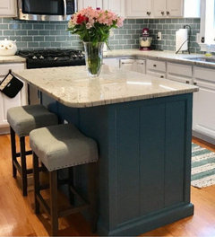
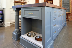
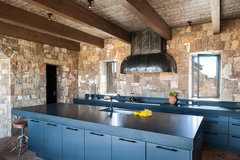
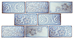
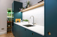
    This type of blue, muted some? Bakken Design Build: "It's a custom match to an existing historical built-in at the house."

    NE Capitol Hill Remodel · More Info


    Estancia del Rio · More Info


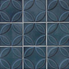
    Antic Feelings Ceramic Wall Tile, Via Lactea, Sample · More Info

    https://www.houzz.com/products/antiguo-feelings-ceramic-wall-tile-via-lactea-sample-card-3x4-prvw-vr~125845668

    Amay thanked everdebz
  • 7 years ago
    last modified: 7 years ago

    Or paint toward warmer side of blue -

    The Royal Mile Kitchen · More Info


    Summer Fall 11.75 X 11.75 Ferrari Mosaic · More Info

    https://www.houzz.com/products/ferrari-square-ceramic-cape-cod-blue-provincetown-deco-prvw-vr~129297508

    Amay thanked everdebz
  • 7 years ago

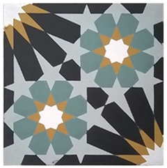
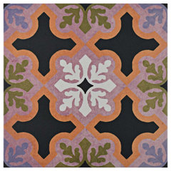
    Pattern? could round shape be cut to show above sink [cross ways]? and some how repeat that 'border' at top of bigger backsplash....Blue Green, Ash Gray, White, Black and Gold.

    8"x8" Rotterdam-B Cement Tile · More Info


    8"x8" Talia Twilight, Handcrafted Cement Tiles, Sample · More Info


    https://www.houzz.com/products/talia-twilight-handcrafted-cement-tiles-sample-prvw-vr~103200694

    https://www.houzz.com/products/8x8-rotterdam-b-cement-tile-prvw-vr~84610629

    Amay thanked everdebz
  • 7 years ago
    last modified: 7 years ago

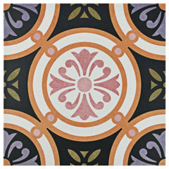
    Possibly pretty with cabs and warm floor color? Not usual, but you could pick a color and paint island base -- pretty.

    9.75"x9.75" Egeo Porcelain Floor and Wall Tile, Case of 16, Rodas · More Info


    9.75"x9.75" Egeo Porcelain Floor and Wall Tile, Case of 16, Quios · More Info


    https://www.houzz.com/products/975x975-oban-porcelain-floor-and-wall-tile-set-of-16-quios-prvw-vr~104041504

    Amay thanked everdebz
  • 7 years ago

    Just adding bright art that could bring the lavender-pink, etc... to LR:

    "Testarossa" Artwork · More Info


    W Residence Master Bedroom · More Info


    Amay thanked everdebz
  • 7 years ago

    Sometime I love doing this, but if you want, I can delete:

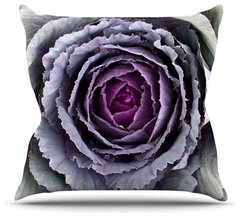
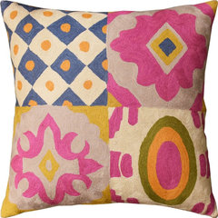
    Susan Sanders "Flower Love" Purple Green Throw Pillow, Indoor, 18"x18" · More Info


    Floral Four Square Elements Decorative Pillow Cover Handembroidered Wool 20x20" · More Info


    Amay thanked everdebz
  • 7 years ago

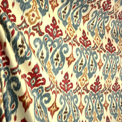
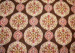
    Maybe with fabric you like, door / windows with color? $15 yd.

    With or without changing island.

    Shantra Twill Sonoma Beige Slate Blue Red Brown Ikat Damask Fabric · More Info


    Ladbroke Peacock Jacobean Paisley Suzani Floral Fabric · More Info


    https://www.houzz.com/products/shantra-twill-sonoma-beige-slate-blue-red-brown-ikat-damask-fabric-prvw-vr~27549914

    https://www.houzz.com/products/ladbroke-peacock-jacobean-paisley-suzani-floral-fabric-prvw-vr~22332377

    Amay thanked everdebz
  • 7 years ago

    I saw your art with bright green -

    Large Graphic Contemporary Floral Fabric Blue Black Green Brown · More Info

    https://www.houzz.com/products/large-graphic-contemporary-floral-fabric-blue-black-green-brown-prvw-vr~55021703

    Amay thanked everdebz
  • Amay thanked everdebz
  • 7 years ago
    1. Agree with those that say leave the tile as is -- goes well with the flooring.
    2. If, however, you are planning to change it, rather than investing in a full tile backsplash, you might consider a single row of tiles the same color as your countertop for your backsplash. You could then paint the wall above that the same blue you have as your wall color in the adjoining room, then paint your base of your island base a much darker and bolder blue -- perhaps even a cobalt blue.
    Amay thanked suezbell
  • 7 years ago

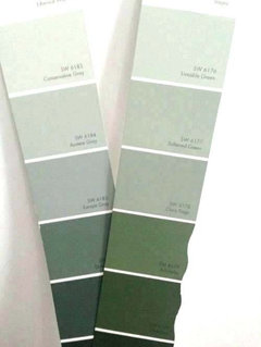
    Thank you all for chiming in, it's really helped me consider design elements I wouldn't have tried before!! For those interested, I've been playing around with colorsnap and I'm really liking a light green wall color rather than the grey I had for the kitchen - particularly rainwashed by sw. I tried blues, but they just don't flow as well with the cabinets and floors. I also think I'll go with a creamier white for the island and backsplash. I'm debating on keeping the butcher block or replacing it with the same granite


  • 7 years ago

    I like subway tiles for a more minimalist style, even if beveled, but the dark colors in your kitchen could easily carry a stronger color and design. Some small glass mosaic tiles would look beautiful. If I were you, I'd change the floor color to something more greyish, but it wouldn't necessarily clash.


    imo the white island doesn't go with the dark cabinets. Why not make it a bright color, like cobalt blue?

    Amay thanked Michelle
  • 7 years ago

    I disagree that dark cabinets/dark counters will always look bad. That combo is trending this year. (google 2019 kitchen trends) Most designers have been doing dark way more than white this year, so you are ahead of the trend! Island aside, I think all you need is a nice tile backsplash to modernize your look. The subway tile example above is lovely!

    Amay thanked User
  • 7 years ago

    like the second mockup with the butcher block on the island. Try black hardware on the island to tie in to the perimeter, [cup pulls or a different configuration] …. but the wood top is nice...I'd keep it.

    Amay thanked herbflavor
  • 7 years ago

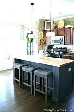
    I do like Rainwashed for a wall color. How about Tempe Star (or perhaps a shade lighter) for the island? With that color on the island, I think the butcher block would work well.

    Amay thanked raee_gw zone 5b-6a Ohio
  • 7 years ago
    last modified: 7 years ago

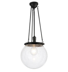
    A, haven't read all of the comments, so forgive me if this has been mentioned,,,,what about a pendant over the island?


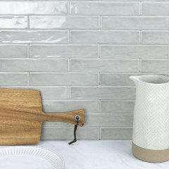
    tried to photoshop some of the elements. your subway tile and I gave you a black and white runner. (I'd also do a taller/thinner piece of art against fridge, or bring in a second one to go under what you have)

    or maybe a soft gold?


    I love this black one from Rejuvenation. Hood.


    like the marshmallow color too. if you want the soft green, then you could do a rug like this and pick one of the pendant lights.

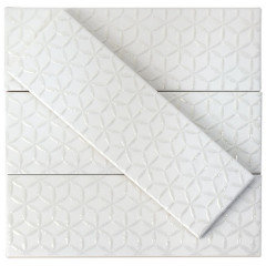
    And these tiles would go perfectly w/that coloring

    2x10, Newport, Polished.


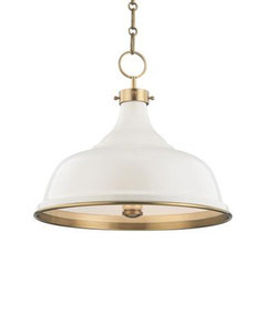
    I like these from Tilebar, (London, White Spring) w/a white pendant light


    Amay thanked Beth H. :
  • 7 years ago

    You mentioned Rainwashed for walls and creamy white for island - what about the opposite?

    Amay thanked Abby Mac
  • 7 years ago

    I love that SW “rainwashed” color...it works nicely with the stainless appliances. If you do the walls, island and the backsplash in that color, it will soften the dark colors without the glare of white. I also prefer a butcher block top on the island....but not a yellowy maple butcher block. My butcher block is made of oak pieces, and it looks deeper and richer than maple does. (I give it a rub with clear edible mineral oil each week.). Brighter lighting will also help.

    Amay thanked felizlady
  • 7 years ago

    The cabinets are too dark and the floor and backslash look dated and dirty. Paint the cabinets and lay a new floor and re-tile the backslash.


    Also, the counter top is too cluttered. Put the knives in a drawer, the cups and butter thing in a cabinet along with the little appliances.


    Amay thanked gwc1973
  • 7 years ago

    Here are a few new mock ups I'm considering. I don't know if I can add a pendant over the island since I already have one over the sink, but I like the look of a white and gold light. I also added some cream sheer curtains that I like for the window. I'm really loving the light sage green colors like rainwashed (my counter top seems to have some green tones in it). I also !love! the newport tile, thank you Beth H. for the suggestion.

    I think I'm really narrowing down what I want to do here, thank you all for the comments!!!


  • 7 years ago

    You might also consider something like SW Liveable Green on the walls, and a deeper version like SW Artichoke on the island, with the light back splash.

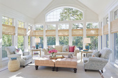
    Instead of white drapes in a kitchen, how about a natural colored woven wood roman shade instead? It would look simpler and relate back to your floor tiles.

    Sunroom Serenity · More Info


    Amay thanked calidesign
  • 7 years ago
    last modified: 7 years ago

    The mock-ups with light paint and light island, imo there's nothing interesting; so your blue medium-muted base adds to the dark-ish cabinets...

    how to say: the cabinet/floor combo needs a SuperColor to help them get related... ;)

  • 7 years ago

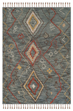
    Please allow me since I enjoy browsing, and I can delete this... but seeing how you like green here's a probable green-grey -

    Safavieh Kenya Collection KNY544 Rug, Grey/Multi, 6'x9' · More Info


  • 7 years ago

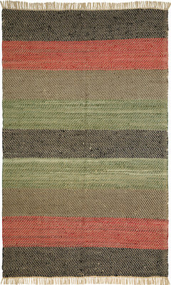
    To me there's enough black - I'd bring in cherry cabinet color - green - tan of the tiles....?

    St. Croix Matador Striped Leather Chindi 2'5"x4'2" Black Rug · More Info

    https://www.houzz.com/products/st-croix-matador-striped-leather-chindi-25x42-black-rug-prvw-vr~102065839


  • 7 years ago
    last modified: 7 years ago

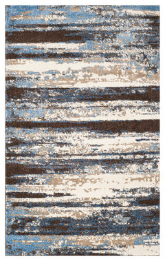
    Might be a place to tie in island blue, cream -

    Safavieh Retro Ret2138-1165 Rug, Cream/Blue, 4'0" X 6'0" · More Info


    Gypsy Street Art Abstract Rugs, Bone-Multi, 3'6"x5'3" · More Info


    https://www.houzz.com/products/safavieh-retro-woven-rug-cream-blue-4x6-prvw-vr~85578870

  • 7 years ago

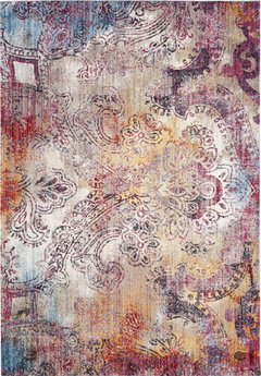
    DR or LR, seems natural with tile and wood... adds a bit to squared tiles of floor -

    Safavieh Monray MNY646D 6'x9' Red, Multi Rug · More Info

    https://www.houzz.com/products/safavieh-monray-mny646d-6x9-red-multi-rug-prvw-vr~118034570