

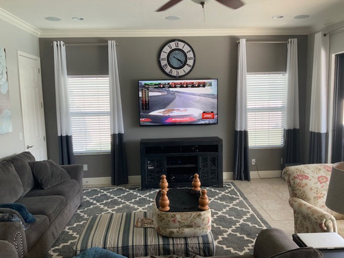
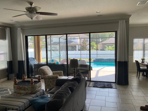
Help!! These drapes are killing me!!
7 years ago
Featured Answer
Sort by:Oldest
Comments (30)
 PRO7 years ago
 7 years ago
Related Professionals
West Plains Interior Designers & Decorators · Grand Forks Interior Designers & Decorators · Crestview Kitchen & Bathroom Designers · Murfreesboro Kitchen & Bathroom Designers · Lufkin Kitchen & Bathroom Designers · Hartford Kitchen & Bathroom Designers · Toms River Interior Designers & Decorators · Victoria Interior Designers & Decorators · Louisville Architects & Building Designers · Willmar Architects & Building Designers · Fairbanks Architects & Building Designers · Decatur Kitchen & Bathroom Designers · Orlando Kitchen & Bathroom Designers · Middletown Kitchen & Bathroom Designers · Farmington Kitchen & Bathroom Designers- 7 years ago
- 7 years ago
- 7 years ago
- 7 years ago
- 7 years ago
- 7 years ago
- 7 years ago
 7 years agolast modified: 7 years ago
- 7 years agolast modified: 7 years ago
- 7 years ago
- 7 years ago
- 7 years agolast modified: 7 years ago
 PRO7 years agolast modified: 7 years ago
 7 years ago
- 7 years ago
- PRO7 years agolast modified: 7 years ago
- 7 years ago
- 7 years ago
- 7 years ago
- 7 years ago
- PRO7 years ago
- 7 years ago
- 7 years ago
- 7 years ago
 7 years ago
 7 years ago
- 7 years ago


Related Stories

ENTERTAININGGot Hand-Me-Down Dinnerware? Make a Memorable Meal
They might be mismatched and not your style, but those inherited plates and forks can help bring meaning to your table
Full Story
NURSERY IDEASGender-Neutral Palette Makes Nursery an Easy Hand-Me-Down
Navy blue walls and coral drapes work for a designer’s firstborn boy and later for her newborn girl
Full Story
FUN HOUZZHouzz Quiz: How to Find Your ‘Me Time’ Place
Looking for the best place in your house to soothe away your stress? We’re here to help
Full Story
DECORATING GUIDESTo Drape a Throw or Fold It?
Spilling softly or crisply creased, throws on chairs, sofas and chaises offer beauty and comfort
Full Story
WINDOW TREATMENTSHow Low Should Your Drapes Go?
Hover, brush the floor or pool like Scarlett O'Hara's tears — we give you the lowdown on curtain length options
Full Story
MOST POPULARThe Perfect Houseplant for People Who Kill Houseplants
If you can fill a jar with water, you can keep golden pothos vine happy — and it will pay you back with cleaner air and a greener home
Full Story
WINDOW TREATMENTS9 Ideas for a Beautifully Draped Home
Go bold with your curtains and drapes for all the privacy you need and heightened drama too
Full Story
DISASTER PREP & RECOVERYFall 2018 California Wildfires: How You Can Help
Here are ways to donate to help victims of the Northern and Southern California fires
Full Story
WINDOW TREATMENTSGet Gorgeous Drapes with Classic Pinch Pleats
A detailed guide to this timeless and tailored window treatment
Full Story
COMMUNITYHow You Can Help Volcano Victims
Want to donate to help people affected by the eruptions in Hawaii and Guatemala? Here are groups providing assistance
Full Story





BeverlyFLADeziner