Software
Houzz Logo Print
crystalpea

Walnut Kitchen Backsplash Help... Square, subway, calm, bold?

7 years ago
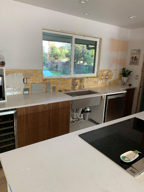
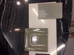
We're finally on the final leg of our first floor reno and I cannot decide on a kitchen backsplash. Having a hard time choosing a direction let alone an actual tile. Any thoughts on the existing samples or other suggestions?


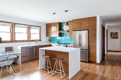
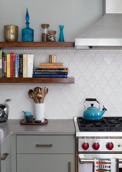
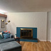
Whole kitchen is walnut grain-matched fronts. Haven't decided on cabinet hardware. Only have this one wall of backsplash, there will be a walnut counter cabinet going up to the ceiling on the left hand side:


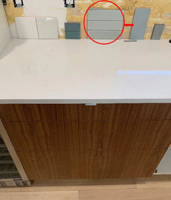
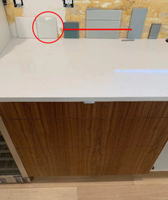
Below are a few favorites of the thousand samples I've picked up. The left is a high variation (whites and greys) 5x5, the others would be a 3x9 or similar :


Counters are quartz, look white unless you're right over them:


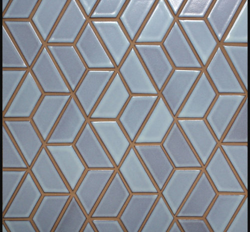
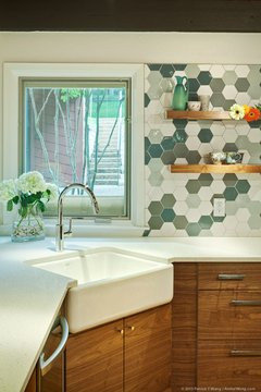
Really love the Heath Ceramics half hex, but my budget doesn't:


Comments (48)

  • 7 years ago

    That last one is gorgeous! I’m no help...

    crystalpea thanked cluelessincolorado
  • 7 years ago

    Many people have gone months, even years before finding their backsplashes. How about saving for the one you really want?

    crystalpea thanked eld6161
  • 7 years ago

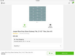
    Based on the selections you've shared, I like this one in the larger size to the right - or even larger (less grout lines). I'd stack them vertically to repeat the grain of the cabinetry.


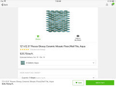
    If it's too colorful for you, I like this one - but also in a large size and stacked vertically.


    An elongated hexagon, vertically oriented, could also be a consideration.

    crystalpea thanked Manon Floreat
  • 7 years ago

    Thanks for the feedback Manon. I was leaning towards the first tile you circled for a long time, but the largest format those particular tiles come in is actually the 2.5x9 shown in the picture :(.


    cluelessincolorado- Ha that's ok. It's beautiful, so tempting.


    eld6161- My budget comment was misleading I suppose. We could buy the tile, but just would rather not spend $50/sqft on something that is purely aesthetic. Tile/installation costing as much as almost all of our appliances would be odd for me.


  • 7 years ago

    Grey certainly doesn’t do anything for the beautiful cabinets. Why do you feel you need a backsplash on the sink wall?!? Put a backsplash above the cooktop, and handle everything else with paint (easier, and a much greater colour choice).

  • PRO
    7 years ago

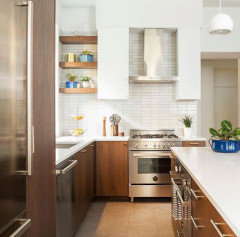
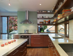
    Go for a fun pattern! Fireclay Tile has some awesome options and colors. See below for examples:


    Concordia Midcentury Modern · More Info


    Woodlawn Kitchen Remodel · More Info


    Midcentury Ranch Remodel · More Info


    Lost Creek · More Info


    crystalpea thanked Sabrina Alfin Interiors
  • 7 years ago

    My vote is that sexy aqua right below the outlet but in a fun shape - maybe a little larger for such a big wall. I agree, no grey! LOVE your cabinets!! If budget is an issue, check out local tilemakers. I had my minty trapezoids handmade, supporting a local artisan, a bit cheaper and I was able to be a part of the design process and color selection. So happy with my choice!


    crystalpea thanked mnmamax3
  • 7 years ago

    The gray tile sucks the life out that walnut.

  • 7 years ago

    jbtanyderi- Cooktop is on an island, so no backsplash needed there. We didn't have tile behind the sink before updating this kitchen and I much preferred the setup at our old house. Tile with minimal grout held up better to food splashes, beverage/water splashes, being cleaned repeatedly, etc. (My husband is a wild dish cleaner apparently).


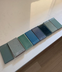
    Sabrina- Love Fireclay. It is pricier though. I'll have to check out their patterns. I wasn't completely sure on the color samples I received being right for the kitchen unless we went the bold route. Here they are. The 4th from right was the only one truly vetoed.


  • 7 years ago

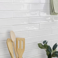
    https://www.wayfair.com/home-improvement/pdp/ivy-hill-tile-newport-polished-2-x-10-ceramic-subway-tile-sost3418.html?piid=37157451

    Newport Polished 2" x 10" Ceramic Subway Tile

    See More from Ivy Hill Tile Shop

    $6.39/sq ft$8.3624% Off They have some pearl tile that is too beautiful, but it is 3 x/s this cost... Maybe this is less price than the others?

    crystalpea thanked redsilver
  • 7 years ago


  • PRO
    7 years ago

    Hi. Before making tile selection, you need to consider


    -What is in the rest of the house? Are there other design elements, colors that this tile will need to coordinate with?


    -What is your color/pattern tolerance? In other words, if you add a busy design/color, when will be the next time you will change the tile in this space? Will you be happy with that until the next time you are ready to tile?

    crystalpea thanked CDR Design, LLC
  • 7 years ago

    I like the reflective quality and the calm of the first tile (5x5) you posted, it would allow the wood to star. The colors are lovely, as well.

    Good points, CDR.

    You said you're unsure of direction, so before debating just the right color, show a photo of the whole wall and maybe someone can photoshop it? Any shelves or other items to go there? Overall style and inspiration?

    crystalpea thanked mercurygirl
  • 7 years ago

    CDR everything is pretty neutral in the sitting area that is open to the kitchen. White paint and brown leather couch with tapered legs are staying, but everything else (area rug, accent chairs) can be switched out. Dining room and family room are painted a very light sage color. Style of all furniture leans towards mid-century modern with a mix of vintage and new pieces.


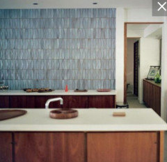
    I love color and pattern and would absolutely love this...


    But to your point I'd probably want to change it out much more quickly than a less patterned less colorful choice. In our other rooms color comes in the form of art and colorful plants and pottery. So if we did do a simpler backsplash I'd display colorful artwork and cookware in the kitchen.


  • 7 years ago
    last modified: 7 years ago

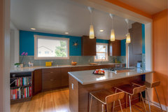
    Found this and thought it may help to visualize with tile color, except think white on walls.

    Missoula Midcentury Kitchen · More Info


    Nice example of neutral walls which are backdrop for colorful art.

    Mid-Century View House · More Info


    crystalpea thanked mercurygirl
  • PRO
    7 years ago

    There are many ways to add color to an otherwise neutral palette kitchen.......and it can be changed up over time and you aren't tying the family room and kitchen into that one color until the next renovation.


    You can also get under- cabinet lighting that changes color.

    Kitchen · More Info


    Coastal. Comfort. Cape Cod. · More Info


    Kitchens · More Info


    Kitchen · More Info


    Chicago Victorian Cottage · More Info


    The Kitchen · More Info


    crystalpea thanked CDR Design, LLC
  • 7 years ago

    I would use white or a color for the back splash rather than gray, which I don't think works well with your cabinets and floors.

    crystalpea thanked calidesign
  • 7 years ago

    I don't know but I did think the orange, maybe even salmon or peach in a small amount mixed with other warm whites or hues is better than the cool gray hues. There is a wide vary of hues and the lighting will greatly affect that wood tone so probably needs to be viewed in person, to make it the best effective long lasting investment for your home. Could be a very cheerful kitchen, to be sure.

    crystalpea thanked redsilver
  • 7 years ago

    Quite a few have commented about gray, is it that the non-white samples look gray? I agree that I don't want a gray backsplash, all the samples aside from the white are greens and blues. Should I look for warmer?

    This is the variation in the white tile sample from my picture:


    I think we want to do two shelves, walnut on either side of the window about 20 inches off the counter.


    Below are examples of the color backsplashes I've been looking at. Are these too cool?

    Rockingham Residence · More Info


    San Carlos Mid-Century Modern Remodel · More Info

  • 7 years ago

    mercurygirl - the first kitchen you posted is so fun. I think the backsplash is similar to some of the samples I have, but the blue wall makes it more exciting.

    CDR- I definitely would use stools or some shelf items to incorporate more color especially if I went with a neutral backsplash.

    Grover- I've looked at a few glass backsplashes in different patterns, but none have had the right color so far.

    redsilver- Cheerful is definitely the goal.

  • PRO
    7 years ago

    I think the white/gray combo, Rockingham Residence and San Carlos are all neutral enough to stand the test of time. My preference would be the gray and white of San Carlos.

    crystalpea thanked CDR Design, LLC
  • PRO
    7 years ago

    How about these? I like the 1st choose of Manon. I think the more classic the better.

    crystalpea thanked Susan Tiritilli
  • 7 years ago

    If you add the same cabinets ...just put a 2 inch backsplash out of the same material as your counter . Sleek and beautiful looking kitchen !

    crystalpea thanked skunst2017
  • 7 years ago

    Your new cabinets are beautiful! I am a blue person (have you seen my new kitchen?!) and would go with the teal in your first two photos. If you're drawn to bold, go bold! You will love it every time you walk in the kitchen. The Heath Ceramics hex tiles are gorgeous. Go big, or go home!

    crystalpea thanked Allison0704
  • 7 years ago

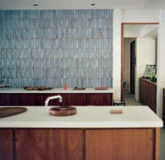
    I love this tile (Studio Moderne Paramount from Walker Zanger)


    crystalpea thanked cawaps
  • PRO
    7 years ago

    I love your kitchen. I see painted glass tiles in it. Although I personally love an elongated subway tile, with this tile you could select a pattern, a subtle color or a pop of color. If you find something you love and just can’t do it right now, paint the wall and get what you love later. You won’t regret the wait!

    crystalpea thanked redesign
  • 7 years ago
    last modified: 7 years ago

    Crystal, the image you show is your inspiration image, is that correct? Can you show us more images that inspire you?

    The classic choice, and I think CDR is getting at this, is not to make a permanent decision with color. All of your permanent choices should be neutral and color is layered on with artwork and textiles. But it seems as though you really want color(s) in your backsplash. If that is correct, that's fine, be bold. Chose something that you will love seeing every day. For me, of all the options shown, I like the Lost Creek image Sabrina showed. Your image is of smaller, more delicate tiles. Is that on purpose or a random choice?


    crystalpea thanked eam44
  • 7 years ago
    last modified: 7 years ago

    mnmamax3 -I missed your comment before. That's great! How'd you source your local maker?

    allison0704- I haven't seen your kitchen? Please share.

    eam44- I think I like the smaller sized patterns because I find the patterned tiles (hexagon, diamond, etc) in a larger size to be overpowering, especially since our ceiling is only 8ft. Yes the other images I shared outside of my original post are inspiration photos. Here are a few more that use color and white as backsplash. Maybe that's why I can't decide:


    For some reason I see this ^ backsplash as kind of neutral.

  • 7 years ago

    I like all of your last 5 examples! Interesting variation in color with a unique shape. Most handmade tiles have variation in them by default. Our tilemaker came recommended by the tile contractor I use but I also googled tile makers in our area and found some others. Most smaller shops will work with you on color/shape - you just want to check their reviews for quality of product, reliability and consistency. It will look handmade... handmade by a 7-year-old is not the look you are going for though.

    crystalpea thanked mnmamax3
  • 7 years ago
    last modified: 7 years ago

    So really the issue, before anything else, is to determine whether you want color in the bs or white/neutral tile. The method developed by OB2B is to get color photocopies of your tile options and tape them up onto the wall, live with them for a couple of days, and violá, decision. In your case I might start by painting your wall color over the bs area in lieu of photocopying white tile. See how that feels for a day or two. Then photocopy two of the tiles you like best, and tape them up in the bs zone. It'll help, I promise.

    Once you know whether you want white or a color, we can help you find some good options.

    crystalpea thanked eam44
  • 7 years ago

    You could also use a light taupe/tan for the back splash if you don't want to commit to blue or green.

    Kitchen with Light Beige Cabinets · More Info


    crystalpea thanked calidesign
  • 7 years ago

    Go with color! Love the blues and greens.

    crystalpea thanked houssaon
  • 7 years ago

    So many beautiful options you have here..I would just say no to gray..walnut and gray don't match very well. We have walnut cabinets and white quartz for the bar (counter is Cambria Torquay which has a bit of taupe veining)..we went with a taupe/tan glass tile..Anything that gray in it just didn't work well. A nice blue would work, white, simple glass tile with a hint of green..


    Ukrainian Village Home · More Info


    Blackburn House · More Info


    Randall Mars · More Info


    crystalpea thanked printesa
  • 7 years ago

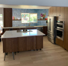
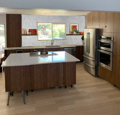
    Yes, I do need to decide between color or white and incorporating color another way, Tried photoshop. Painting the wall to see if I prefer white or color is a good idea, but I'd have to decide on a color. I like the blue or jewel tone green below maybe.


    Some of our panels and doors aren't on so I had to fake them which is why things look crooked and there's mystery legs, but it gives a better idea of the layout.


  • 7 years ago

    They all look pretty. What direction are your windows?

  • 7 years ago

    I like the blue and white..the last one looks too dark. It also depends on the amount of light you get in the room

    crystalpea thanked printesa
  • 7 years ago

    The window above the sink and the sliding doors to the left of the counter cabinet face east. There are floor to ceiling windows on the other side of the island that face west.

  • 7 years ago
    last modified: 7 years ago

    Here's another idea, light blue tile as above up to shelves, white walls with a couple of colorful paintings above. I love to see art in kitchens.

    crystalpea thanked mercurygirl
  • 7 years ago
    last modified: 7 years ago

    So you get plentiful light in the morning and afternoon. Try printing it out and taping it up, see if your blues are light enough to live with.

    crystalpea thanked eam44
  • 7 years ago

    our kitchen is a very similar style (walnut/white cabs with Eggshell quartz), and we are going with this sage green (tiled vertically); which we find reads as a neutral. I don't have it up yet but will post when it happens if you're interested.

    I surprised everyone (myself included) that I didn't choose white this time, but this spoke to me. (I also love greens)


  • 7 years ago
    last modified: 7 years ago


    another pic from samples at the store (the tile on the right was too pastel-y inside our house)

  • 7 years ago

    That’s pretty! Please do share when it’s Done.

  • 7 years ago

    This thread speaks to me!

    I, too, am undecided on backsplash for a walnut kitchen (I'm envious of yours as it's much more of a chocolate walnut instead of mine, which ended up too yellow for my taste). We're also doing white quartz counters and I would totally go with a blue backsplash but alas DH is not a fan. FWIW, of the last three Photoshop images you posted, I would totally go for the top one!

    p.s. you might look at Seneca Tiles as they're beautiful like Heath and Fireclay but about half the cost from what I can tell.

    crystalpea thanked Mittens Cat
  • 7 years ago

    @crystalpea, is this one Heath tile or ?


  • 7 years ago

    Mittens Cat- Thanks, I love the walnut. Our old kitchen was very orange, very grainy oak put into our 1960s house in the early 90s by the previous owner. At the last straw a drawer front fell onto my foot when I went to open it. So happy to never see it again. I have to say I saw your post when I searched walnut and think your cabinets are beautiful.


    Yes that tile is heath ceramics. My husband isn't a fan of any of the bold colors either, but gonna find a happy medium or go wild with the colors displayed on the shelves. I'll have to check out Seneca, thank you!

  • 5 years ago
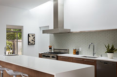
    @crystalpea What did you decide?

  • 5 years ago

    Yes, would love to see if @crystalpea decided (or if she's like me and is still in limbo more than a year after move-in!).
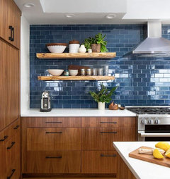
    :-D

Sponsored
Haus Studio
Average rating: 4.8 out of 5 stars28 Reviews
Franklin County's Preferred Custom Cabinetry & Design Studio