Software
Houzz Logo Print
webuser_156688745

NEED advice on white paint color for kitchen cabinets

6 years ago

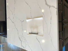
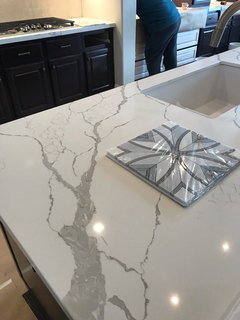
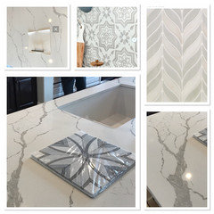
I just had my quartz installed and it is beautiful, falls in between white and ivory, with light grey and taupe veining. What I am stuck on is what color white I should paint the cabinets. I was LOVING SW SW 7637 Origami white in photos, but ordered a big 8x10 swatch and it looks more yellow when near my quartz. NOT the look I am going for. Anyone have any suggestions on a fabulous white that has would compliment an ivory/taupe/grey quartz. My walls are SW 7029 Agreeable Gray. The hardware, kitchen faucet I selected in a satin champagne bronze.

Comments (47)

  • PRO
    6 years ago

    SW Shoji white it is a neutral white that works great with gray...do You have any white painted trim in your home? What white is it painted?

  • 6 years ago

    The crown is a custom white semi gloss. Close to SW extra white I think.

  • 6 years ago

    We did BM Super White and love it! It’s closest to pure white with no undertone and our walls are close to Agreeable gray.

  • 6 years ago

    I just went through choosing the perfect shade of white for my custom cabinets and made the decision to order about eight different samples of those peel/stick from Samplize. I was also looking for that neutral shade of white and for me, it was Benjamin Moore Simply White.

  • PRO
    6 years ago

    What brand and pattern is your quartz? Are you sure you want white cabinets?

  • PRO
    6 years ago

    Your lighting will make big difference as well. A cool white light will drive any white cooler and a warm light more creamy. Get your lighting set up as much as possible. I have a file with whites. But need to get to my desktop first. Bbl

  • 6 years ago
    last modified: 6 years ago

    where's the quartz? lets see a pic of it.

    you want a white cab and not a gray or taupe color?

    pick a white that isn't yellow.

    very important about lighting. you want something in the 3500-4000K range. anything less will give off yellowish hues.

    if you did a pure white on your trim, what's wrong w/that for your cabinets?

    here's Shoji,,,very creamy


    Alabaster (notice how it looks next to the natural daylight, and then over to the left w/the warmer bulbs. see the diff?)


    Oxford White


    Simply White


    Pure White


  • PRO
    6 years ago

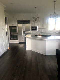
    Just did a Reno on a kitchen and it has quartz counters with gray veining..we did Super White on cabinets...medium wide plank wood floors...champagne silver lighting.

    Cox kitchen reno · More Info


    Cox kitchen reno · More Info


  • PRO
    6 years ago

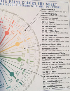
    Here are a couple most white colors. SW Extra White has least chance of looking yellow. BM Simply White more reflective with LRV of 90. If you like your trim color match it. Be aware of “finish” because different finishes of the same color will look slightly different. So if trim is “satin” finish do cabinets in same finish. Satin finish is great.

  • 6 years ago

    We could all give great suggestions but you need to invest in samples and view them in the rooms lighting with the sample of the countertop material. I would start with whatever shade you have for the wood trim. Maybe a pure white with an Agreeable Grey glaze ?

  • PRO
    6 years ago

    You need to hold all sampleS up to your quartz..they tend to be more on the bright white side....get a sample SW extra white....the trim paint you have that might be the white that works perfect.

  • 6 years ago

    We choose Behr Painter's White for our perimeter cabinets, and I love it. Countertops are Mont Blanc quartzite, with possibly similar coloring to your quartz. The cabinet color is bright without feeling stark/sterile, and there's no yellow undertone (unless I'm colorblind). I'm not sure what the SW equivalent color would be.... Good luck!

  • PRO
    6 years ago

    A close match to Behr's Painter's White is BM OC-22 Calm. The two colors are very close in all the parameters. If you want to try that color in BM. I couldn't find a close enough match in SW paint yet. I'll try later tomorrow if this is of interest.

  • PRO
    6 years ago

    Make sure to choose a stark, crisp white tone of white. Although some pictures of your countertop and cabinets would help.

  • 6 years ago

    I will get some sample pictures out there, it's tricky because even the photo's I have don't really show the quartz accurately, def more of a soothing ivory than a stark white. I am going to have the cabinet refinish person work me up a sample of the origami white and see what I think. I will be back with pictures in need of more advice soon :) Thanks everyone.

  • 6 years ago


  • 6 years ago

    Quartz, with a sample square of the origami white and the satin bronze

    hardware

  • 6 years ago


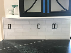
    You can see it's more ivory in this pic. The tile (for center stove area) will be grouted in a super light grey- the rest I am doing in white beveled subway- that's going in now

  • PRO
    6 years ago

    Your accent tile is a different gray and is not a good choice with your quartz..it leans cool and your counters lean warm...does your accent tile come in any other colors?

  • PRO
    6 years ago

    The Oragami white seems to work well and you picked very pretty hardware..please rethink your accent tile!

  • PRO
    6 years ago

    With strong pattern on countertop, simple backsplash is best. It is supporting actor to star which is your countertop. Matching grout to tile too.

  • 6 years ago

    LOVE your fun tile!

  • 6 years ago

    I adore the tile despite the commentary. Once it’s grouted I think it will be fantastic... at the end of day I only did one section like this - subway everyplace else. Strategic decision as it’s easy to change out 20 sq ft in time vs 70 Sq feet which was my total backsplash space.

  • PRO
    6 years ago

    I love the design of your tile but the color is not right..don’t depend on grout to make it work..grays are very difficult some are cool and some are warm...also the white is too bright with your soft white quartz....I think it is going to look light blue once it is up....

  • PRO
    6 years ago

    Going in the warm direction like these tiles would be beautiful...as you can see your tile is a very cool tone...

  • PRO
    6 years ago

    I'm surprised, origami is right in your realm. Take a peek at sherwin snowbound or toque white. Snowbound never fails... :)

  • 6 years ago

    I’ll send a pic once grouted - it’s already up. I’m leaning towards a light grey cabinet now vs white...I’ve had input from a pro SW colorist and 2 interior designers and landed here ...will see ......how it shakes out...stay tuned

  • PRO
    6 years ago

    A pro said to use that tile color With your quartz?

  • 6 years ago

    Yep, two actually and the grey color is def much more subtle than the bad pic illustrated with plastic wrap. How about we wait to see once done vs- Houzz shaming. Like I said it’s only a small area and if should not love I replace at end of day.

  • PRO
    6 years ago

    No worries just on my screen it just seemed so off on color and didn’t want you to have a bad outcome...but you already have it up...

  • 6 years ago

    Following for pics

  • PRO
    6 years ago

    Kelly- I don’t know why you feel there is “Houzz shaming”? I saw HIWE giving you great input. You asked for opinions? Color on the Internet is not accurate and perhaps the colors in your home and light are different than what we see. I thought HIWE nailed some better options for you only to be slammed for her efforts. Maybe I misinterpreted your remarks.

  • 6 years ago

    following


  • 6 years ago

    Home Interiors with Ease - you made a very good point about the grout looking blue as I have just experience this week. I’m leaning towards having the grout re-done and will have my tile guy do a sample board with a few of the cut tiles. My backsplash is Bianco Dolomite and counter top is a gorgeous soapstone and everyone recommended “Snow” a soft white grout color. It reads blue in my kitchen.


  • 6 years ago
    last modified: 6 years ago

    I agree that your backsplash looks too cool for the marble *in the pic*, particularly since your veining is warm and Agreeable Gray is a warm greige. Trust your eye for what you see in real life.


    For white, we were leaning towards Snowbound (SW) but ended up doing Greek Villa (SW) - the lighting makes such a huge difference in what works and what doesn't.

  • 6 years ago

    Also, someone above mentioned you need to hold all your sample together...true, but it can make a huge difference in HOW you hold them. You should be placing the backsplash perpendicular to the counter and the paint next to both. The angle can really change things.

  • PRO
    6 years ago

    Good point Lauren. Colors look different horizontally and vertically. That is some gorgeous soap stone! Don’t think I have ever seen it with that coloring and veining. Beautiful!!

  • 6 years ago

    Flo Mangan, my original plan was to use Quartzite and I looked at every slab yard in San Diego, but once I saw that Soapstone slab I knew it was meant for my kitchen.

  • PRO
    6 years ago
    last modified: 6 years ago

    Hey Kelly, we use BM Super White with our clients from www.hoffmanestatepainters.com and we also did it in our previous home and it really pops out out. I agree with most of the folks here and really like BM. If you have any questions, feel free to shoot!

  • 6 years ago

    follow

  • 6 years ago

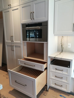
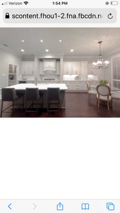
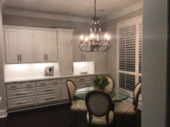
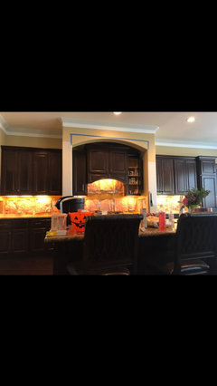
    Finally getting around to posting pictures. I’m really happy with the way it turned out (will I switch out the backsplash for something a little less bold one day, probably) but after looking at before shot, I’m much better off now..

  • 6 years ago

    Wow, what a difference. Can you post a close up of the tile behind your stove?

  • PRO
    6 years ago

    Wow, looks amazing! The most important thing -- you love it. Congratulations!

  • 6 years ago

    Thank you!

  • 6 years ago

    It looks fabulous! I really like your tile. What color did you end up painting the cabinets?

  • 6 years ago

    SW 7028 incredible white. It’s a soothing white - I didn’t want stark. I went against designer idea to match the crown molding / trim to cabinet color. I wanted variance-cabinets to be their own thing- glad I listened to my gut because it’s a ton of cabinets to not like-it’s really a great color- looks great with the satin bronze hardware.

Sponsored
High Point Cabinets
Average rating: 5 out of 5 stars21 Reviews
Columbus' Experienced Custom Cabinet Builder | 4x Best of Houzz Winner