

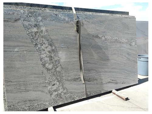
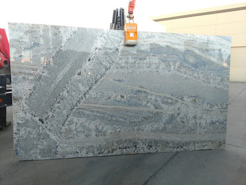
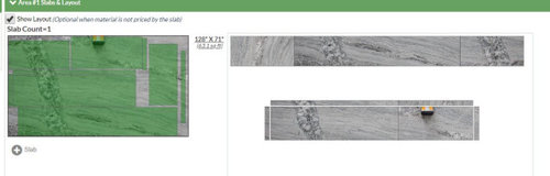
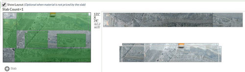
Please help determining which slab, which templating
6 years ago
Featured Answer
Sort by:Oldest
Comments (6)
 6 years ago
Related Professionals
Bronx Kitchen & Bathroom Designers · Nashua Bathroom Remodelers · Hays Tile and Stone Contractors · Milwaukee Tile and Stone Contractors · Hot Springs Kitchen & Bathroom Designers · Sebring Kitchen & Bathroom Designers · Dodge City Kitchen & Bathroom Designers · Las Vegas Kitchen & Bathroom Designers · Clarksville Kitchen Remodelers · Houston Kitchen Remodelers · Detroit Kitchen Remodelers · Eugene Kitchen Remodelers · Queens Kitchen Remodelers · Bridgeport Custom Countertops · Saint George Custom Countertops- 6 years ago
- 6 years ago
 PRO6 years agolast modified: 6 years ago
- 6 years ago
Related Stories
DECLUTTERINGWhen Simplifying, Which Papers to Keep and Which to Toss?
Find out which records you can get rid of when you are decluttering or moving to a smaller home
Full Story
KITCHEN DESIGNHouzz Quiz: Which Kitchen Backsplash Material Is Right for You?
With so many options available, see if we can help you narrow down the selection
Full Story
BATHROOM DESIGNWhich Flooring Should I Choose for My Bathroom?
Read this expert advice on 12 popular options to help you decide which bathroom flooring is right for you
Full Story
KITCHEN APPLIANCESWhich Appliance Finish Should You Choose for Your Kitchen?
Find out which design situations call for stainless steel, black, paneled, white and colored appliances
Full Story
DECORATING GUIDESWhich Rooms Get the Oscar?
On the eve of Hollywood’s night of nights, we bring you top films from the past year and their interior twins
Full Story
KITCHEN DESIGNOpen vs. Closed Kitchens — Which Style Works Best for You?
Get the kitchen layout that's right for you with this advice from 3 experts
Full Story
KITCHEN DESIGN12 Great Kitchen Styles — Which One’s for You?
Sometimes you can be surprised by the kitchen style that really calls to you. The proof is in the pictures
Full Story
BATHROOM DESIGNWhich Shower Bench Style Is Right for You?
Shower benches can be sturdy, floating, fold-away or movable. Read about 6 types to find one that suits your needs
Full Story
FURNITUREWhich Dining Table Shape Should You Choose?
Rectangular, oval, round or square: Here are ways to choose your dining table shape (or make the most of the one you already have)
Full Story
HOUSEKEEPINGWhen You Need Real Housekeeping Help
Which is scarier, Lifetime's 'Devious Maids' show or that area behind the toilet? If the toilet wins, you'll need these tips
Full Story
Joseph Corlett, LLC