Software
Houzz Logo Print
decker11

House color decision time

6 years ago

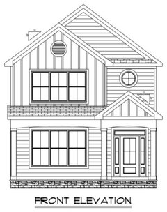
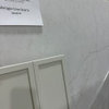
We finally broke ground on our beach house project and I have some decisions to make - specifically outside color. I’m lookin for a Beachy blue-green, but nothing bright. I’m looking for something pretty and subtle. Neighboring houses are “typical” colors (browns and whites” so I don’t want to look out of place. I’m between two Sherwin Williams colors: quietude and oyster bay. I love quietude - but online pics give me a little pause. They look a little brighter than I might be comfortable with (I know colors get cooler in sunlight so that might be the issue). On the other hand, oyster bay looks kinda “blah” I. Person...but again, online pics make it look much more attractive/in my wheelhouse. Thoughts on how to figure this out? I have painted planks in each color I looked at outside, and I do like quietude (and oyster bay looks a little gray for me). But they are still only about 6x10” swatches...colors side by side and collage of online pics of each are below.

Comments (46)

  • PRO
    6 years ago

    I vote for more muted not bright colors. So i would go with Oyster Bay.

  • 6 years ago

    Second vote for oyster bay

  • 6 years ago

    I like the blue-green in the Quietude, but I’m sick of grey. How much trim will there be and what color will it be?


    If you’ll have a white porch or something, that may change the look.

  • 6 years ago

    quietude


  • 6 years ago
    last modified: 6 years ago

    I would not rely on on-line pics for this decision . Trust your eyes and your designer instinct on this, not an enhanced picture quality photo (edited for brighter/ bluer skies, or greener lush lawn)

    I'd buy sample cans of both. Paint a large poster board or primed plywood with each color and then judge again

    The one pic of oyster bay with the dirt lawn- The OB paint looks like a gray color.

  • 6 years ago

    The house will have a porch. Trim will be “white” (specific color to be determined next). Ignore the direction of the siding on the pic. It’s wrong but I can’t find the correct one.

  • 6 years ago

    Ps. I know what you are saying about online pics! Problem is that online is the only place to see “a lot” of the color. I really do love quietude in person on my sample and I’m really tempted to use it. Had the online pics not seemed borderline bright I would not have thought twice. The sample of oyster bay is a nice gray- but I don’t see much blue-green in it really, although that is the color pallet it’s supposed to be in. I hate big decisions...

  • PRO
    6 years ago

    What is the next color down from Quietude? Can you go one lighter on the paint card to give you the same feeling, just not so bright?

  • 6 years ago

    ^Mindblowing info Lori.

  • 6 years ago

    Lori is correct that you can not rely on pictures from the internet to pick colors. The reason is a bit more complex, but the end result is correct.


    To see what the color will look like on the outside of your home you should paint 2 samples that are at least 18" x 24" and place them against something white - large poster board, drywall, foam core - whatever you have. Look at the samples on different sides of your home at different times of the day. You may also want to take them to a neighbors home and set the samples against their home to judge just how much brighter Quietude will be in comparison to their house. My educated guess is that Quietude will be to clean and saturated compared to the homes around you. If one color feels too bright and another feels to gray you can always get a formula in between the two colors.


    I often mix a 25/75 blend, a 50/50 blend and a 75/25 blend when I am stuck between two colors.


    If you choose a blend have the paint store give you the formula for both colors and either do the math yourself or post the formula and have someone with experience do the math. I have seen some really bad math from paint store employees who could not figure out how to split the formulas.


    Kim thanked Jennifer Hogan
  • 6 years ago

    I’m always glad when I ask a question on this forum. Great information! Thanks to all!

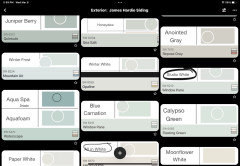
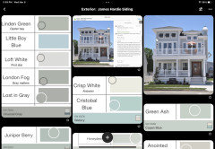
    The reality (and trouble) is, I will actually be using a James Hardie siding “dream color”. So why did I give you SW colors? Read on as I vent a bit about James Hardie siding colors. My local distributor does not have paint chips (they said nobody does bc the colors are too new). Hardie colors on their website look like they are on cedar siding-and so they look kind of washed out so the color is hard (at least for me) to even guess about undertones. You really need to have a reasonable guess about what they will look like in person because although you can order samples of colors on a piece of Hardie Board, they are $10 PER 4”x6” SAMPLE. I have 40 SW free paint chips I have played with, narrowing the colors down to what I think I ultimately might like. I would prefer not to spend $300-$400 on hardie board samples (which will ultimately end up in a landfill. I appreciate seeing the color on the board, but can’t they send paper paint chips as a more friendly and economical way to play with colors?). I do understand that SW provides Hardie’s paint colors - so I can theoretically look at their paint chips and then buy sample quarts without wasting money on what will end up as trash, BUT of course, Hardie renames the colors (and there is no guide that I can find to match them up).

    I have matched up a few of the SW colors I think I like with their hardie counterparts using the SW website and the website of a company that has “regular” swatches of Hardie’s colors that it shows in order to match them up with their own products. It works (so far anyway. I have confirmed by ordering a handful of those hardie colors and I was “right” about the match) but it is incredibly time consuming-too many colors to compare to make the match. If anyone knows of a better way to go about this please let me know!

  • PRO
    6 years ago

    Hardie has architectural kits.


    What Hardie colors are you considering?

  • 6 years ago

    I ordered juniper berry (which is quietude) cristobal blue (lighter) and aqua sphere (darker). Here is one of my matching attempts. Literally just playing with cutting and pasting colors to see if I can get a match. I have access to the 12-15 “standard” colors hardie makes, but the dream colors are their new 500 or so available colors...

  • PRO
    6 years ago

    Why are you cutting and pasting colors?


    I'm not sure what you're trying to do.


    Is Juniper Berry the Hardie color you're considering?

  • 6 years ago

    I’m trying to find a Sherwin Williams color I like and can sample in large quantities locally and use that to figure out a hardie color I like - see my whole rant below. Juniper berry is one hardie color I’m currently considering. (It is the same as SW quietude). I’m also considering hardie linden green (which is likely the same as SW oyster bay).

  • PRO
    6 years ago

    Ok, I get it. You're trying to get a paint color match to the Hardie colors.


    Probably not what you want to hear but the fastest most accurate way to do that is to measure the physical color samples from Hardie to get the color data values. Then use those measurements to see if there is a paint color out there somewhere that's close enough to call it a match.


    It's not a matter of using an app that claims to find a matching paint color.


    The professional process is very different from how those apps work.


    Wedo it all the time with various materials. But you need the actual sample to measure the color. Also a paint color that matches the siding color has to exist. In some cases, there isn't a "matching" paint color out there to find.

  • 6 years ago

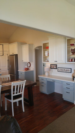
    I love Oyster Bay on my kitchen cabinets. It is a very live-able (for me) blue grey. Not sure how that translates in natural light though. I think a shade or two darker on that color strip would be gorgeous outside--like SW Retreat or Geyser Steam. I think the advice to take a sample to compare to the neighbors' homes is good! I think ordering and paying for the actual Hardie samples is a must too. In the long run, it will be a very small part of the expense of siding your home, and so worth it to get it right.


    at home · More Info


    Kim thanked highdesertowl
  • 6 years ago

    The OP started at a place of wanting a "beachy blue-green", but to me none of these choices look like that. They all look sage-y. Are you sure that's where you want to go?

  • 6 years ago

    I definitely want a blue-green. Quietude does run towards the green side, but most of them lean one way or another, and I generally find (to my eye anyway) those that lean green are less “loud” than the ones that lean blue. I definitely am not looking for a blue-gray or anything slate. My husband works for SW and always says everyone sees color differently, and that is definitely true. (And he is also my expert color matcher and has a heck of an eye for undertones and matching colors from pretty much any source).

    It’s difficult to look at this color where the house/neighbors are bc it’s a vacation house three hours away. First world problem, I know. I think my next step here, as suggested by many of you, is do a really big swatch of quietude this weeken to see if I still like it when there’s a lot of it - or if it starts to look a bit bright, like the online pics.

  • 6 years ago

    Okay - when I was trying to match my Pella Door I asked for help where they sold Pella Doors - No help except giving me the brochure with the printed color sample. I looked online for information - no luck.


    So I called Pella. They told me that the matching color for their cranberry door was SW HGSW 3411 Winery Red. When I went to the SW store they told me they could have simply looked it up on their system.


    I would check with your SW paint store. If that does not work call Hardie. Someone knows exactly what color matches the new Hardie Colors.


  • 6 years ago

    My husband works for SW (and has for 20+ years) - he has looked in their electronic system and called every contact he has, and nobody has the color information for Hardie's colors. Also, my distributor called Hardie as well to try to get color information (or at least a set of their own samples that I could at least look at in person), and no dice...I have at least a couple weeks (I think) until my contractor needs to order the siding and in addition to doing a large board of quietude, I will probably order 3-4 more Hardie samples that appear to be "in and around" the color I want. (But it does irritate me to have to spend money on what should just start with a paint sample that everyone else gives you for free. Bad marketing/customer support on Hardie's part in my opinion. They are making it WAY too hard for me to use their product.) Thanks!

  • PRO
    6 years ago

    Quietude is one of my personal favorites, but I’ve only used it for interior walls. Have you heard of Visioneering Homes? Our service is the best way to see a color on your home before committing! Www.visioneeringhomes.com

  • 5 years ago

    Hi Kim, wondering what color you ended up choosing? I am in the same predicament. But I am thinking Oyster Bay or Silvermist.

  • 5 years ago

    I think we ended up with oyster bay. I’ll try to post a pic later. (We love it).

  • 5 years ago

    Here’s a pic.

  • 5 years ago

    Correction: we used repose gray...

  • 3 years ago

    Beautiful home! I’m in the same boat as you were when you initially asked the question. I have to make a decision on the exterior of our beach house. I’m leaning towards Juniper Berry (SW Quietude), but fear it may be too bright in the sunlight. Looking for a blue-green that’s not too bright. What made you decide against Quietude? Are there any other colors you would recommend? Did you figure out any other SW equivalents?Thanks to your comments I ordered Juniper Berry and Linden Green, but may get some more. Any help would be appreciated…thanks!

  • 3 years ago

    I love SW Comfort Gray, not actually gray, just a subdued, muted blue green gray, not as colorful as Quietude.


  • 3 years ago

    Oyster Bay is one shade darker than Comfort Gray


  • 3 years ago

    I figured out a bunch of the colors i have a pinterest board with them (i may still have it) i decided against quietude because it felot just a little darker/bluer than i ultimately wanted. however however, i dont think it would have been a bad choice had i gone with it . keep in mind the sun washes everything out

  • 3 years ago

    I do still have my board. Here are a few close matches (not all of them end up being exact).

  • 3 years ago

    And a few more

  • 3 years ago

    A few more. Not sure if these posted the first time…

  • 3 years ago

    Oh wow…this is awesome! I’ll go through them tonight and I’ll be sure to post a pic of the completed project!

  • 3 years ago

    This required a lot of work on your part…so, again thank you for sharing! Someone should give this to customer service at James Hardie.

  • 3 years ago

    Thanks Jen for your help too. I’m familiar with Comfort Grey. I don’t see a Hardie equivalent, but do for Sea Salt which is one color lighter.

  • 3 years ago

    I love sea salt as a color. Almost used it on the outside, but put it inside instead. Good luck!

  • 2 years ago

    The SW equivalent to Coastal Fog got cut off. Do you still have that information?

  • 2 years ago

    Do you mean London Fog? I don’t see Coastal Fog 🤷‍♀️. I ended up going with Boothbay Blue because it was in stock and we wanted to meet our deadline.

  • 2 years ago

    Coastal Fog is the last one in the first column (below Silver Strand) on the page that contains Polar Ice (middle column)

  • 2 years ago

    I'm will be using Barrier Reef (Dream Collection) since HOA said no to Coastal Fog.

    Cosmetic Peach is my door color.

  • 2 years ago

    HOA also said no to Juniper Berry.

  • 2 years ago

    I’m sorry I can’t help you. Maybe Kim will see this and respond. Good luck!

  • 2 years ago

    Here’s a pic. 6183. Conservative gray

  • 2 years ago

    Thanks!