Software
Houzz Logo Print
kylierohr18

Offset gross yellow tile, help!

6 years ago
last modified: 6 years ago

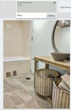
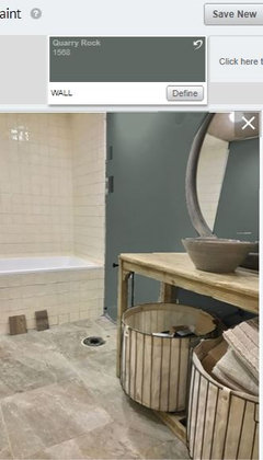
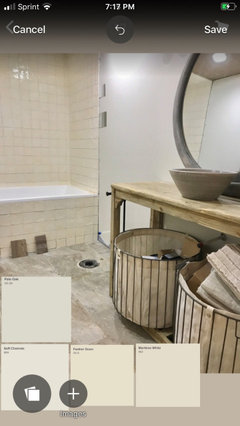
Need help with color tones and paint colour to help our basement bathroom look less yellow (the tile we bought looked white in store but when put up looks like a smoke stained yellow).

We painted the wall colour before we had tile or lighting so I have a feeling that needs to change.

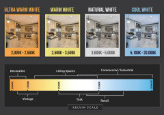
Lighting is 5000k daylight

Any suggestions welcome!


Comments (29)

  • PRO
    6 years ago

    Change the lighting first do LEDs in 4000K that will give you the true color of the tile then decide paint color

    kylierohr18 thanked Patricia Colwell Consulting
  • PRO
    6 years ago

    The lighting is 5000k Daylight and it’s odd how warm it still looks.

  • PRO
    6 years ago

    It's pretty just can't use a gray with it. Simply White, White Duck, Creamy, Delicate White - something in that range is going to make the tile look better.


    Or you could go with a white to match the tub like Extra White.

    kylierohr18 thanked Lori A. Sawaya
  • 6 years ago

    Is the tile grouted?, it looks weird. I would take a piece of cotton duck/canvas to the paint store and get a few shades lighter. The harsh white is just making it look off.

    kylierohr18 thanked J Williams
  • PRO
    6 years ago

    It was grouted but it was pure white grout which made it look even more yellow. We quickly scratched it out before drying

  • 6 years ago

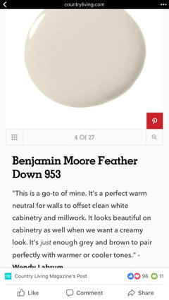
    I think the tile is lovely! Just paint the walls a creamier white such as BM linen white . Then you can bring in fluffy white towels as contrast if you want.

    kylierohr18 thanked Business_Name_Placeholder
  • PRO
    6 years ago

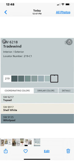
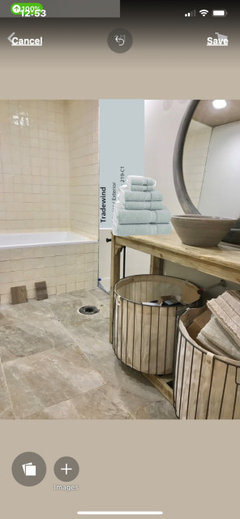
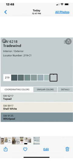
    Agree change bulbs to incandescent. See how that works. They are warmer lighting. Alternatively, go with soft blue green for spa feeling. Take a look at SW Tradewind.

  • PRO
    6 years ago

    Here is look.

  • 6 years ago

    That looks really pretty, like a beach.

  • 6 years ago

    Would keep the yellow tile abov e the tub in the "surround" area and try to grout it with a pale yellow grout.


    Would rip that tile off the front side of the tub and choose a different material altogether for there instead -- think stark white wainscoting, then use that same white for any trim and shelving in the room.

  • PRO
    6 years ago
    last modified: 6 years ago

    Love the color of the tile with the vanity. Perfect!

    I would keep the scheme going by hanging a wallpaper, like this crosshatch pattern vinyl grass cloth. I think it would be perfect with the tiles(s), the vanity, the mirror and sink. You could paint the ceiling blue.


  • 6 years ago

    The wallpaper suggested by JudyG Designs would look really good on the one wall behind the vanity (the most interesting vanity I've seen in a while... like it) but do consider a slightly lighter brown/tan paint for the rest of the room as putting wallpaper on the entire room could visually shrink the space.

  • 6 years ago
    last modified: 6 years ago

    To start - the 5000k lighting has the least yellow, any number lower than that will enhance the yellow.

    I would not change the lighting unless you want the tile to appear more warmer, more yellow.

    It is a creamy, yellow white vs bright white and actually goes nicely with the vanity.

    The flooring has a lot of grays and having the warm creamy yellow next to the cooler pinker grays and greens in the floor doesn't work well.

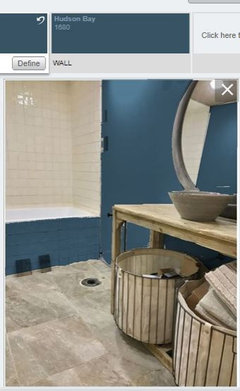
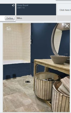
    I agree with Flo that a blue/ blue green is your answer, but I would not go soft. I think soft adds another pale element that competes with the other neutrals.


    I would go bolder/darker


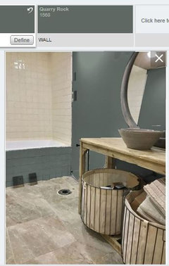
    and I would use the same color on the tub apron


    kylierohr18 thanked Jennifer Hogan
  • 6 years ago

    For some reason one of the pics did not load - it is there if I hit edit, but not on the displayed page, so here is the one with the apron and wall in the greener tone


    kylierohr18 thanked Jennifer Hogan
  • 6 years ago
    last modified: 6 years ago

    It's the wall color that's odd man out. the tile is gorgeous, and so are the other items.

    5000K is like daylight, almost on the blue end. 4000K is more natural.


    if you painted your wall another color, it would look perfect. Any of the blue toned colors will just make the tile look more yellow. The current color you have is a blue/gray, and your lighting leans blue. It's a very cool wall color and the other elements are warm. that's why it doesn't work.

    love the vanity and floor tile. try and match the warmer gray tones in the floor tile if you want more of a monotone type look to the room. You could go w/the creamier linen wall colors if you like. Or

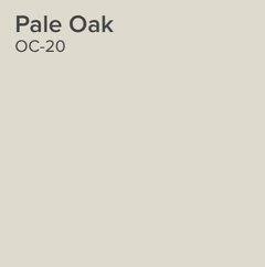
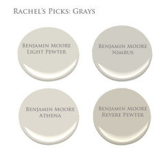
    Try Pale Oak, or Light Pewter. they're warmer grays that won't make the tile look yellow


  • PRO
    6 years ago

    Is that a new tub? If so, would you mind sharing which make it is?

    kylierohr18 thanked Design Girl
  • 6 years ago

    yes, 5000K is HARSH. it's definitely on the blue end of the spectrum. it's basically like corporate office lighting and makes any room feel colder and depressing. I feel like it belongs only in workshops and garages.

    I agree to the comments above to look for 3,500 - 4,000K LEDs, and also to change the paint color.

  • 6 years ago

    Please don’t use blue in this lovely bathroom. I am not usually adverse to using color but I love the wonderful mix of rustic and calm, soft tones you have in here! There is enough warmth in the beautiful stone floor so embrace that tile and be sure to show us when it’s done!

  • PRO
    6 years ago

    If you want to go mono, take a tile to paint store and color match it for walls.

  • 6 years ago

    There is a lot of light bulb manufacturers pushing 4000k lighting. There description may or may not be exactly scientifically correct.


    They call 4000 neutral, 3000 warm and 5000 cool.


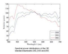
    Per the CIE a perfectly balanced white light, having equal wavelengths of all colors is 5455 K.


    5000 will not be blue - it is whiter than what most people are used to, but it is not blue.

    4000 is whiter than the old Incandescent lights, but is not neutral - it is actually very close to the color of moonlight (4100 k) and will slightly favor yellow hues

    6500 favors blue hues.


    "CIE (International Commission on Illumination)Illuminant E This is a hypothetical reference radiator. All wavelengths in CIE illuminant E are weighted equally with a relative spectral power of 100.0. Since it is not a Planckian radiator, no color temperature is given, however it can be approximated by a CIE D illuminant with a correlated color temperature of 5455 K. Canonical standard illuminant D55 is the closest to match its color temperature."


  • 6 years ago

    I am not saying that 4000 k lighting is bad. It is actually a nice compromise for many homes, but we should stop calling it blue or calling it cool. It is cool in comparison to 4000 k, but 4000 k is warm compared to 5000 k and both are slightly warmer than a true white balanced light of 5455 k.


  • 6 years ago

    I love this bathroom! Please don’t change that tile. Once you settle on the perfect new neutral wall I’d say bring in more white so that doesn’t look like the odd man out. White towels, maybe a white ceramic vase or bowl on the counter. Lovely!

  • 6 years ago
    last modified: 6 years ago

    Jennifer Hogan there's the data behind it, but there's also just the feeling certain light gives a room, esp when we're talking about what's available at Lowes and Home Depot. I think that when most of us say "blue" we really mean "cool toned" (and in this case, too cool toned). personally, I will never love the look of a 5000K bulb in a room. it's either blindingly harsh, or if you used dim bulbs, can make the room feel sad and grey like the way a jail cell is lit in a tv show.

    I especially hate it in a bathroom because it makes skin tones look ghastly. how much fun is it to look in a mirror when you're in a public bathroom lit with fluorescent lighting? a 5000K LED has a very similar effect.

  • PRO
    6 years ago

    My sentiments exactly B F. I am so over LEDs in any case. They are fine in some applications, but generally, just too stark for me.

  • 6 years ago
    last modified: 6 years ago

    BF - like I said, I am not saying 4000 k is bad, it just isn't truly neutral.

    I don't necessarily agree that 5000 k light is sad and gray - it is the color of sunlight at 2:00 in the afternoon, but it is more difficult to get a good CRI at 5000 k, so that may be your point of reference. A high quality bulb like CREE with a CRI of over 90% will render colors beautifully.

  • 6 years ago
    last modified: 6 years ago

    Flo Mangan -- I hear ya. back when people were switching off incandescent, I did a bunch of comparisons to figure out what is so awful about CFLs and LEDs. I realized a big difference is the shadows! incandescents give a soft diffused edge to a shadow. there's something about the hard edge CFL and LED shadow that really kills a room. so nearly every fixture in my house has some kind of cover to diffuse it -- whether that's paper, white acrylic, frosted or white glass, etc. it helps a lot. that, and appropriate color temp. I feel like LEDs have come a really long way though. when I first bought them, they were so warm and dim. practically orange. they've improved a lot!

    Jennifer Hogan I agree that 4,000K isn't truly neutral. but I personally think a room needs just a tinge of warmth to feel good. just like how most people don't go for true white paint. it's just a personal preference. it's kind of like the difference between the sunlight coming in from north vs south facing windows. I'm always going to prefer south!

  • PRO
    6 years ago

    Thank you everyone! and the tub is Swiss Madison.

  • 5 years ago

    You might consider a pale green for the walls (or for an accent wall) or even a beach green blue -- perhaps Medium Aquamarine -- for your wall color. Green and yellow go well together and the right color of greenish blue would likely create a cream vibe rather than a yellow vibe..

    Paint Color Schemes from Better Homes and Gardens.