Software
Houzz Logo Print
sab1948

Help with paint color

13 years ago
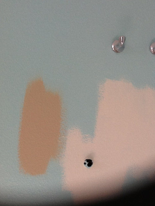
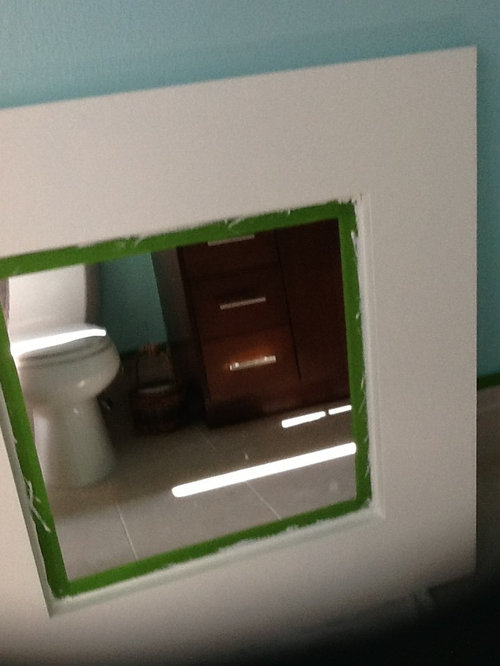
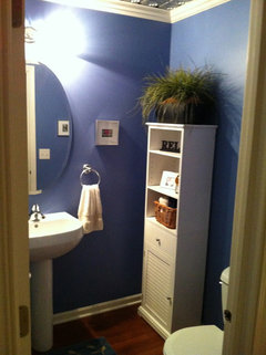
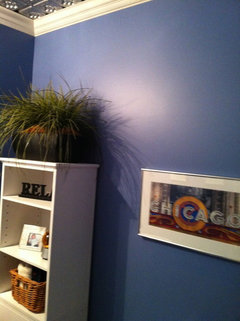
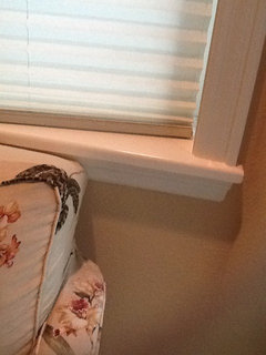
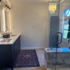
I have a small guest bathroom and I really need help picking a color. Trying to go beachy / coastal. Painted an ugly gold metallic 36/36 mirror white. Painted the entire bathroom on Tuesday balmy seas by Behr. When it was done, I hated it. Picture will not show you how ugly it is, but picture peptones bismal pink in greenish blue. You will see two other colors I have put on the wall and I don't like those either ANXIOUS TO GET THIS DONE

Comments (75)

  • 13 years ago
    Is BM worth the money. It's double Behr price and I've had great results with Behr
  • 13 years ago
    Here's the Palladian in our bedroom here in CT.
  • 13 years ago
    Very pretty. Can I ask, do you use flat, eggshell. Satin sheen or other. Thanks again
  • 13 years ago
    It's eggshell finish.
  • 13 years ago
    BM Sidewalk Grey might be a good choice. It's a fresh, clean blue-ish grey. Looks awesome with crisp white trim and accents. Beautiful!
  • 13 years ago
    I used Nantucket fog in a bedroom and found it to be a very "in your face" kind of blue. But it was also a very bright, sunny room. Something with more gray / cooler undertones might better serve your purposes.
  • PRO
    13 years ago
    Paint the bath in a cool grey blue and pull art and towels, accessories in the coral for highlight. I love BM Grey Owl, it's a great cool toned bluish/grey that works well with corals, and coastal colors.
  • PRO
    13 years ago
    What works for one powder room won't necessarily work for another. You need to see the paint color in context to your own room. For example, Palladian Blue which is a lovely, workable color in most rooms, will look "off" with your counter top. Your counter top trumps everything because the undertone color is so strong. So have your counter be the jumping-off point for your paint color.
    And when choosing a paint color that will cover all four walls, go a shade or two grayer than what you "think" you want. A color intensifies when it bounces from one wall to the next. So that peach that you painted as a sample color? The undertone is good with the counter top, but it's such a strong hue, you'll tire of it soon. Go grayer and it becomes more neutral, more sophisticated, and a more livable color. If you think of natural, beachy colors, they are washed out. And grayed down. Driftwood, shells, sand...
    Another help in choosing a paint color, would be to paint out the wall color behind your color sample with white, THEN paint your sample color over that. Or paint the sample on a piece of white board, leaving a large white frame around the sample color. You will be looking at the sample color in a purer context - not influenced by the color around it. Good luck.
  • 13 years ago
    Have you tried Farrow and Ball colours? Use Estate Emulsion which gives a soft powdery effect. You can get advice about light, W/S/E or North facing rooms and there are reviews from people who have used them and the effect they give. Try 'Borrowed Light' for a beautiful, pale blue that is not cold looking or 'Parma Gray' with white woodwork. Gorgeous magical colour.
  • 13 years ago
    last modified: 13 years ago
    All three of my baths are painted Sherwin Williams "Beach House"- here is a sample I think it might compliment your vanity top- http://www.myperfectcolor.com/en/color/743_Sherwin-Williams-SW2051-Beach-House

    Add the beachy look by subtle nods towards the beach theme in your accessories
  • 13 years ago
    We've used both BM paint and Behr and tend to like the Behr better. My local Home Depot has many of the BM color formulas on file. So I tend to choose a color from the BM palette and then have it made in Behr. Our closest BM store is a good 45 minute drive.
  • 13 years ago
    I used Sherwin Williams Sea Salt in my three bathrooms. It's relaxing and almost neutral, easy to add or change decorating colors. Take a look at it.
  • 13 years ago
    Thanks for all your responses, the coral color you see is actually parchment. It's so deceiving. I'm going broke on samples. Lol.
  • 13 years ago
    I like the idea of blue/gray. Also you might look at a lt. blue w/a green tint - not quite aqua. I really liked those stripes up a few postings. I've painted several rooms with one wall one color and the other three a contrast. My small powder room has a dark green wall (behind the sink with a framed mirror that has some green in it) and 3 lt. taupe-y ones, altho it has been 8 years and I'm now ready for a change. Depending on your budget, you might look at the offerings from American Clay; that's what I'm looking at for my powder room. Also, if that counter top is a sticking point, you might have to consider changing it. You have heard that houses are called money pits???
  • 13 years ago
  • 13 years ago
    i have remodeled 5 houses in the past 15 years from the studs out. if you are set on just paint, i would strongly recommend WALNUT HILL from Ace Hardware, believe it or not! of all the wall treatments i have done, this one simple paint color gets the most attention. it is mercurial, like the light. it looks, by turns, foggy blue, green or gray. i think it would go well with your countertop--the color you choose needs to be earthy, not pastel-y.
  • 13 years ago
    Irb945, I am going to check that color out too! thanks.
  • 13 years ago
    I'm not a gray paint person for walls. Looks too cold for me. I'm a warm color person. But for your gray floor, gray might look good with white accessories. I notice you have stainless faucets. I have wood floors with beige and brown walls in the hall entering into the half bath and I used a burnt brown color on the walls in the half bath. It scared me when first done, but I have dark wood cabinets, gold framed mirror, white accessories on the wall other than pictures like Tuscan style on wall and colorful rug. I love it. It has become my favorite space.
  • 13 years ago
    Don't you think that choosing a color has nothing to do with name or color on the sample, but the context, the light, the counter and so on? Do not hesitate to go with a color specialist: they rare but so essential!!!
  • 13 years ago
    Hello Sab1948 - I also LOVE anything ocean, beach, or seaside but remember that blue is (my opinion) one of the hardest colors to paint on a wall. I think what is throwing you off is the brown cabinet. Blues go well with pale weathered grays or whites but brown is difficult. That being said if you think about the surroundings of the seaside you will see a lot of greenish hues - and green pairs great with brown. I would try some PALE greenish yellows. Maybe something like Pale Sea Mist from B. Moore? Get at least 20 sample and tape them to the wall (various colors of pale greens) to see which works well with your lighting. From there you can then start to put chach in the room. I saw something recently on a wall that had wood carved whales that were situated in a circle (24" ??) I personally have a bathroom that I made more fun beachy. I put a distressed shelf above the window and extended it to the adjacent wall and put ceramic crab on it as well as a lobster crate with wine bottles in it, old fishing lanterns, ceramic starfish (classy - not cheesy). These items are great for color pops as well. If you get stuch I could take a pic of my bathroom and post it for you. I also distressed the back of the door to look old. Have fun with it and take time to do it. Real life beach pics work well too, especially when they are done in black and white. Hope this helps. Take some pics when you are finished!
  • 13 years ago
    Vielavie, you are correct going w/a colorist although they are not rare but adds cost to your budget.
  • 13 years ago
    P.S. Please do not look at Pale Sea Mist online - it IS NOT THE COLOR IT SHOW ONLINE AT ALL!
  • 13 years ago
    I also suggest not matching the countertop. Set if off with either an off white (with no yellow tones) or a spa blue.
  • 13 years ago
    Unless you want high drama in which case I would use a rich metallic cooper paint by Ralph Lauren. That would be smashing!
  • 13 years ago
    Would that actually do well in a bathroom, moisture?
  • 13 years ago
    I painted my powder room blue/gray a few months ago and I hated it too. It's now back to neutral.
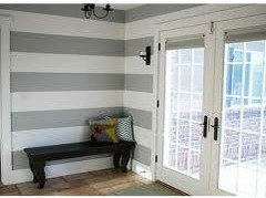
    When I think of coastal/beachy I think of shells. Consider a warm white in a wide stripe pattern painted with matte/satin finishes alternating. Bring your colors in with towels and other accessories. Consider painting the ceiling a sky blue (very pale) for a subtle point of color and a visual lift on the ceiling to make a small room feel larger. I'm assuming your ceilings are not vaulted in there.
    Good luck.
  • 13 years ago
    I am a huge Candice Olsen fan. She has always said that a small bathroom is a perfect place to go with a bold color and I concur. If I were looking for beachy as you are, I would go with a vibrant Aqua. I am thinking Carribean vibe.
  • 13 years ago
    For ruaware. if you're asking about moisture and American Clay, it's not a problem.
  • 13 years ago
    It might also be time to consider wallpaper, at least on one wall, then pick up a color from that for the other walls. I did a tiny - 3-1/2' x 6' - powder room in a light pink & metallic huge flowers. All walls. It has been over 20 years and I still love that paper.
  • 13 years ago
    I just painted my bedroom SW rain.....matches the porcelain blue color from Pottery Barn...you could try that.
  • 13 years ago
    blue/gray might be more of a warm tone, I would stick to a lighter gray to open up the space. Gray still matches with almost anything.

    Here is a thought, gray and white stripes on the long wall of the bathroom behind the toilet and sink.
  • 13 years ago
    Just a thought, not my style, but it does look nice.
  • 13 years ago
    Keep it in a soft earth tone. Sage, smokey-blue, sand or slate grey.
  • 13 years ago
    Hey Sab. Just a thought, I too was looking for coastal, beachy, but in a formal space. My floors are dark hardwood in the PR, thank goodness for no grout! I'm all about supporing local artists so I went into my collection to find several hand colored photos, had them matted in white and framed in chrome to hang "gallery" style over Behr Windsurf Blue. Washed out colors, corals, accessories from Target', will always look awful (kinda like all your friends PR?) Go classic, blue and white, silver & crisp white accents. My embossed silver ceiling tiles were imported from India & framed by white crown moulding but I think Windsurf Blue with chrome and crisp white will get you a PR to be envied. Good Luck!
  • 13 years ago
    Try Kelly Moore Beach Bum. This color is sophisticated. Make sure it is dry when you see it because it looks beige when it is wet, then changes to blue/green gray when it is dry. It is a light blue/beige/green/gray and goes with everything. It changes with the light. I have it in my entry way, living room and dining room.
  • 13 years ago
    Find wall art that you want to put in the bath room then match one of the colors for your wall color. This will give it a 'custom' look. :)
  • 13 years ago
    Rereading some of the postings about color reminded me that we needed to paint our church. A group chose Rootbeer float. The pastor painted a sample on the wall and it was PINK! By the time he'd painted various other samples on the wall, we ended up with what I call baby poop brown. Obviously not my choice. It's nice that paint stores now sell 2-4 oz. samples so you don't spend a lot of money painting something you'll hate.
  • 13 years ago
    Why do you want peach? are you trying to match marble on sink? Try a troupe. Muffin tan by Ben Moore try that one or a more tan tone.
  • 13 years ago
    Trav. I don't want peach. That color that looks peach is parchment.
  • 13 years ago
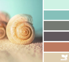
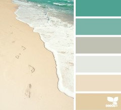
    The website below has many color palette options inspired by the beach / seaside...
    http://design-seeds.com/index.php/search/category/the-sea
  • 13 years ago
    Try a darker blue and add a lot of white and tan accents. We used Behr Paint and Primer in "Waterscape 530F-5". All out accents are White and Tan with beach art on the walls. Looks Great.
  • 13 years ago
    I love the coastal colors too and found lots of great color pallets on . http://design-seeds.com/index.php/home/entry/coastal-tones1. I'd love to see what you decide on.
  • 13 years ago
    I just used ballet slipper by Martha Stewart Living in an Olympic One base. It is a lovely shade of peachy pink. I wanted a pink that would feel serene. It is not at all pepto which is what I see so often when pink is chosen. It is warm and neutral and cheerful. My perfect shade of pink. I think it could feel very coastal.
  • PRO
    13 years ago
    I am sure you have gotten enough advice, but cool colors in the bathroom make you feel cold. Remember you are naked in there, and you also want something that looks good with skin tones. Beware of any color that is too fleshy (gag). Beige may seem like a cop out out to some, but it is sophisticated, warm and comfortable, and you can accessorize with other colors. Find a few different shades of beige (if you like that idea) and try it out.
  • PRO
    13 years ago
    I have never had luck with Behr paint colours. I would recommend using Benjamin Moore colours.
  • 13 years ago
    Wow! You sure have a lot of paint color advice here. I'm thinking you may have way too much. Try to walk away from the project for awhile, to get back into YOUR creative zone.

    Here's a paint tip that I've always found helpful, especially for resurrecting colors I was SO SURE I'd love,
    but weren't quite there.
    Add some black .
    This is what designers mean when they say " grey up" a color , or formula. Just remember to keep track of how many drops, or ounces, etc. that you've added to the formula, or can, so that it can be duplicated , if need be.
    Good luck. And for what it's worth.. Beachy can just look tacky when overdone. I agree with some of the others,
    Less is more. Organic, sparkly, fresh........
  • 13 years ago
    Beach Glass by BM is a great color
  • 13 years ago
    I used Benjamin Moore 'Yellow Squash' in my bedroom. I was looking for a warm beige. I love the color. It shows a yellow beige on the card, but it has very pink undertones, lending a soft peachy candlelight look. It's a very relaxing color. I used the lightest color on the color strip, (Woodland snow 2161-70) for the woodwork. I used high gloss for the trim work. It looks like a creamy white and matches the color tone. I would use a silver or gold (or both) wood mirror. You could do that traditional or modern, depending on the look your going for. Good Luck!
  • 12 years ago
    Bulldogs mom, I bought a sample of palliative blue. Loved it on the stir stick mouth it on the wall and it looks gray. I now have 5 different colors on the wall mom wondering if it could be too much light coming from vanity light. It's only 3 small bulbs. BTW, I had to take an unexpected 2 week break, but I'm back and need help more than ever. My last try will be tomorrow and if that doesn't work, it's getting painted WHITE and ill reprint my white mirror