Software
Houzz Logo Print
lvgorman

Dining Table Paint Color

6 years ago
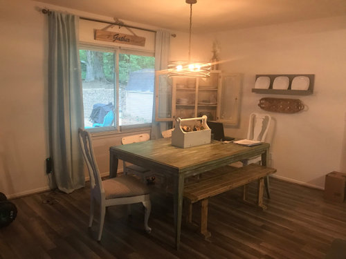
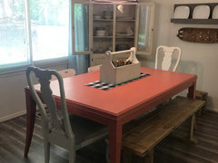
This is my current dining room. I want to repaint the table. It was given to us, and needed painting in the first place, but I haven’t been happy with the green color I picked or the way the curtains look with it. Our house is mostly white with colorful accents...somehow lots of blue and yellow, but some other colors as well. I thought about navy blue, since the chairs have a white and navy ticking fabric on them, but I feel like that will be too dark. Coral has also come to mind too. I wanted to stay away from white since the walls are white. I’m just sort of all over the place and just can’t decide! Thoughts? I’m not afraid of color, but also fine with more subtle colors too.


Comments (15)

  • 6 years ago
    last modified: 6 years ago

    What a charming room! I really like how you’ve mixed furniture.


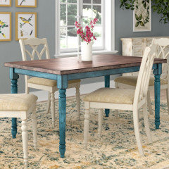
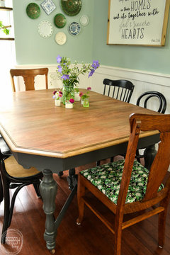
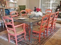
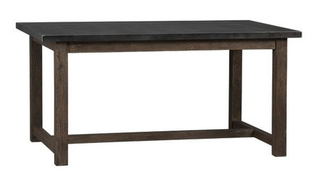
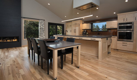
    One idea is a wood stain on top, color on bottom:


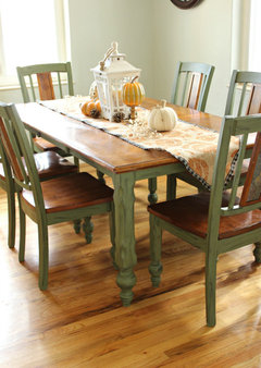
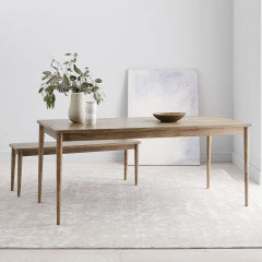
    Another idea is doing a cerused finish on either the top, or all. There are lots of colors/tones you could choose from, this is an example on the West Elm site:


    https://www.westelm.com/products/modern-farmhouse-dining-table-carob-h3999/


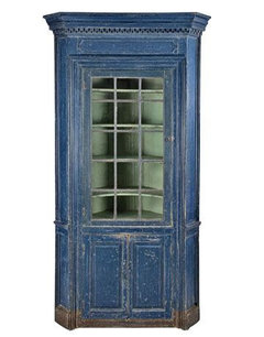
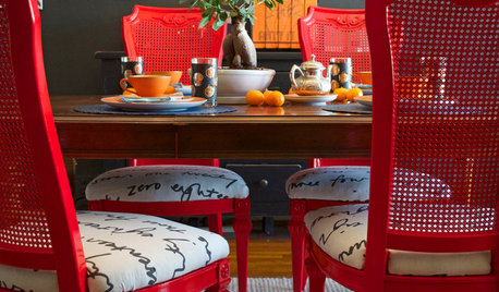
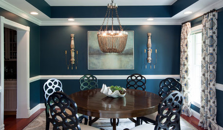
    Or you could do the chairs in brighter colors (but I really like how they look now):


    .


    I hope you show us what you decide!

  • 6 years ago
    last modified: 6 years ago

    I totally understand! I always have that problem, too. :)

    Its hard to say without seeing all of your house, but what about a purple? Not a bright, but more of a “dusty” muted tone? Or bluish-purple?

    Do you want to slap me for adding another color to the mix? 😁

    I’m not on Pinterest, but found these pages doing a google search:

    https://www.pinterest.com/VSRestoration/purple-painted-furniture/


    https://www.pinterest.com/generalfinishes/purple-painted-furniture/

    And again, maybe wouldn’t work in the context of the rest of the house. But they sure are pretty!

    Can you do mock-ups? If so, it might help to get pics of several angles/lighting, and mock-up colors you like in there.

    Good luck!

  • 6 years ago

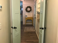
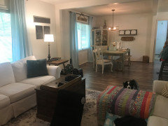
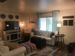
    Here are some additional pictures. The dining, living, and kitchen are all open...the Kitchen is a mess so I didn’t get a pic of that, but it’s white cabinets on top, light blue on the bottom. The other is the entry way looking down the hall...we live in a rancher so all one level. I love the purple! Not sure what my husband will think😂! I want to do some other accent pillows on the couch to draw more colors like the quilt thats on the couch...which does have purple in it!


  • 6 years ago

    Thank you for showing me ... I love your house and decor! So, so charming, beautiful, and cozy. ❤️ You have a great eye for colors and textures.

    Ooo, I see some purple in that quilt. 😉

    I hope others will chime in! I haven’t been much help — I’m like you and love ALL the colors!

  • 6 years ago

    Thank you! My husband actually seemed ok with the purple🤷‍♀️🤣. I think he’s probably just tired of hearing me talk about it!🤣

  • 6 years ago
    last modified: 6 years ago

    I like the idea of the two toned. However, it is hard to really tell for sure, because of your yellowish light bulbs. On my monitor, your walls look very cream color and the yellow light bulbs, seem to cast a different color on everything. Please change your bulbs to a daylight type at least 4000k led and then post a new picture. Very pretty house.

  • 6 years ago

    Yes, the lighting is terrible! I have those vintage bulbs in several fixtures around the house and they are terrible! I don’t have any normal ones laying around to change them out right now, but I definitely have new bulbs on the list! It makes things feel so gloomy. But yes, the walls are an off white color (quail egg by Valspar).

  • 6 years ago

    The yellow lights also make it look a bit gloomy, and I can tell by the rest of your house, that your house is not gloomy. Have you thought about the table painted the color of the draperies in your living room. It would tie the two rooms together, and they are a very pretty color.

  • PRO
    6 years ago
    last modified: 6 years ago

    I like the table as is and I like the painted Queen Anne chairs. My suggestion is to replace the bench and side chairs.


  • 6 years ago

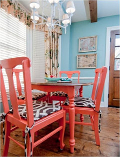
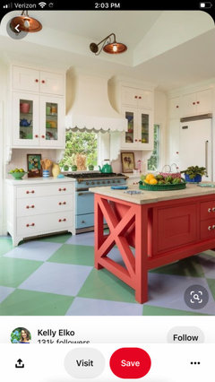
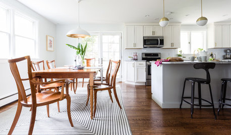
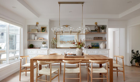
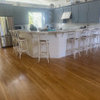
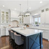
    Thanks for the suggestions! I think I’m going with coral! 🙂 I love Alison Krandle’s designs and this kitchen she did!

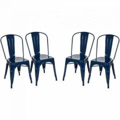
    I found a color that matches the kitchen island here, and I think that will compliment the blue curtains, and brighten that space up. I love the idea of navy metal chairs to replace the others, but the bench was built by my husband so I plan to keep that☺️. The chairs are from the barn behind my moms house. They are super old and not very stable, so later down the road when the budget allows I will definitely look into the navy ones. I think that color would compliment the coral and the blue as well!

  • 6 years ago

    Oh and I just realized I misspelled her name! Kandler, not Krandle!

  • 6 years ago

    All finished! I love how it turned out! I’m working on refinishing the bench now...not sure if I want to go with a natural stain, darker, or maybe even black!?! Suggestions? The finish on it now is an antiquing wax.


  • 6 years ago

    I love it! Great job! My opinion on bench: not black ... I like the idea of a natural stain. I think it’d look more cohesive with everything else.

    You are so talented!

  • 6 years ago

    Thank you! Yes, I’m thinking natural will look the best too!