Software
Houzz Logo Print
denise_boyce1

Does this stone have the wrong undertone?

6 years ago
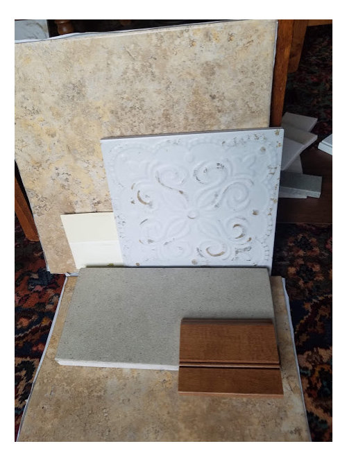
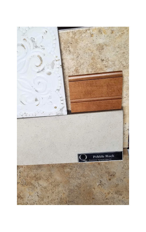
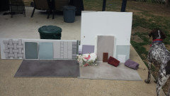
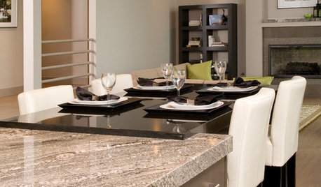
Is this counter too blue? It does have taupe and cream hues but I'm thinking it reads too cool with all my other warm choices. Thanks


Comments (27)

  • 6 years ago

    So the tile in the back is your floor, and the counter is flat? What’s the white tile? Is that backsplash? Is there anything that’s already installed? The tones area meshing well together.

    denise boyce thanked hemina
  • 6 years ago

    I find both the counter and the embossed tile too cool.

    denise boyce thanked Susan Murin
  • 6 years ago

    Typo: area= aren’t meshing well together. I agree with Susan.

    denise boyce thanked hemina
  • 6 years ago

    Agreed. The white tile and the countertop materials are too cool with your floor tile and cabinet selections. Since your floor tile is rather busy, you will mostly likely need to choose a countertop that is solid with no flecking, otherwise they will compete with each other.

    denise boyce thanked megs1030
  • 6 years ago

    your cabs and floor look good together. (warm)

    counter (cool) and b/s (style) , not so much

    your floor is 'busy' so i would go with 'quiet' counter.

    bring your floor & cab samples with you to the stone yard/counter store and go from there.

    denise boyce thanked sprtphntc7a
  • 6 years ago

    You say “all your other warm choices“ Does that mean the tile is not installed yet? If not installed, I would strongly consider a less busy floor tile. This pattern can look pretty in one tile, but over the entire floor can be too much. Most ID, Architects, etc would not choose this tile, but stick with a more uniform or subdued pattern.

    denise boyce thanked dianeski
  • 6 years ago

    If you are planning to use all these materials in one space, I hope you think again and eliminate the icy blue-white tile first. Keep your materials down to a maximum of three which actually work together. If you have not done it before, get some help from someone who has experience.

  • 6 years ago

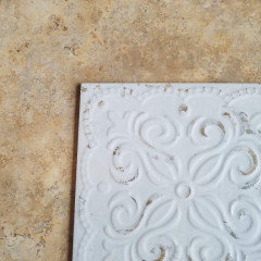
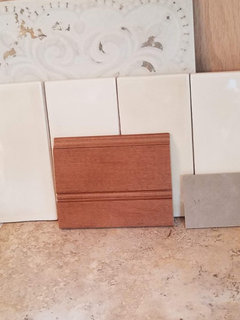
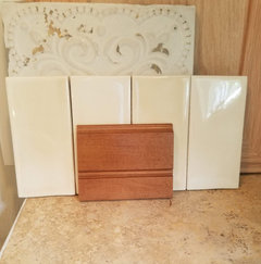
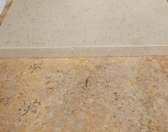
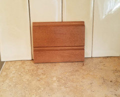
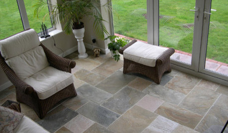
    So the back splash really to me reads as a white, it has warm brown distressing. Posting pictures without the counter, please comment if ya'll still think it's too cool. I took some photos of it with a buttery yellow tile and I think it looks more like a neutral. I love this tile BUT if it clashes I'll just stick with the subway. The counter is my sticking point. I can't seem to find a plain warm slab without a lot of either flecks or veining. The small sample in pic2 is Silestone Coral Clay, it has brown tones with warm veins but still looks blue to me. I appreciate the help guys.


  • 6 years ago

    I see now that the distressing on the tile does coordinate with your floor tile. But the white in the b/s tile is still a cool, blue-white. I would suggest finding something else. Are you absolutely married to either? Honestly, I would suggest going with a simpler floor tile above all else.

    denise boyce thanked megs1030
  • 6 years ago

    I think it’s different and beautiful! Don’t go with the usual matchy- matchy! I didn’t listen to anyone’s advice cuz everyone wanted me to have a traditional earth tone etc. kitchen. I designed everything myself n even did Carrara mosaic tile on my backsplash myself when everyone said something else would be a better choice. I wanted it to sparkle under the light and it truly does. Even tho it was only my 2nd time tiling, I knew what look I wanted n it turned out BEAUTIFUL😍
    BTW☺️We get tons of compliments on the Kitchen now‼️I also designed my own giant island that ppl said wud be too big n have tiny specked quartz counters in black n my island counter is white granite w/bigger black, gray n some tiny gold specks.
    Go for it girl❤️listen to yourself👍🏼
    Do what YOU love afterall you’re the one that has to look at it forever

    denise boyce thanked Jenifer Bogan- Lillich
  • PRO
    6 years ago

    The tile is still too white even with the touches of brown/tan - and it is too busy with your counters. You will be better served with a plain subway.

    denise boyce thanked Design Girl
  • 6 years ago

    Design girl-Boring!!!!

    denise boyce thanked Jenifer Bogan- Lillich
  • 6 years ago

    Everyone has subway tile cuz it’s the safe way to go

    denise boyce thanked Jenifer Bogan- Lillich
  • PRO
    6 years ago

    No that's not true. Sometimes when people have a countertop that is busy with a lot of movement, it requires a quiet tile to co exist. It can be subway shaped, square, etc. In this case, because of the counters AND the floors, the backsplash needs to be quiet.

    denise boyce thanked Design Girl
  • 6 years ago

    Jennifer Bogan, you described a really interesting kitchen ... but then didn't show us what it looks like?

  • 6 years ago

    Sometimes everything you love doesn’t play well together. The white tile is too glaringly white - even with the distressing. The subway tile in the last photo looks good with the countertop. Not sure the floor fits into the picture so well.

    denise boyce thanked RedRyder
  • 6 years ago

    God only knows what color you are seeing when I posted the same pictures.


    denise boyce thanked Jennifer Hogan
  • 6 years ago

    If you can take everything outside on a clear day around 2:00 in the afternoon and look at it in natural daylight you should have a much better idea of how well the materials go together. You also want to set the vertical pieces on a vertical plane and the horizontal pieces on a horizontal plane.


    denise boyce thanked Jennifer Hogan
  • 6 years ago


    denise boyce thanked Jennifer Hogan
  • 6 years ago

    The confusion is coming with the first photo with the counter top sitting horizontal (as it would in life) in the first pic and then it standing vertical (like it never will). And then it is being influenced by (what I assume) to be the travertine tile colour.


    The BEST way to assess a counter top colour on the COUNTER (where it will live) and then place the floor tile on the floor (where it will live) and then the backsplash tile against the wall where it will live.


    Now that you have everything set up nice and neat you simply step back 10 feet and assess how each feature reads. If your current kitchen is throwing to much 'colour' into the air then simply lay a white sheet down and do everything again. The white sheet becomes your white backdrop. Now reassess from 10ft away.


    If you see a colour clash you remove that item and replace it with something else. Keep doing this until you have the right combination.


    Right now, you have two items clashing with the other two items. The distressed tile and the counter tops work well together....but they are fighting with the wood and the floor tile.


    Now you have to decide which GROUP to keep and which GROUP to get rid of.

    denise boyce thanked SJ McCarthy
  • 6 years ago

    Thank you for the comments. JB-L, thank you for the encouragement to strain away from the white shaker subway and marble route. lol I'm going for a look that fits my little old lady cottage sitting in a meadow.

    Jennifer the color is true on the left. Thanks for the photoshop, that's how I imagined it. I think everything goes great except for the questionable counter, sometimes it's all the way beige and then boom all of a sudden looks blue gray. Who knows what'll happen when two huge slabs show up. It's the pain in my butt because all the lighter slabs I can find run cool and into the blue white. My house was built in 1931 and I'm trying to restore the charm that was lost during an ugly remodel in the 80's. The distressed back splash tile is not really white, it is creamy off white and matte, it looks like white that was stained with tea. I love it because it reminds me of old tin. I'm going to take it outside and look in the sun, thank you for the suggestion.

    SJ my kitchen is black cabs and gold granite {not my design} I can't see a thing in there as far as true color with all the black and tan even with a white sheet sigh... thank you though. I'm gonna keep the floor and the stained wood the counter can go without a blink. The distressed tile...it's gonna hurt. lol

  • 6 years ago

    here's the counter and floor close up


  • 6 years ago

    what color would you go with if I use the yellow subway?


  • 6 years ago

    Do you have white or wood trim in the house?

    denise boyce thanked Jennifer Hogan
  • 6 years ago
    last modified: 6 years ago

    Following

    denise boyce thanked katinparadise
  • 6 years ago

    no, I have the original 1930's finish on all doors and windows. It is a varnish on Oak. The floors have been refinished though