

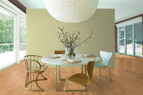
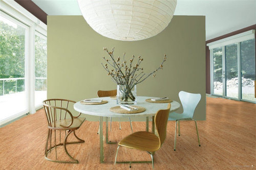
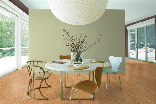
Help with cabinet color
6 years ago
last modified: 6 years ago
Sort by:Oldest
Comments (3)

Related Stories
DIY PROJECTSHelpful Hangers: French Cleats Support Projects Big and Small
From cabinets to birdhouses, French cleats hold projects securely in place
Full Story
DECORATING GUIDESDecorate With Intention: Helping Your TV Blend In
Somewhere between hiding the tube in a cabinet and letting it rule the room are these 11 creative solutions
Full Story
Storage Help for Small Bedrooms: Beautiful Built-ins
Squeezed for space? Consider built-in cabinets, shelves and niches that hold all you need and look great too
Full Story
HOUZZ TOURSHouzz Tour: A Modern Loft Gets a Little Help From Some Friends
With DIY spirit and a talented network of designers and craftsmen, a family transforms their loft to prepare for a new arrival
Full Story
KITCHEN DESIGNKey Measurements for Your Kitchen Design
Get the ideal kitchen setup by understanding spatial relationships, dimensions and work zones
Full Story
BATHROOM MAKEOVERSRoom of the Day: See the Bathroom That Helped a House Sell in a Day
Sophisticated but sensitive bathroom upgrades help a century-old house move fast on the market
Full Story
LIFEDecluttering — How to Get the Help You Need
Don't worry if you can't shed stuff and organize alone; help is at your disposal
Full Story
KITCHEN DESIGNDesign Dilemma: My Kitchen Needs Help!
See how you can update a kitchen with new countertops, light fixtures, paint and hardware
Full Story
SELLING YOUR HOUSE10 Tricks to Help Your Bathroom Sell Your House
As with the kitchen, the bathroom is always a high priority for home buyers. Here’s how to showcase your bathroom so it looks its best
Full Story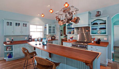
KITCHEN DESIGNHere's Help for Your Next Appliance Shopping Trip
It may be time to think about your appliances in a new way. These guides can help you set up your kitchen for how you like to cook
Full Story

Patricia Colwell Consulting
dan1888
Related Professionals
Concord Interior Designers & Decorators · Augusta Bathroom Remodelers · Brainerd Kitchen & Bathroom Designers · Plattsburgh Kitchen & Bathroom Designers · Portland Kitchen & Bathroom Designers · Gainesville Interior Designers & Decorators · Huntington Interior Designers & Decorators · Sioux City Architects & Building Designers · Carbondale Kitchen & Bathroom Designers · Lexington Kitchen & Bathroom Designers · Elizabeth City Kitchen & Bathroom Designers · Greenville Kitchen & Bathroom Designers · Edison Kitchen & Bathroom Designers · Glenwood Springs Kitchen Remodelers · Orange County Custom Countertopsdavid_danaanOriginal Author