Software
Houzz Logo Print
jboysma

Need help with colors

13 years ago
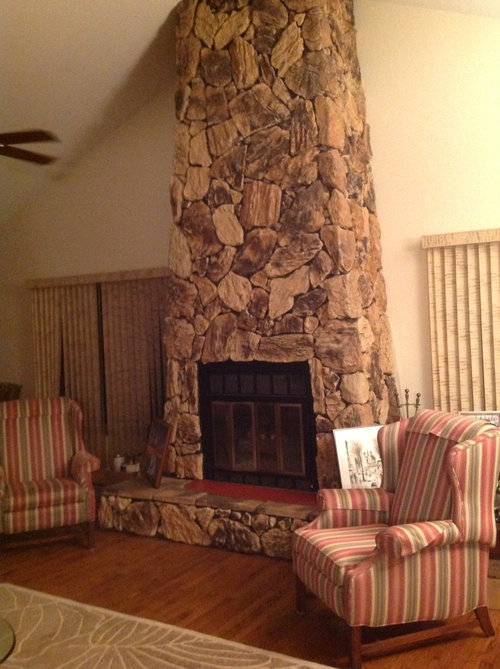
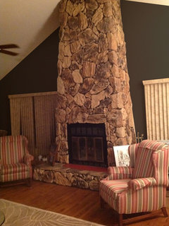
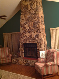
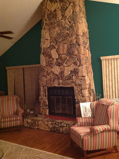
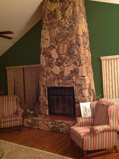
I'm redoing my great room. The fireplace is mostly brown stones. I've picked out three neutral gray materials for the sofa, two chairs and drapes. Since the FP has no mortar , could I use a dark gray almost charcoal in between the stones and put up a mantle with a large modern picture? Or do I have to do the room in shades of brown and beige?

Comments (39)

  • PRO
    13 years ago
    last modified: 13 years ago
    I would add a black mantle. Rustic if that's your style. Gray sofas will work. I like the coral color in the chairs to work with the grays. Maybe coral and gray geometric drapery for the windows. Artwork with your colors or a simple designed framed mirror above the mantle. Round works better for the asymmetry of the chimney.The mirror could also be brushed nickel or silver.
    jboysma thanked LB Interiors
  • 13 years ago
    I was leaning toward transitional or contemporary. All furniture has to work around fireplace. I suggested taking it down and got the strangest look from dear hubby. Love the idea of round mirror. Thanks again
  • 13 years ago
    I would choose a mortar that wouldn't stand out but there is no reason that you can't use gray for your paint choices. I think that it will really make the darker colors in the stone stand out and will be very pretty.
    jboysma thanked Kim
  • PRO
    13 years ago
    last modified: 13 years ago
    I wouldn't use charcoal color for mortar or any color that is too dark. You will see all the grout first. It will be a lot of busy movement. The rock is busy enough. I would use a light to medium gray mortar. That will assure that the rock is the focal point and the mortar is less obvious.
    jboysma thanked LB Interiors
  • 13 years ago
    I will stay away from dark grout just leave it without. Less work and thanks to you it will look better. FP is busy so new furniture must be neutral . Coral sounds good. It would soothe the browns in FP and look very nice with gray sofa and chairs. The room also has a dining room . Any suggestions for chair colors?
  • 13 years ago
    Highlighting the grout is going to make the FB look "cheap." Sorry. If it isn't already done, it may well ruin the look. As long as you get rid of those vertical blinds, anything else is a huge improvement.

    Actually, I'm not a huge fan of those coral chairs -- the color is warm, but sort of clashes with the stone. Gray walls would make the FP stand out, and it is gorgeous. I'd hesitate to break up its upsweeping line with a mantle or art. It is its own art. If you have to put something on it, consider a large wood or metal sculpture, something in iron, rustic, distressed, rough and almost primitive.

    Forget beige walls. Think about rich color. Deep rust. "Ancient Copper" by (I think) SW. A shade of chocolate. A shade of deep "gold" from the stone. Everybody paints gray. ( I wonder if the whole world isn't being done in shades of gray!) If you're doing gray furniture, rich color for walls would be a sharp counterpoint.
    jboysma thanked inkwitch
  • PRO
    13 years ago
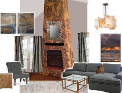
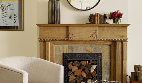
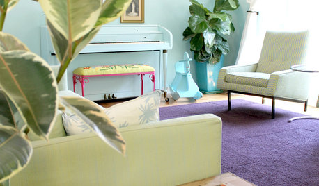
    Here are a few color options you may consider.
  • 13 years ago
    Would suggest something in greige that leans more heavily toward the gray in your fabric selections, if you've already purchased them. Here is a tutorial on greige. Then you can accent with all the color you want and change it when you want.
    https://www.houzz.com/magazine/going-greige-tips-for-choosing-this-all-around-neutral-stsetivw-vs~577375
    jboysma thanked decoenthusiaste
  • 13 years ago
    @spatialists: what is the brand and paint color of the one in the upper right of your four photos?
  • 13 years ago
    Apologies -- also inspired by LB Interiors mantel suggestion.
    jboysma thanked Rina
  • PRO
    13 years ago
    I agree with' inkwitch' everyone looks like they will have some sort of gray walls. Tired of gray walls too. There are thousands of other colors on a palette to choose from:)
    jboysma thanked LB Interiors
  • PRO
    13 years ago
    last modified: 13 years ago
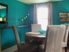
    I like # 2 color and I love the teal color in 'SPACIALISTS' example for the walls, if it works with furnishings and your taste.
    jboysma thanked LB Interiors
  • PRO
    13 years ago
    No problem Rina, your example is nice.
    jboysma thanked LB Interiors
  • PRO
    13 years ago
    Hi jboysma -- Since you've selected all your furnishings in grey, I don't think you need to add more as grout, making the FP even more of a visual buzz. Rather, I'd take that golden brown tone down into the room. Teak coffee and side tables in particular would look sharp with your stone. Remember that brown=bronze and grey=silver/mirror, so you can have lots of texture and sparkle here. Then step back and see if you need to add a bright accent -- I don't think you do, since the room is so richly textural.

    Here are some resources if anything here catches your eye:
    http://www.ebay.com/itm/Bubbles-Champagne-Wall-Mirror-Modern-Style-51-Tall-New-Free-Shipping-ltd-/190868646217?pt=Mirrors&hash=item2c70a86949
    https://m.rugs-direct.com/ShopDetail/Details/156286/Surya/Nuage/NUA1006/LightGrayTaupeOffWhiteBrown
    http://www.art.com/asp/mountshop/default.asp/_/mt--1/pd--18069386132/sp--a/posters.htm?PODConfigID=4990831&ui=908873C2C76F47E48436EEEDABEF1824
    http://www.art.com/products/p13897852958-sa-i4311753/tim-o-toole-kinetic-stone-i.htm?sorig=cat&sorigid=0&dimvals=0&ui=908873c2c76f47e48436eeedabef1824&searchstring=gray+brown&ssk=gray+brown&sby=all
    http://www.lampsplus.com/products/george-kovacs-alabaster-dust-glass-30-inch-wide-chandelier__24500.html
    (Cursor over photo to enlarge.)
    jboysma thanked Barnhart Gallery
  • 13 years ago
    The firepl. Is huge. No gray grout. It does not need any more attention. In fact I would remove the top half or dry wall in, all but bottom. Just paint wall and add mantel. Then add art. Way too busy for anything now.
    jboysma thanked Nancy Travisinteriors
  • 13 years ago
    Are you removing verticals?
    jboysma thanked Nancy Travisinteriors
  • PRO
    13 years ago
    last modified: 13 years ago
    I wouldn't go through the expense of removing any stone. If you add a simple design and simple design style with colors in art or simple uncomplicated mirror frame above the mantle/firebox, it will cover a lot of the stone. It will simplify the busyness of the stone and be beautiful. Get something large enough. The grout can be beige, creamy beige, light tan color. Soft and just there to work with it but not accent with a darker color of the stone.
    jboysma thanked LB Interiors
  • PRO
    13 years ago
    I love the chandelier from 'Barnhart Gallery'
    jboysma thanked LB Interiors
  • 13 years ago
    There are so many angles in that room ! The fireplace seems to be the focal point. It is already busy with the stones shapes and colors, no grout !. The windows on each side totally clutter the space. De emphasize the spaces on either side of the fireplace with flat window treatments that blend into the color of the wall. A simple sculpture or natural looking art piece on the rock would draw eyes toward the fireplace and make it feel less massive. A mantal is another angle not needed in the room. Either a very light or very dark paint on that wall would make the firplace pop. Plain simple solid colored funiture with accent pieces like pillows,throws, glass etc...drawn from the color palet of the stones would pull the space together and give a coheasive feel. Your gray furniture screams for color. Use the stone as your inspiration Corals yellows, greens. There may even be some blues in the stone. Can not really tell from the pictures. Have fun !
    jboysma thanked anwutzke
  • 13 years ago
    Believe me I needed these comments. Hired interior decorator and heard from her a month ago. All furniture is going including chairs and verticals. I'm taking the advice of most of you: no grout, accent walls in a deep color from FP, sofa and chair in shades pulled from FP, probably browns , love the mirror or sculpture ideas,. No colors are set in stone except... The fireplace and you are so right those are the shades I should work with.. Windows are being changed so it will appear to be a picture window with 1/4 on each side and 1/2 in the middle. With the drapes it should look like a picture window ,cutting out some clutter. I am so thrilled with your pictures and suggestions.
  • PRO
    13 years ago
    Sounds like a great plan, jboysma, and it will be beautiful.
    jboysma thanked Barnhart Gallery
  • PRO
    13 years ago
    Nice. Good luck! Happy decorating!
    jboysma thanked LB Interiors
  • 13 years ago
    I had something much more intense than the apricot. Something with more depth and richness for a wall color.
  • 13 years ago
    Don't keep me in suspense , inkwitch, what color?
  • 13 years ago
    Inkwitch, my drawing done you wrong!
  • 13 years ago
    Sorry, I was at work all day. Only now getting a chance to sit down.

    There are a lot of rich rust colors that might work. "Copper Pot"/SW "Butternut"/Valspar Or a warm, rusty brown. "Curry Powder"/Behr Deep warm gold. "Tapestry gold"/BM "Bronze"/Pratt & Lambert. Nothing I could post would look true on your monitor.

    Check out every paint brand you can find, pull a dozen chips, narrow it down. Buy samples. Paint patches. It'll look like a NYC subway for a while, but it's the best way to find out what color works. Because that FP has such definitive color, you can't just guess. You got to get up close and personal with the paint.

    Then you look at it for about a week, in all kinds of light. This is the best way to get it right and not have to do it again.

    The thing is, if you don't incorporate that FP within a color scheme, then it becomes the "elephant" everyone tries to ignore. It is stunning and an original. If you're too cautious about a wall color, it will just be a "miss" that almost made it, but never quite rises to the style level it deserves. Painting the wall around the FP may be sufficient if you choose another color for the rest that works. I'm not a big fan of "focus walls" as they tend to be both dated and limiting. However, it's your house. Don't let my preferences define what you want. With that much intense color, neutral tone furniture will work well. The grays you've considered will give it class and keep it from looking like a yard sale. Understated, maybe a bit ethnic (this could go well with some Oriental or Moroccan touches). Hope this helps.
    jboysma thanked inkwitch
  • 13 years ago
    Lots of terrific information to digest, inkwitch . Keep in mind this great room includes a dining area. I've always done focus wall. Maybe it's time to update . Tomorrow I'm off to grab paint chips and invest in some samples..I emailed the interior decorator and told her we should part ways, we're not on the same page. She quickly emailed with an apology. Now I don't want to hurt her feelings but... Anyway I'll think of something. Thanks again for all your help. I'll be posting hope you're around.
  • 13 years ago
    To bring warmth paint entire room flat taupe. Solid furniture in white, cream or taupe. Keep patterns and accent color in rugs and throw pillows and art. Be sure not to hang art too high a few large canvases would be great
    jboysma thanked Bonnie Hicks Charles
  • 13 years ago
    Barnyard gray from Benjamin Moore with an accent color such as a stone blue
    jboysma thanked Taramarie Robert
  • 13 years ago
    Me personally I'd go cream with the chairs and settie
  • 13 years ago
    Cream color would be to easy. What fun would that be? And dear hubby couldn't sit on the furniture. Although the paint choice should be last, the colors in the FP have to be taken into consideration . Once I decide that hopefully furniture colors will fall into place. Thanks for trying to simplify matters though.
  • 13 years ago
    GOod luck! And trust your gut. You'll know when it fits. (My litmus test for wall color is when I get excited about it. After dithering over various shades of brown, taupe and gold for my dining room, when I decided to paint it deep turquoise, I got excited, and it looks stunning!) You have to live there, not any of us. I'm excited for you. Can't wait to see what you decide.
  • 13 years ago
    last modified: 13 years ago
    That turquoise is stunning. I'll sample blue - yellows ; but the deep shade you picked is exquisite ! New York subway here we come! Thanks again
  • PRO
    13 years ago
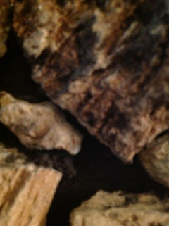
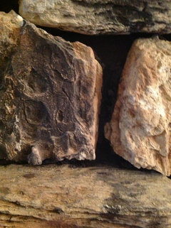
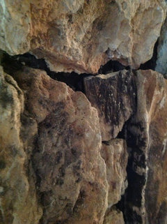
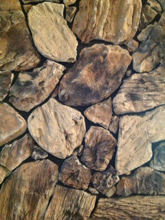
    I'm thinking that the stone on the fireplace may look too unfinished if you don't add some grout. I'm guessing ... what is making the f.p. stone look busy is the dark shadows that are created due to not having any grout. I feel it would look less busy if a light color of grout filling the void came closer to the edges of the stone, I think. Could you post a close-up pic? Thanks
  • 13 years ago
    Here's the close ups of the FP. Thanks LB
  • PRO
    13 years ago
    last modified: 13 years ago
    You're Welcome! I love the colors in the stone. I'm feeling that it 'does' look unfinished. It does create very dark grouting effect. Without grout appears busier.
    This is Before & After - gives a rough idea
    After - Upper top and right side are 'without' grout.
    Before - Without grout · More Info

    After - With grout · More Info
    jboysma thanked LB Interiors
  • 13 years ago
    Definite difference for the better. Now I just have to get a price on having it done. When the FP was built it was built from the top down so as not to get any cement on the stones. I would have to find someone who knows what he/she is doing. I'll look into it. We'll have to do a virtual lunch. As always thanks
  • PRO
    13 years ago
    Thank you jboysma! Wish we could have lunch :))