Software
Houzz Logo Print
neo_carla

Color Combination - Yay or Nay?

6 years ago
last modified: 6 years ago
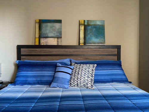
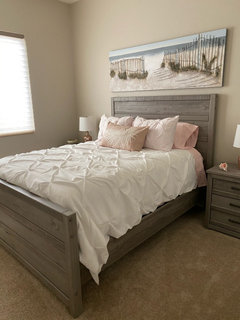
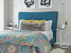
Hi - I have these canvases and was thinking of hanging them over a guest bedroom bed. Do you think if I add some pillows with colors from the canvases to the bedding, all the color combinations will mesh well? I'm thinking "Nay", but I'm not that creative with colors anyway. Your feedback/other recommendations would be greatly appreciated. Thanks in advance.


Comments (48)

  • 6 years ago
    In my opinion, the colors are not the main issue here but rather the competing and clashing geometric shapes/lines from the bedspread, headboard, and pictures. I don't think that those paintings go well with such defined stripes.


    I'd probably pair those paintings with some softer colors and less defined shapes surrounding them.

    Neo Carla thanked lejohnson89
  • 6 years ago
    last modified: 6 years ago
    Nay on those pics.

    They are too small for one, and the colors are not good either.

    You want your art piece, whether a print or textile art or whatever to be approximately 3/4 the width of your bed.

    If you are using two pieces, then the total width including the space between the two pieces which shouldn't be more than 4 inches at most.

    The height should be commensurate with the ceiling height as well.

    You don't want a small pic with a whole lot of wall above it, so that the wall above it visually dwarfs the picture.

    Why don't you bring the pillowcase to art stores?

    Another thing you can think about, since you like the natural texture of your wood headboard is textile art.

    A great wall hanging in a white or ecru, especially on a piece of wood would look marvelous on your wall color and would tie in with your headboard and the white of the bedspread.

    Look at this vintage kimono on sale at Etsy now-


    The colorways are perfect- Although its blue is almost too close to your bedspread, it is really perfect, because the blue is broken up by the white and the orange and green and red and light blue.

    The blue, orange, red and green make up a color tetrad on the color wheel With the greatest percent of color being the blue, then in descending amounts, orange, green and red, so there is harmony, not cacophony.

    Neo Carla thanked loobab
  • 6 years ago

    Nay, rethink color and size please.

    Neo Carla thanked tob123
  • 6 years ago

    Nay from me as well. The colours and patterns don’t work with each other for me.

    Neo Carla thanked sydneyfv
  • 6 years ago

    nay for above the bed. I wouldn't put anything there. but they may be fine on a different wall putting more distance from the bedding. I actually like the pictures more than your bedding though

    Neo Carla thanked Cheryl Smith
  • 6 years ago

    Nay ... too matchy and generic.

    You don’t have to match bedding colors. What are some thing you love? What are your interests? How is the rest of this room and your house decorated? Go from there.

    Neo Carla thanked Jilly
  • 6 years ago

    Nay

  • 6 years ago
    Nay

  • 6 years ago
    last modified: 6 years ago

    With all these "nays", we sound like a herd of horses!!

  • PRO
    6 years ago

    I actually do not like the bedding it looks like it belongs in a boys bedroom .not a guest room and nay for those pieces if you keep the bedding for sure. My opinion is a guest room should be a restful 5 star hotel feel .

  • 6 years ago

    I agree with pat. The bedding looks more suited to a boys room. I would look for new bedding with a softer look for a guest room. Keeping bedding more neutral as in a solid color allows you to change smaller usually cheaper things like pillows and art to totally change the look and feel of the room. More restful and comfortable. When furnishing a guest room think about what makes you comfortable on a trip and what nicer motel rooms have that make your stay enjoyable.

  • 6 years ago

    Nay. Sorry.

  • 6 years ago

    Nay. You could probably keep the comforter if you got some some nice crisp white sheets (or a contrasting color) turned down the sheets over the comforter, and some white pillow cases. The pics don’t work, they are too small and the colors are too muted. With the texture of the headboard and pattern in the comforter, I wouldn’t add anything over the bed.

  • 6 years ago

    Please remember...this is MY OPINION ONLY...LOL...LOVE the artwork and it's colors !! BUT...that bedding HAS to go !! Artwork has linear lines that compliment those in the headboard, so they work great, and teal colors are "restful" to the eye.....How about a CREAM colored bedding set ( NOT WHITE !! ) and then perhaps an accent pillow between the shams done in similar teal color?? You could also drape a teal blanket or "throw" across the bottom of the bed to pull it all together....In MY OPINION, this would give the room a soft, restful ambiance, with the artwork and other teal accents giving it a "pop of color", giving the room a "welcoming vibe"...I think I spy a night table to the left of the bed? A lamp with a teal base and cream-colored shade would look awesome there !! NOTE...if you're unsure of my suggestions, buy a sheet set for that bed in a cream color ( you can always use an extra set of sheets, right? LOL ) then drape the top sheet over the bed to get the idea of how that color would work with your existing artwork !! If you like the "look", THEN go ahead and buy a comforter set for the bed !! Good luck with your project, and please post "after" pics of whatever you decide !!

  • 6 years ago

    Wrong! The key word is focus. Pick something you love. Is it the headboard with its broad horizontal bands in brown? I’m guessing that the backdrop “pictures” might be something special, perhaps nostalgic to you. Are they well-crafted stained glass windows?
    I would go with them. Make sure the textures as well as the colours work together. The harsh brown bands in the headboard could be softened with a little DIY. Clearly the harsh blue in the bed cover would not soothe the eye as you enter the room.
    Focus, is it the beautiful headboard? There’s a lot you could do but get rid of the pictures and the bed cover. Walk into the room with a fresh eye and you will know what to do.

  • 6 years ago
    last modified: 6 years ago

    hah hah from an artist here. yay yay yay

    I like what you did, and I definitely like the canvases. But I would toss the graphic b&w pillow. I would be very tempted to use the bedspread as a foil for a beach vibe, with toss pillows in colors of seafoam, sky and sand -- which would give your canvases a Richard Diebenkon echo!

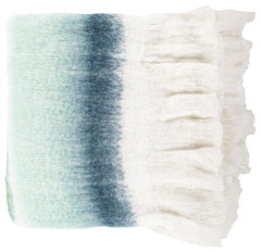
    Lanose LSE-1003 50"x60" Throw · More Info


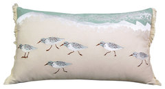
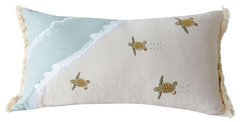
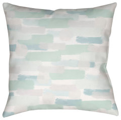
    To contrast with the many strong lines and abstract feel, I might add pillows like these:


    Sandpiper Sprint Coastal Lumbar Pillow · More Info


    Sea Turtle Migration Coastal Lumbar Pillow · More Info


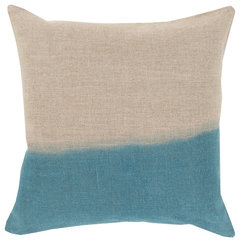
    maybe pillows like these


    Surya Dip Dyed DD-010 18"x18" Pillow Kit, Teal/Khaki · More Info


    Surya Seaside Splendor 16 x16 Medium Square Throw Pillow · More Info


    or maybe just the two solids in this group

    Sky Line Drive Indoor/Outdoor, Zippered Pillow Cover with Insert, Set of 3 · More Info


  • 6 years ago

    Okay, if beachy doesn't work at all for that room, here are some other directions I'd go:


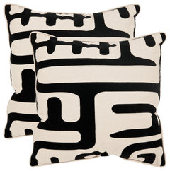
    Keep emphasizing the strong lines:


    Zébresse Ikat Lumbar Pillow · More Info


    Maze Pillow (Set of 2) - Black, Polyester, 20"x20" · More Info

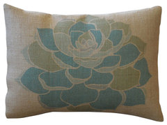
    or break up the strong lines in the direction of organics


    Gaza Pillow, Taupe/Multi, 20"x20", Down Insert · More Info


    Colored Succulent Burlap Pillow, 12"x16" · More Info

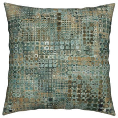
    or finally, maybe what you want is to go toward sophisticated


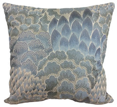
    Blue Copper Abstract Geometric City Circles Throw Pillow Cover Linen Cotton · More Info


    Cowtan & Tout Decorative Throw Pillow Cover - 20x20 - 11434-01 · More Info

    or if you really can't get enough blue


    Fernande Ikat Pillow Blue 20"x20" · More Info

    Have fun!

  • 6 years ago

    Nay

  • 6 years ago

    Nay- in my opinion the paintings and the bedspread/pillows clash. I agree with previous comments that said bedding looks more appropriate for a boy’s bedroom. I love the artwork.

  • 6 years ago
    last modified: 6 years ago

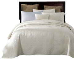
    was thinking if you want to get rid of the bedding, you might try a combo of coverlet, throw and shams set up like this but in a tone closer to ivory or cream than pure white


    Tache Powder Snow 100% Cotton Solid White Quilt Bedspread Set, California King · More Info


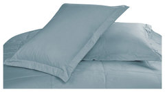
    Cottonpure Colors All Natural 100% Cotton Pillow Sham, Blue, King · More Info


    Lightweight Pebble Creek Throw Blanket, Sea Foam · More Info


  • 6 years ago

    I'd use one or the other: either go with the artwork and lose the bedding, or go with the bedding and lose the artwork. I like the artwork with the headboard - try a plain tan/cream coverlet, perhaps with some texture from quilting or stitching, then pull out a couple of colors from the artwork for a variety of pillows/sizes. Don't add more patterns on the pillows, but mix textures. Also, consider turning the artwork around so the yellow bars "bookend" both when hung for better balance. Complete the look with a plain throw in one of the more subtle colors, and one with a texture like chenille, faux fur, a cable knit or weave. Have fun!

  • 6 years ago

    If you like the artwork, ditch the bed cover.

    Once artwork is hung and bed cover gone, it will be easier to focus on selecting a different bed cover.

  • 6 years ago

    I don’t think art needs to “match” furnishings, but it should be harmonious. These clash. I would pick a simpler bedding without lines. It’s not important to pick bedding that perfectly matches a color in the art.

  • 6 years ago
    last modified: 6 years ago

    I would remove the pillow shams and layer per picture and turn down comforter so sheet is showing. Layering will feel more cozy and modern. Look for a large horizontal picture with a black frame, complimenting the color combination and your rustic headboard.


  • 6 years ago

    You may want to start over. The bedspread isn’t welcoming as a guest room and the paintings don’t work well with it either. A guest room should be warm, serene and welcoming! Sorry!

  • 6 years ago

    You've got some really nice elements with wonderful potential. I like the art and the headboard, but not on the same wall. I'd put the art •one above the other• on the side wall (to the right of the bed as you're looking at it). And I'd ditch the boy-blue bedding - go with a restful plain cream comforter, as others have said, and a mix of cream and pale-teal or cream and pale-yellow pillows. Will look awesome.

  • 6 years ago

    Nay!

  • 6 years ago

    Nay

  • 6 years ago

    Nay.

  • 6 years ago

    If you ditch the bedding and the art, what else do you have to work with?

  • 6 years ago

    The picture is too long on most for the bed something a little shorter And go neutral in the pillows

  • 6 years ago

    Maybe consider flipping the art piece on the right, raise them leaving about 4"-6" between them. Then some cream/white/teal/blue type mixes for all pillowcases. A bit of soft yellow or burnt orange will soften the look and give it less of a nautical, boys room look. Also...it's a much less expensive option. Have fun!

  • 6 years ago

    Absolutely no, but the canvasses are doing something interesting with the horizontal lines on your headboard. I would go with plain linens there. Actually...anywhere.

  • 6 years ago

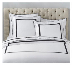
    ...and forgot to add, imagine all those bold lines on the canvases and headboard combined with bordered linens (these are Pottery Barn):


  • 6 years ago
    last modified: 6 years ago

    you know what else could be fun? Run a rod rather high above the bed and suspend the art from the rod. But make the rod wider than the headboard so you can use brackets at each end to drop down light pendants from it.

    This are different arrangements from what I'm envisioning but you get the idea


    SLS Brickell - Contemporary New Construction · More Info


    My Houzz: Casual Boho Style in a Treehouse-Like Los Angeles Home · More Info


  • 6 years ago

    Nope. Sorry. 😐

  • 6 years ago

    1st Bedroom - No,No and NO sorry to busy NAY.

    2nd Bedroom - pictures should never exceed the width of the bed, sorry


  • 6 years ago

    Well, I think you have your answer! Agree on changing the bedding vs the art. Good luck!

  • 6 years ago

    Change it all. The art is bad. The bedding is bad. And neither do they look good with eachother nor do they look good with the headboard.

  • 6 years ago

    And can we do something about the wall color?

  • 6 years ago

    Lol

  • 6 years ago

    I would like to add that I am not an interior designer BUT having made poor paint color choices and purchasing a sectional only to pay to have it redone to a loveseat and a sofa with a table in the corner instead (best idea after spending 6000 on sectional) yes I paid more but I knew I made a mistake after the fact. I have learned to know when to ask a professional for service re paint, its not expensive for 1-2 hours versus re-painting and time involved. Had one to help with exterior colors on house and I have to say would have NEVER picked or considered what she offered (3 choices) I told her to pick from the final 3 cause I still didn't trust myself. LOL My husband is happy to pay for this service as he is the one live with me after LOL cost of designer $250-300, results priceless!

  • PRO
    6 years ago

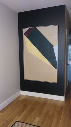
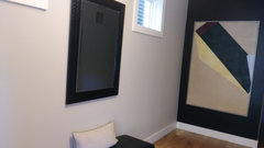
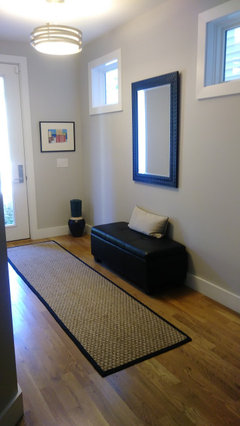
    I could use some Houzz help. we have a new modern home about 4 years old and the last area to tackle is to redo the front entry. The entryway is about 6 by 14. Gets lots of light. we just painted the black wall and hung a modern painting adjacent wall is a light gray that's in the painting. we have thought about having a floating cabinet under the two windows which would make it approximately 7 ft wide. I have a piece of pottery that's on the floor that we'd like to incorporate. Black teal white and gray. we've thought of many ideas nothing that I'd like to go through with. The bench and mirror will probably be gone. I need help with color of the cabinet, styling and how to incorporate the piece of pottery that's in the corner it's 36 in tall. thank you in advance for your help

  • 6 years ago

    @Susan Ricciardi, not the place to make your request for help, you should start your own thread for that. : )

  • 6 years ago

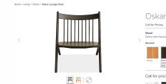
    @Susan Ricciardi, you need some storage in an entryway, and a landing spot for keys and such. I would place a storage cabinet off-center so it is half under the window closest to the door, and half under the mirror (raise the mirror up a bit), and then place the bench or a stool or small chair between the storage cabinet and your painting wall. I would go with a sculptural chair, placed at an angle to the corner. Place the tall vase on the left hand side of your cabinet surface, under the window. The height will balance the mirror. Put some gorgeous branches in your vase.


    Cabinets: light, grayish wood with black base. I like the one with the ceramic top because you can throw your hand bag and phone down and not worry about t scratching anything.


    Inexpensive and fun:

    Sculptural:

    or go for a pop of contrasting color:


    or just some nice vertical lines:


  • 6 years ago

    Sources for above items, in order:


    1 and 2, Room and Board.

    3, 4, 5, MOMA Design Store

    6, Room and Board